04 February 2020
Heuristic Evaluation: It’s Easier Than You Think

What do we mean when we talk about good UX/UI design? Undoubtedly, every top quality design boasts its own WOW features to stun users. Yet, there’s something fundamental that any good design is rooted in—10 usability heuristics.
Back in 1994, Jakob Nielsen shared his experience in the field of usability engineering in 10 general principles for interaction design. Decades later they are still relevant and help UX designers and development teams to raise the level of user satisfaction with the final product.
Usability Heuristics explained
First things first, let’s make the word ‘heuristic’ less enigmatic. According to Nielsen, there are 10 universal principles for product design:
- Visibility of system status.
- Match between system and the real world.
- User control and freedom.
- Consistency and standards.
- Error prevention.
- Recognition rather than recall.
- Flexibility and efficiency of use.
- Aesthetic and minimalist design.
- Help users recognize, diagnose, and recover from errors.
- Help and documentation.
Download office posters with 10 usability heuristics here:
https://uxposters.agentestudio.com/Visibility of system status
We feel comfortable with the system if we are in full control of it. For example, when you are listening to a song on your phone, you need to see what song it is and the number of songs left on your playlist. When you are typing a post in Twitter, you want to see the number of characters you have left (as you may know, your tweets are limited to 280 characters). When you are jogging with your fitness watch, you need to check your pulse, pace, and distance. Reliable and predictable systems empower us to make further decisions, be it a bus ride or interaction with a device.
So, according to the first heuristic, UX designers need to understand the information that is crucial for a user and present it in a timely manner. There are two types of such information:
- Persistent status. For example, battery life, mobile network or Wi-Fi connection indication on your mobile phone.
- Feedback after a user action. For example, the change of button color after a user has pressed, or a progress indicator when information is being downloaded.
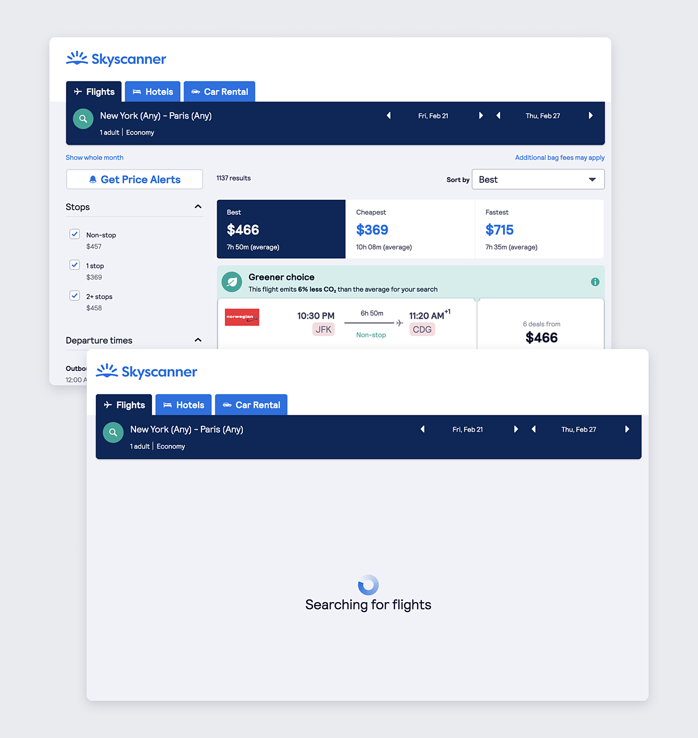
Source: Skyscanner
Match between system and the real world
There are two rules here: speak the user’s language and follow real-world conventions. While interacting with a device, a user should feel like communicating with a human being.
When the user doesn’t understand the machine-oriented language, they feel frustrated. They leave the website or app and go elsewhere where they feel more comfortable.
For example, we have a landing page of a product company. In your opinion, which button is more understandable: ‘Meet & greet’ or ‘Contacts’? Both have the same purpose—to display the company’s address and contact information. However, the second variant is direct and clearer. In all probability, a user has already interacted with websites like this and found contact information in the ‘Contacts’ section.
The same principle should be applied to icons. The more an icon resembles the function, the better.
Source: Agente
User control and freedom
This heuristic might seem to overlap with the first one, yet it states a separate logical principle: Every system should have an emergency exit. For example, undo buttons help to go a step back. They are especially needed in devices with a touch screen where accidental taps are common.
Sometimes, you get lost on the way to your goal. It’s especially common while visiting online stores. How many times have you ended up with items in the cart that you don’t need? Instead of canceling the whole purchase and starting again, you can simply use a ‘Remove’ button and take a superfluous item from your cart.
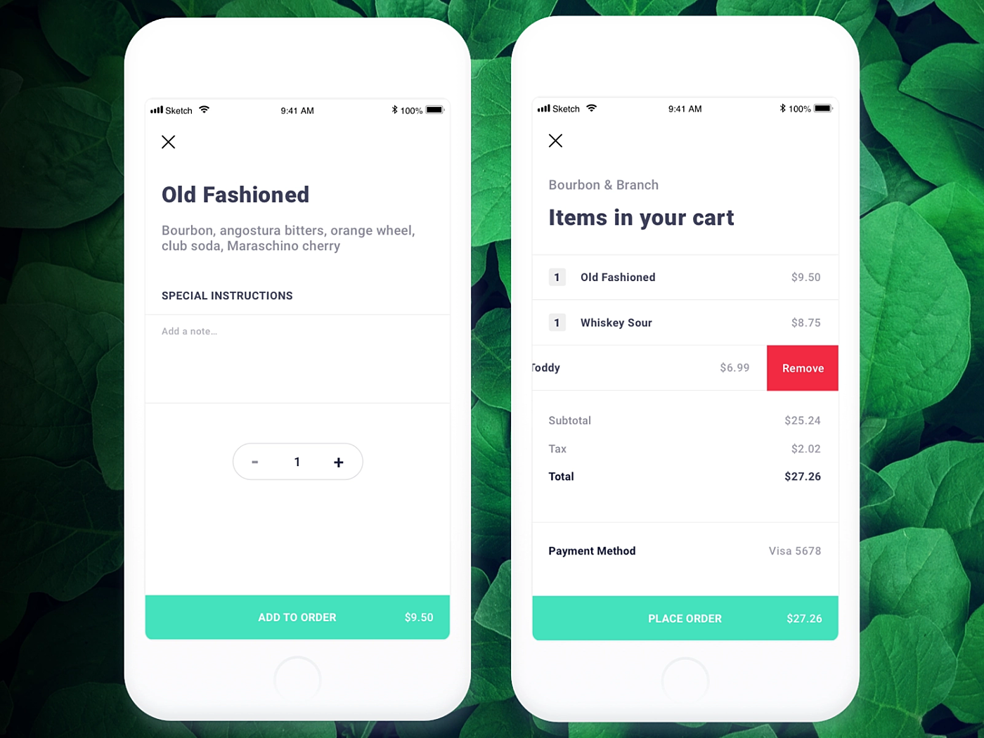
Source: Dribbble
Consistency and standards
User interface should be predictable and learnable. Jacob’s law of Internet user experience states that people spend most of their time browsing other websites and interacting with other apps.
Users expect your product to follow conventional principles that they have already seen on websites or apps of the same industry. This is called external consistency. For example, the ‘Cart’ button usually looks like a shopping cart and is placed in the upper right corner.
Source: Dribbble
There is also an internal consistency that you maintain in a family of products. For example, below you see two iPhone screens with system messages. Notice the same font style and the same color of active buttons.
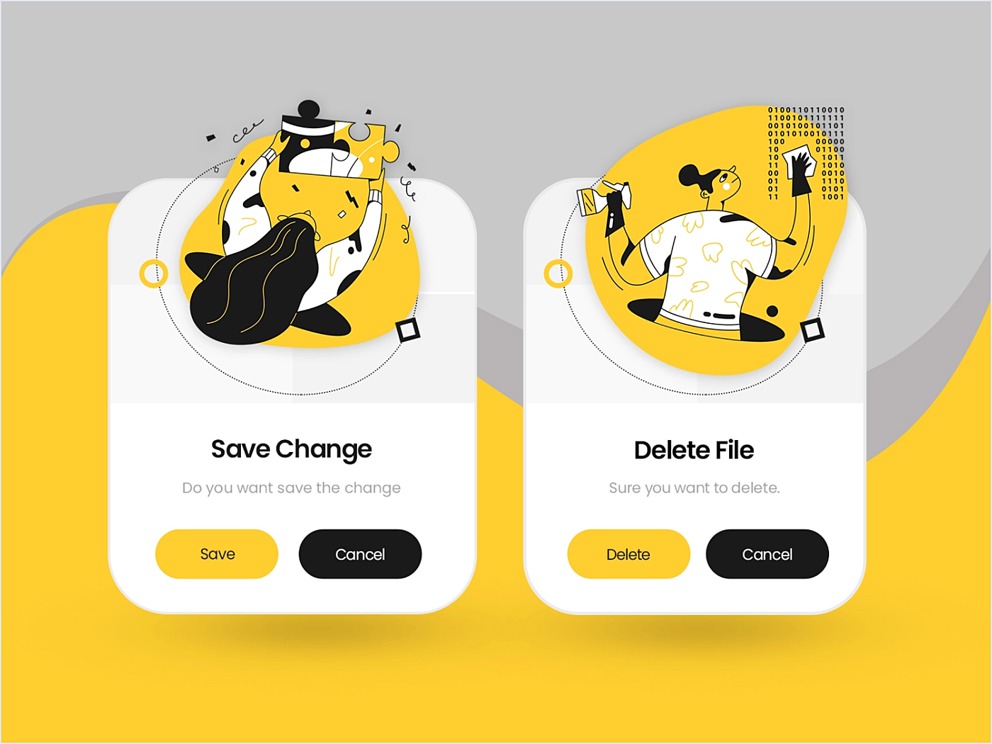
Error prevention
“Errare humanum est”— “To err is to be human.”. The clever design should minimize errors. This is especially important for healthcare, finance, and transportation where an accidental click can lead to the loss of huge sums of money, or it can jeopardize people’s lives.
According to Nielsen, designers should “either eliminate error-prone conditions or check for them and present users with a confirmation option before they commit to the action.”
For example, use separate colors for ‘delete’ and ‘cancel’ buttons, or send an “Are you sure?” message when a user wants to delete something.
Source: Dribbble
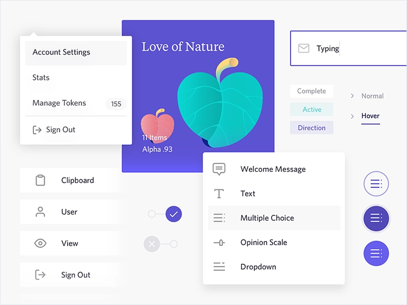
Recognition rather than recall
Which question is easier to answer:
- Was Apple founded by Steve Jobs and Steve Wozniak?
- Who founded Apple?
Naturally, the first question is easier, as it contains the clue to the correct answer. There are two types of memory retrieval: Recognition and recall.
The first one is easier, as you are already presented with an object or concept you are familiar with. It is a very shallow form of retrieval from memory and it doesn’t require any work. Recall demands extracting rarely used information from your memory. It is a deep intellectual process that requires more work.
The recall process is difficult and error-prone, so a good user interface doesn’t require a user to do it frequently. Instead, it offers graphical options that are instantly recognizable. For example, images of menu categories instead of bare description.
Source: Dribbble
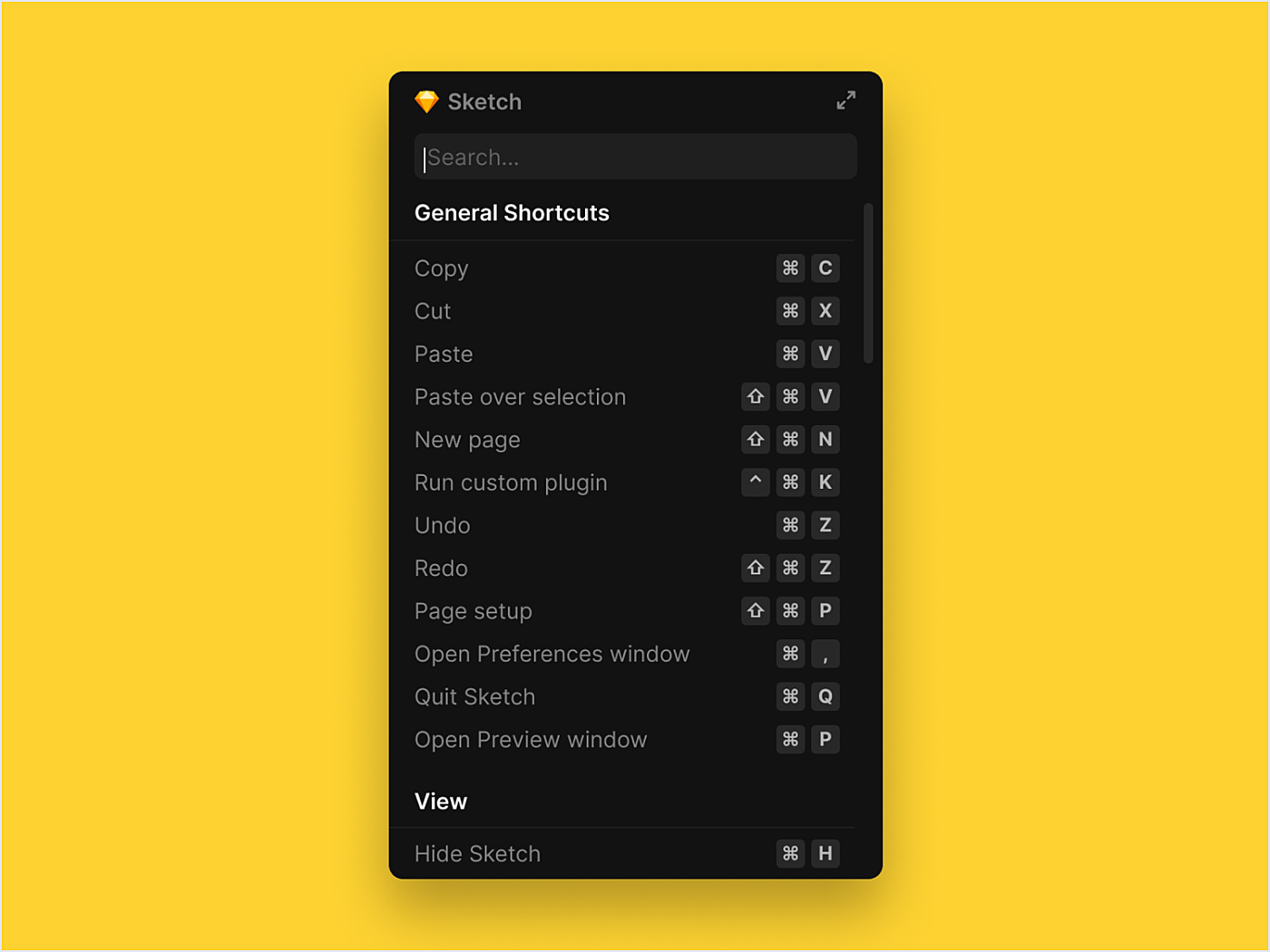
Flexibility and efficiency of use
Design should be friendly to both experts and newbies.
Experienced users should be able to speed up their interaction with the system. For example, keyboard shortcuts, macros or various app accelerators (e.g., tap twice to like an Instagram post).
New users would not notice these accelerators so they tend to use features in the most convenient and logical way for them.
For example, designers who learn Sketch use menu options instead of keyboard shortcuts. When users get to know the system, they can find the best way to optimize their experience with accelerators.
Source: Dribbble
Aesthetic and minimalist design
There is a concept of a signal-to-noise ratio. Good design has a high signal-to-noise ratio, which means relevant information (text, visuals, animation) prevails over the irrelevant.
Every extra unit in the UI prevents users from seeing the relevant items and accomplishing their tasks. So if there’s something in your design that is here only for beauty, get rid of it.
An excellent example of a high signal-to-noise ratio is the Forbes search panel. There’s very little to distract the user from the primary task, which is conducting a website search.

Source: Forbes
Help users recognize, diagnose, and recover from errors
There are three things a system should do when an error occurs:
- Inform the user what has happened. It’s advisable to use a combination of a warning text and visuals (red font or a warning sign).
- Explain the problem in simple terms.
- Explain how to fix the error (for example, provide an ‘undo’ button).
Source: Spotify
Help and documentation
Although we hardly ever read the documentation before starting to use a device or application, there’s a high probability that we will go back to it someday. The more interactive a product’s help center is, the quicker users can solve their issues. Help information should be easy to search for, and it should be concise as well as focused on the user's task.
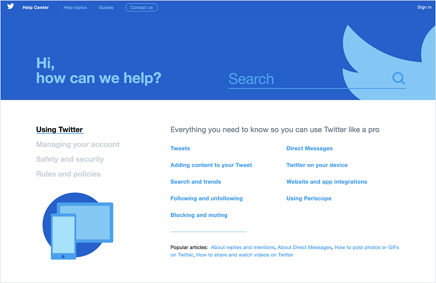
Source: Twitter
On a final note
We strongly believe in the 10 usability heuristics and practice them in Agente projects. That’s why we created a set of 10 posters to remind ourselves of the golden UI standard, and why we put them up in our office—to be inspired every day.
They help project managers, UX/UI designers and developers to plan and build intuitive digital interfaces. What’s more, these posters can be used when you perform a UX audit.


Rate this post!
694 ratings, average ratings is 4.5 out of 5

Related Posts

16 January 2024
ChatGPT Plugin Development: Features and Benefits for Business
Explore the process of crafting a ChatGPT plugin tailored precisely to meet your unique business requirements.

19 January 2024
AI Model Fine-Tuning: How to Use Your Organization's Data?
Organizations are transitioning from generic solutions to hyper-customized intelligence, seeking AI models designed to address their unique challenges and propel them toward strategic objectives.
This demand has propelled fine-tuning to the forefront of AI development.
Develop Custom Corporate Microlearning Platform
Custom microlearning solutions for corporate training: Discover how to develop a tailored platform for efficient and engaging employee learning

24 January 2024
Employee Training Management Software Development in 2024: Features and Cost
Streamline your employee training with cutting-edge software solutions. Explore the features and costs of employee training management software.

How to Launch Your Online Travel Marketplace Platform in 2024?
Learn how to launch your own online travel marketplace platform in 2023 with our comprehensive guide and step-by-step insights.

22 January 2024
Top 15 Software Project Risks and Mitigation Examples in 2024
Explore our guide to the top 15 software project risks and learn mitigation examples to ensure project success.
Let's talk
Is there a challenge your organization or company needs help solving? We’d love to discuss it.

Managing Director, Partner
Andrew Terehin

Thank You!
Your message has been successfully sent.
We will contact you very soon.