17 February 2017
9 Best Examples of Travel Website Design

Travel websites provide a whole package of travel experience which used to rest on the shoulders of offline travel agents. Today, the online travel market size has reached $432 billion, as most people want to book their trips through websites themselves. That’s why tourism website design is of crucial importance in marketing.
This article explores trends in travel web development and design, killer features, cost, tech stack, and Agente’s experience as a tourism web design company.

Trends in travel website design and development
Utility is the word to live by when it comes to travel and tourism web development and design. Take a look at the latest trends that represent this concept:
- Simplicity: Websites are now developed and designed to make them efficient on mobile devices, leaving behind clumsy and cluttered layouts. Modular design, flat architecture, and simple navigation are the design choices these days.
- Inspirational videos: Great quality videos, like interactive city guides and 360-degree clips inspire people and boost their motivation to travel.
- User-generated content: More and more website source content from clients’ social media, creating boards with Instagram or Facebook photos. It helps to demonstrate real-life experiences and builds trust between the website and its users.
- Data analytics. Travel website developers introduce travel boards to gain invaluable insights into the forms of content users prefer, the partners that provide the best services, and a lot more.
Features to add to tourism website design
The tourism and travel industry includes many types of sites, like bookings, tour operators, accessory suppliers, and blogs. Therefore, the functionality will vary depending on your specialization. Here, we describe the features common to all travel and tourism websites.
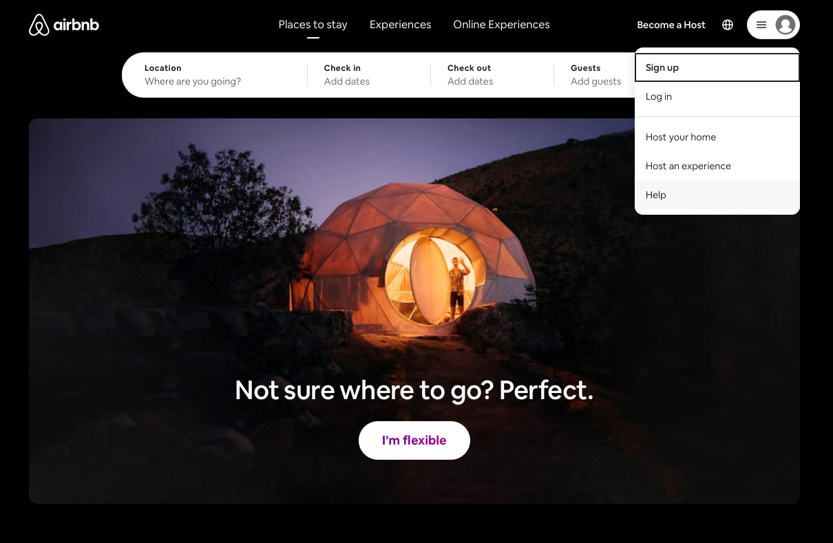
Registration
Registration should include manual filling out and connecting to Google, Apple, and Facebook accounts, as well as email address and signing in through the accounts.
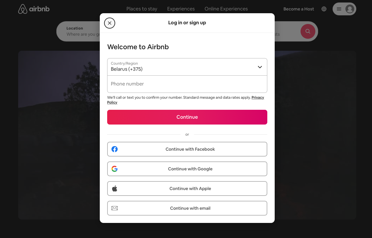
Source: Airbnb
Search bars and filtering
It’s essential to allow people to find places by commonly searched features such as location, available rooms; free Wi-Fi, parking, room service, breakfast, or wheelchair accessibility.
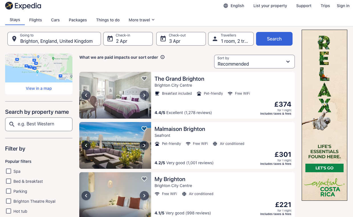
Source: Expedia
Customer reviews
People want to get as much information about the place they are going to visit or the product/ service they want to purchase, so reviews and testimonials from travelers always enhance credibility.
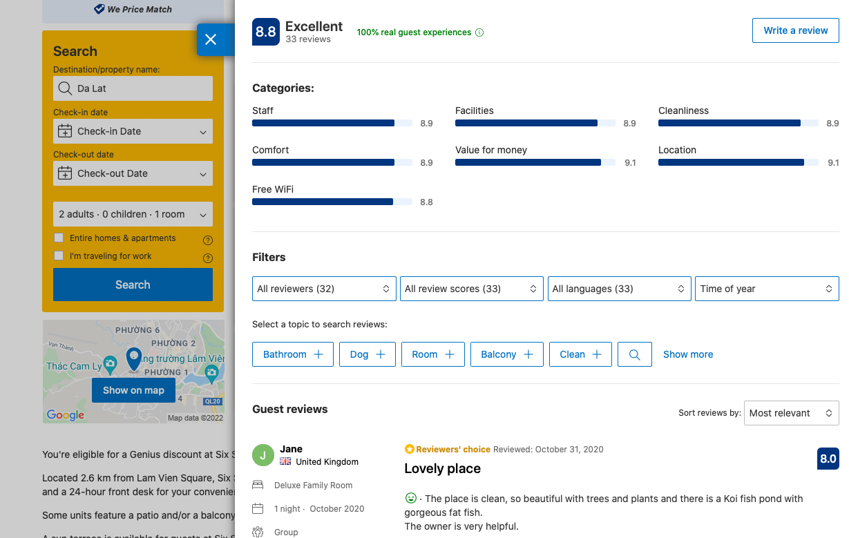
Source: Booking.com
Reservations
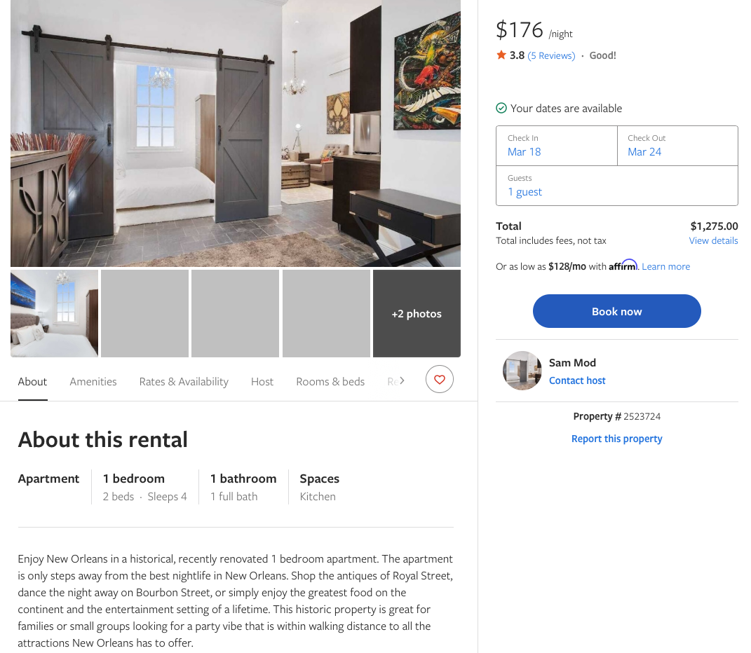
You need to create a reservation system that manages dates, room types, facilities, tour packages, and more. Don’t forget to create blocked-out slots for unavailable options.
It’s great for users to see the upcoming months' options so they can compare prices and get the best value for money.
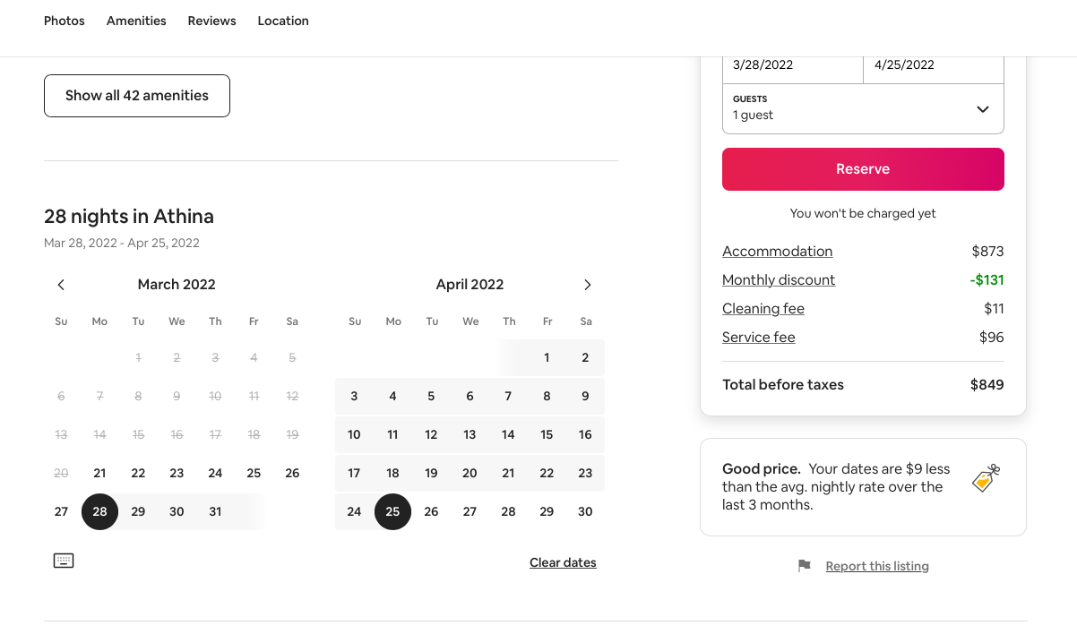
Source: Airbnb
High-quality images and meaningful descriptions
Visual content inspires people and conveys a more precise message about the place, product, or service. High-quality images boost the brand’s credibility together with an evocative, compelling, and keyword-rich copy.
Source: Vrbo
Payment gateways
You can use popular gateways like Stripe, PayPal, Braintree or Dwolla. Include multi-currency acceptance; it makes your site much more user-friendly.
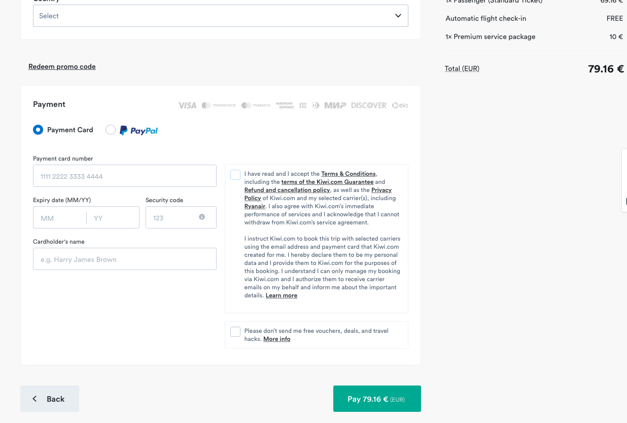
Source: Kiwi
Notifications
It’s good practice to notify registered users about booking confirmations, cancelations, or purchased equipment via email. If users allow, keep them updated on places worth visiting with push notifications.
Customer support
Customer help should be available from any page. It’s for you to decide whether it will be in the dropdown menu or chat support.
Source: Airbnb
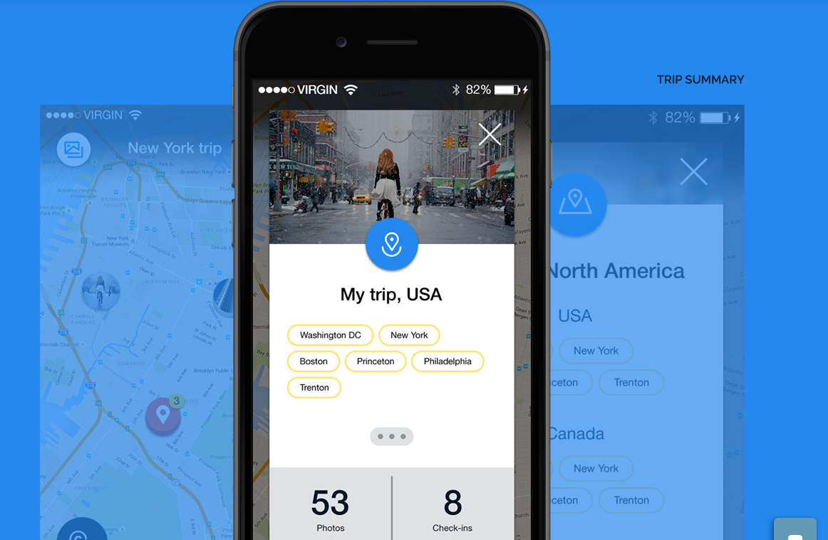
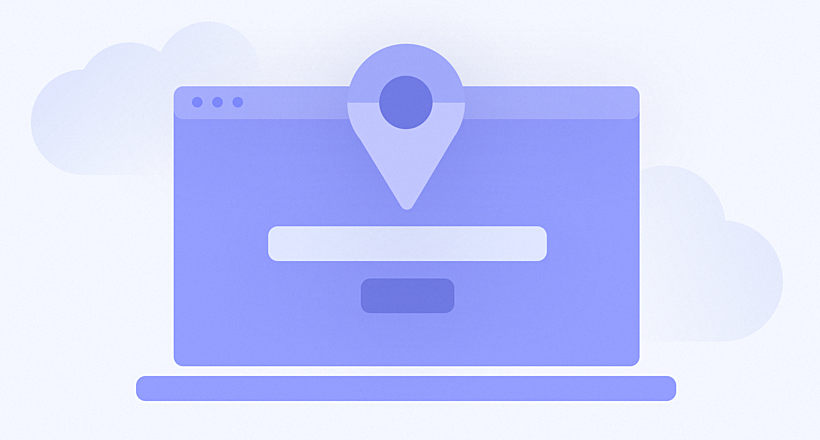
Maps
Enable website visitors to find places by selecting the exact location or distance range on a map. The map should be interactive with activities available, prices, and several photos of the destination.
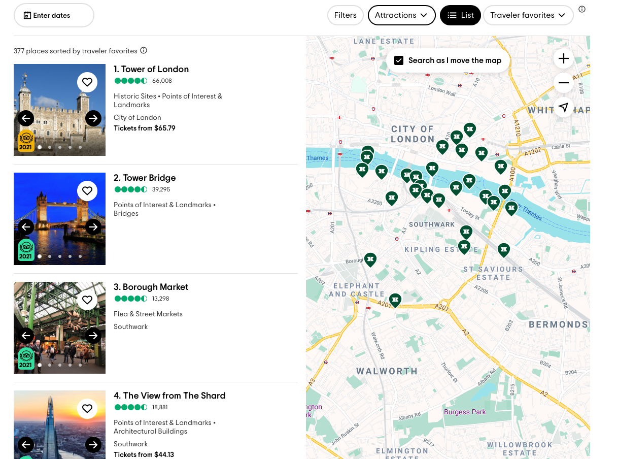
Source: TripAdvisor
Examples of Travel and Tourism Website Design
We’ve divided all the examples into three categories:
- search and booking (OTAs, flights, and hotels)
- custom packaging tours and holidays
- travel content sites and portals
We will analyze websites in each category and then describe why we have chosen these sites, considering criteria such as user experience, visual UI design and its quality, as well as content and services presented on the website.
Search and booking
There are many systems and services for searching and booking flights and hotels. The most popular are used each time people are planning their next trip, while others are used less often because they are niche booking engines or services. We chose the most interesting websites relating to the criteria described above.
Kayak
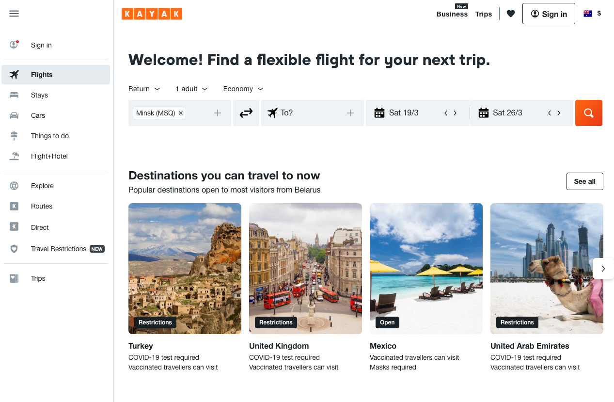
Source: Kayak
An industry leader can’t have bad usability. It looks like hundreds of user tests are performed each week, and thousands of user metrics are tracked and gathered by the system for the following analytics. As a result, you get a system with great UX design, well-thought out structure, and even an adaptive logotype.
Kayak has a clear UI design style with flat elements complemented by big hero images, used as a background of the main search area. These images are related, and change according to search requests. The visual style is simple and clean, with bright color accents on call-to-action elements, which effectively attracts users’ attention.
The range of services on such types of sites has already become an industry standard with minimum variations and deviations. The content is well-structured, the main popular sections are highlighted and additionally marketed with glyph icons, which catches users’ eyes and immediately tells them what’s behind the content blocks.
Skyscanner
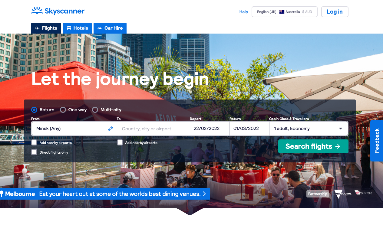
Source: Skyscanner
This website provides a clean and smooth UX when it comes to searching for flights, hotels, and cars. The search results are well-structured; each is separated from the other, which helps users perceive the page’s content much easier. The main booking buttons are well-highlighted and located in the main user's focus area.
The color scheme of visual UI is based on three main colors with minimalistic flat backgrounds. The beautiful background picture doesn’t distract from the content.
Skyscanner is not just a flight search, it offers hotel and car bookings as well, which provides an all-in one travelling experience.
Design Hotels
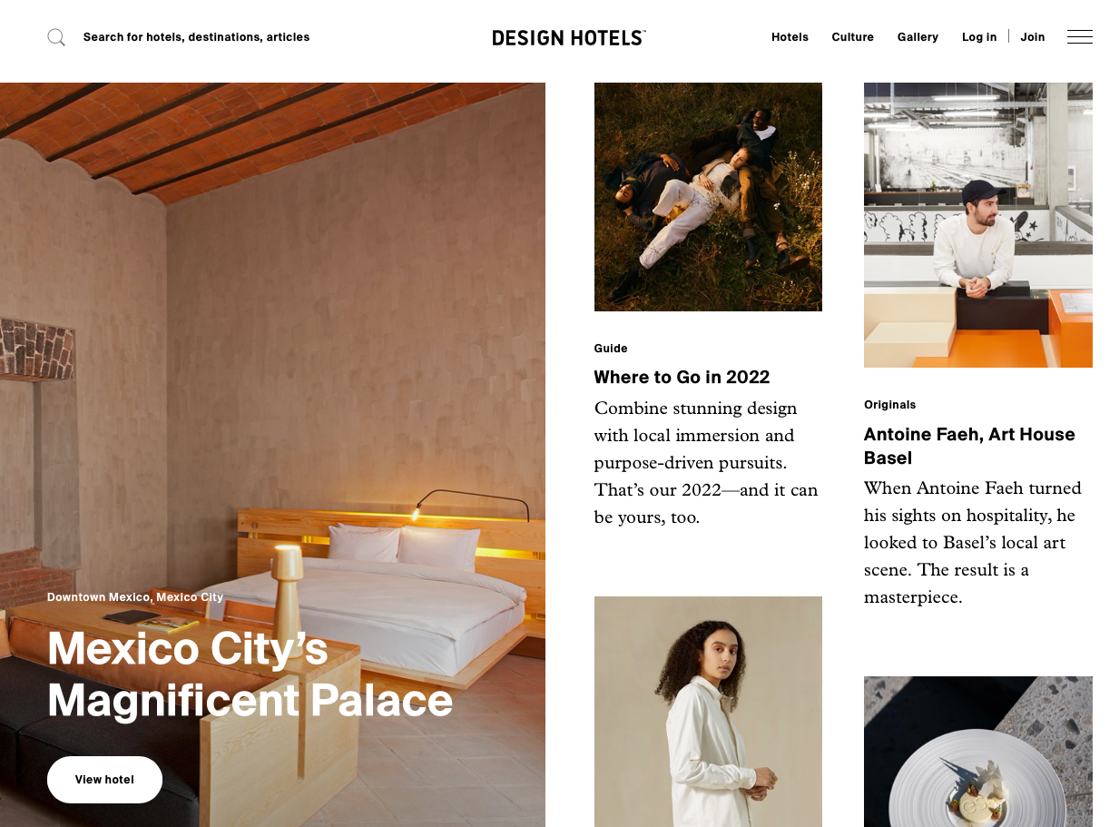
Source: Design Hotels
Design Hotels is a well-known brand in the travel market as a niche searching and booking service, so a service with “design” in the title can't have bad UX/UI design because the target audience is rather spoiled, and is used to beautiful design and ease-of-use aspects. Yes, this project has good UX design, the responsive layout is well thought out, and calls to action are visible and well-placed.
The visual structure of the pages is not cluttered; it is well balanced with an emphasis on huge photos. The rest of the UI exists like the frame for the picture, which helps to draw attention to the beautiful design hotels.
The website offers the full range of services related to Design Hotels all over the world. Content is well-structured and grouped by the categories.
Custom packaging tours and holidays
We single out this category because there are so many impressive projects on the market that offer customized tours and niche travel possibilities. Tourists can take cruise adventures or journeys by car for business trips, or relaxing holidays to exotic destinations within any price range.
Travel Triangle
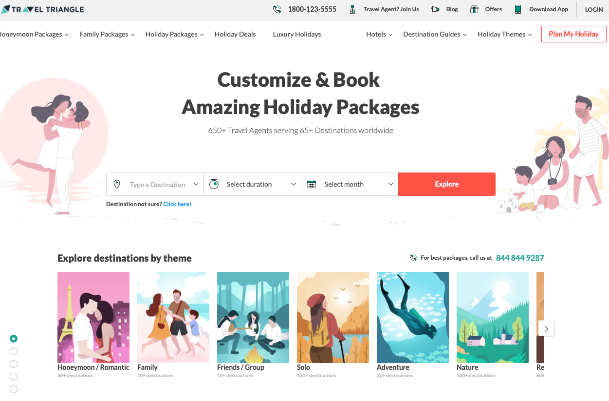
Source: Travel Triangle
Travel Triangle is one of the leaders in its category and niche, so leadership really deserves by thoughtful UX design and attractive visual UI.
The color scheme uses pastels with flat UI elements, beautiful typography and use of custom iconography. The color accents on buttons are well balanced and noticeable. There’s a lot of space in which to easily find each functional element.
This project is loaded with interesting content and offers; there’s a choice of your perfect destination by theme; all content is well-structured.
Arctic Wild
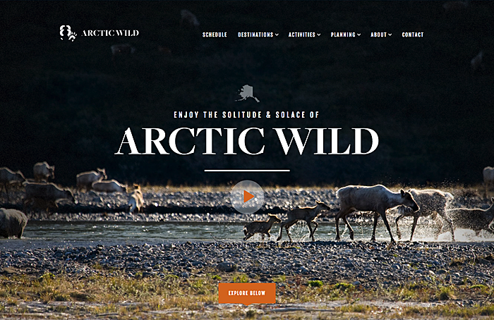
Source: Arctic Wild
The information structure is well-thought out; calls to action are visible and nicely placed. The multi-level navigation is useful and well-structured.
The color scheme is well-balanced, the accents on the pages are adventure photos. The design style is a bit outdated, but it still works well on the audience.
The website offers the full range of services related to Arctic travel activities. Content is well-structured and grouped by the categories.
The Yacht Week
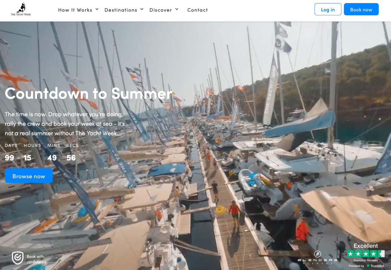
Source: The Yacht Week
The Yacht Week is the industry leader and a famous brand in the yachting travel niche. The overall impression of using the website wasn't bad. The header navigation looks too small, but the structure is well-organized, and it’s easy to get the needed information in a few clicks.
Visual UI design is based mostly on large, attractive photos, and the color scheme consists of two main colors: blue and white. It would be nice to add a third accent color for important CTA elements, like buttons or some important UI controls.
The content and services look good; the site provides a lot of yachting-related types of entertainment in a range of destinations, and the blog section consists of typical promo content materials.
Travel content sites and portals
Some of the travel content sites use mixed models with booking and search services, but most of them provide the traveler with full information about countries, sharing inspirational ideas about traveling and possible ways to spend holidays.
Conde Nast Traveler
Source: Conde Nast Traveler
It’s no surprise that the largest media-publishing company owns one of the best content media resources related to traveling.
Conde Nast has been serving users/readers from a variety of niches for more than one century already, so they have a lot of UX design practice. I can say that UX in modern online media is sufficiently standardized, so Conde Nast Traveler is keeping good UX design standards.
This site has a content-centered design style, based on huge photography and typography with a lot of white space, which helps to perceive the content much easier.
The content is the king here. Everything is made around content and based on the content.
Skift
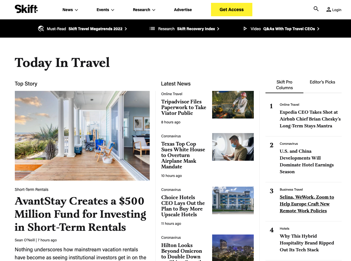
Source: Skift
The subsection of the website related to traveling has a good UX; the navigation is clear and well-structured, and the rest of the UX features are industry standard.
The newspaper/magazine style layout has a lot of whitespace, huge typography and headers, and an emphasis on large photos.
Not only is Skift always at the cutting edge of tourism news, but the resource produces some of the most thoroughly researched and future-focused reports in the industry.
Jetsetter Magazine
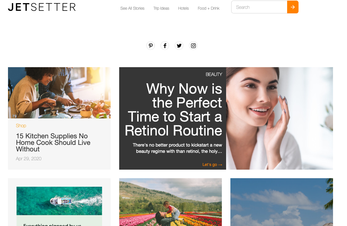
Source: Jetsetter
The magazine section of the famous Jetsetter portal uses a typical grid structure layout, the usability is quite good enough, and the simple magazine functionality does not imply any super-custom or complex UX design features. Long-read articles have a good design with sub navigation, so it’s much easier to read the content.
Jetsetter has a blog- or magazine-style grid layout, with photos and a lot of white space.
The quality of photo content is the core of Jetsetter; all articles are supplemented with amazing professional photos and the post structure is well-divided with headings and subheadings.
How much does travel website design and development cost?
The final cost of tourism web design services and end-to-end development depends on the project scope, budget, number of specialists involved, and the specialists’ location. The basic feature set will usually engage a team of 7–10 members skilled at the development of travel websites:
- tech Lead
- project manager
- data Scientist
- 2–3 frontend developers
- 2–3 backend developers
- 1–2 QAs
When it comes to costs, an MVP will take around a month and will cost $31,000 in Eastern European countries. A fully-fledged product is normally ready within six months and will cost around $150 000 in Eastern Europe.
Tech Stack for Travel Website Development
The exact technologies may vary depending on the feature set required for a project, possible features are scalability, performance, cost, support, and maintenance. Here, we give the basics.
Frontend programming usually involves JavaScript, HTML, CSS, Ember.js, jQuery, Backbone.js, and JavaScript technologies such as Angular, React, and Vue.
The backend programming languages include Java, Python, PHP, Ruby, Node. js, .NET.
Why us?
Our company has extensive experience in developing travel projects mostly for the CIS market, mostly OTA (online travel agency website design) and booking platforms that provide flights, hotels, and car bookings. Take a look at our portfolio:
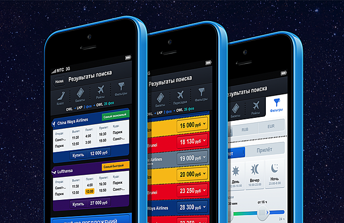
Kupi Bilet
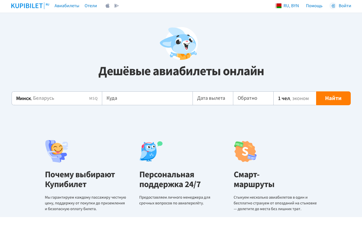 Source: Kupi Bilet
One Life
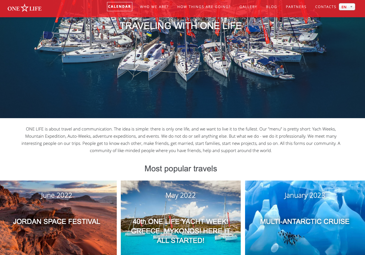
Source: One Life
Triptracker
Source: Agente
Rhlah
Source: Agente
Final Words
We hope our analysis will be useful for travel industry representatives. If you’re still wondering how to combine functionality and design, at least you know that nothing is impossible.
Moreover, applying our insights to a business travel app can significantly enhance its usability and appeal to professional travelers.
Use your bravest ideas and give them to professionals. AGENTE is always here to help you create an OTA or any other travel product or service from scratch—or improve your existing one. Our wide experience lets us deliver high-quality results mixed with the most creative and innovative solutions. Reach out to discuss your next project.
FAQ
Are there any new features for travel websites in the post-pandemic world?
When it comes to booking flights and property, it’s becoming more and more popular to add the feature called “insurance.” A person can purchase insurance against catching COVID-19 and having to cancel the trip.
How to create an online travel website
There are several ways to do that. The cheapest is to create a website on a website builder, however, it will be too simple and won’t fit all the features you want. The second option is to buy an out-of-the-box solution and customize it. The feature set will not be impressive, and there may be problems with scalability. The third option is to hire travel website developers who will leverage their experience to create a fully-fledged custom solution.
How long does it take to develop a tourism website?
If we are talking about an MVP, it will take about a month (with standard features). A fully-fledged solution development will take around six months.
Read also: How to develop a website like Udemy?


Rate this post!
212 ratings, average ratings is 3.4 out of 5
Related Posts

16 January 2024
ChatGPT Plugin Development: Features and Benefits for Business
Explore the process of crafting a ChatGPT plugin tailored precisely to meet your unique business requirements.

19 January 2024
AI Model Fine-Tuning: How to Use Your Organization's Data?
Organizations are transitioning from generic solutions to hyper-customized intelligence, seeking AI models designed to address their unique challenges and propel them toward strategic objectives.
This demand has propelled fine-tuning to the forefront of AI development.
Develop Custom Corporate Microlearning Platform
Custom microlearning solutions for corporate training: Discover how to develop a tailored platform for efficient and engaging employee learning

24 January 2024
Employee Training Management Software Development in 2024: Features and Cost
Streamline your employee training with cutting-edge software solutions. Explore the features and costs of employee training management software.
How to Launch Your Online Travel Marketplace Platform in 2024?
Learn how to launch your own online travel marketplace platform in 2023 with our comprehensive guide and step-by-step insights.

22 January 2024
Top 15 Software Project Risks and Mitigation Examples in 2024
Explore our guide to the top 15 software project risks and learn mitigation examples to ensure project success.
Let's talk
Is there a challenge your organization or company needs help solving? We’d love to discuss it.

Managing Director, Partner
Andrew Terehin

Thank You!
Your message has been successfully sent.
We will contact you very soon.