Furnique
Furnique — Furniture Marketplace
The main goal of this project was to create an adaptive user interface for a large online furniture retail marketplace. The marketplace contained thousands of product names, dozens of categories and brands, but its interface was outdated and its backend system was difficult to use.
The project included a full range of services associated with prototyping and designing user interface: competitor analysis, hit-maps analysis, information architecture, prototyping, and designing desktop and mobile interface. Besides that the project included new logo design.

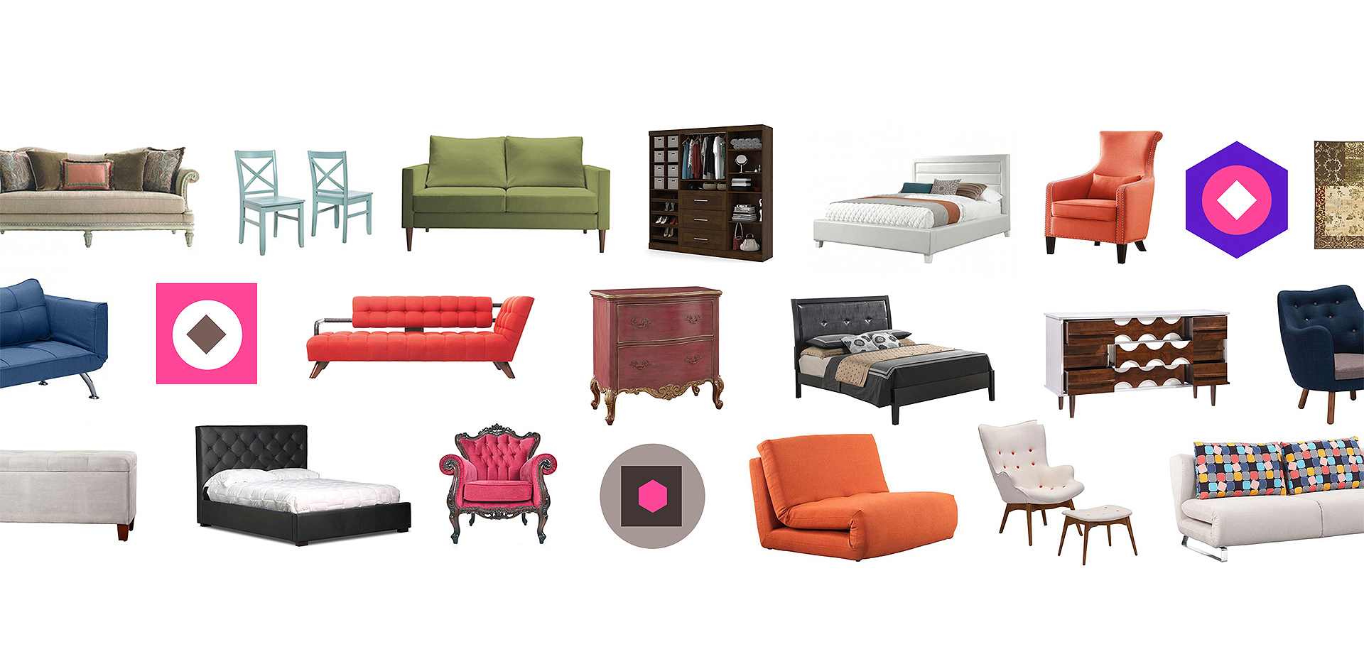
Competitors analysis
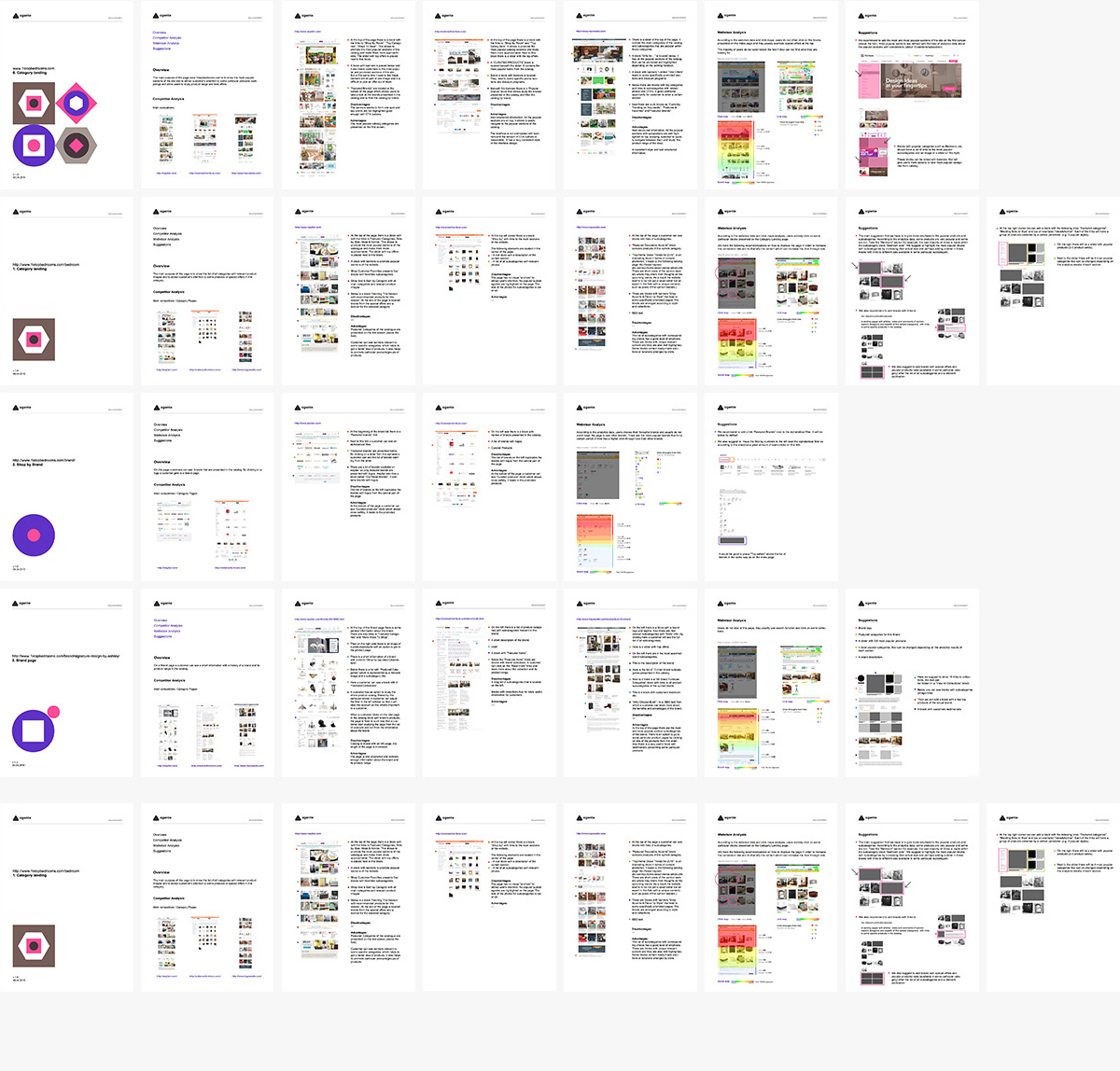
Each of the pages was compared to the similar competitor’s page and it helped us to find its strengths and weaknesses. Additionally, we tested each page in the analytics tool and analyzed hit-maps, scroll maps, and all the main user scenarios. This was done to find what areas get the majority of clicks and what areas get overlooked. The tool provided us with the information about the time users spent on each part of a page. Finally, we presented our suggestions on how the page can be improved with the help of low fidelity wireframes.
UX design and UI design stages
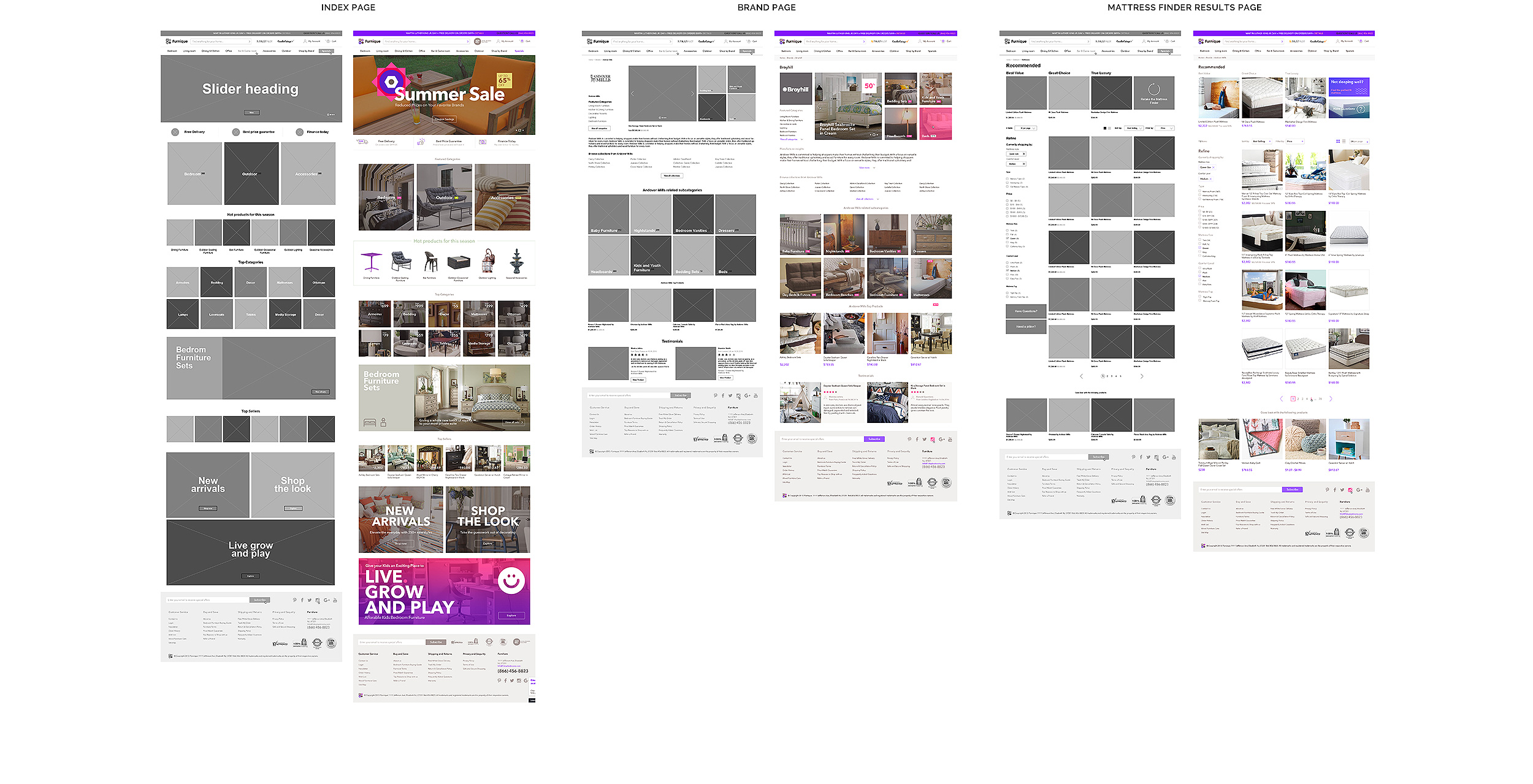
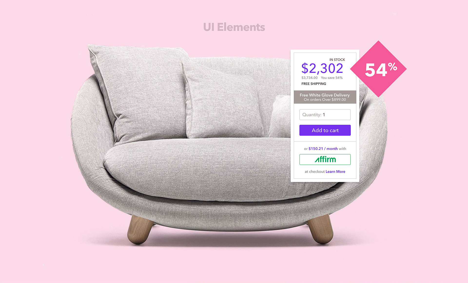
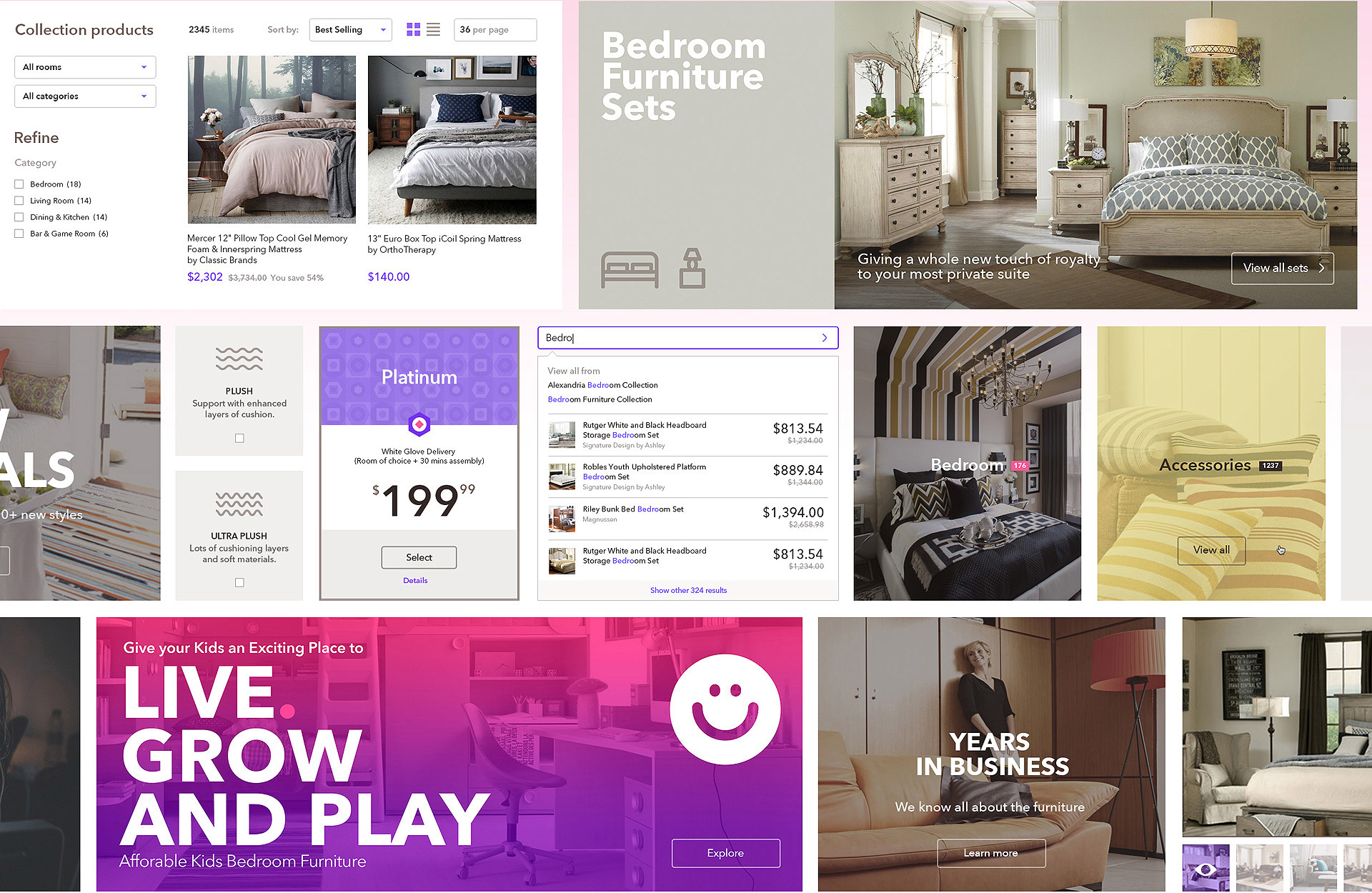
As soon as the low fidelity wireframes were approved we prepared a more detailed UX wireframes for each page. After that, we developed a new UI concept for the website that included purple color scheme and new fonts and presented new pages to the client. Below you can see the examples of the Index page, Brand page and Mattress Finder Results page.
Mobile version design
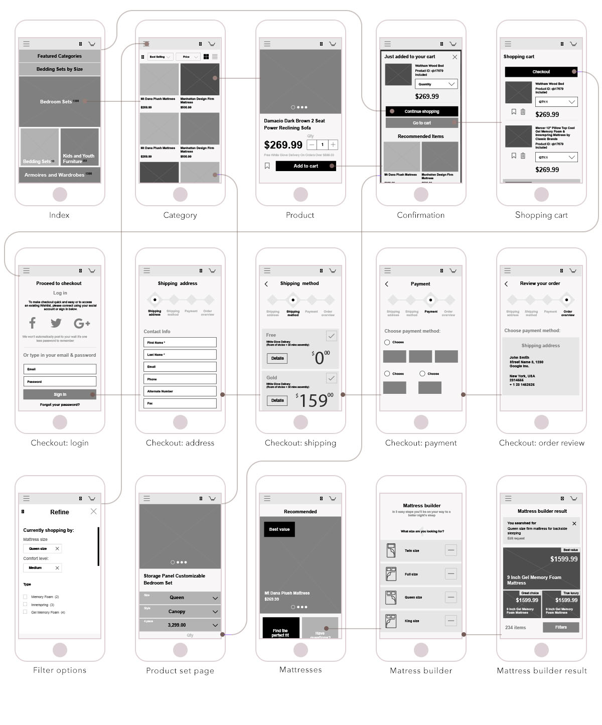
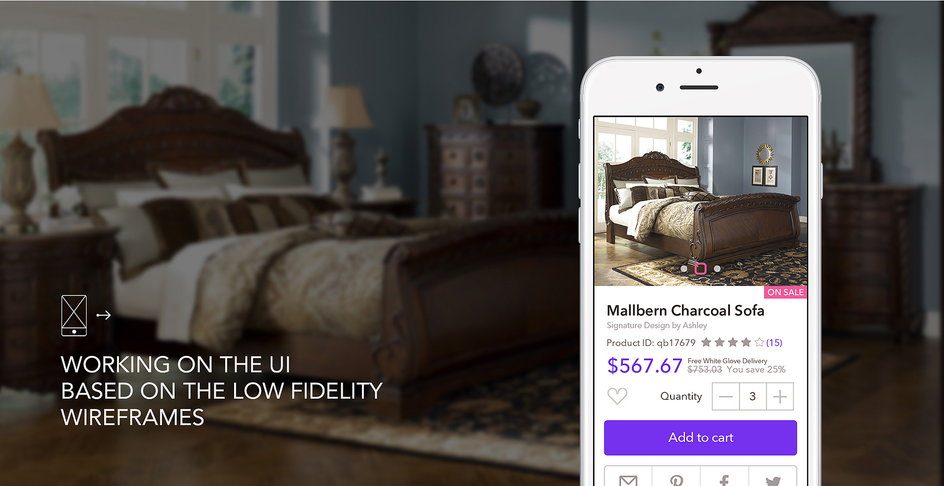
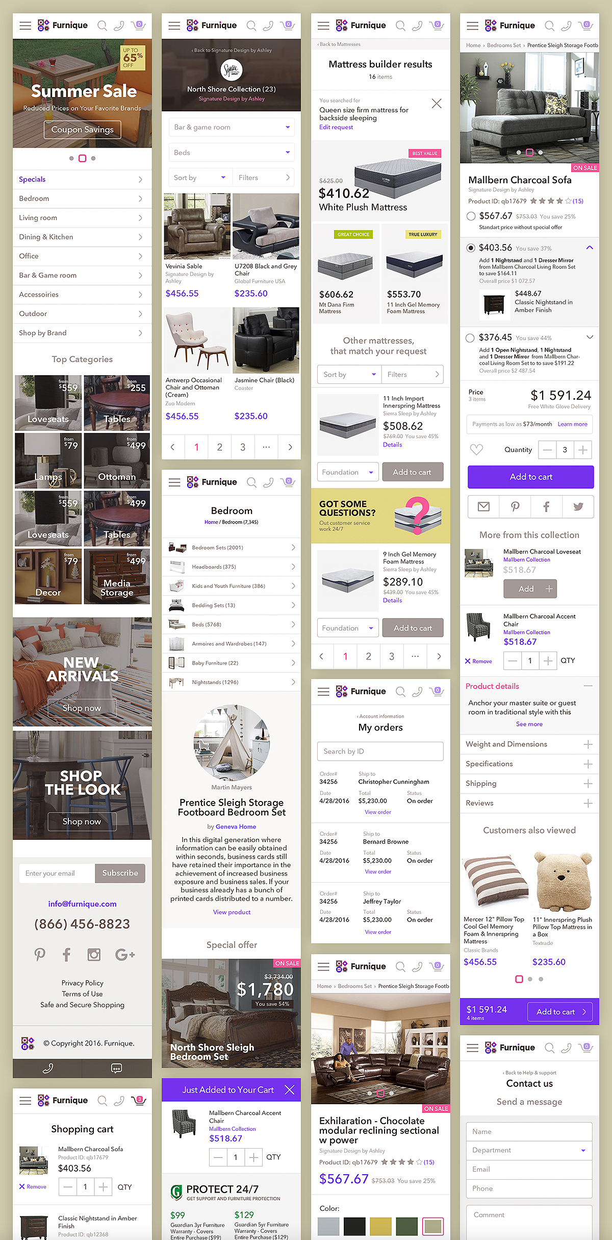
The mobile version of the website was treated as a separаte version and it allowed us to use a slightly different approach to some features and thus offering a better user experience tailored specifically to mobile users’ demands. The work on the mobile version also included competitor analysis (which was similar to what was done in terms of the desktop website), and wireframing followed by the UI phase.
Inventory management system design
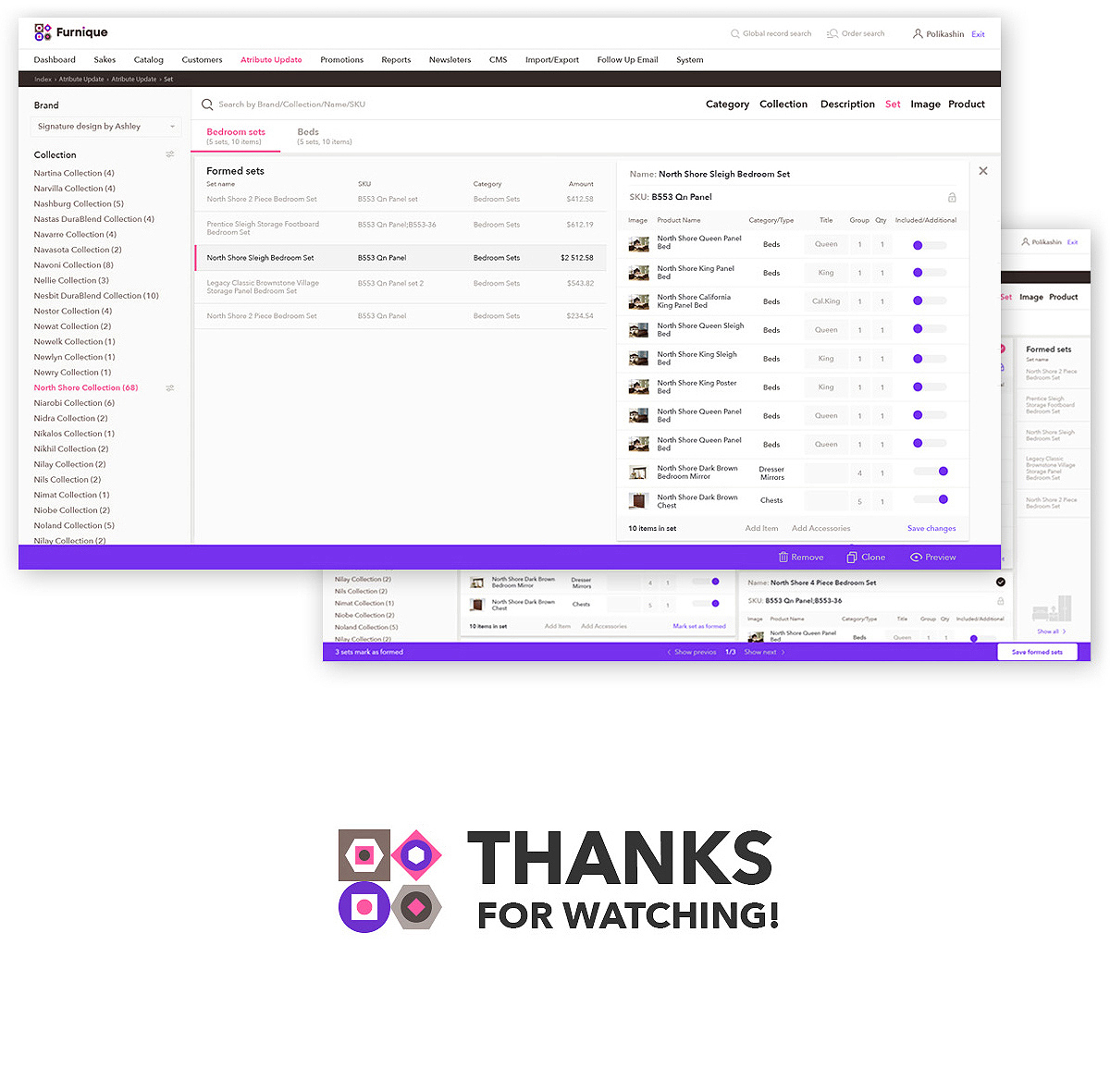
We prepared an updated UX for the several of key backend inventory management system templates. It became easier for the system’s Admin to work with collections, categories, and promo blocks. The UI of the backend system resembled the UI of the frontend in order to provide a consistent user experience.
Let's talk
Is there a challenge your organization or company needs help solving? We’d love to discuss it.

