User profiles on a website is a great way to keep your audience engaged. People come, sign in, fill in the info about themselves, and make your website an online community.
In this article Agente Studio will show how to design the best user accounts and profile pages. See more works in our portfolio.
Who could benefit from user profile page design?
- Website owners: since these records serve as the sources of valuable customer data, website owners can better target marketing activities and increase profits by 15%.
- Users: they will be able to receive personalized product/service recommendations and build a network.
User Profile Design: Key Elements to Use
Just like any other page, design of a user profile page has to include some crucial elements in order to be successful. What are they?
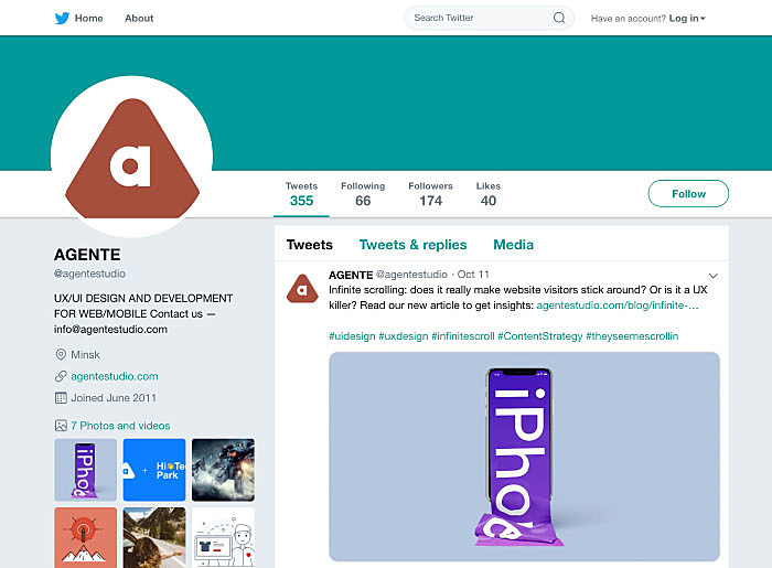
Profile Picture
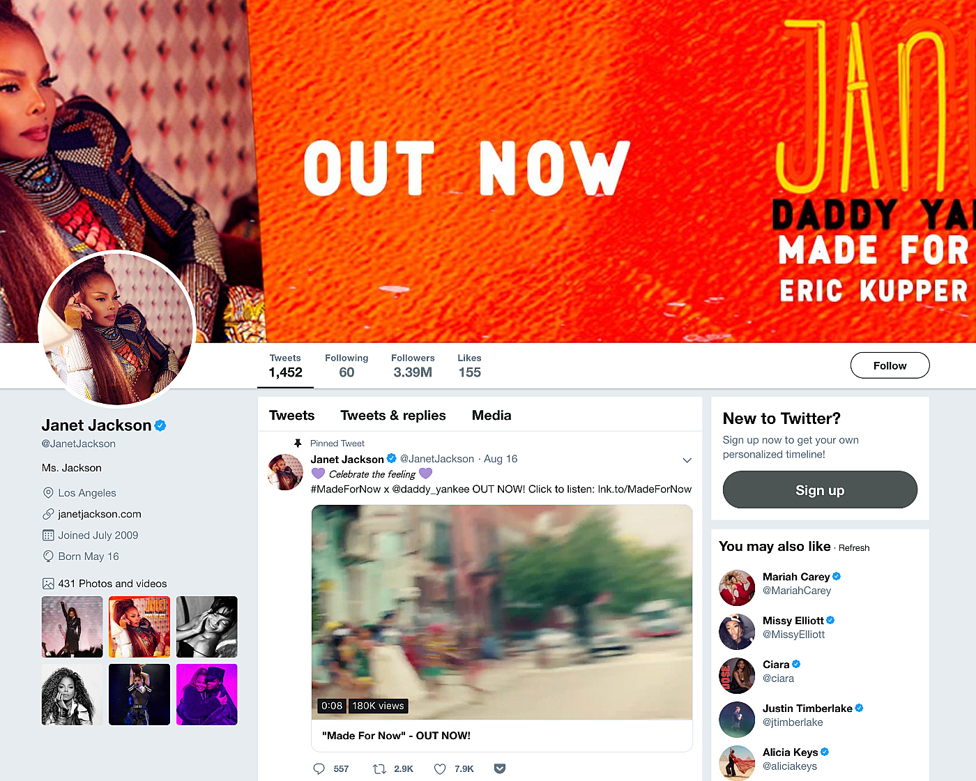
When creating a profile on a site or in a mobile app, people are usually prompted to upload a picture/photo. This image plays a crucial role. For instance, it can help you get a job offer through LinkedIn or find the love of your life on a dating app. On social networks, such pictures are no less important—remember the power of the first impression!
Make user profile interface design wisely, making it possible to upload custom images and avatars, and change them as often as needed.
Source: Twitter
Name and Nickname
People’s names are their brands, so are their nicknames. Give users a chance to promote it. Not only should you introduce a ‘nickname’ field to this page, but you should also include the nickname in the URL. This way you will gain customers’ loyalty and boost traffic to your site (especially if a famous person has an account on it).
It’s a good idea to allow adding both a name and a nickname. People often have the same username on multiple websites and apps, especially on those where a real name is not mandatory. Their friends who know just the nickname may search by it on your site or app to connect with the person.
Summary and About
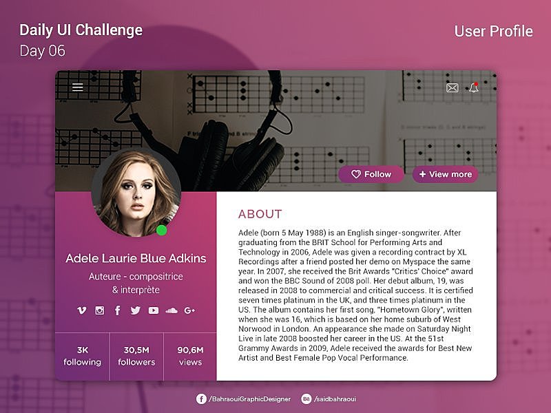
People love talking about themselves. Why don’t you grant them such an opportunity and reserve some space for a summary section in your user profile design UI?
A well-written summary is crucial when it comes to networking. It’s usually the first thing people see when opening such a page. If the summary does not interest them, they won’t scroll the page down.
Interests and Achievements
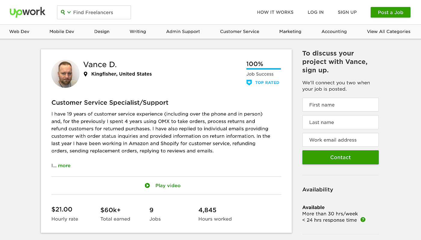
A summary section is usually not enough to create a clear impression of somebody. Let people share more details with others. It could be information about their achievements (e.g., date when they completed a graphic design course) and interests (sports, singing, etc.). But don’t make the fields mandatory. This won’t help in the long run as you may face user frustration. Instead, take advantage of progressive profiling, asking newcomers to fill in only what is really necessary in order to register them in your system.
Source: Upwork
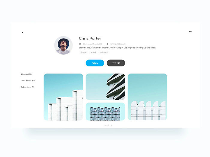
Follow Button
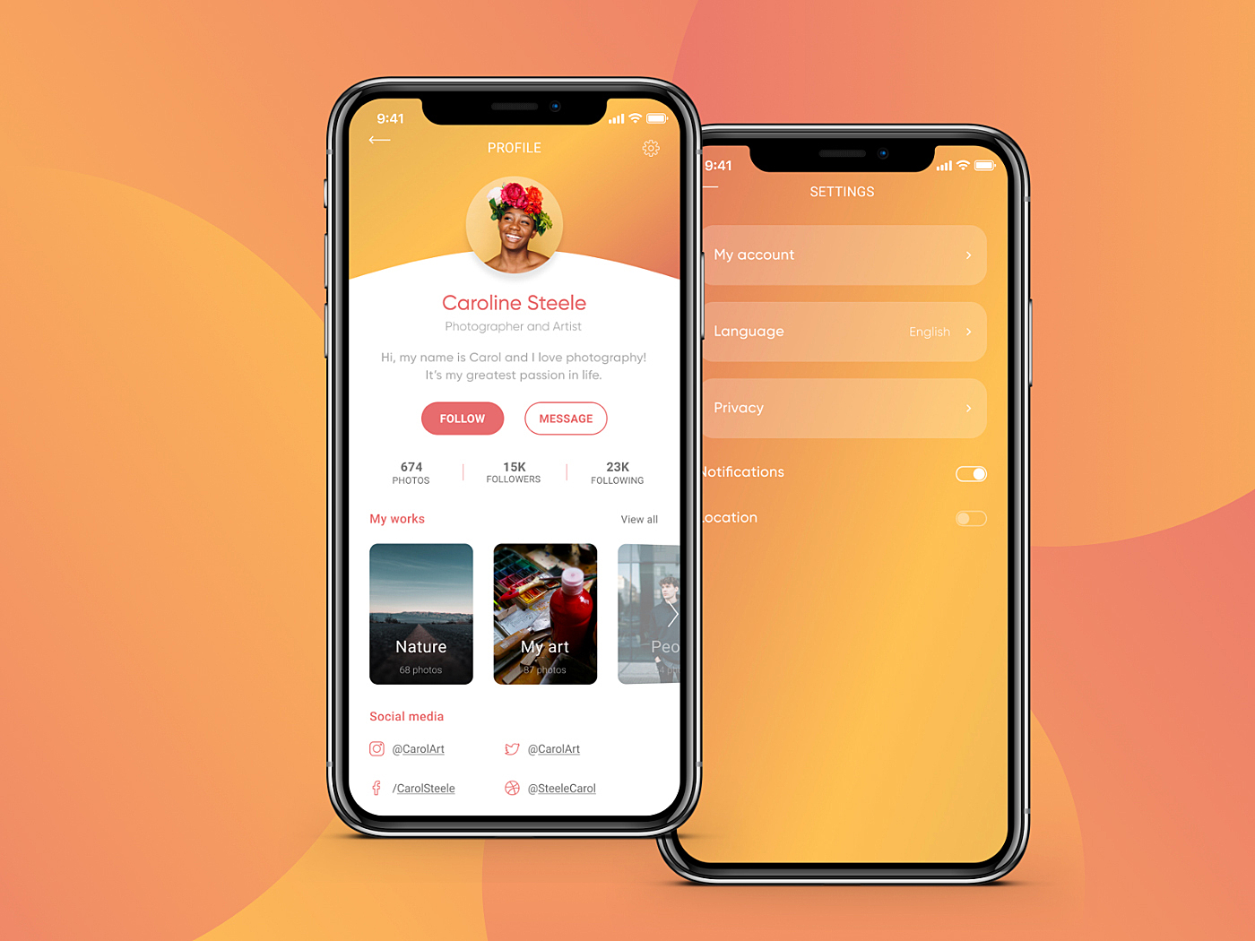
The ‘Follow’ button is a must-have for any networking app or website. If it’s a mobile app, make sure to place it within the thumb zone otherwise almost no one will click on it.
One more tip: don’t forget to make the button clearly visible. The position does matter but without being able to see clearly where to click it will remain unused.
Source: Behance
Other Useful Elements
There is no two similar apps or websites. That’s why developers must conduct a product development workshop to take their unique features into account when working on a profile page for users. Here are some other elements that may be included:
- User rating. This feature shows how professional or active a particular person is. That might be one of the helpful features of an e-commerce website. Those whose reviews are rated high are likely to have their reviews higher on the list.
- Followers and following. This option is good for social media platforms such as Instagram to indicate users’ popularity.
- Activity status. This feature comes in handy if it’s imperative to see whether someone is online. Need an obvious example? Check your Direct Messages on Instagram.
Read also: 10 Best Examples of Beautiful Blog Design
Mobile Apps and Website
There is certainly a clear difference between a web profile page design and that for mobile apps, particularly if a site has its own mobile app. Compare your Facebook profile on the desktop with a mobile version to get an idea of what we mean.
In a nutshell, how is the UX/UI design of user profiles different on mobile?
- Things are kept clear. For instance, Twitter put the profile at the top of the page to make it visible for other users at all times, thus eliminating the need to navigate elsewhere to view it.
- Intuitive navigation. Simple and user-friendly navigation makes a great mobile app, and this is true for other pages too. Menu options should be easy to reach, and there shouldn’t be too many of them. A separate menu for the page can help to overcome possible UX issues.
- Forms. They should be easy to fill out with (even pre-populated) and have a one-column layout. Labels should be in place too. For a detailed guide to forms, read this article.
Top 10 User Profile Design Examples
We searched the whole web to find stunning examples of user profiles. We hope you’ll get inspired by them for your next project.
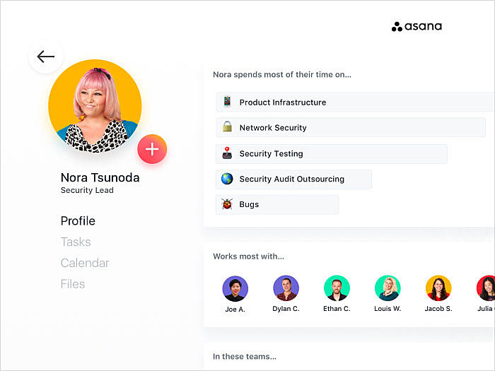
Teammate profile
Source: Dribbble
Social media user profile
Source: Dribbble
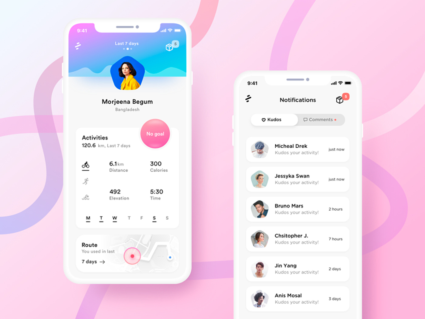
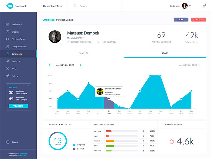
Fitness app user profile
Source: Dribbble
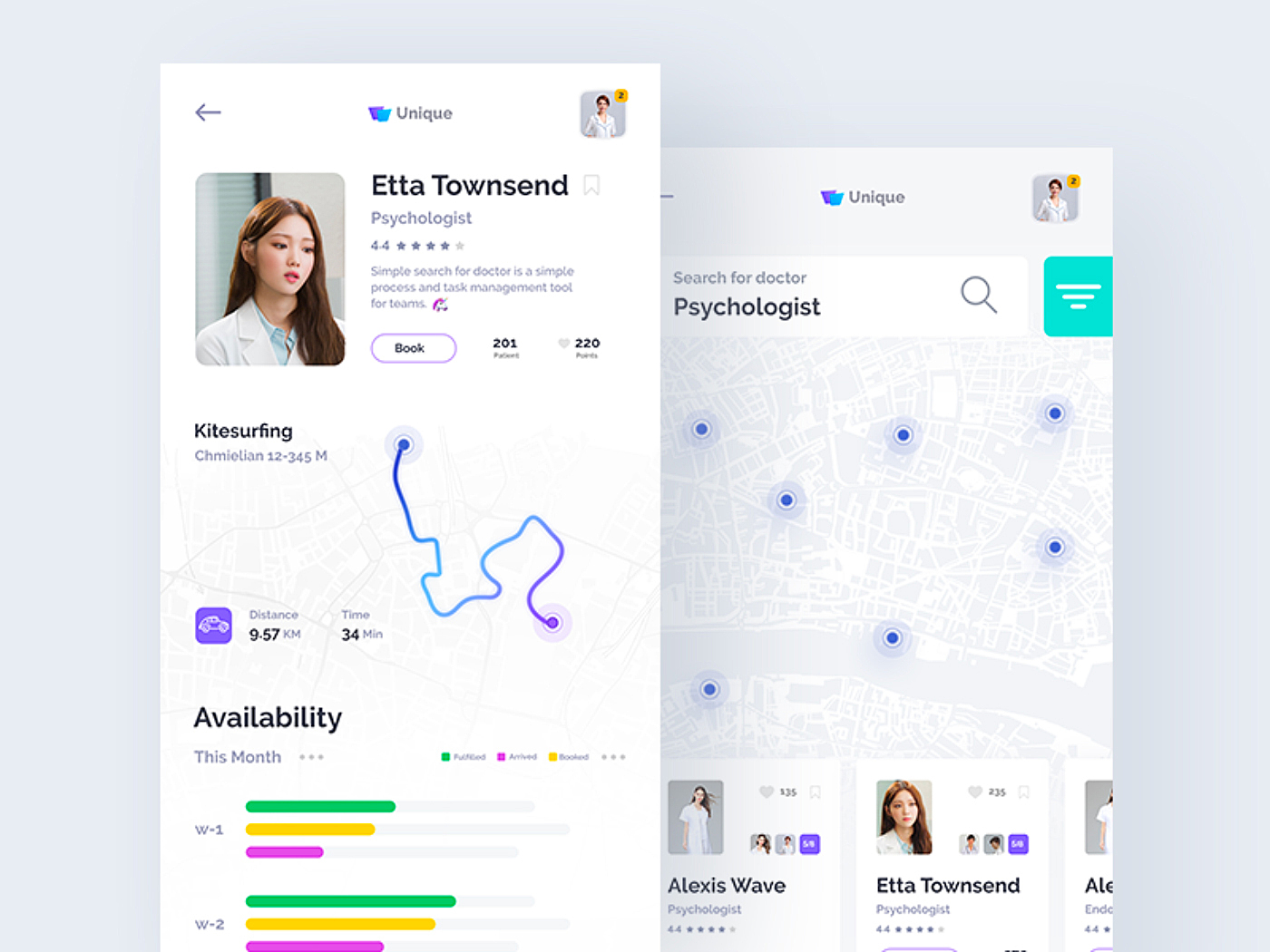
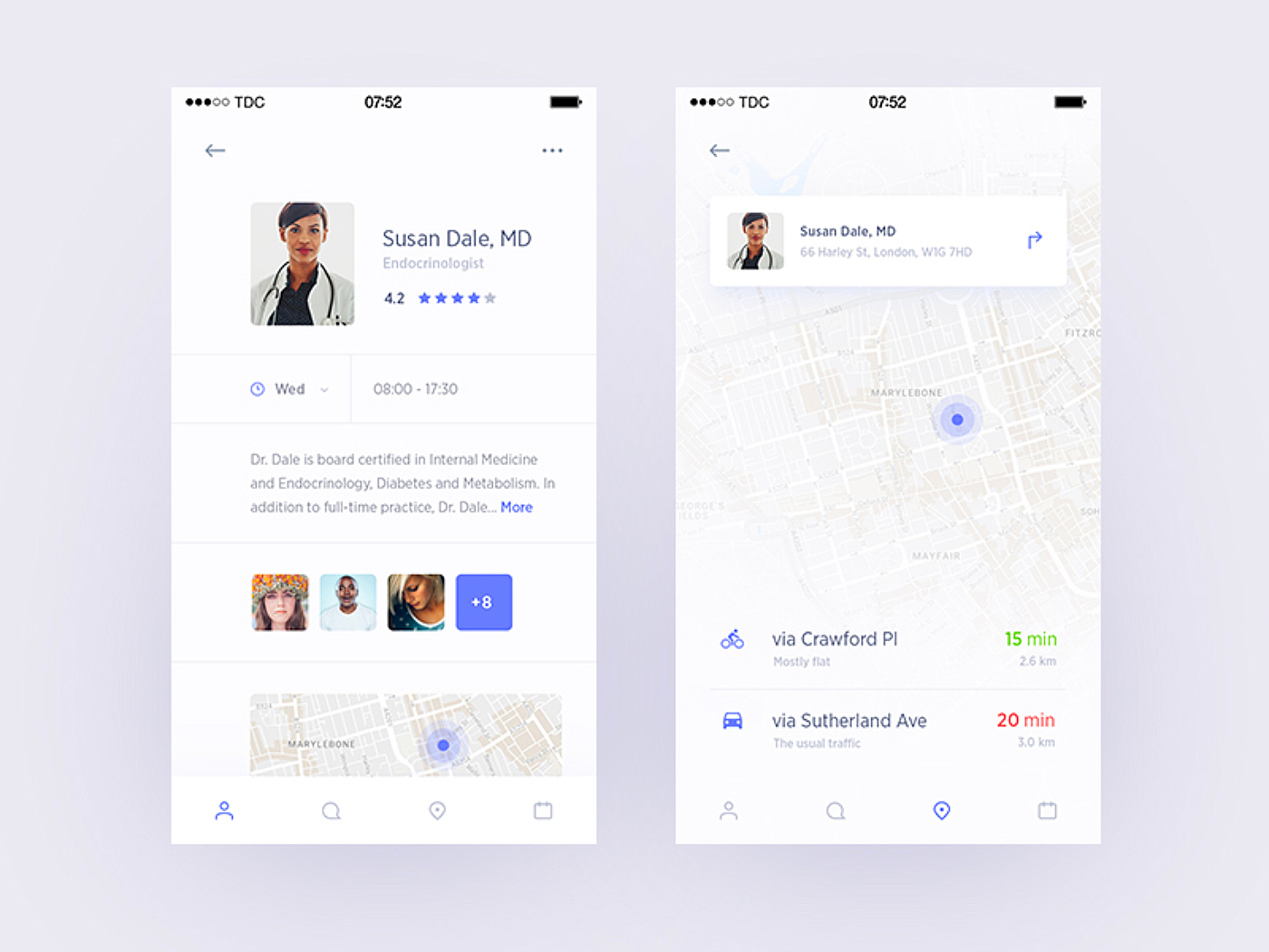
Doctor's profile
Source: Dribbble
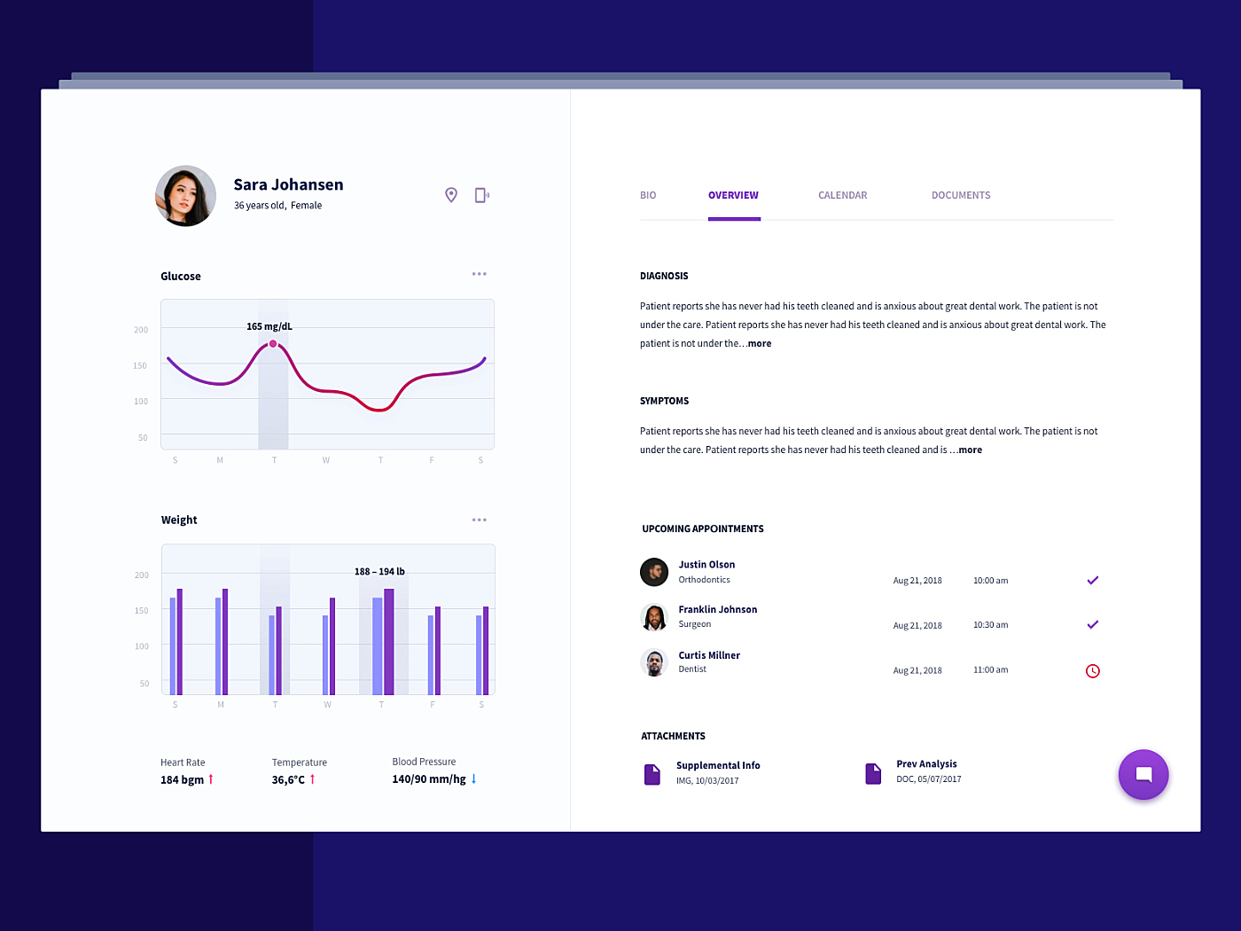
Patient's profile
Source: Dribbble
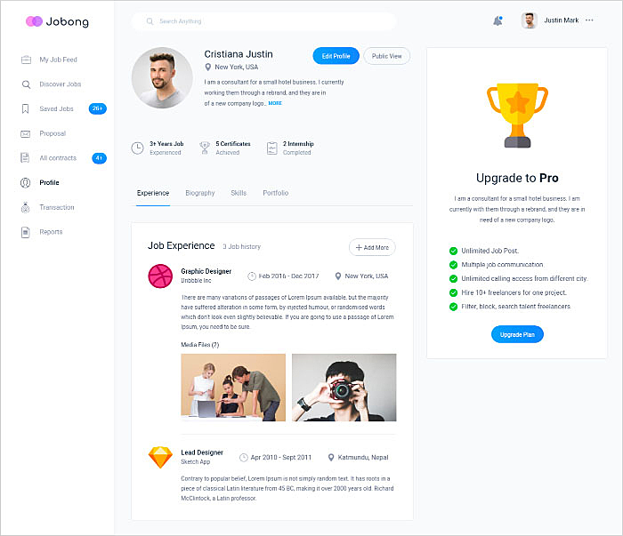
Job dashboard profile
Source: Dribbble
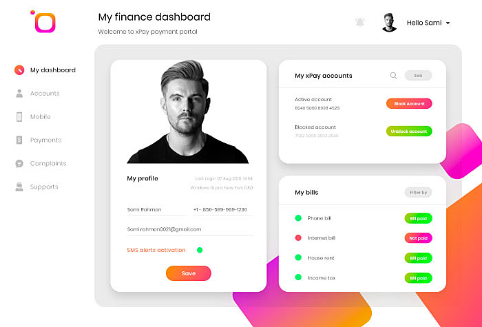
Payment portal user profile
Source: Dribbble
Clinic app user profile
Source: Dribbble
Employee profile
Source: Dribbble
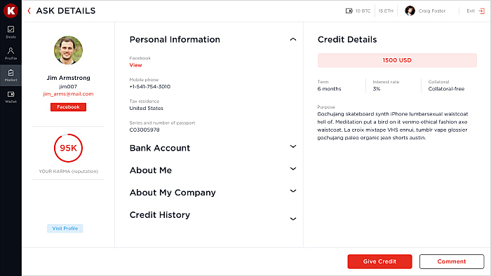
Fintech app user profile
Source: Karma
Summing Up
User profiles can become a constant flow of customer-related data that is extremely useful for marketing. A well-designed profile page contributes to the overall usability and user satisfaction.
In this article, the AGENTE team described some important aspects of designing user profile pages. If you still have any questions or want us to design it for you, let us know in a live chat.
Further reading: Reasons do redesign an e-commerce website.
Rate this post!
1012 ratings, average ratings is 4.0 out of 5
Related Posts
22 January 2024
Top 15 Software Project Risks and Mitigation Examples in 2024
Explore our guide to the top 15 software project risks and learn mitigation examples to ensure project success.

Travel Agency Website Development in 2024: Features, Tech Stack & Cost
Explore the world of Travel Agency Website Development, discover features, and get insights into the costs of building your online travel platform.
05 January 2024
10 Best 404 Error Page Designs for 2024
In our new blog post, we review the best 404 page design examples of 2019 that will never disappoint you even if you meet the dead end on the website.
26 May 2022
10 Best Examples of Beautiful Blog Design | Agente
In this article, you'll find 10 best examples of beautiful blog design, along with the tips that can help you enchant visitors.

How to Write a Project Brief for Websites & Mobile Apps the Right Way
We are talking about the importance of a project brief in the success of an app and website development There are many reasons for that, but a common one is a discrepancy between what a client had in mind and what was written in the design or app design brief template.
20 October 2020
How to Design a Website For Black Friday & Cyber Monday?
In this article, we will talk about how to create an attractive and selling website design for Black Friday and Cyber Monday. Let's take a closer look at each step of creating such a website.
Let's talk
Is there a challenge your organization or company needs help solving? We’d love to discuss it.

Managing Director, Partner
Andrew Terehin

Thank You!
Your message has been successfully sent.
We will contact you very soon.
