Interra Corporate website
Location
Global
Client
Interra
Industry
Emergency Services Data Solutions
Our client approached us with the vision to redesign Intterra's website. Intterra specializes in providing advanced big-data solutions for emergency services and responders, enhancing the effectiveness of all emergency responses and transforming community protection. Their software delivers crucial, real-time data to organizations of all sizes, empowering them to visualize, prepare for, and respond to events with distinctive operational intelligence.
The Agente team began the project by thoroughly analyzing Intterra's target audience, focusing on their specific needs and expectations. This in-depth understanding guided our conceptualization process and informed improvements to the company’s logo and branding. As a result, we developed an intuitive user experience (UX) paired with a thoughtful and visually appealing user interface (UI), ensuring that the redesigned website is both user-friendly and aesthetically engaging.
Discovery Stage
Among the initial steps in the design development process is the discovery stage. We began by identifying key pain points and proposing targeted solutions. Only after this comprehensive analysis did we proceed to the actual design phase.

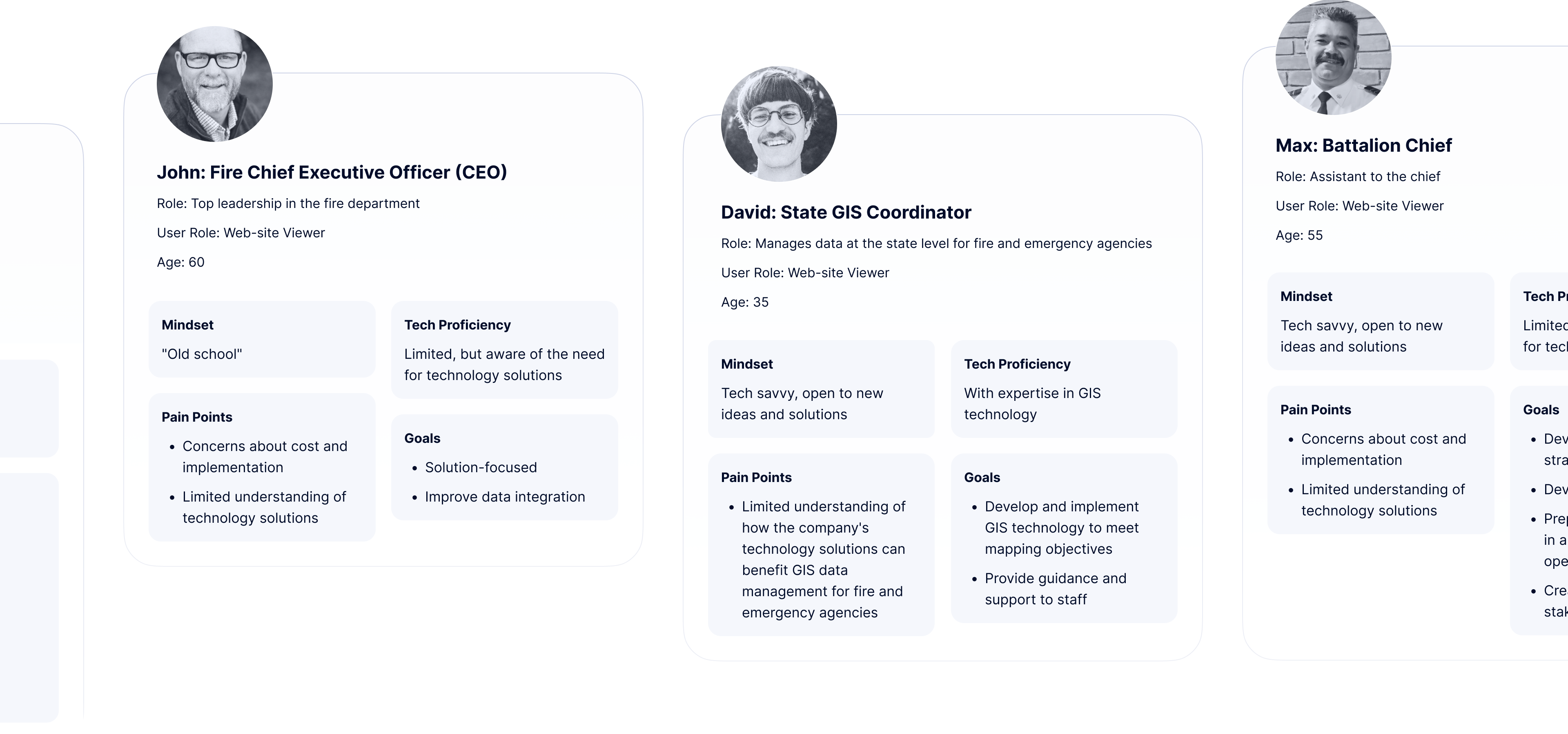
Define Personas by Mindsets
We defined personas based on their mindsets. Working with a diverse audience with varying backgrounds and skill levels, it was crucial to categorize them according to their perspectives and attitudes. This approach allowed us to tailor our solutions more effectively to meet the distinct needs and expectations of each group.
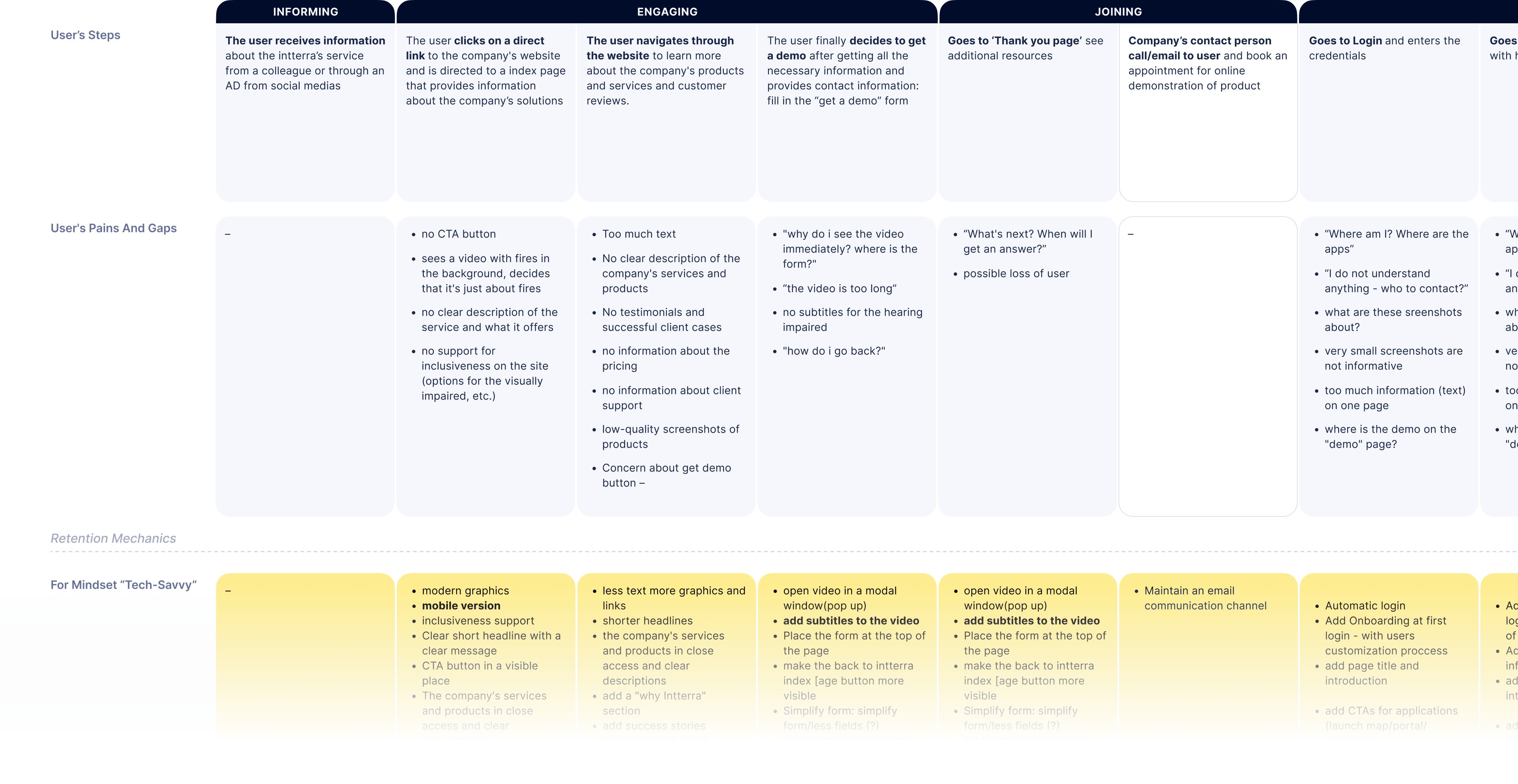
CJM analysis
When creating Customer Journey Maps (CJMs), we take into account the various mindsets of our users, reflecting their potential thoughts and feelings. This approach ensures that the CJMs accurately represent the diverse experiences and perspectives of our audience.
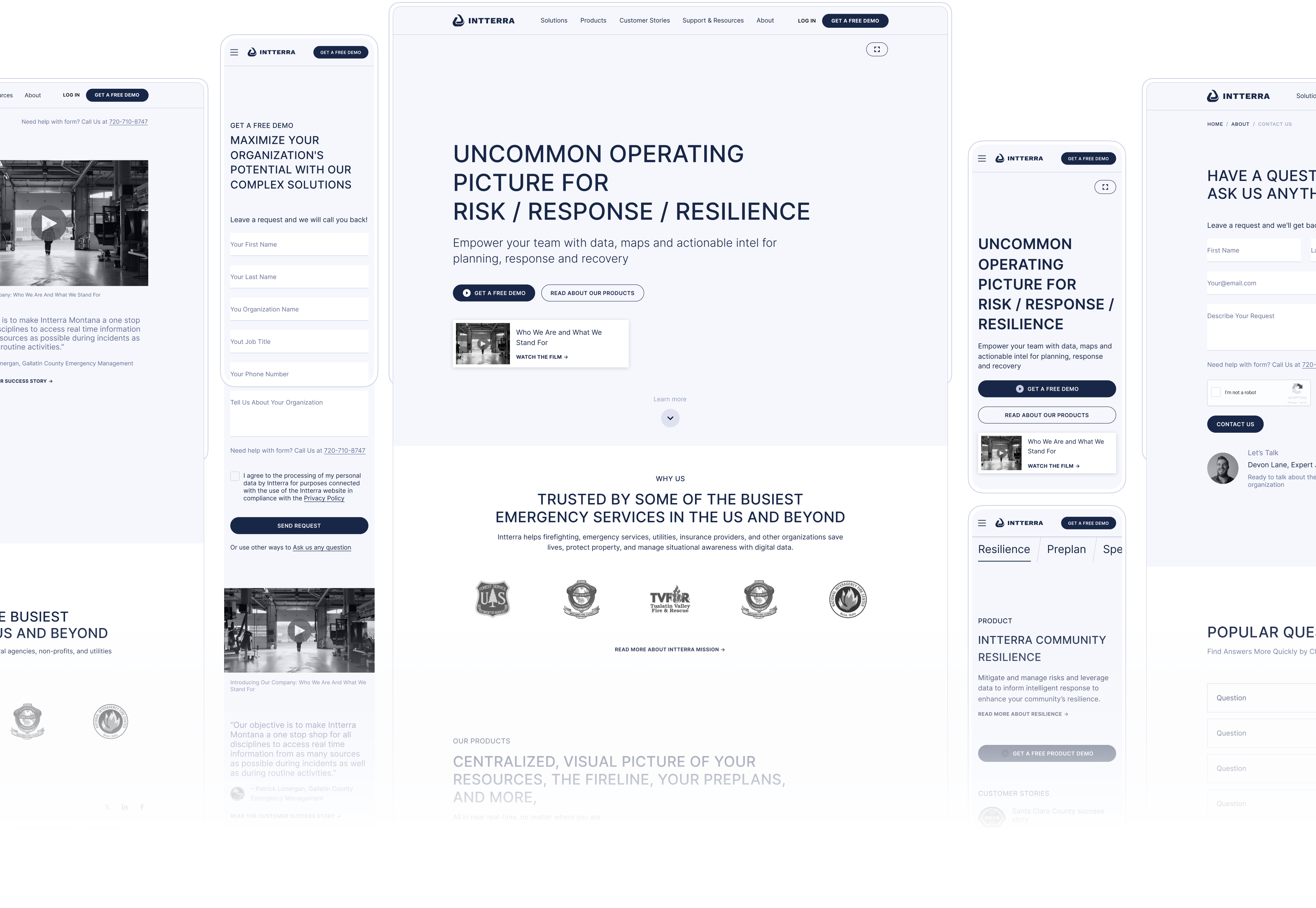
UX Wireframing
Initially, we developed high-fidelity wireframes to visualize and solidify key design elements. Following this, we concentrated on polishing the design details and creating a prototype that precisely showcases the product's look and functionality.
UI Wireframing
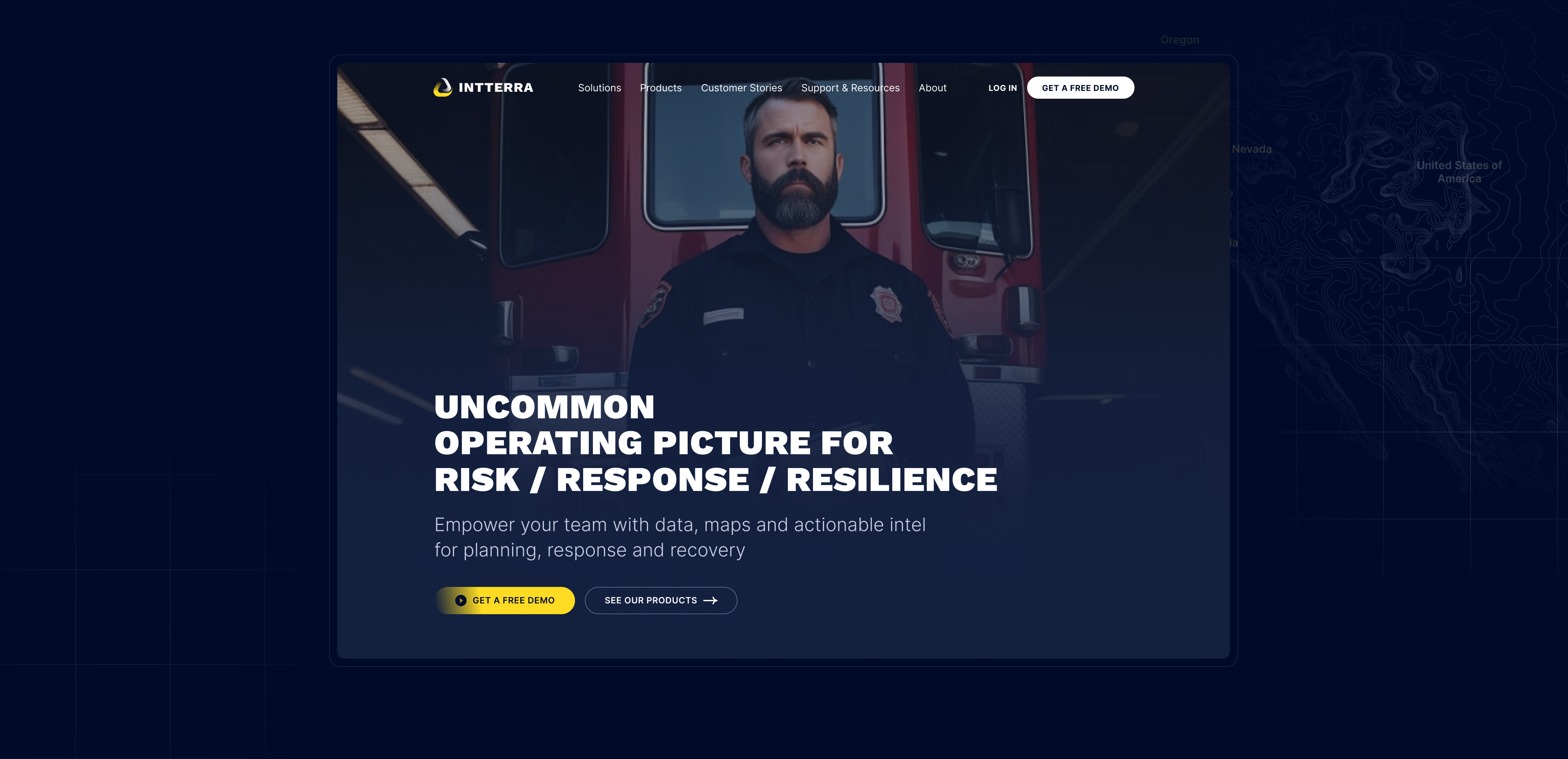
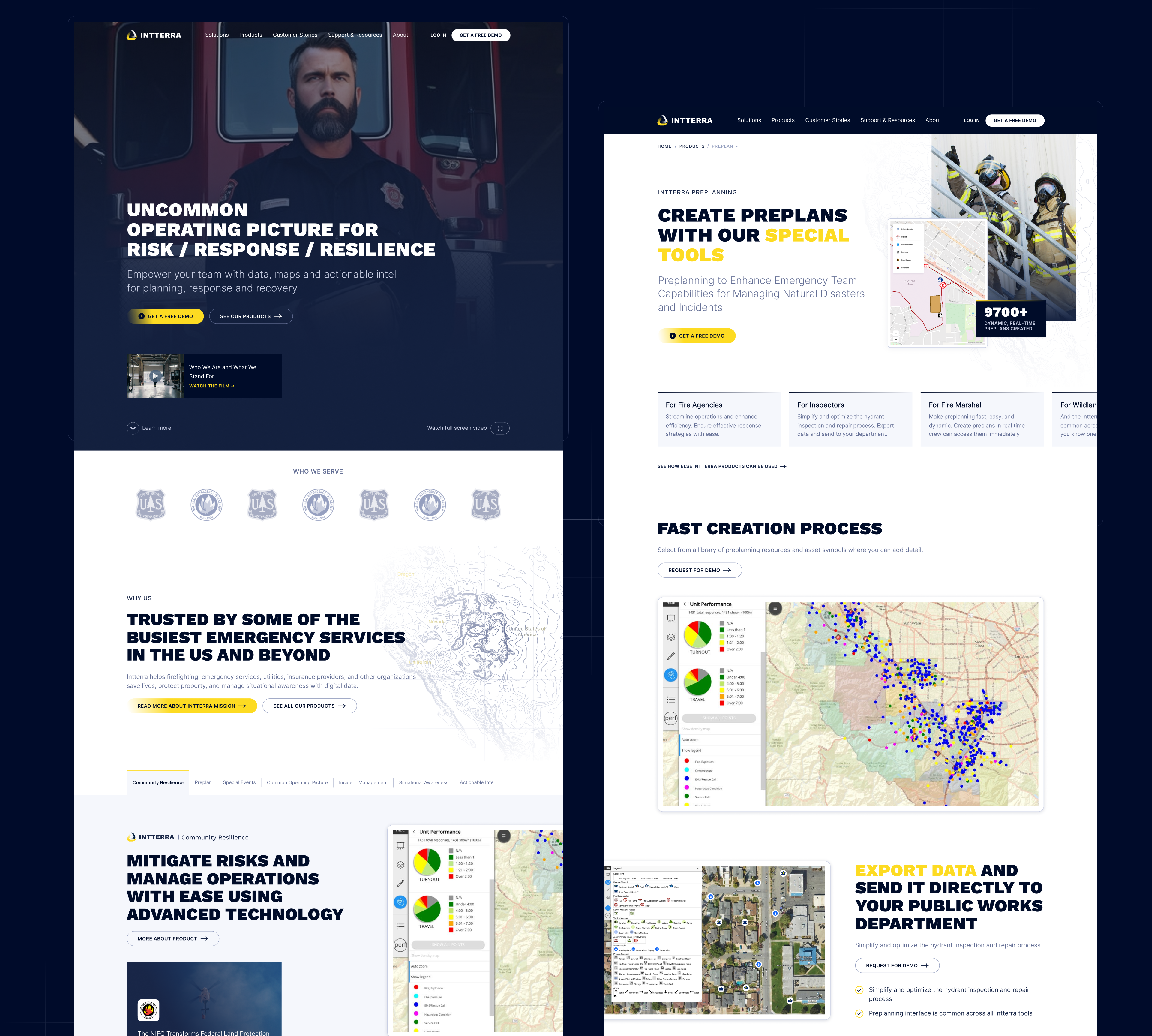
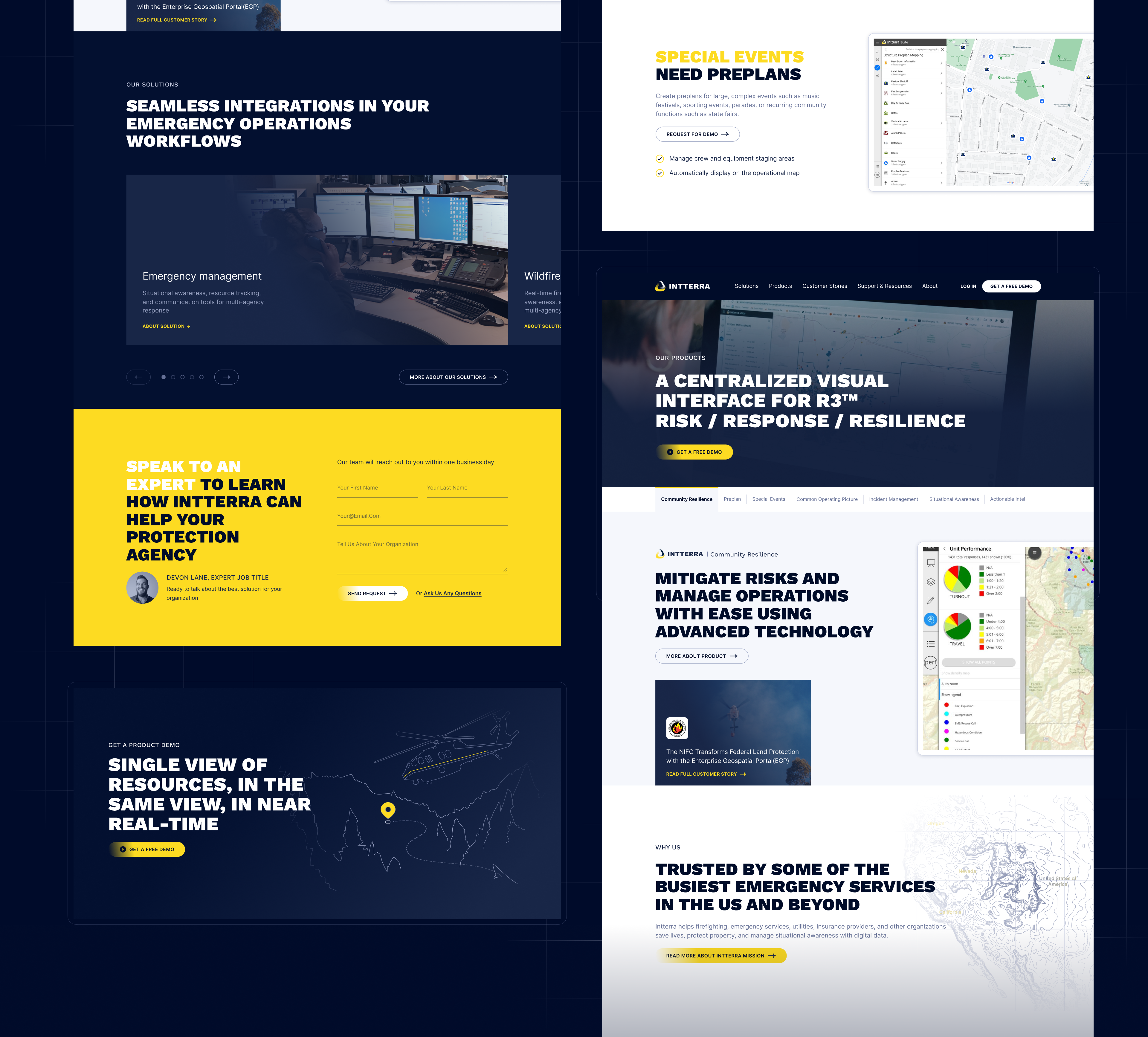
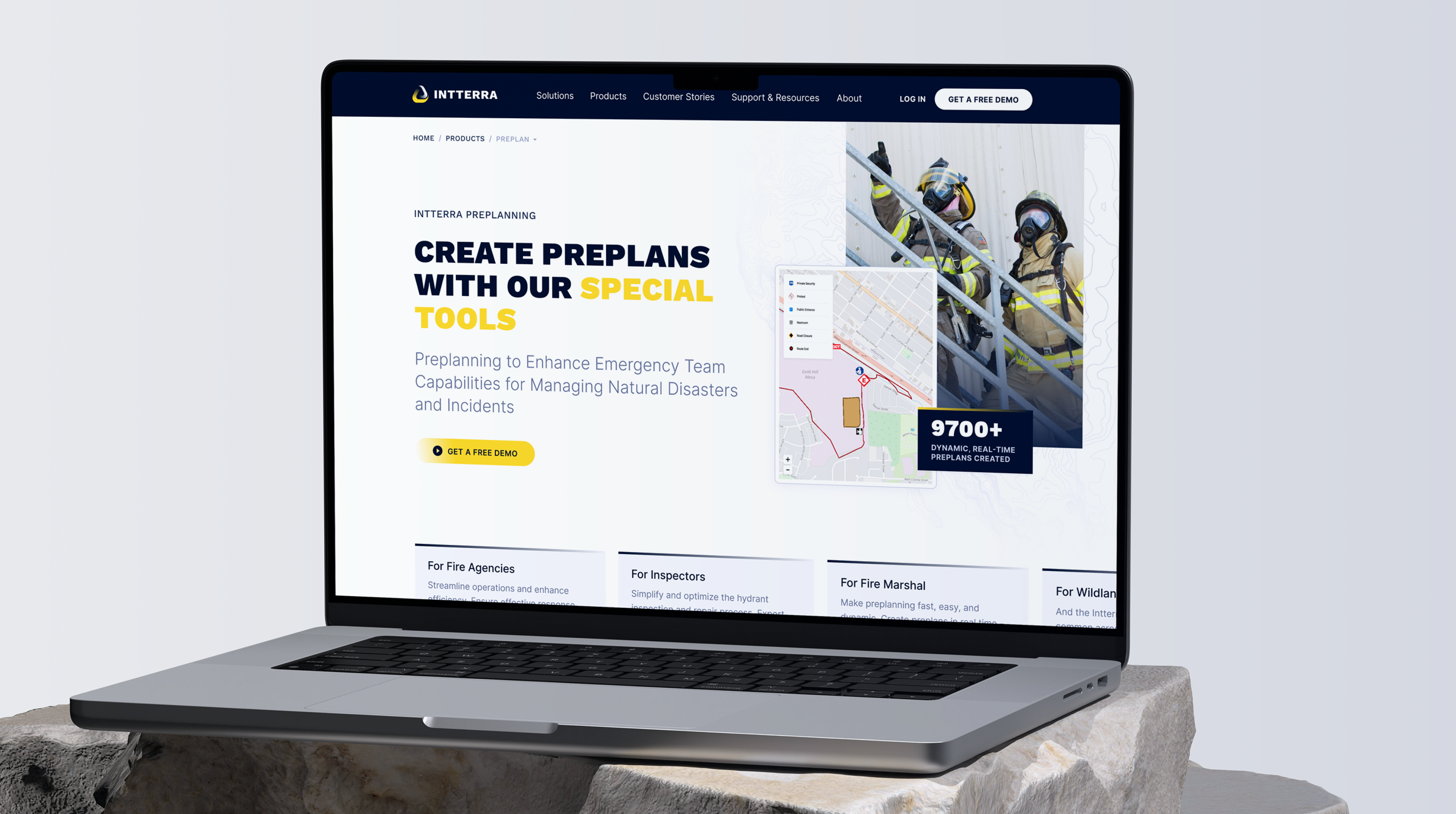
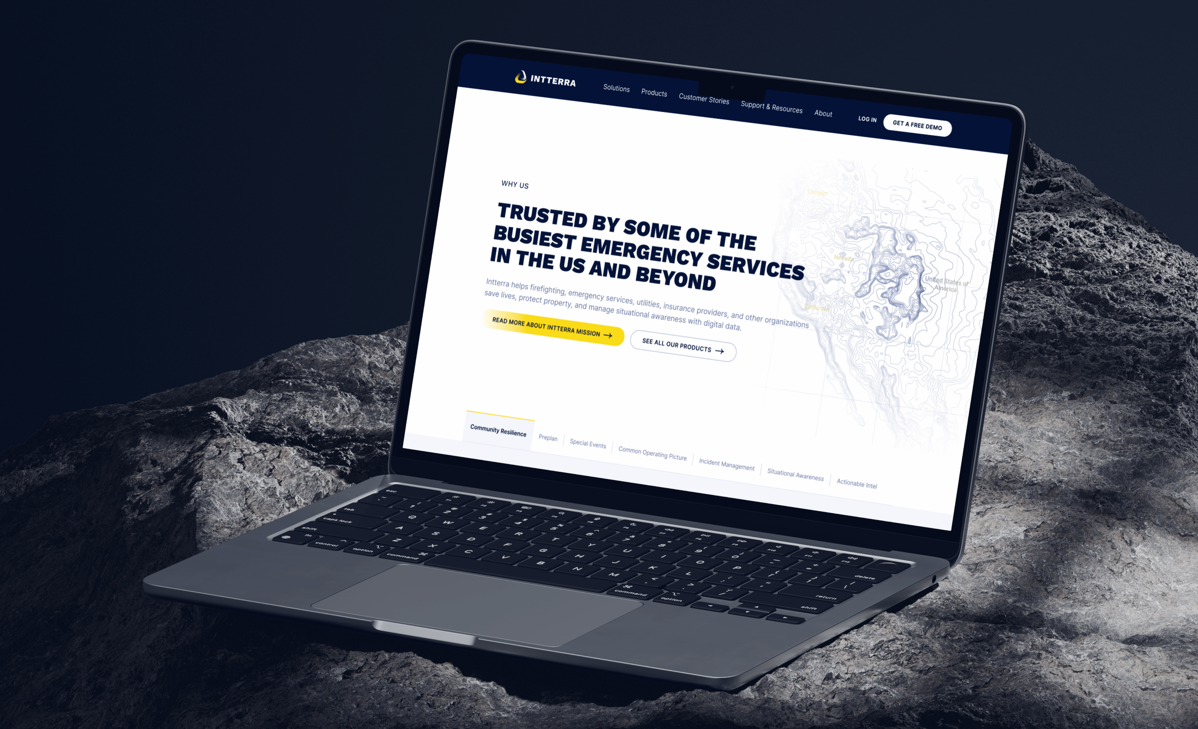
To capture the essence of their business, we chose an active accent color and embraced the trend of bold headlines. This approach allowed us to create a grand style that emphasizes important headlines and impactful images of people, effectively conveying the significance of their work.
Customer Stories
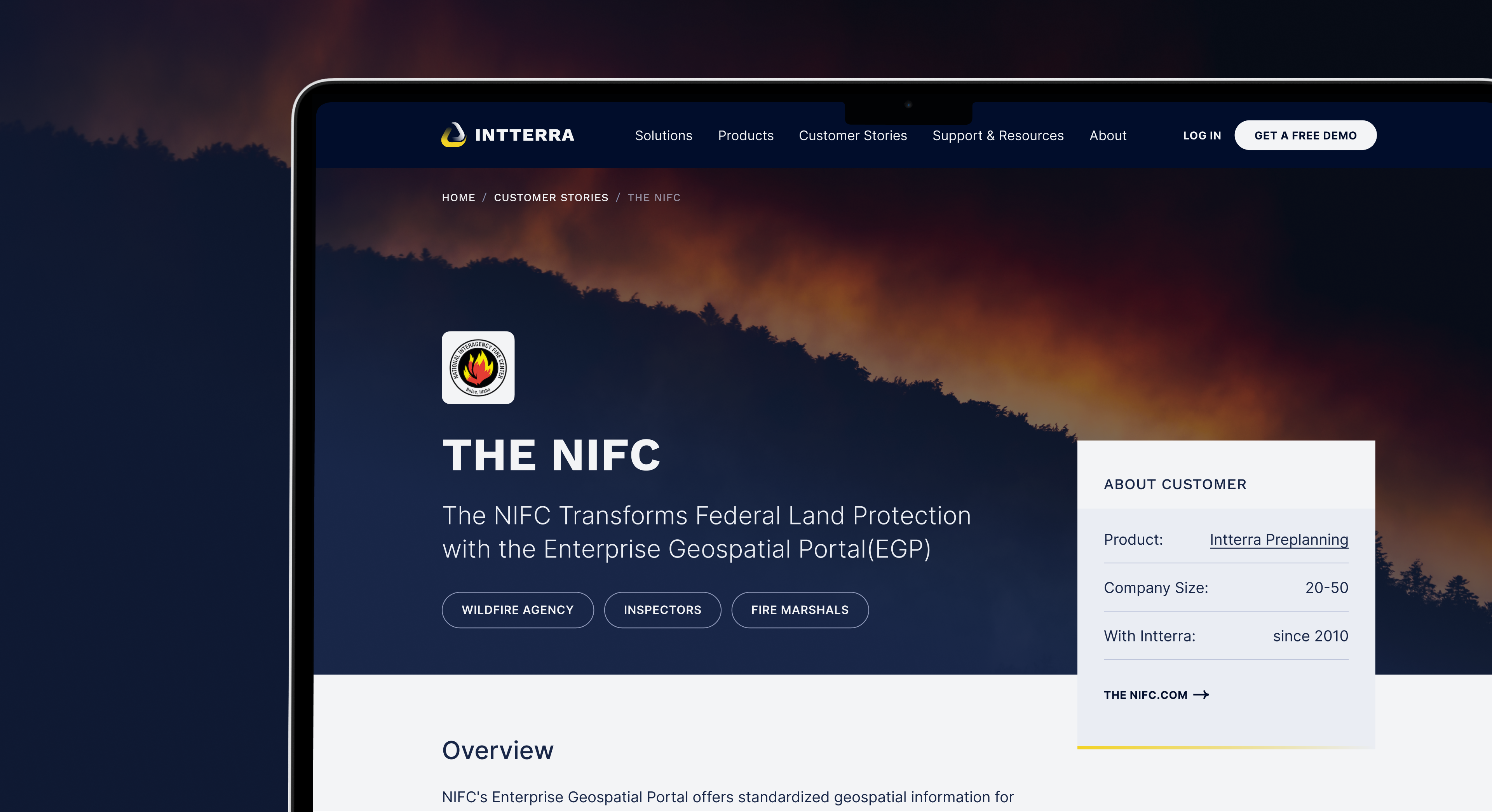
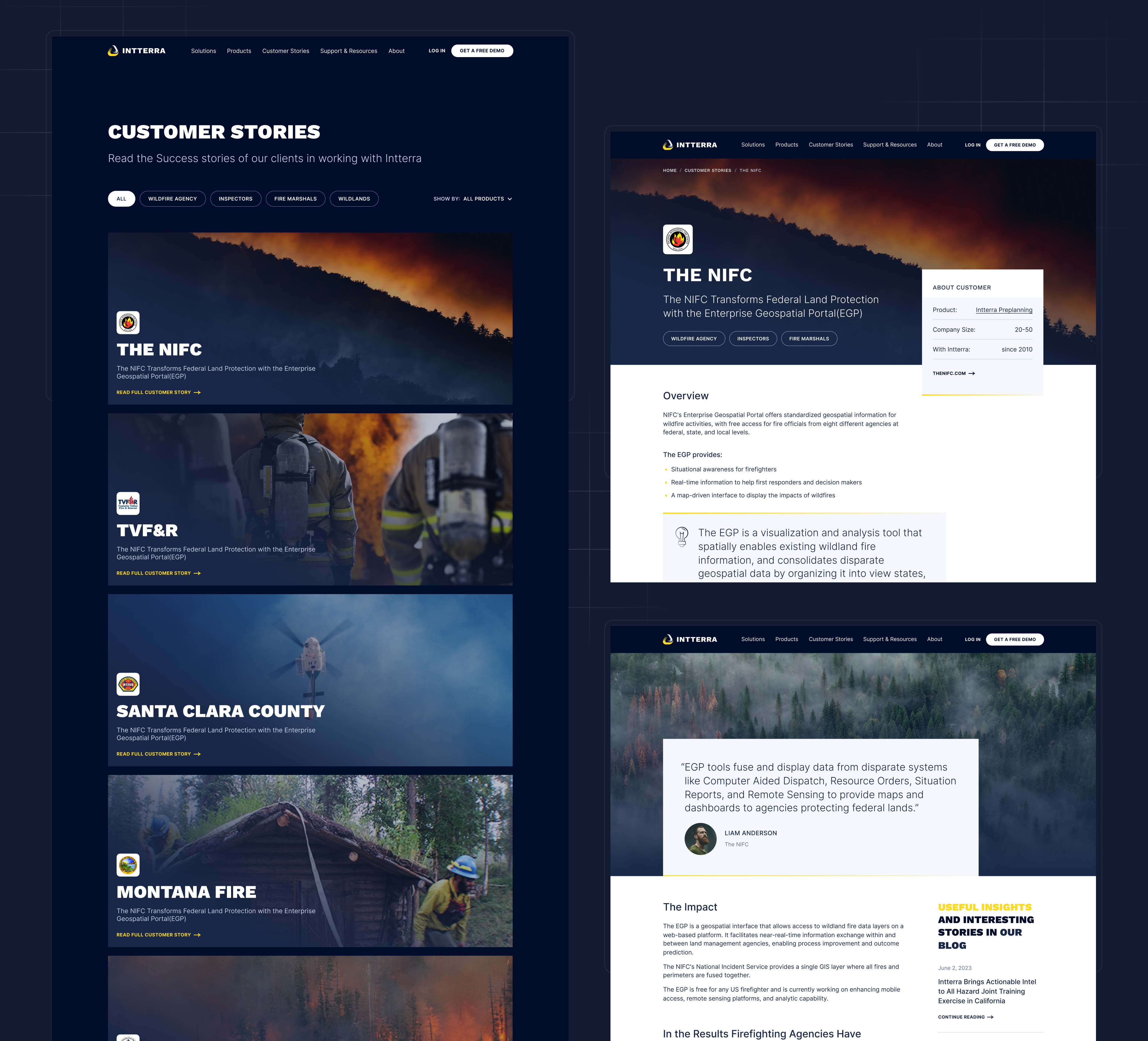
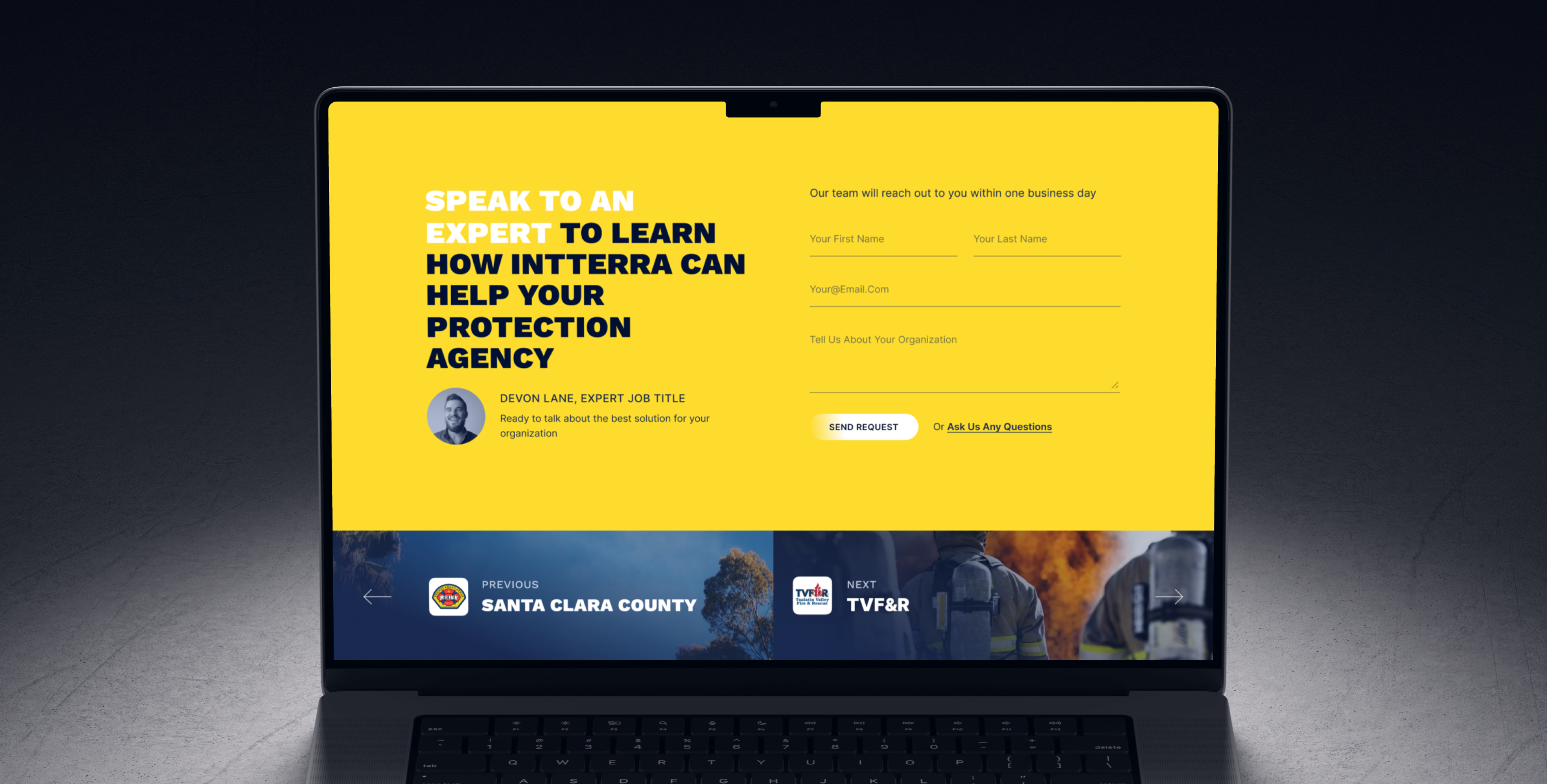
We place a lot of importance on customer stories in our design. This is why we have created an attractive and carefully designed layout to display them. Our objective was to ensure that each story is not only interesting and enjoyable to read, but also provides in-depth insights into the experiences and impacts of the customers. Our aim was to present each story in a way that fully reveals its depth and significance, making the content both compelling and informative.
About Page
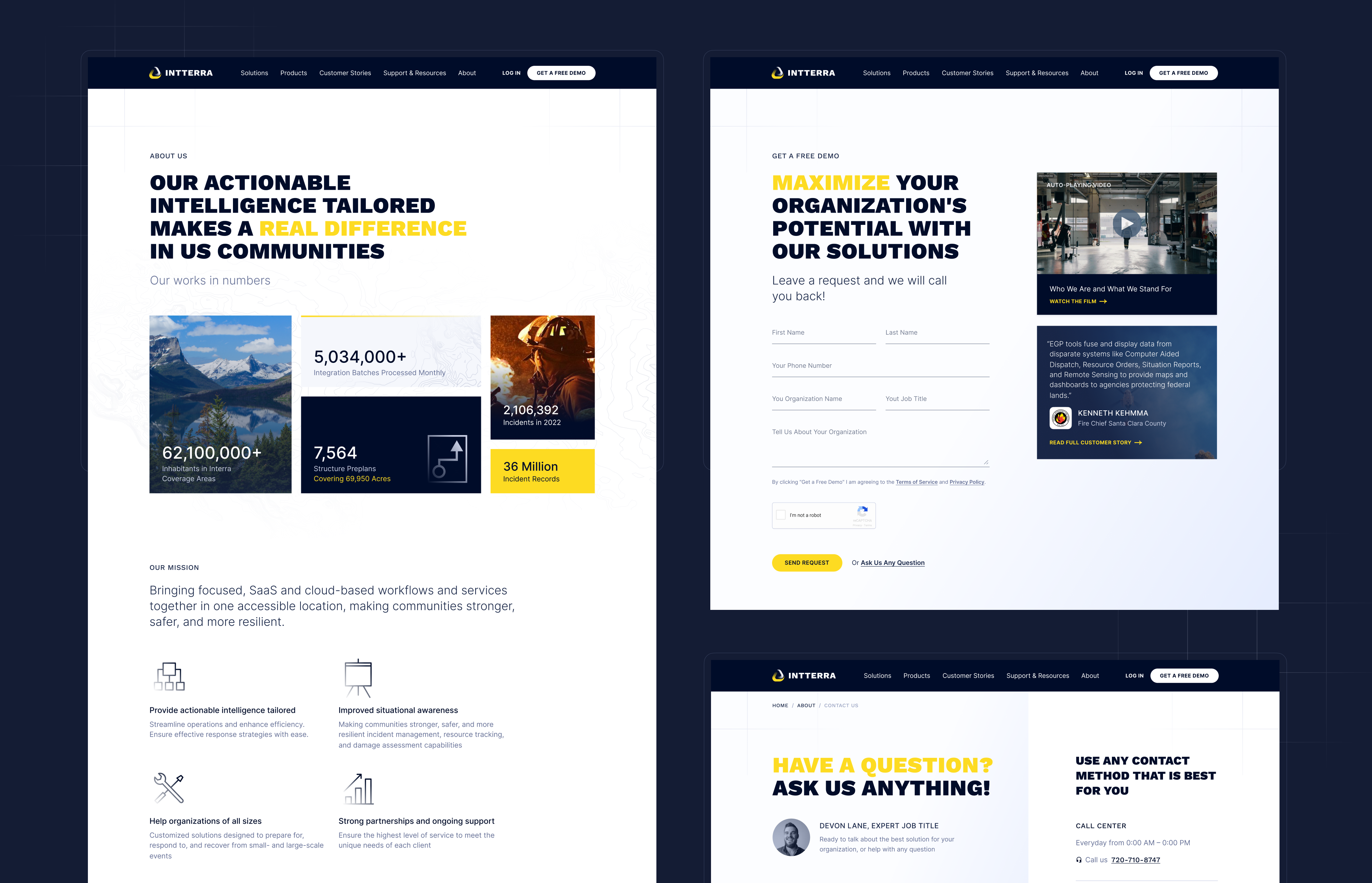
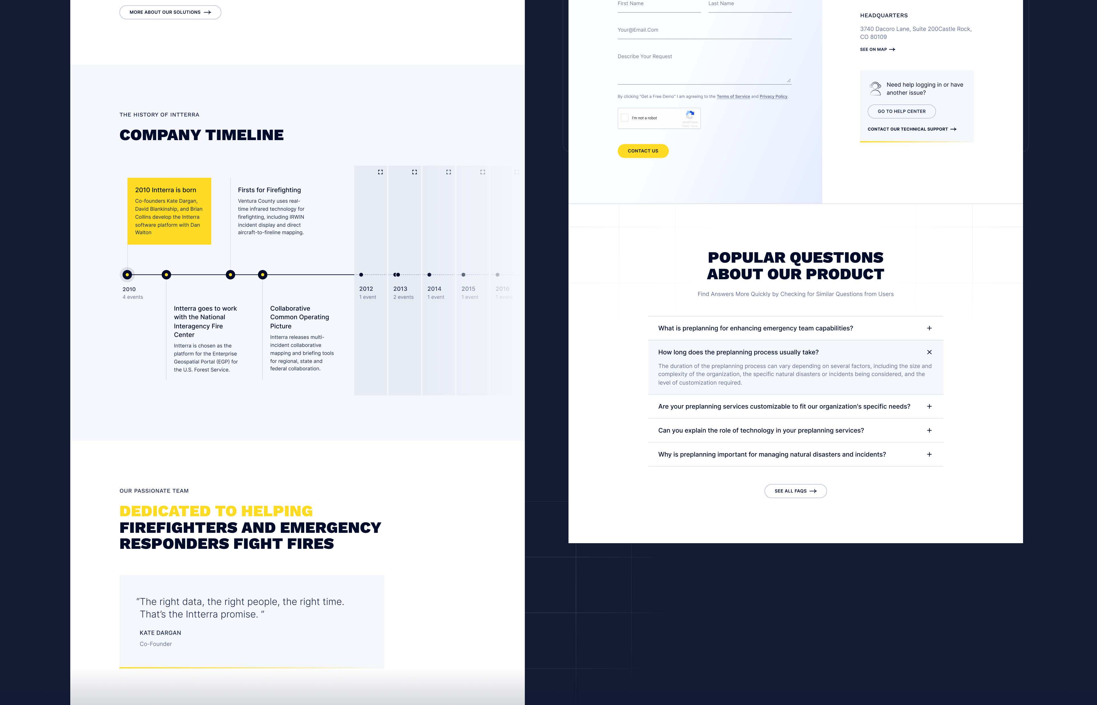
The company has significant expertise, and we aimed to showcase this through important statistics. Additionally, we crafted a company timeline to highlight its extensive history and developed a user-friendly interface to facilitate seamless communication with the company.
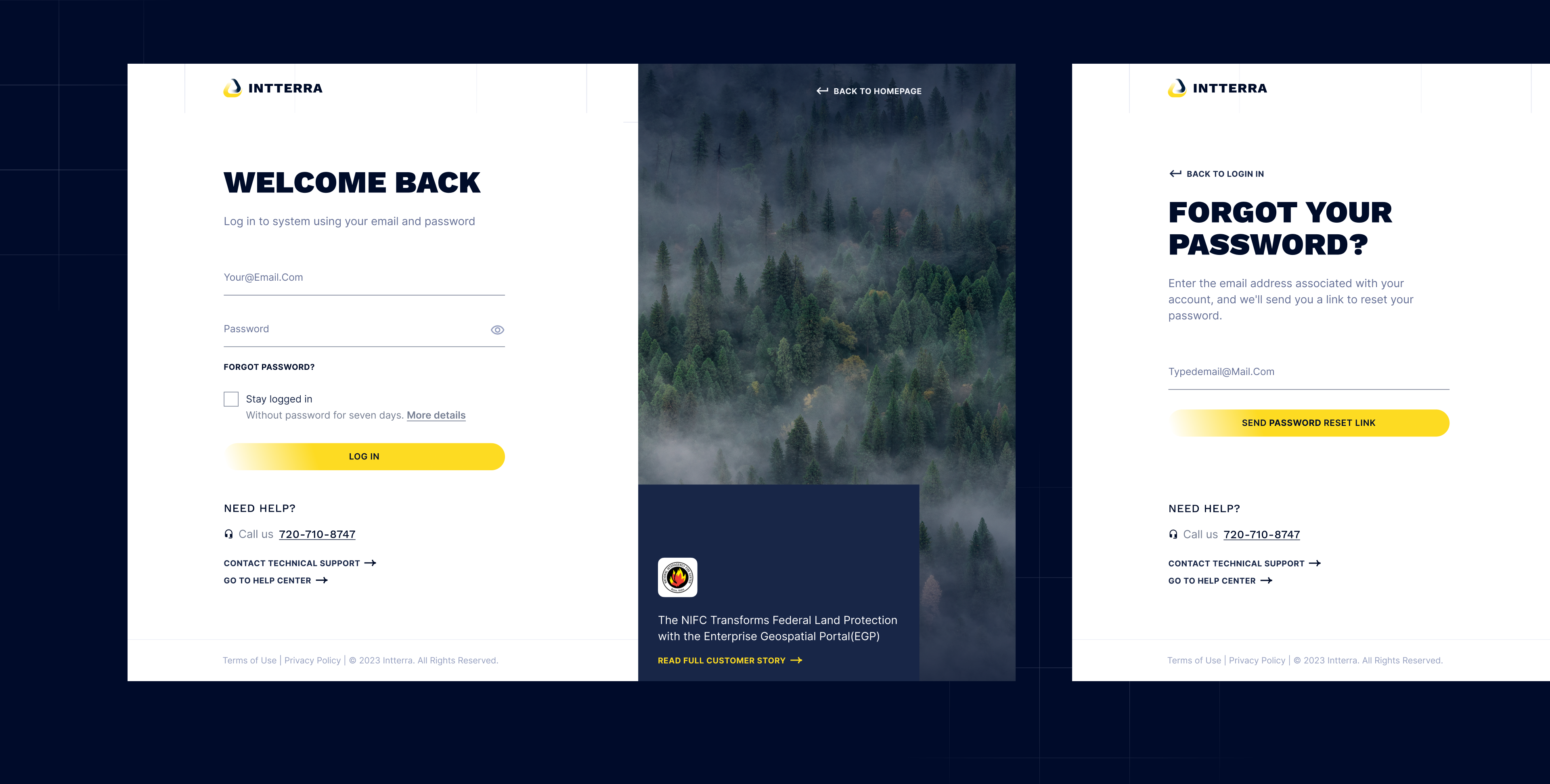
Sign In
Screens leading to the product were integrated into the overall style. We also included contact information and links to contact forms to ensure that users have the ability to stay in touch.
Results

Let's talk
Is there a challenge your organization or company needs help solving? We’d love to discuss it.

