Just Reach Out — SaaS For Media Pitching
The client needed to re-design a PR software platform and a public-facing website for it. They needed a higher conversion rate from the website, better client engagement in the internal platform and a more aesthetically pleasing design in general.
Agente team redesigned and redeveloped a website and PR software solution, working from business goals to flushed-out design. The team also did coding in HTML and Ruby on Rails. Two months after the launch, the redesign has tripled the website’s conversion rate.
What is Just Reach Out?
JustReachOut.io is a SaaS platform for PR and media pitching that helps small business and startups gain media exposure through pitches to journalists, bloggers, and influencers.
What Was Done?
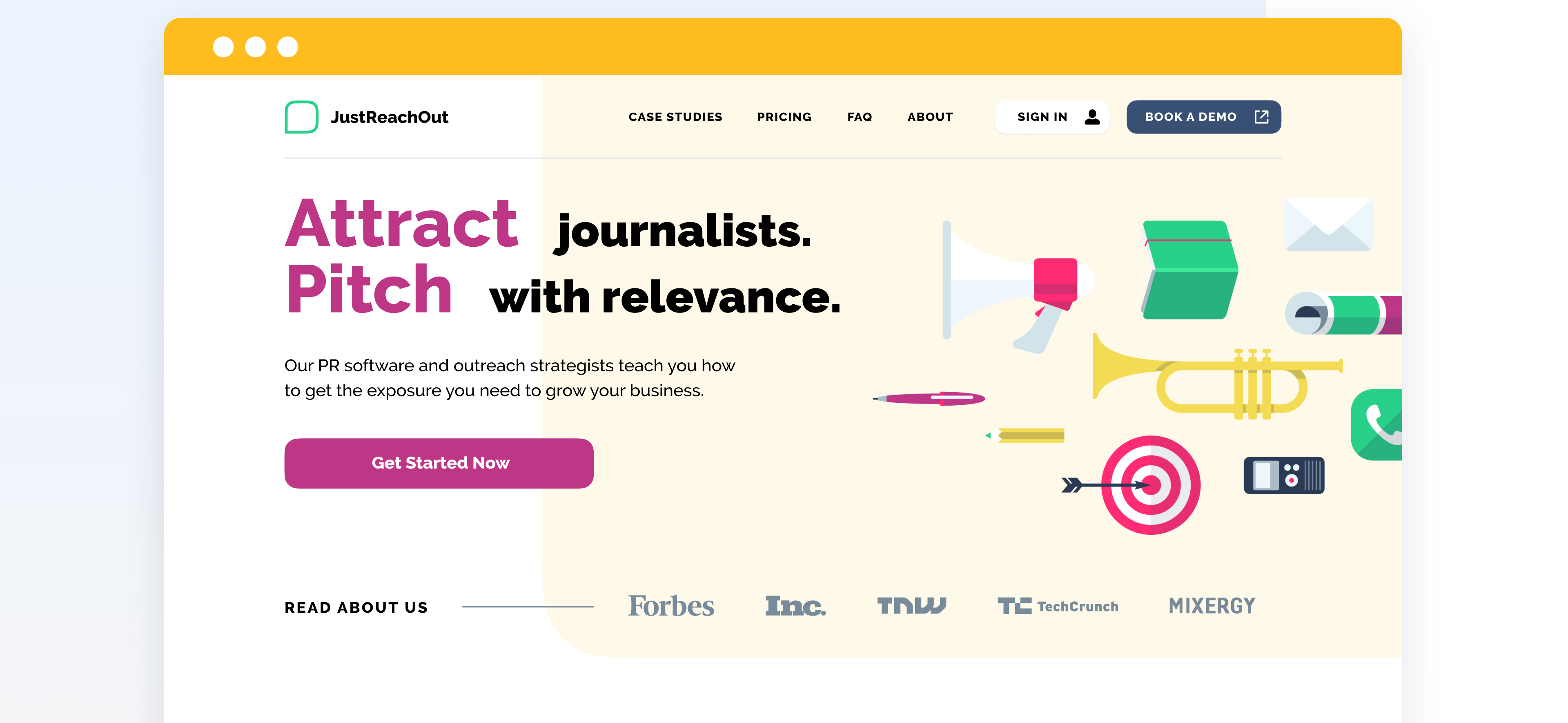
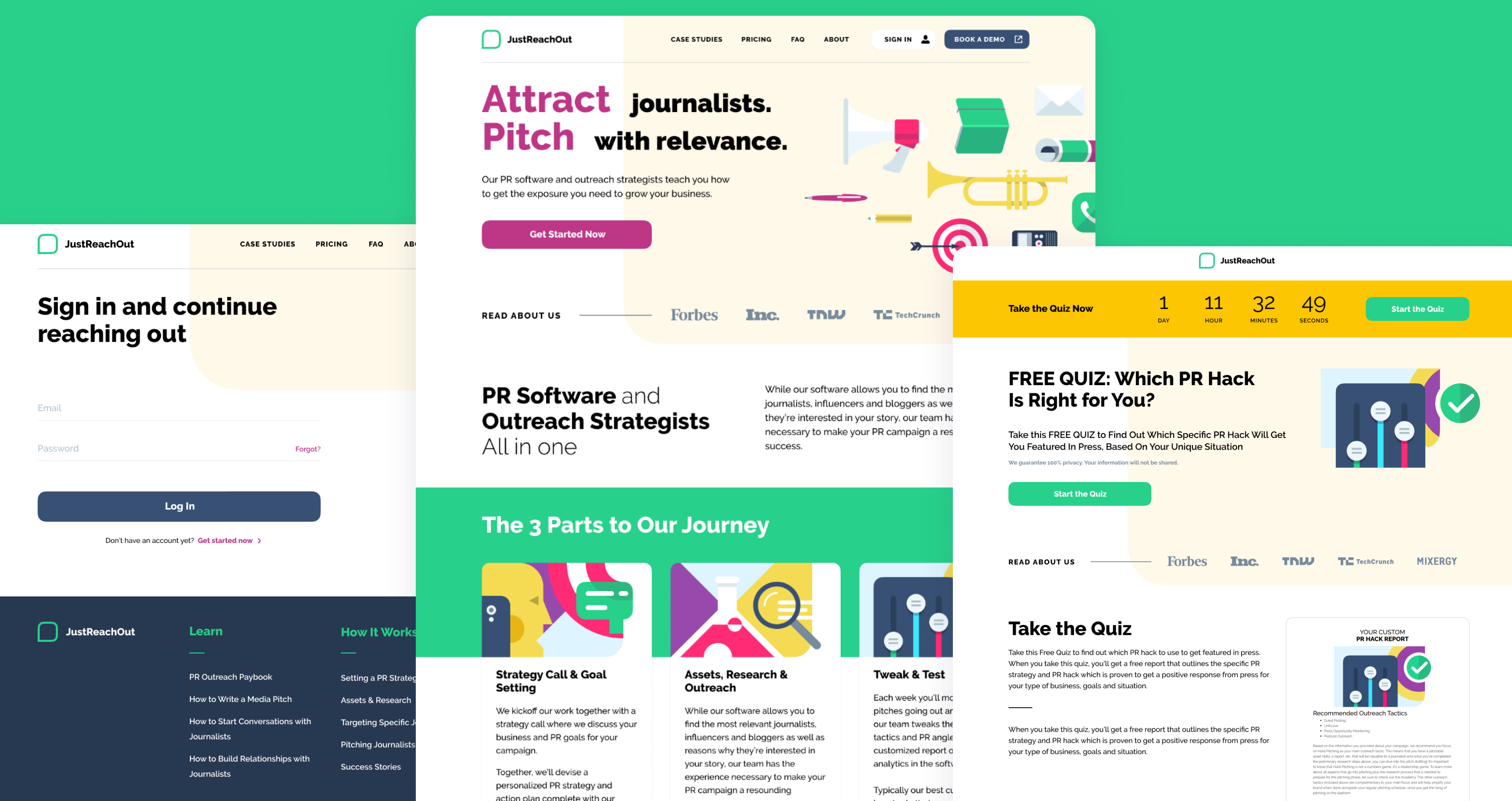
The first challenge was to increase the conversion rate on the public-facing website of Just Reach Out. We conducted a heuristic evaluation of their landing page, analyzed user flow and mouse tracking flows on pages, and decided not to change the layout dramatically. Instead, we designed the detailed and illustrated guidance on the product’s usage, provided proper CTAs across the page, and made color accents on the critical interface elements.
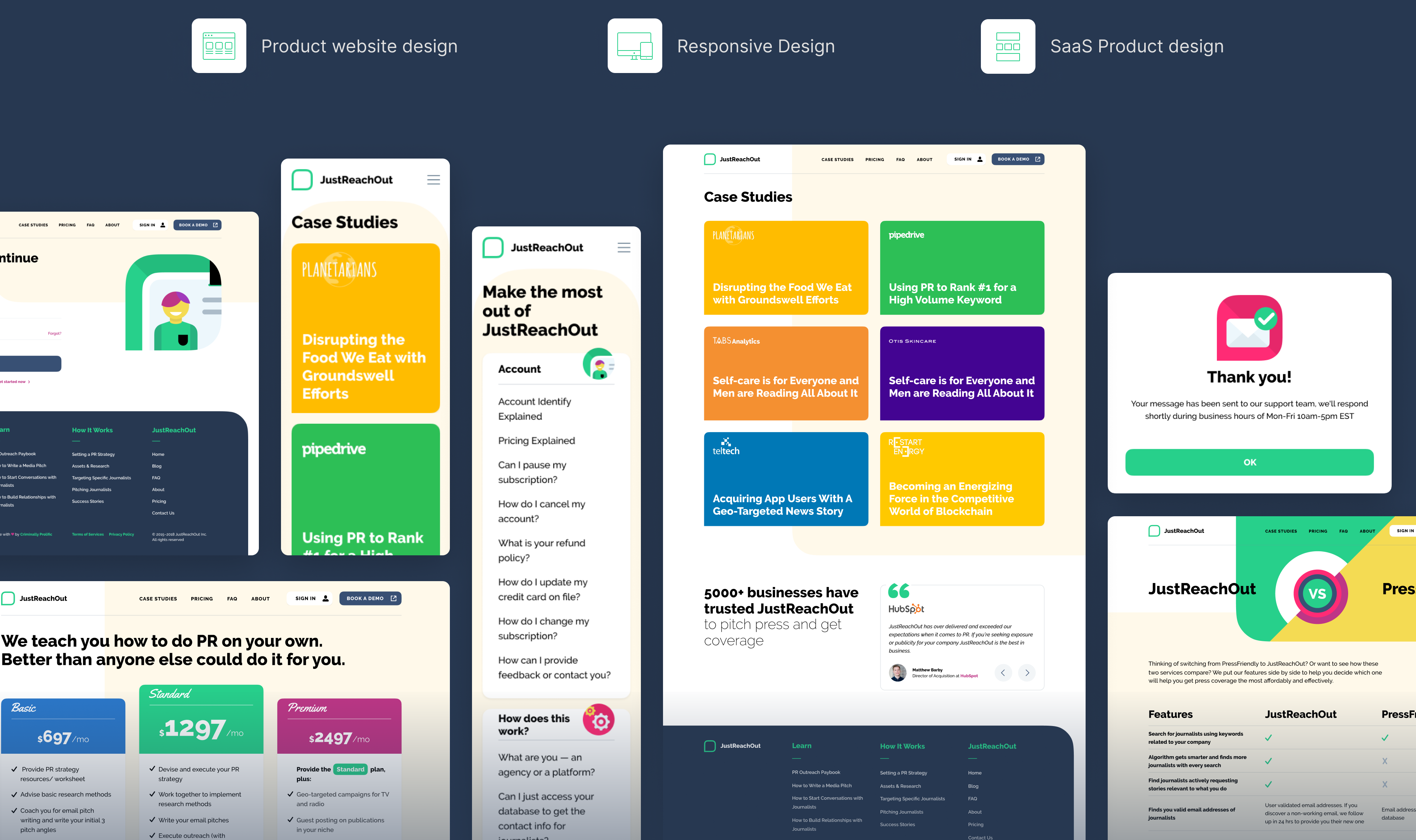
Promo Website
By installing Cointube as a browser extension, a user can view market insights and analysis from global cryptocurrency exchanges. The app monitors the most popular currencies based on the size of market capital. It uses the coinmarketcap.com API to mine crypto data.
SaaS Product design
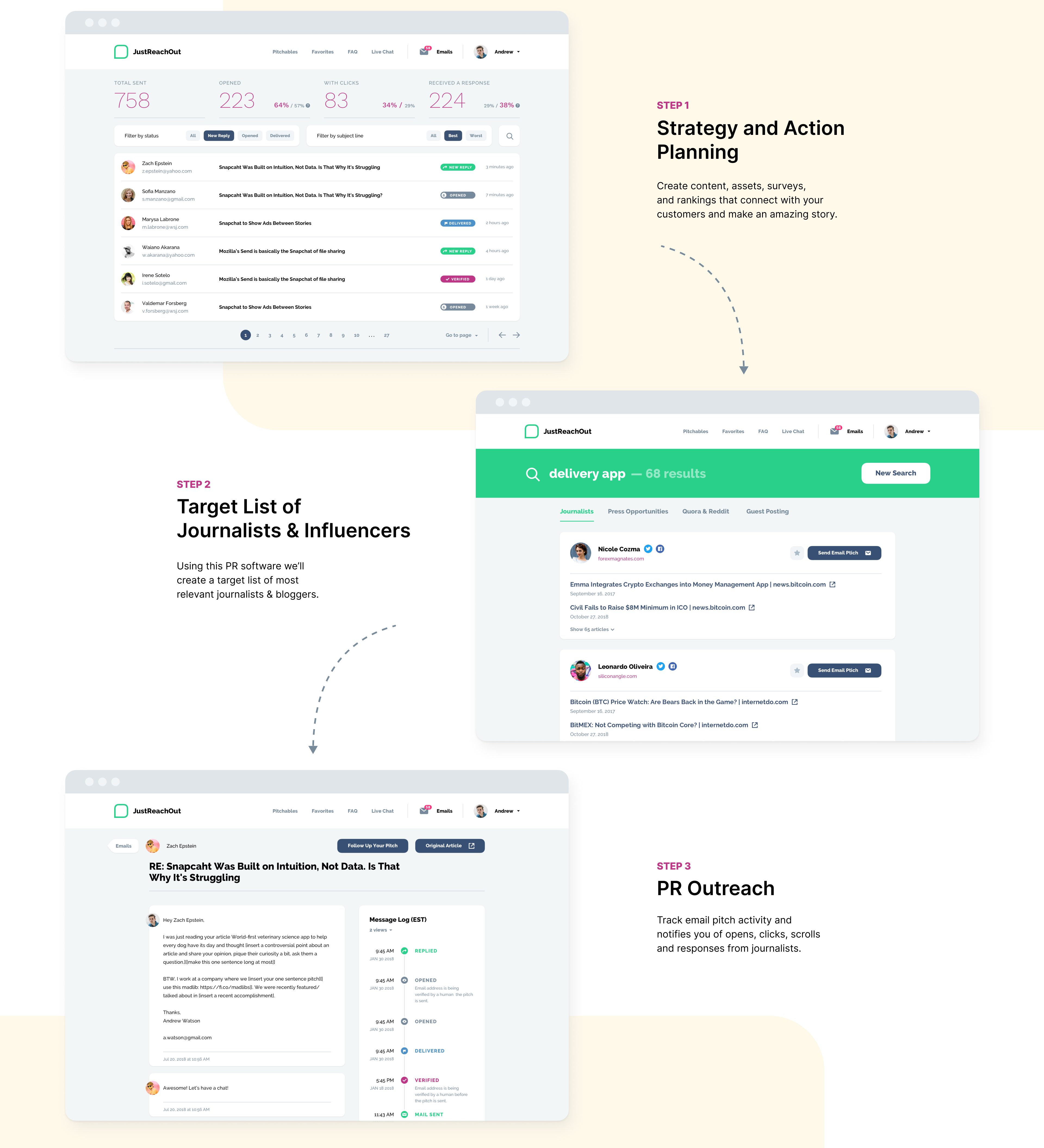
The second task of ours was to improve engagement for Just Reach Out’s current customers in their internal PR platform. Our UX research team ran a few user tests in order to find blind spots of the post-login UI of the system. As a result, we re-designed some dashboards, user forms, and table views to make them less content-heavy and easier to use.
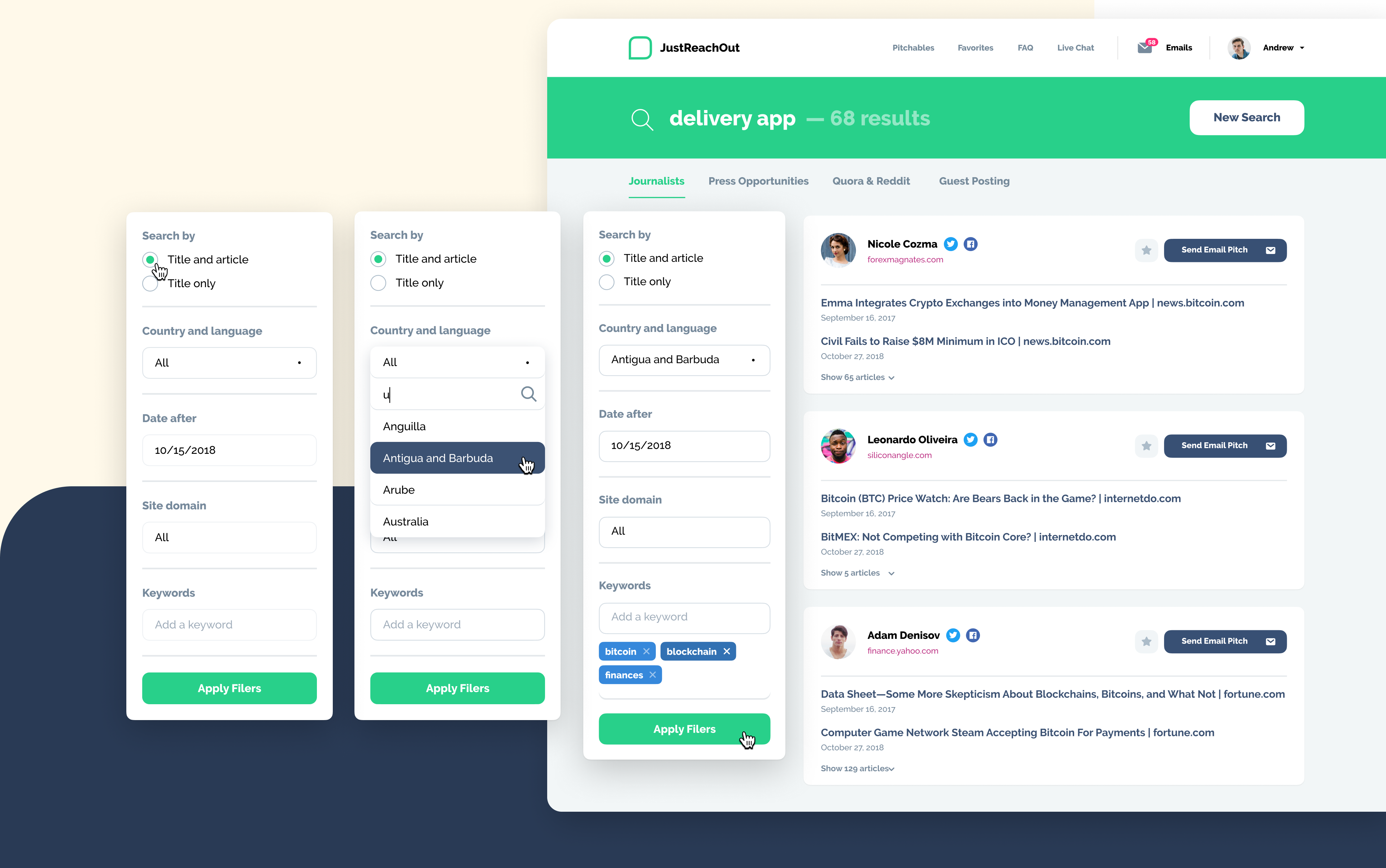
Search and Filters
Special attention was given to the search engine of the website, as users experienced difficulties finding what they were looking for because of the clogged design of the previous search system. We reduced the unnecessary options by new filters and made the overall layout clearer.
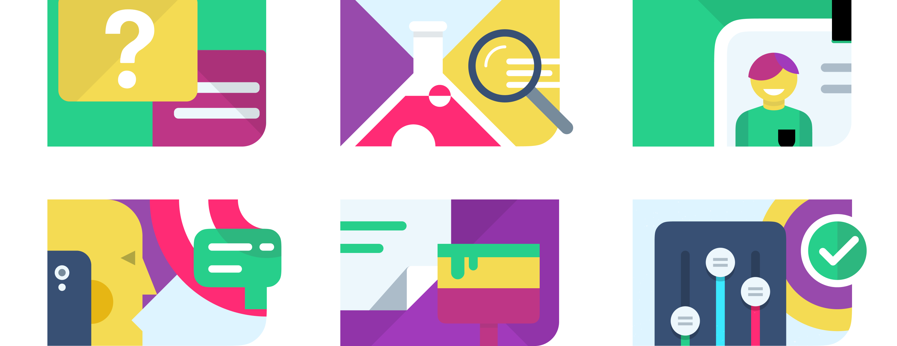
Set of illustrations
In the course of work, our team also offered the client to liven up the front page of the website with bright and bold illustrations. Graphic design became one of the hallmarks of the landing page and got a lot of glowing accounts from the platform’s customers.
Results
Within two months of launching the redesign, the conversion rates on the public-facing site tripled, which was the customer’s initial goal. The workability and usability of the site have also improved.

Let's talk
Is there a challenge your organization or company needs help solving? We’d love to discuss it.

