Corporate Gaming Website for KOEI TECMO
The leading Japanese video game company KOEI TECMO reached out to us to improve their website for the America and European market. The website didn’t have a game catalog, making it hard to find the necessary items and rendering the user experience slow and tedious. The absence of the direct-to-purchase links, sorting features, and product information confused users. As a result customers were leaving the landing page fast without making a purchase. The client wanted a clear, easy-to-use and engaging platform with the proper features.
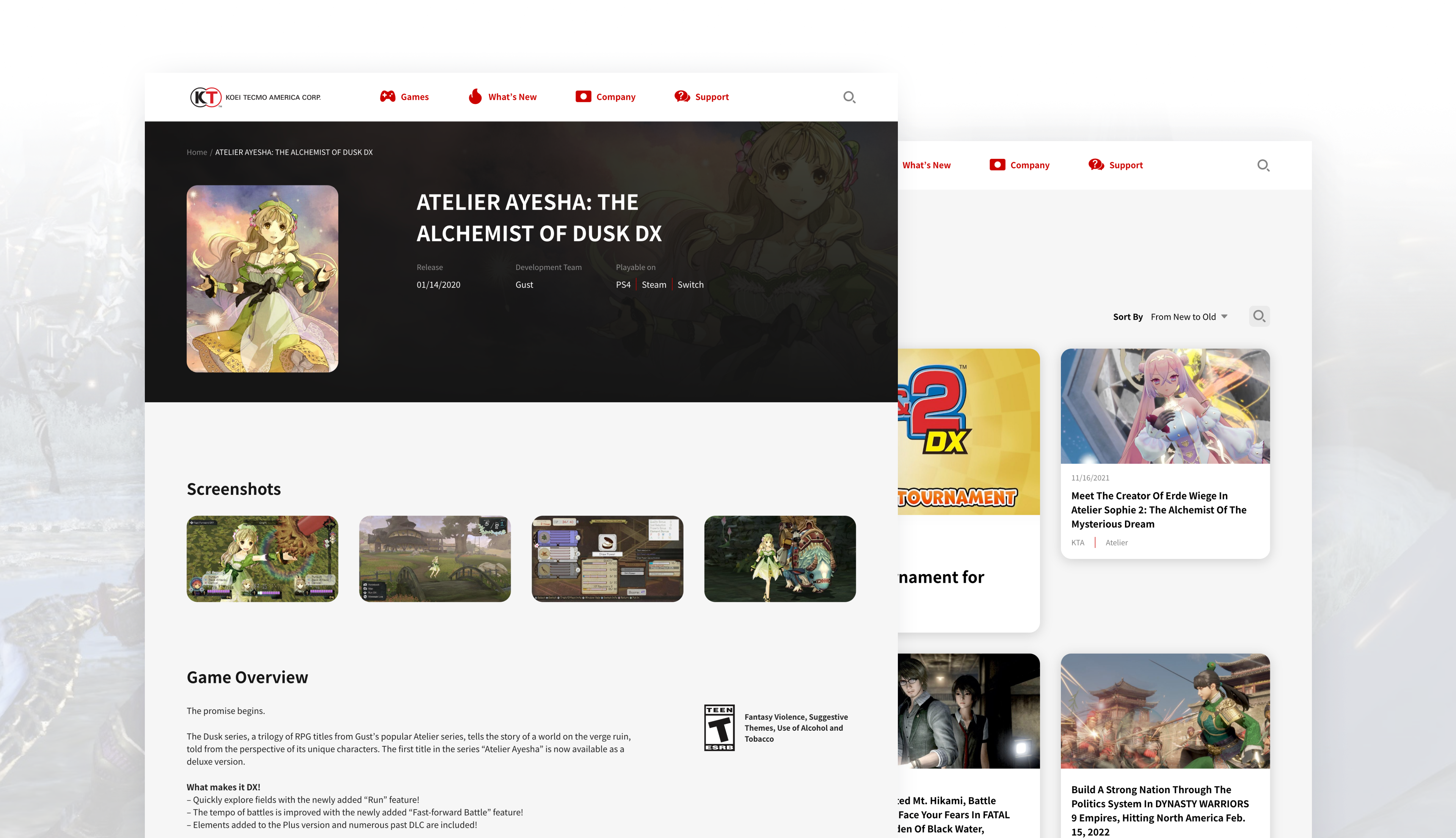
Our team completed full-cycle redevelopment of the entire game catalog and gaming marketplace design improvement, and simplified the workflow, added the direct links and replaced the information on the page. In the complete case study we describe the creation of the comprehensive game catalog with the game cards, sorting tools, and filters. Game development company website design lacked order, so we improved the user flow and also removed the excessive visual elements from the screens, making them more minimalistic to put a better accent on the important data.
Who is KOEI TECMO
KOEI TECMO is a publisher of interactive entertainment software for current generation consoles, mobile, and digitally downloaded content. The company is a wholly owned subsidiary of KOEI TECMO HOLDINGS CO., LTD., headquartered in Yokohama, Japan and is best known for the Romance of the Three Kingdoms, Dynasty Warriors, Samurai Warriors, Nioh, Dead or Alive, Ninja Gaiden, and Atelier series.
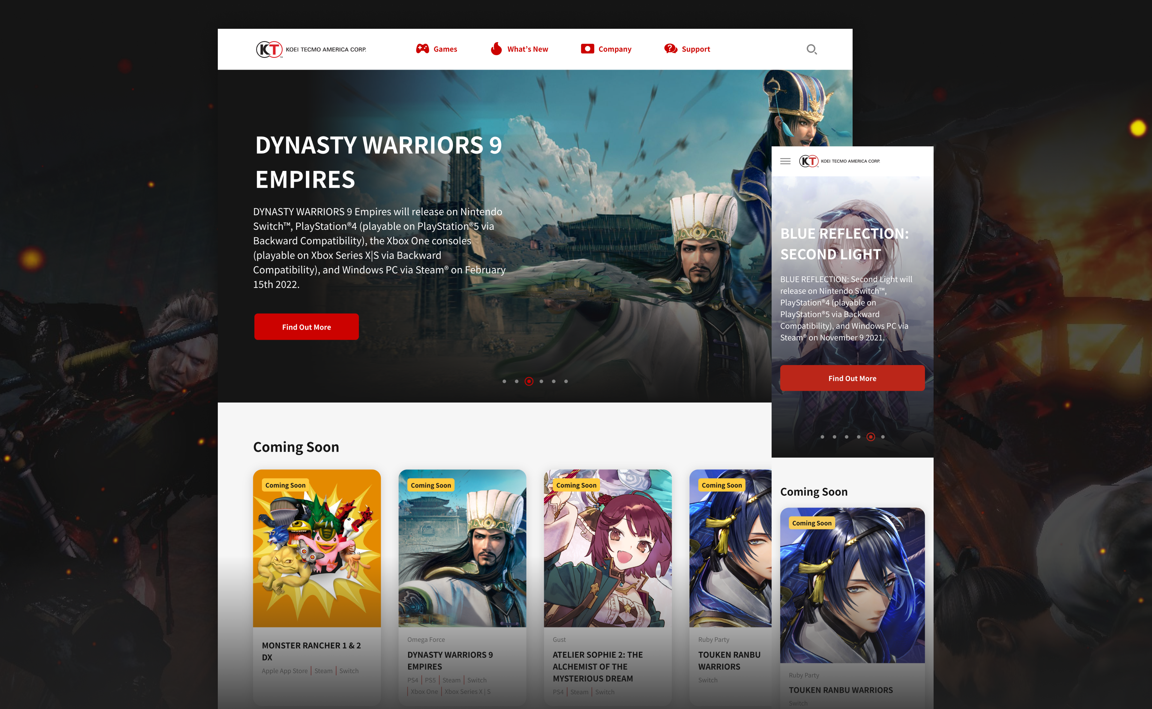
UX Wireframes
We completely reconsidered the existing portal architecture and the website map. After that we prepared a minimalistic low-fidelity wireframe to get a clear image of how the final solution would look and to check on its usefulness. The user flow was also simplified, making it to logical and easy (adding filters and tools), so the interaction with the game cards now takes seconds.
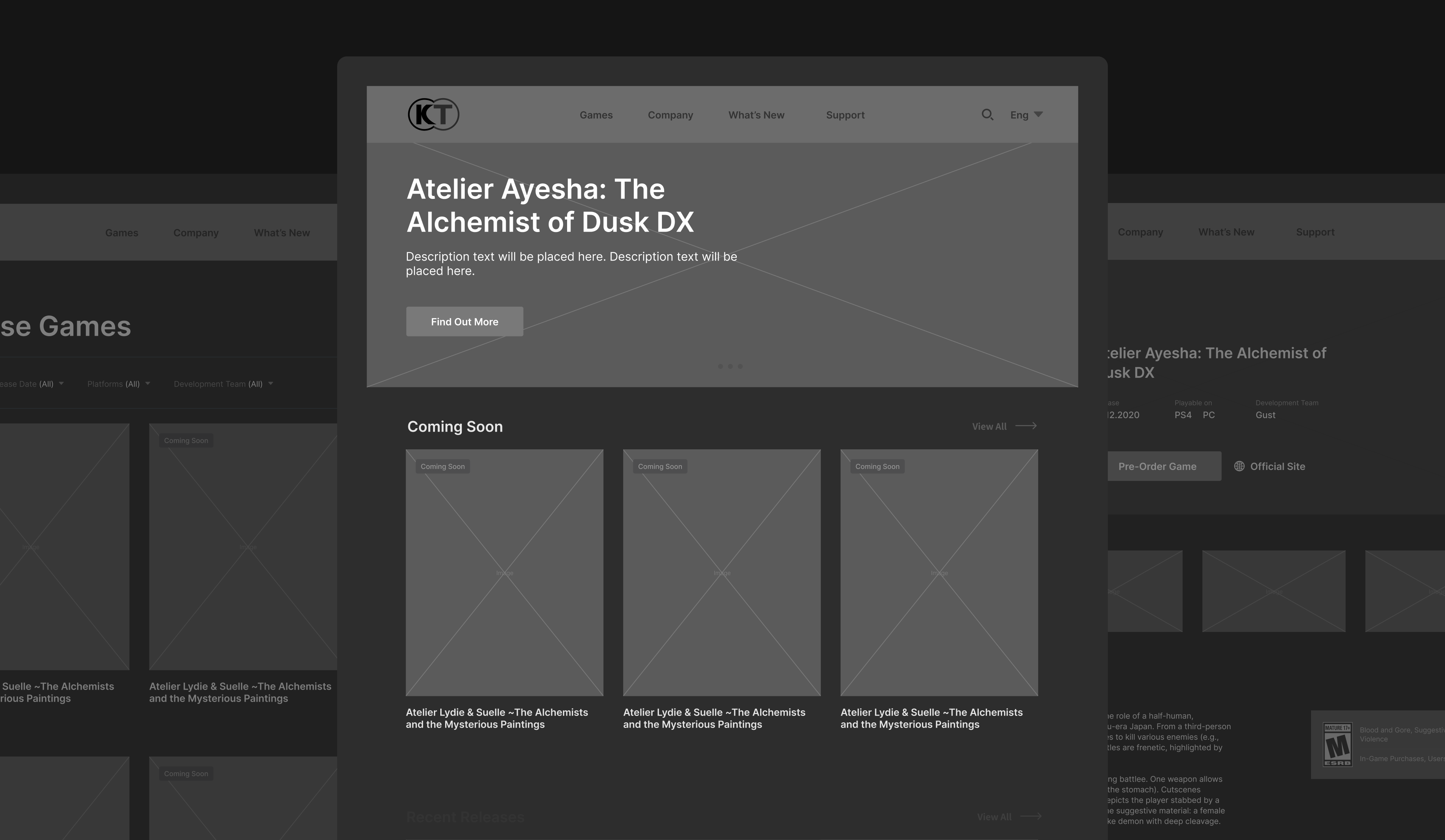
UI Wireframes
As the website didn’t have a clear enough UI design we removed all the distracting visual noise, making it minimalistic. Now the attention is drawn to the important data instead of unnecessary details.
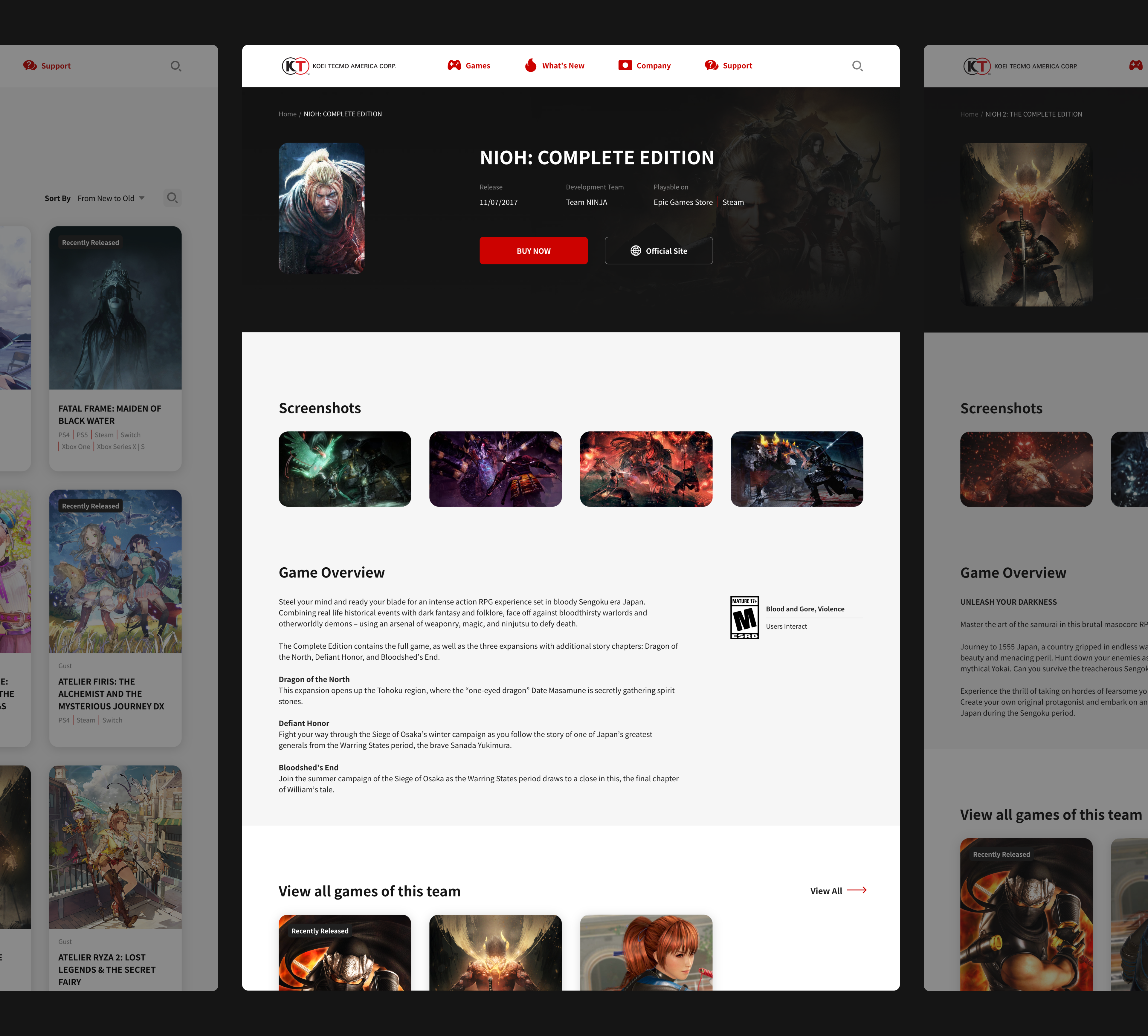
Responsive Design
We created a responsive design that looks good on any device—PC, tablet or smartphone—so the users will feel comfortable accessing it from any gadget.
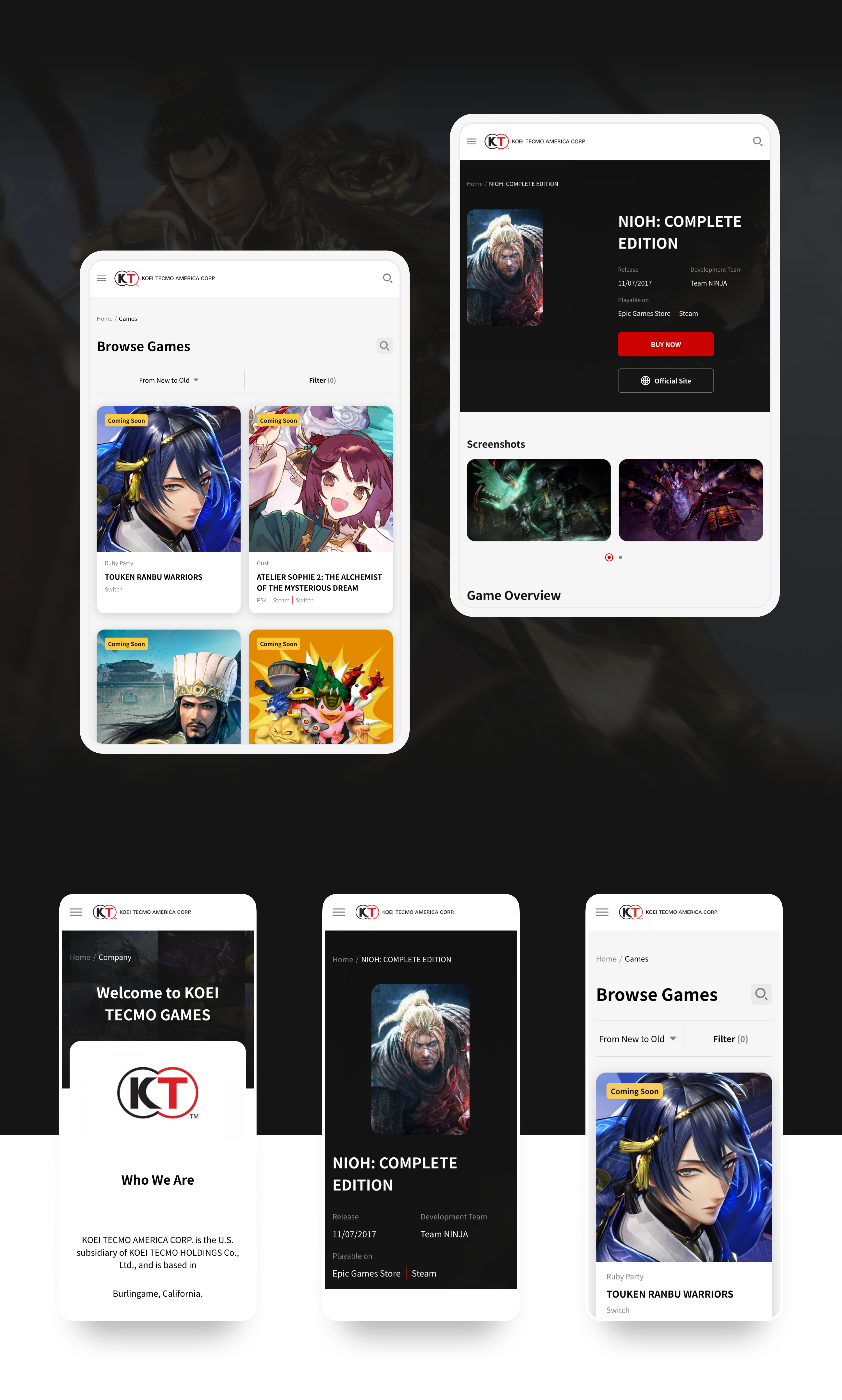
Main Functionality
We performed full-cycle game website development creating the following features:
- Game catalog of digital gaming products;
- Cards with the description of the game items;
- Catalog filters and sorting options;
- Updating news feed to keep tuned ;
- Contact form to text support;
- A search bar for easy access to the desired items and materials.
Results
We provided complete gaming marketplace development, improving the platform to become user friendly, eye pleasing, and easy to use. The customers now have easy access to the game catalog and can use the search bar, filters and sorting tools, as well as the comfortable navigation purchasing is easy now.

Let's talk
Is there a challenge your organization or company needs help solving? We’d love to discuss it.

