Prometheum
Prometheum — Fintech Platform
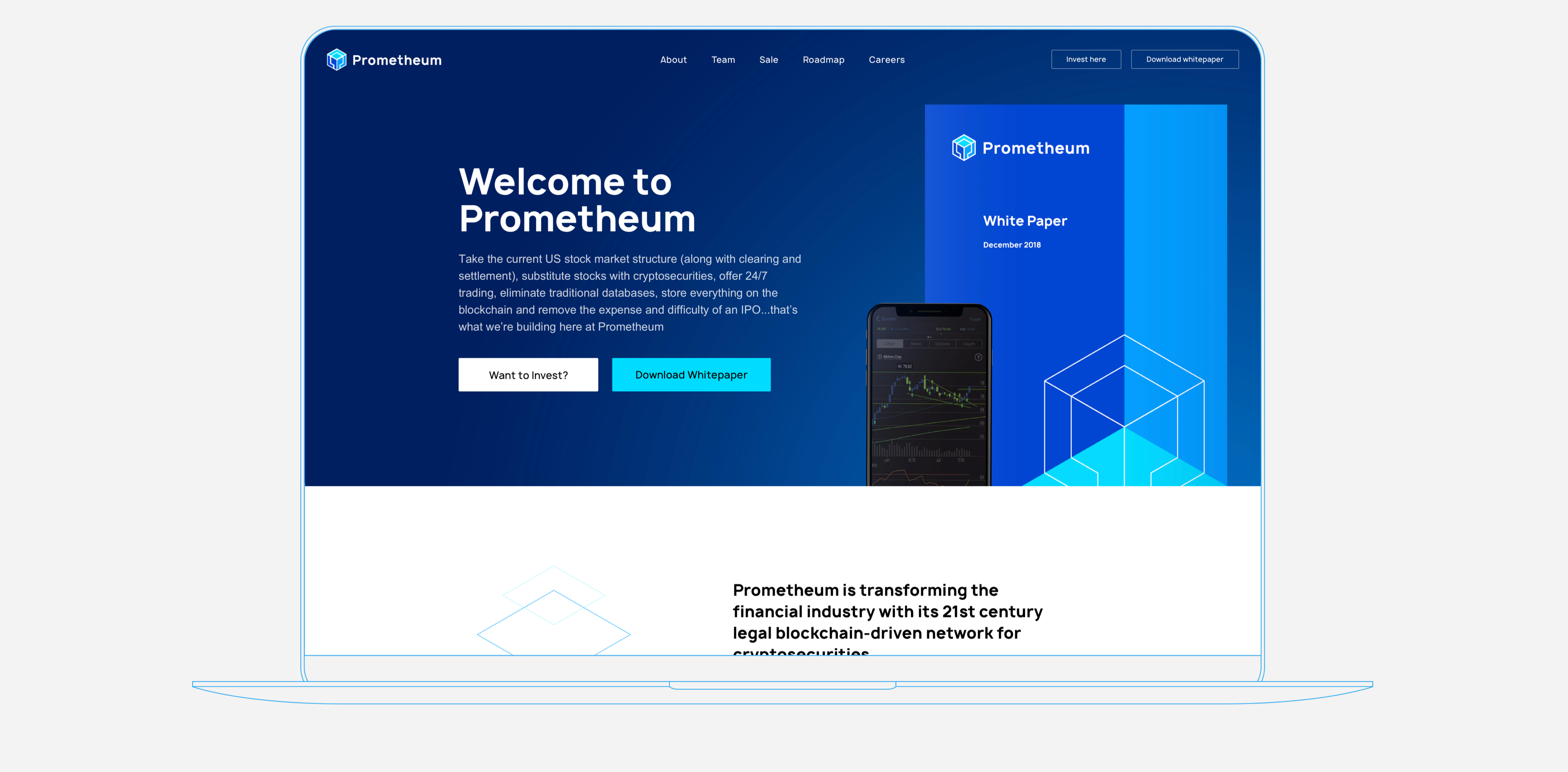
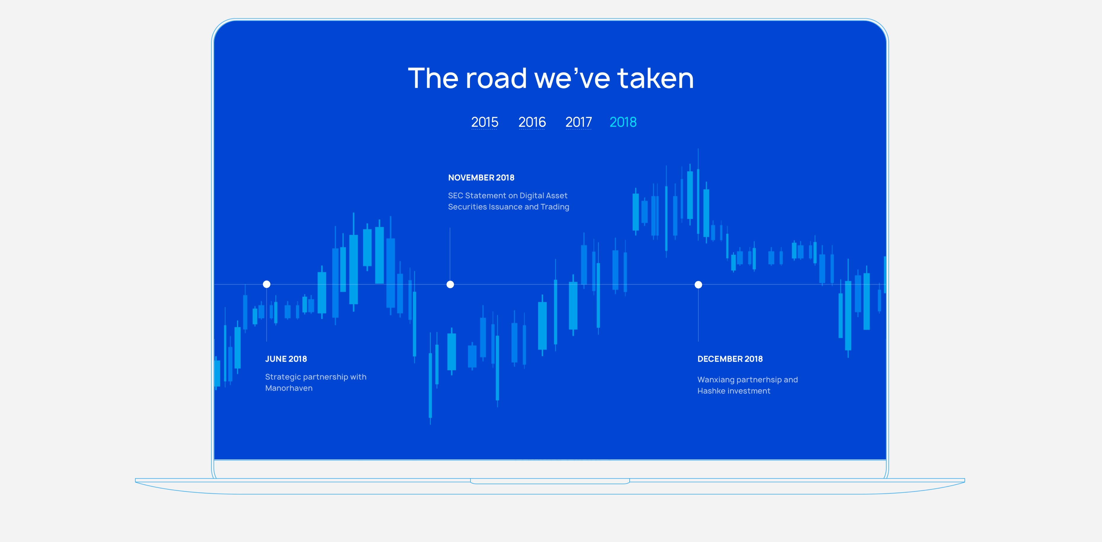
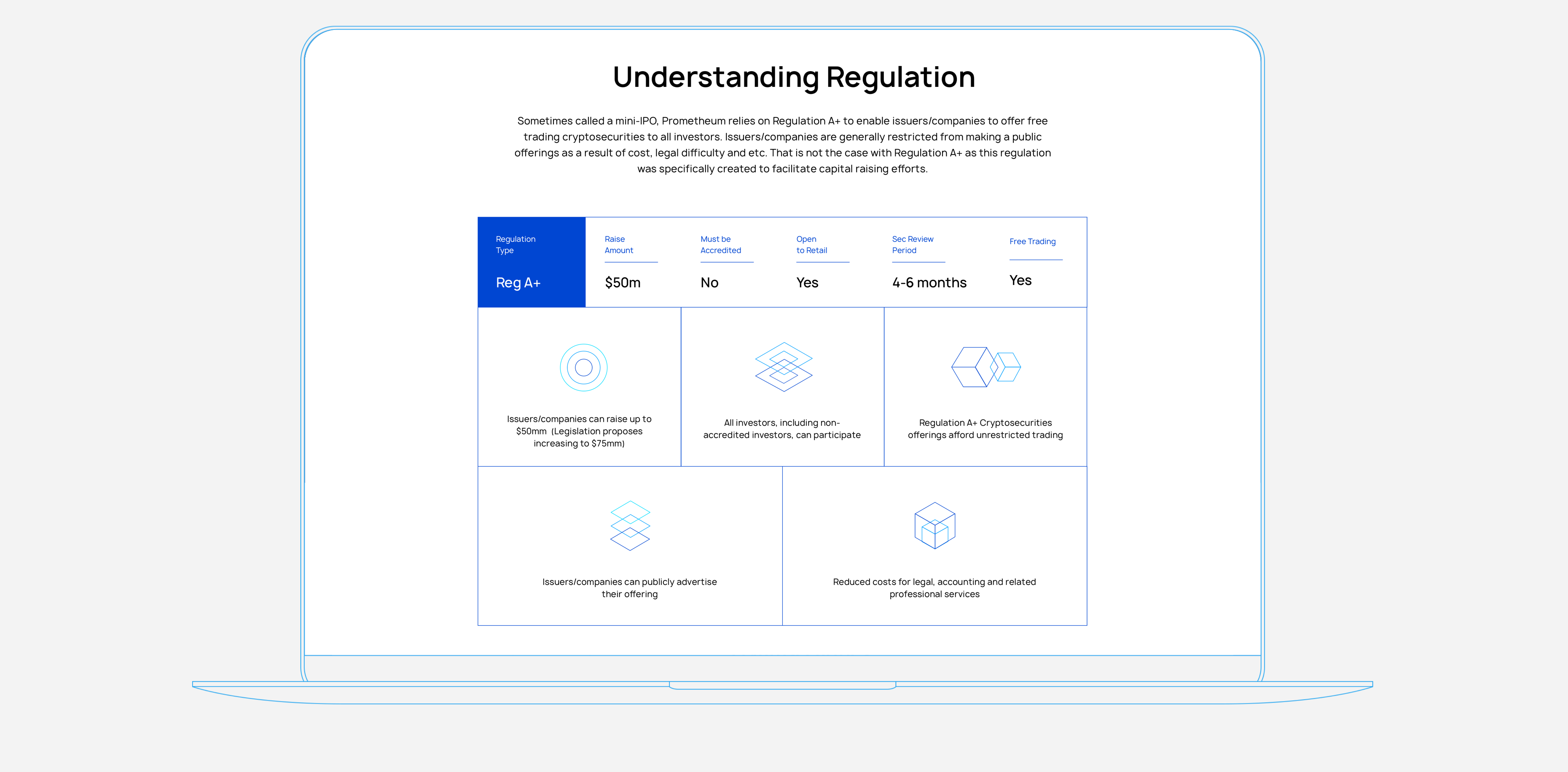
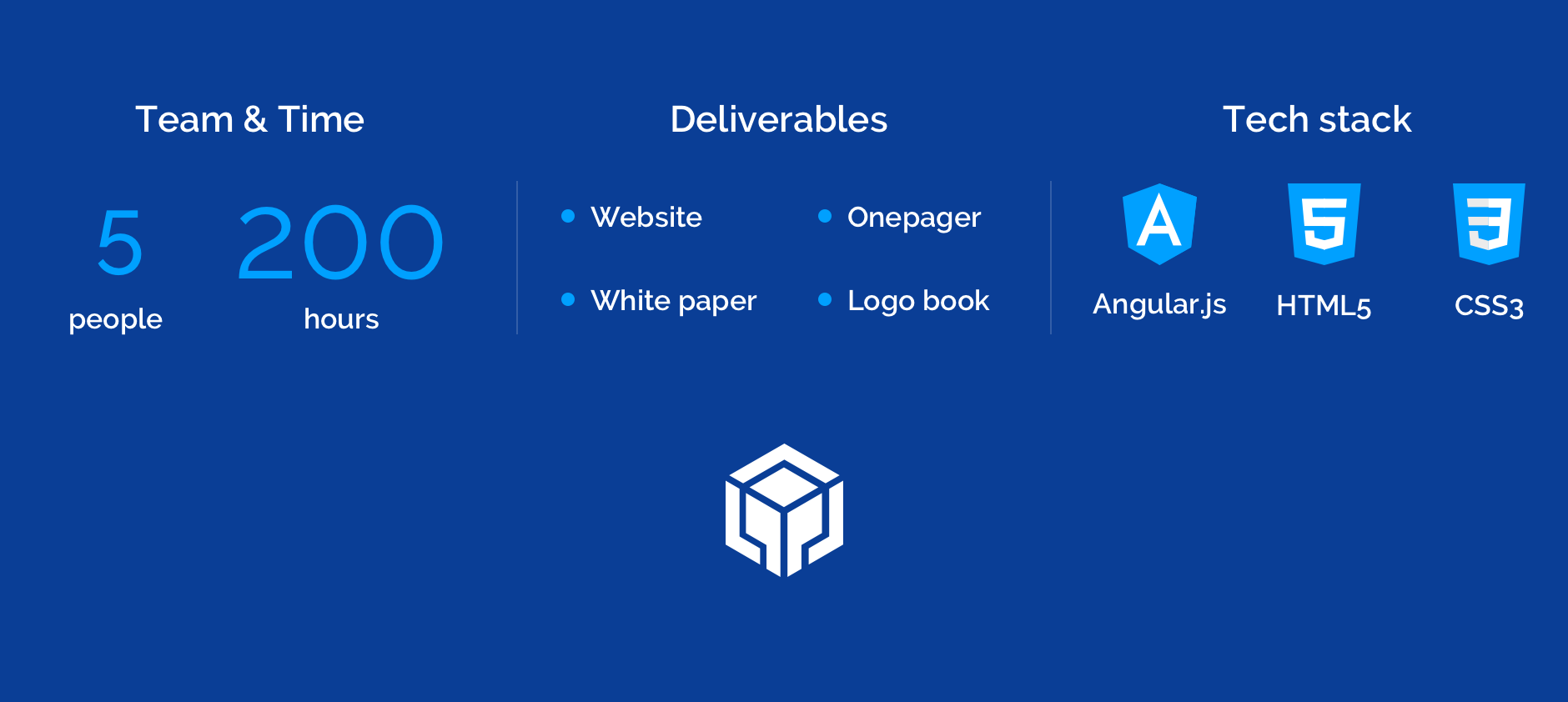
The client approached us to re-design their corporate website, brand identity, and whitepaper so that users will understand the mission of Prometheum and invest in the disruptive technology the company offers.
We created a responsive website design and brand identity for Prometheum. Our team managed to depict the brand as a reliable and innovative company staying on the edge of progress.
What is Prometheum
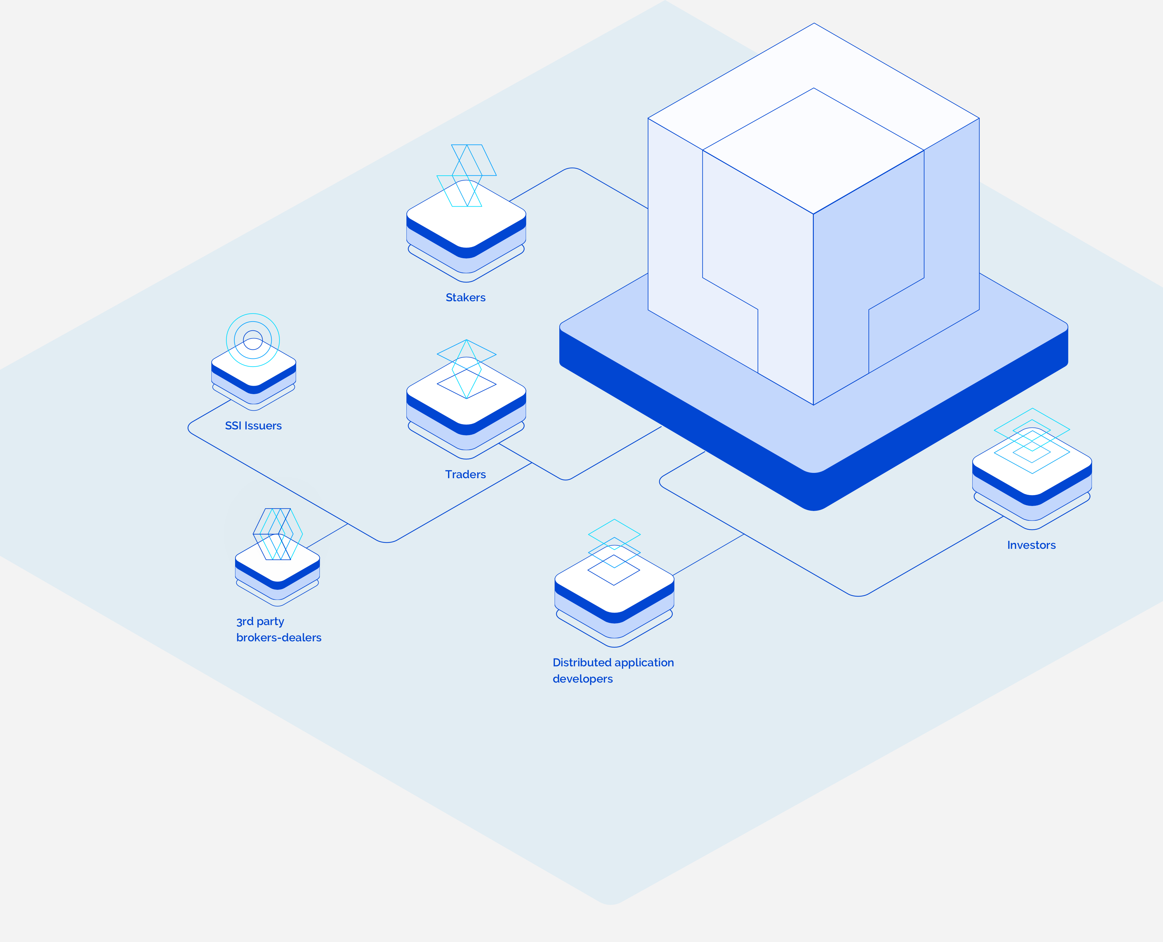
The simplified trading platform for cryptosecurities that clears and settles trades in 24 hours, without cumbersome traditional systems or the expense and difficulty of an IPO. Company mission was to simplify cryptosecurities trading process and enhance the experience of modern investors.
Challenges to overcome
When the client contacted Agente, they already had the first version of the website developed by another team. But the product wasn't engaging for potential investors, had poor information architecture and weak brand identity. That's why our team decided to start over and build the website from scratch. That’s what our goals were like:

Intuitive UX That Encourages To Invest
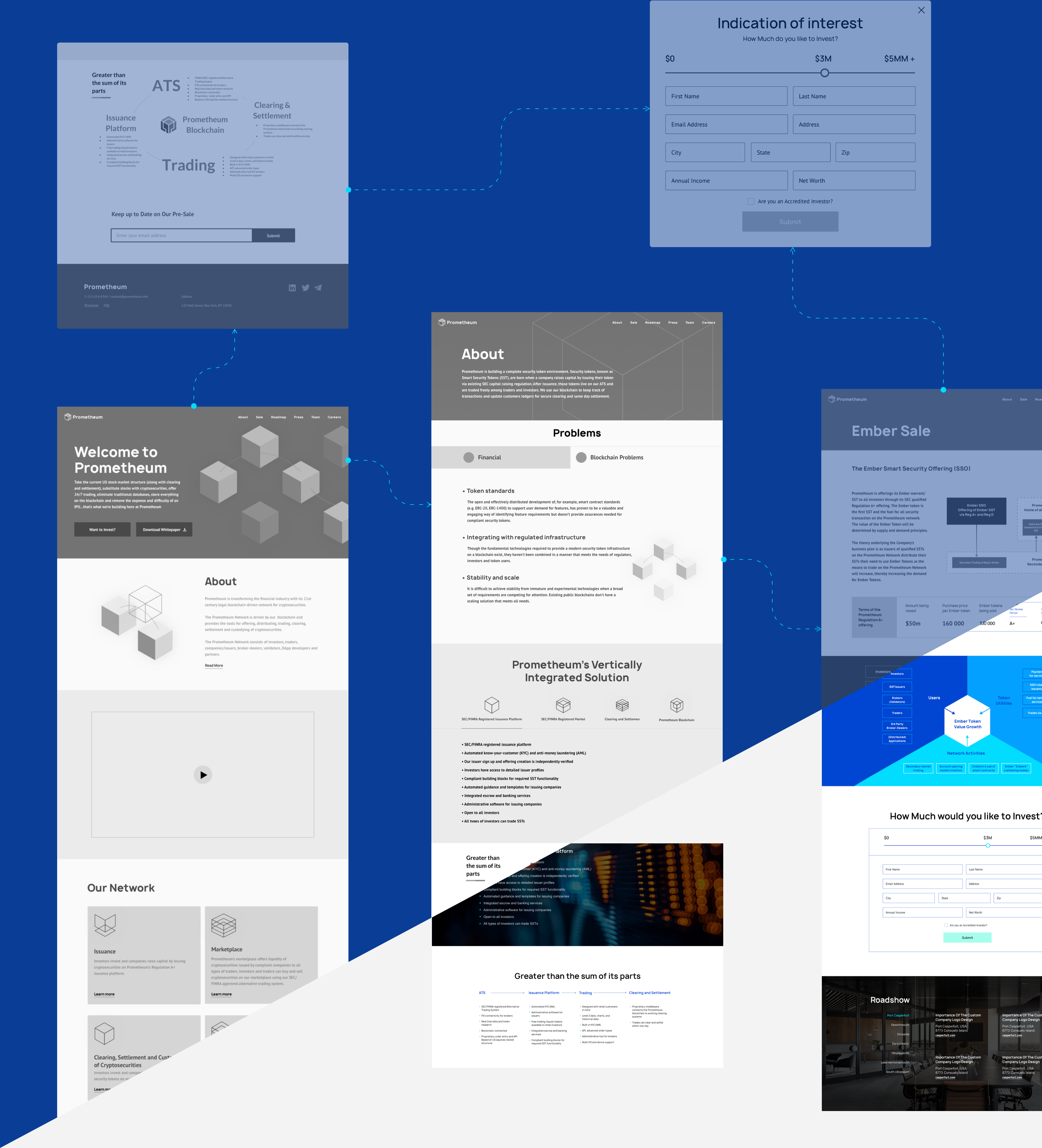
In order to drive the website’s conversions, we needed to design simple, uncluttered navigation so that visitors can get maximum useful information along their way and make a decision about investing in the company’s offers. Our team created a consistent and minimalistic user flow that leads the user from reading the whitepaper, browsing through the informative sections of the website to watching the promo video and making a final decision at the investment form.
We also featured the website with email subscription forms, CTAs, and unobtrusive pop-ups that encourage users to subscribe to the newsletter or invest in the client’s platform. To prove that the redesign features will be useful to customers, we conducted the testing of the existing website on internal users with an eye to extend the information architecture and implement changes based on feedback we gathered.
Modern-Looking User Interface
Our next step of the design process was to work on the user interface and marry the brand identity with the UX design and information architecture we had previously crafted. The product design was created to be neutral and easy for an eye. We also ensured that the website’s grid, fonts, images and input fields comply with the standards of web accessibility.
UI Mobile Adaptation
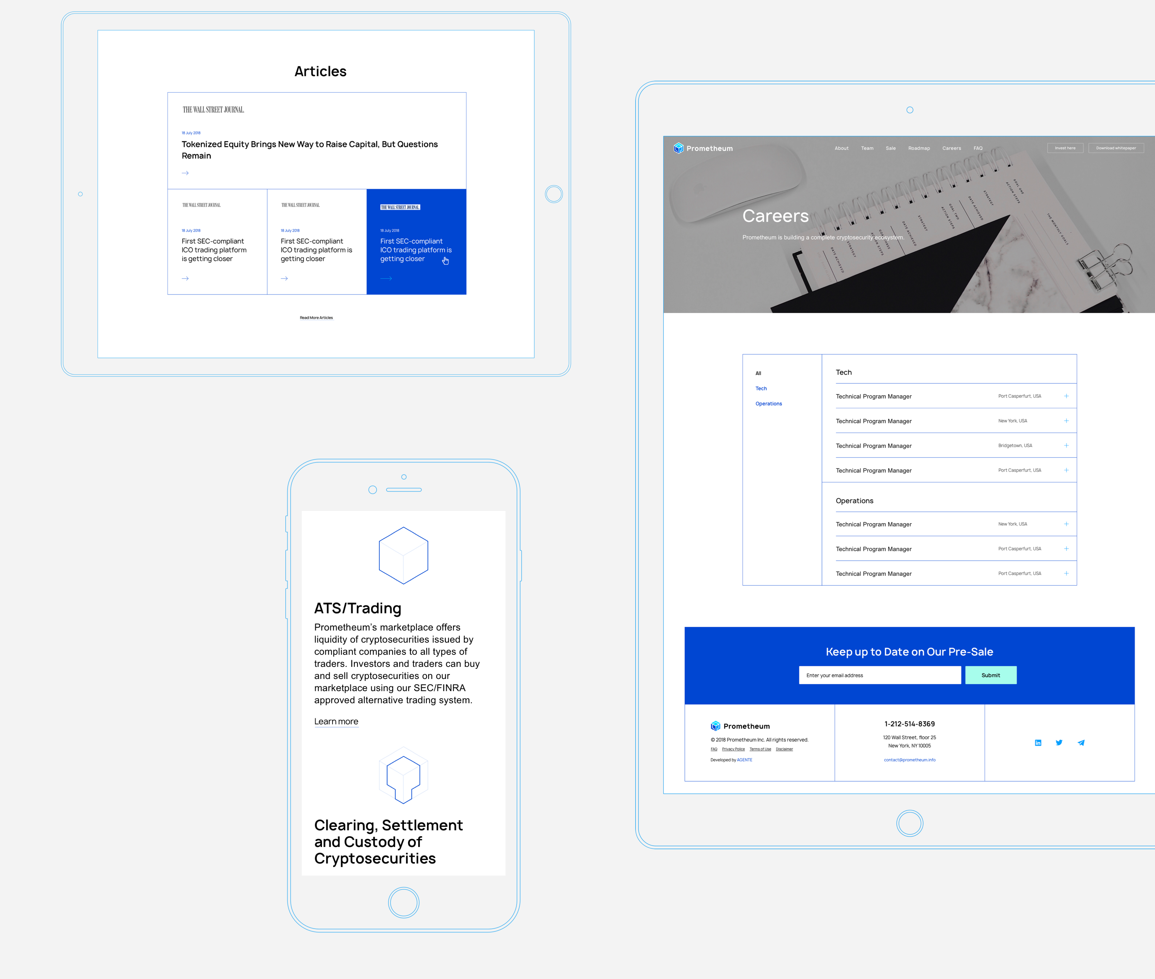
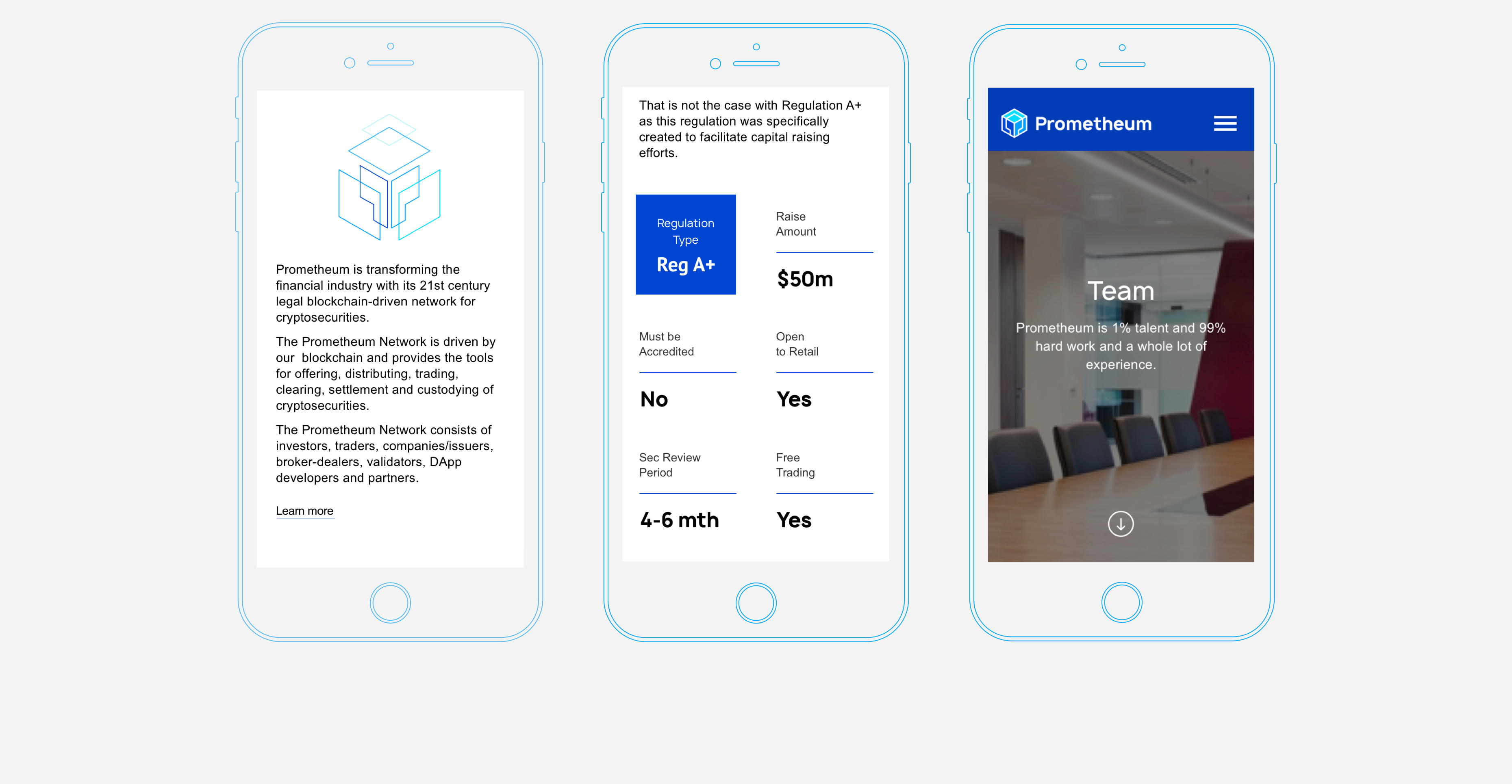
As mobile-friendliness is considered one of the major factors affecting user experience design and search engine rankings, we made a special effort to scale down the existing website elements, button sizes, and pop-up forms. The challenge was to adapt large elements to smaller screens and preserve the high level of readability.
Branding & Marketing Materials
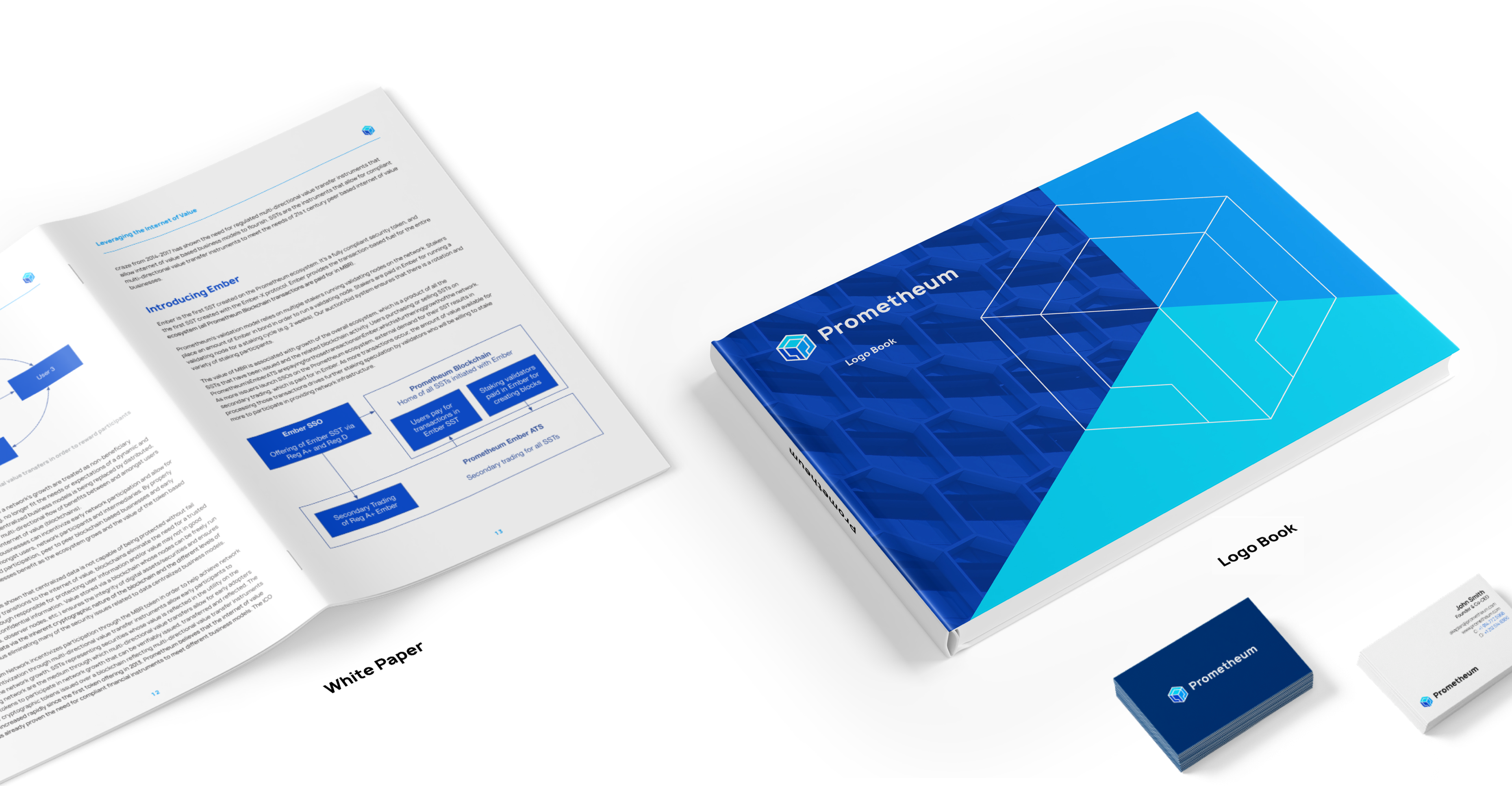
We were asked to elaborate on the design of white paper pages, logo book and a set of icons that grab people’s attention and reflect the brand in the way that Prometheum wanted to present it to potential contributors.

Our team wanted to create simple but easily recognizable brand identity. We used a technological and business-like color palette with dark blue and white colors, blocky and angular shapes and dashed lines.
All the elements are incorporated into simple geometrical forms or can variously stand out at the website showing the dynamic and flexible nature of the company.
Icons
Result
Once the work was done, we conducted usability testing in a small focus group to make sure that we understand what users want at the moment and our design keeps up with the current trends. After the research, we did the other iteration of visual design updates and prepared the website for the release.
Let's talk
Is there a challenge your organization or company needs help solving? We’d love to discuss it.

