When accessing a website, users usually have a specific goal in mind. And technical problems are not something that they would expect. Hitting a dead end frustrates visitors and often makes them abandon the site, never to come back. But sometimes errors are inevitable, no matter how hard you try to avoid them. And the 404 error represents one of them.
What is a 404 Page?
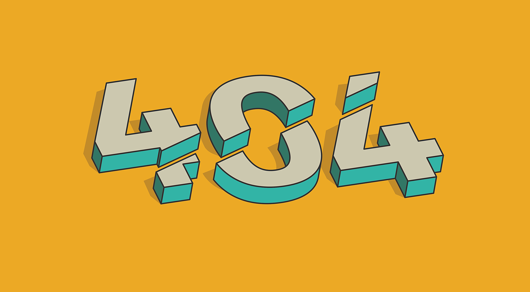
A 404 error page is what visitors see when they attempt to reach a website’s page that no longer exists or may never have existed at all. There are some effective ways to fix a 404 page not found error like these ones, but you’ll never fully eliminate them.
There are some common reasons why this page appears:
- Page removal
- Site is offline
- Broken link
- Outdated link from a search engine
- URL mistyped by the visitor
Why Choose a Custom 404 Page Design?
Successful websites follow a golden rule of never using a standard 404 page. They turn this page into one more marketing tool by customizing it. Here’s how a custom 404-page design can help a site:
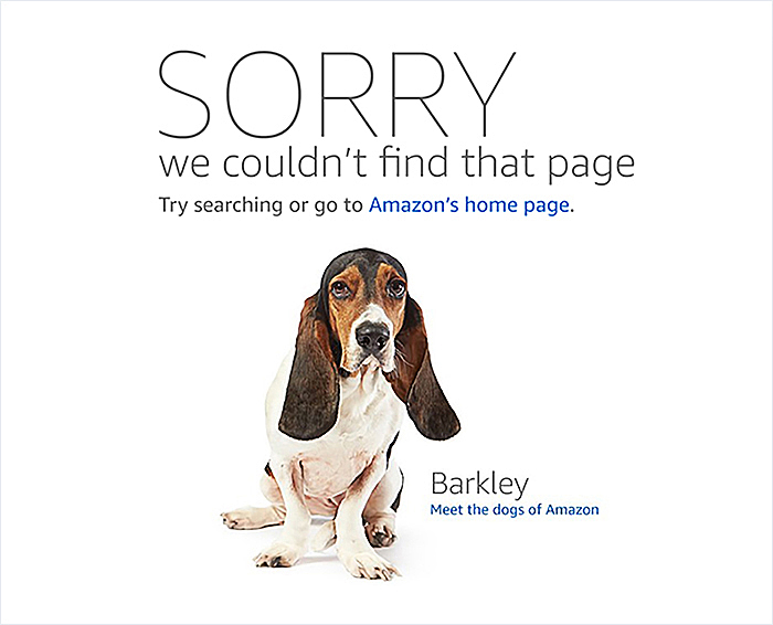
- It can encourage unhappy visitors to come back by giving them useful information, or even a just link back to the homepage.
Source: Amazon
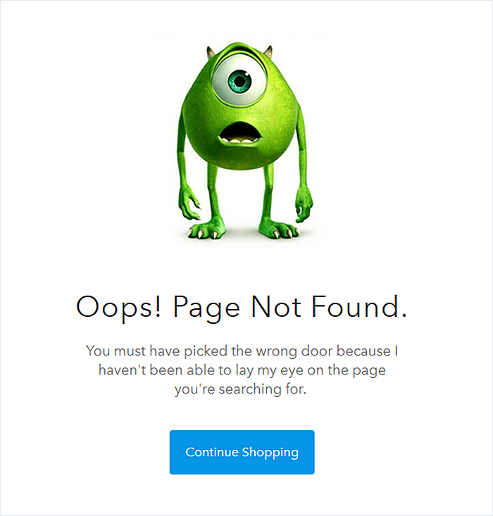
- It can build a strong brand image by maintaining the same theme on all pages, thus creating a consistent image.
Source: Shop Disney
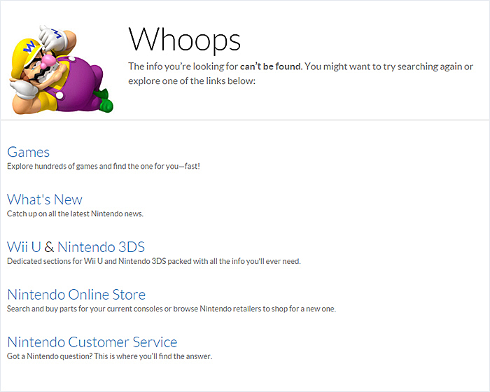
- Increase conversions by listing useful information, such as most popular site pages.
Source: Nintendo
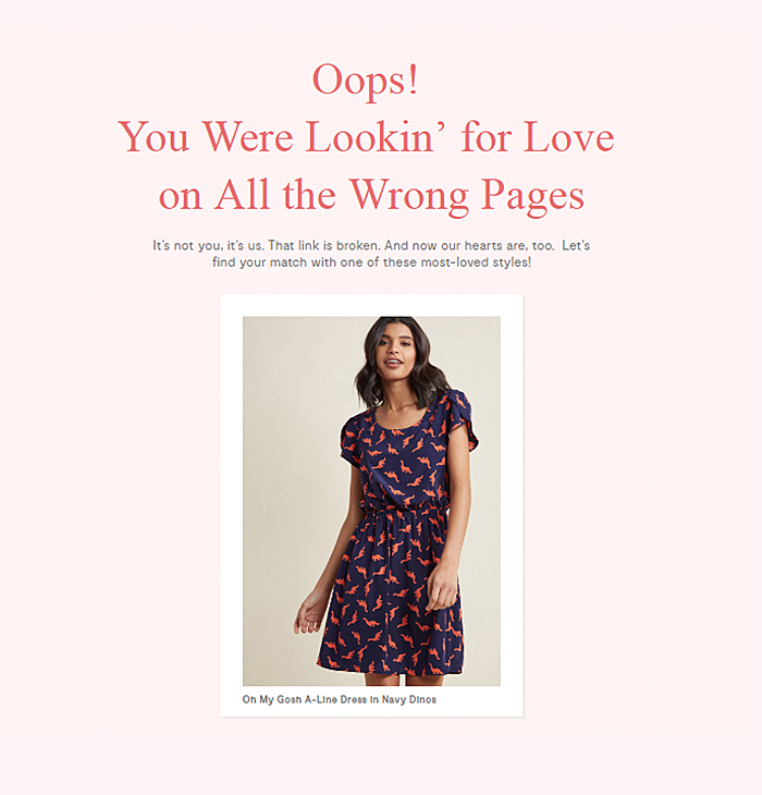
In e-commerce website design, some stores go even further by offering popular products right on this page.
Source: ModCloth
How to Design 404 Pages
It’s not as easy to create a stunning 404 page as it may seem. Read on to learn what you should take into account.
Make sure you include a search bar
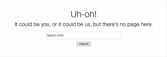
You can keep visitors on the website by granting them an opportunity to continue navigating from anywhere with the help of a search bar.
Source: CNN
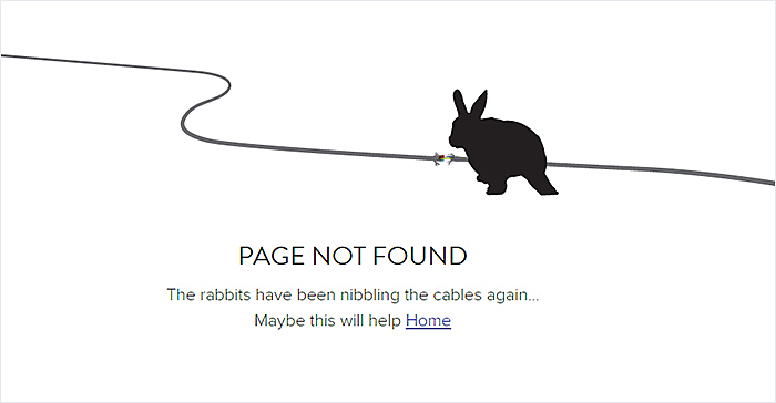
Include links to popular posts or to the homepage
Blogs have turned into a must for many websites. And if you’re one of them, it’s a wise idea to engage users by adding links to the most interesting articles. If you are not running a blog yet, you can simply allow visitors to return to the homepage.
You may also be interested in 10 Best Examples of Beautiful Blog Design
Source: Hoppermagic
Source: Shopify
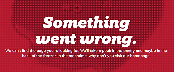
Speak plain language
Don’t utilize technical terms to explain to users why they’ve been taken to the page. Clarify the situation in a very simple way.
Source: Campbells
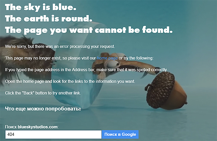
You can even write something like a nursery rhyme to entertain site visitors.
Source: Blue Sky Studios
Don’t forget about the curious nature of human beings. You can include the reason why the error has happened.
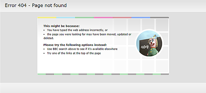
Source: BBC
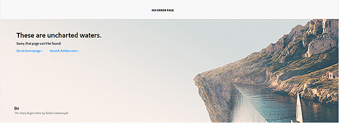
One more tip: spice 404 page designs up with some humor like Adobe, Lucasfilm, and Lonely Planet.
Source: Adobe
Source: Lucasfilm
Source: Lonely Planet
Make it easy for users to contact you
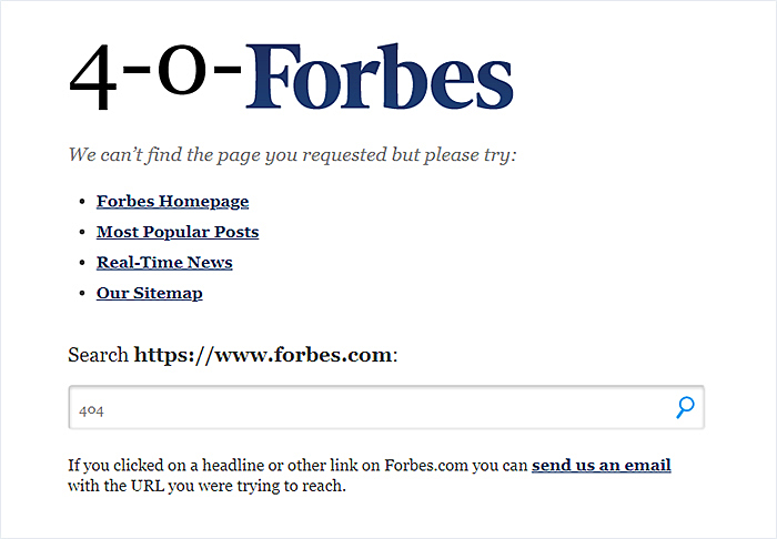
Give visitors a chance to reach you in order to report an error or ask a question, by accessing a special form or sending you an email.
Source: Forbes
Source: GOG
Allow users to join your email list
As we’ve mentioned previously, the 404 page can be a marketing tool. So use it to add new names to the email list. To make your offer irresistible, you can give a discount to new subscribers.
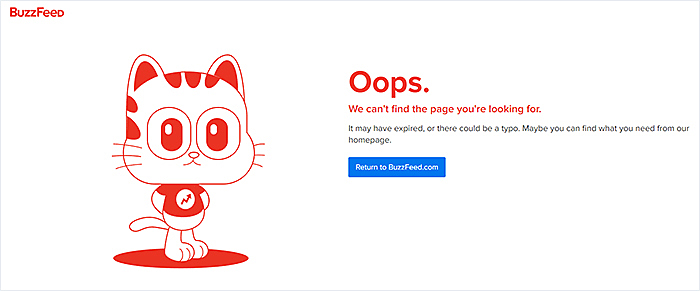
- Ensure design consistency by using the same colors, image styles, and typography across the whole website.
Source: BuzzFeed
Put animation to use in order to hold interest
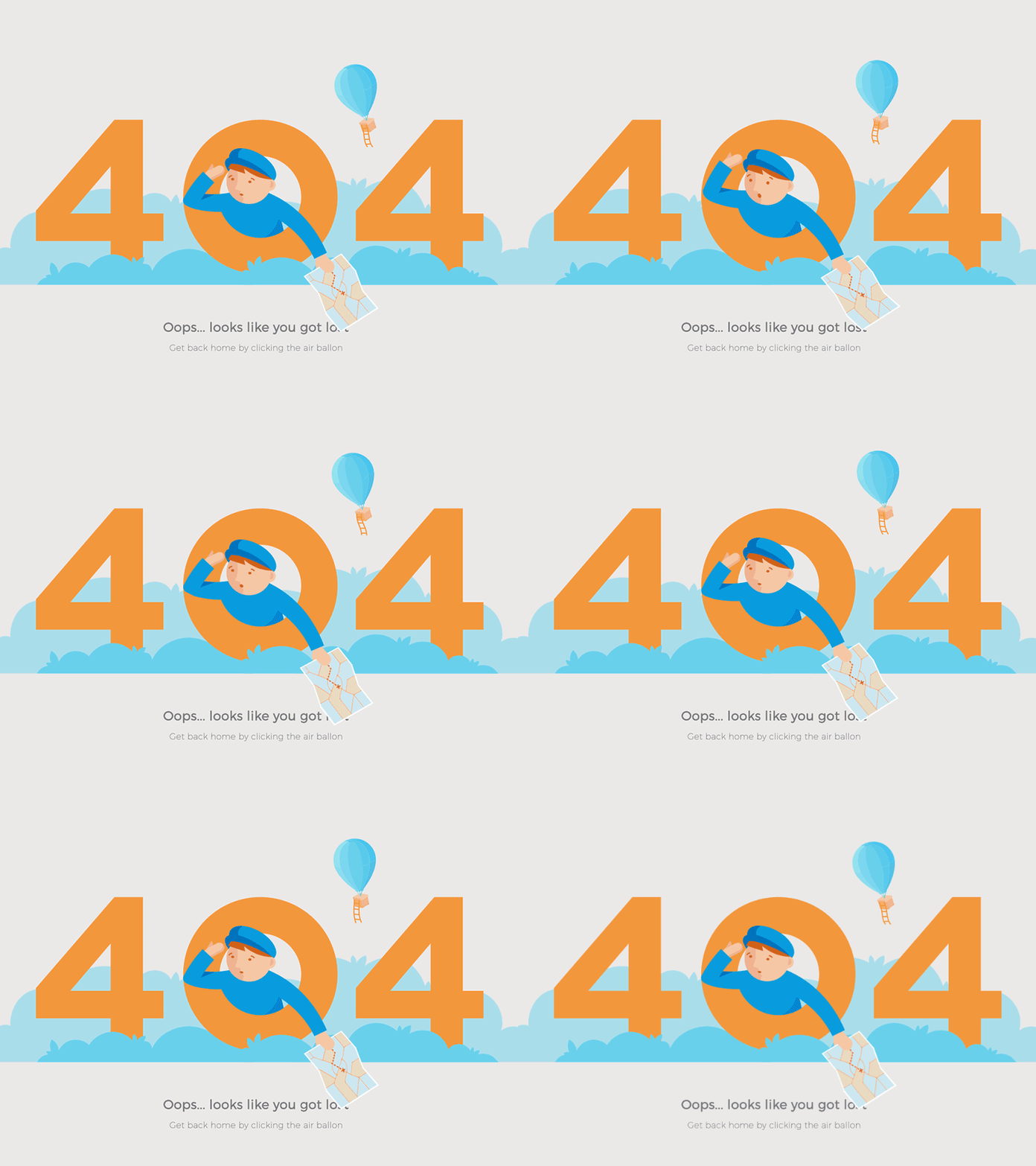
The animation is all the rage today. You can make a design more attractive by utilizing animated elements.
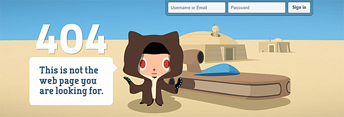
Add a login form
Some websites require users to be logged in to perform a search, so allow visitors to log in to your site from the ‘not found’ page.
Source: GitHub
Enable social media sharing
If users love your 404 page, they’ll certainly want to share it with others. Allow visitors to share the page with almost no effort by implementing social media buttons.
Source: The Huffington Post
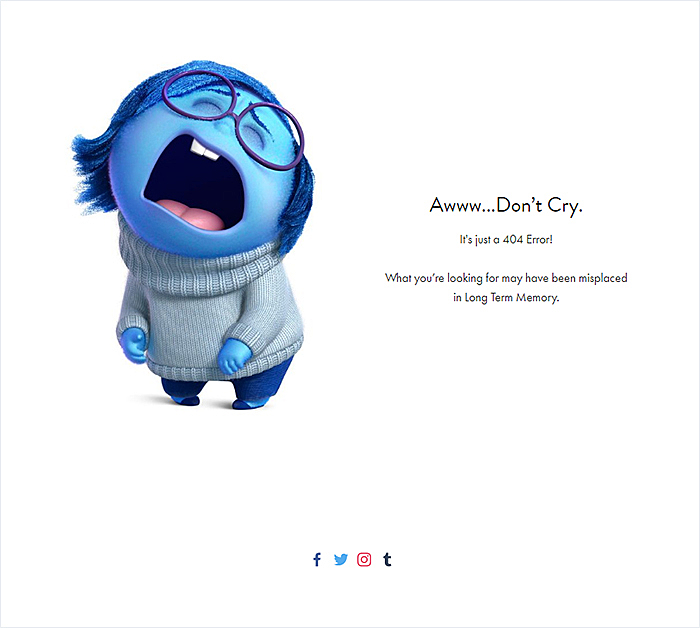
You can also add links to your social media accounts.
Source: Pixar Animation Studios
Utilize gamification
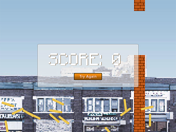
If you want to stand out from the crowd, think of putting gamification to use. You can follow the example of Eastern Market; they turned their page into an old-school game.
Source: Eastern Market
Best 404 Page Design Examples
There are more than 1.5 billion websites on the Internet today, and many of them have creative 404 error pages.
See below real-life examples of 404 page design that will certainly pique your interest in 2019.
1. IMDb
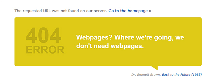
The ever-changing content makes this page worth your attention. Start reloading it, and you’ll never stop, as this page shows a new quotation each time it is reloaded.
2. ICONFINDER
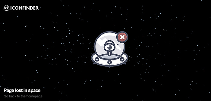
This 404 page design has animated elements that make it much more entertaining than static pages found on the web. And we also like how the page describes the reason why the visitor is seeing it.
3. Dropbox
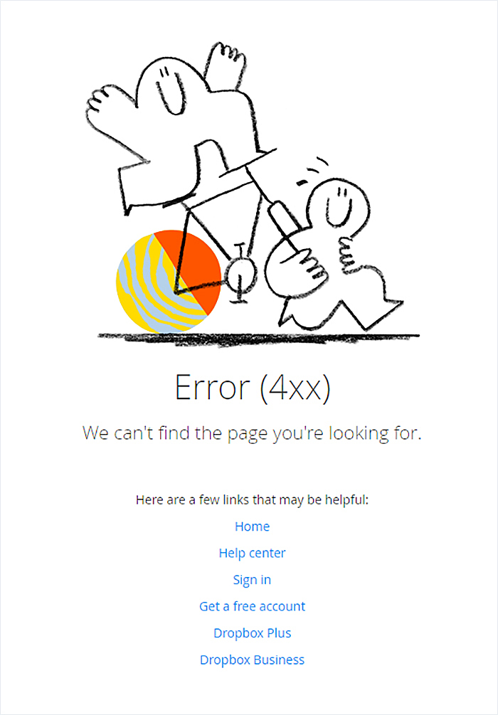
It not only has a funny image that you’ll immediately fall in love with, but it also includes links to the most important pages like the homepage, help center, registration, and more.
4. Disney
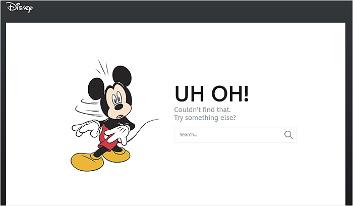
Mickey Mouse and Disney are inseparable, aren’t they? Visitors can return to the homepage by clicking the logo, or they can continue their search using the search box.
5. Blizzard Entertainment
This 404 error page design maintains brand consistency by utilizing the same colors, typography, and icons as elsewhere on the website.
6. Imgur
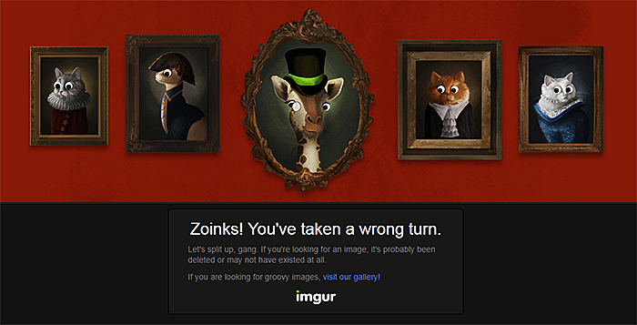
Believe or not, animals’ eyes are following the cursor. So you can spend a couple of minutes playing with them, follow the link and visit the gallery, or go back to the homepage by hitting the logo.
7. Digital Trends
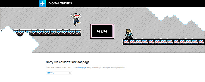
It evokes childhood memories by showing the visitor an image of a game similar to the ones they used to play. It also allows the visitor to return to the homepage and gives users a chance to restart their search.
8. MailChimp
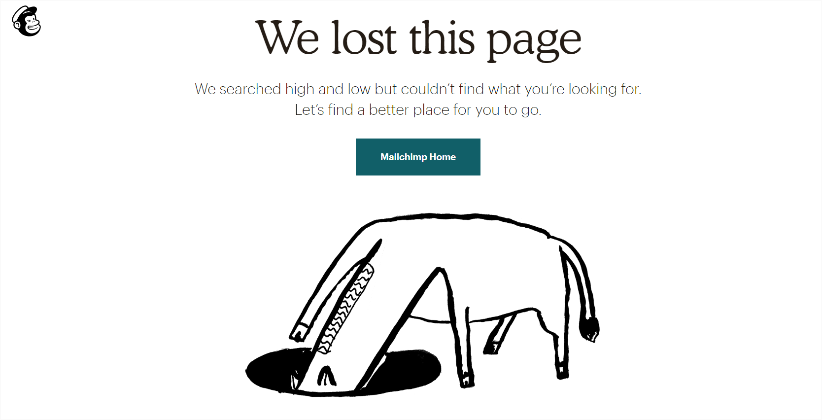
This is one of our favorite best 404 page designs. MailChimp tells visitors that their query wasn’t found. The horse in the image reminds users of the new characters in their updated visual identity. There’s no need to go back to the previous page to continue the search since a Mailchimp Home button is available.
9. eHarmony
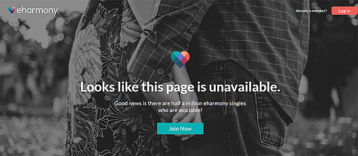
If it’s your first time with the website, it’ll be pretty clear to you what it’s about immediately after you see the beautiful image. Newcomers can sign up, and registered users can log in from the same location.
10. GoDaddy
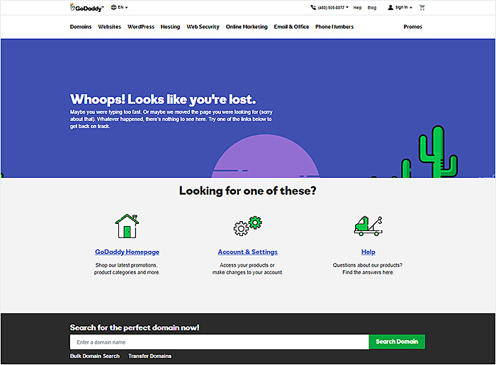
This page explains in detail what has happened and how to cope with the situation. Visitors are offered links to the main sections of the website, and they can utilize a search box. They can also contact the support team using a phone number available on the page.
Conclusion
Great user experience is what today’s visitors expect from any website. To ensure this, and to leave competitors in the dust, website owners should use a unique design for all the pages. A custom 404 page may help to increase conversions and boost sales. In this article, we discussed how to create a great design. We hope that the tips and 404 error page examples prepared by the AGENTE team will give you the inspiration you need.
What’s the best 404 page ever in your opinion? Share it with us via Facebook or Twitter.
Read also: How to make a Udemy-like website?
Rate this post!
168 ratings, average ratings is 3.8 out of 5
Related Posts
26 May 2022
10 Best Examples of Beautiful Blog Design | Agente
In this article, you'll find 10 best examples of beautiful blog design, along with the tips that can help you enchant visitors.
29 April 2022
How to Design a User Profile Page in 2022
User profiles can become a constant flow of customer-related data that is extremely useful for marketing. How to design a user profile page? Read in our new article.

06 November 2020
How to Perform UX Audit that Will Pay Back x2 | AGENTE
How to perform a successful user experience audit? Why does your company need one? In this article, you'll read about important steps to perform an audit, its cost and deliverables.

20 October 2020
How to Design a Website For Black Friday & Cyber Monday?
In this article, we will talk about how to create an attractive and selling website design for Black Friday and Cyber Monday. Let's take a closer look at each step of creating such a website.

01 October 2020
Your Ultimate Guide to Successful User Experience Research
Your UX Research step-by-step guide to benefits, approaches, methods, tools, conferences, and influencers.

What Is a UX Audit and How Does It Help In Pandemic?
For those businesses that rely heavily on the customers from the internet, it is the time to make sure their brand touchpoint on the internet works well. That’s where the UX audit comes into play because it is one guaranteed way to find out whether the website or app performs at its best.
Let's talk
Is there a challenge your organization or company needs help solving? We’d love to discuss it.

Managing Director, Partner
Andrew Terehin

Thank You!
Your message has been successfully sent.
We will contact you very soon.
