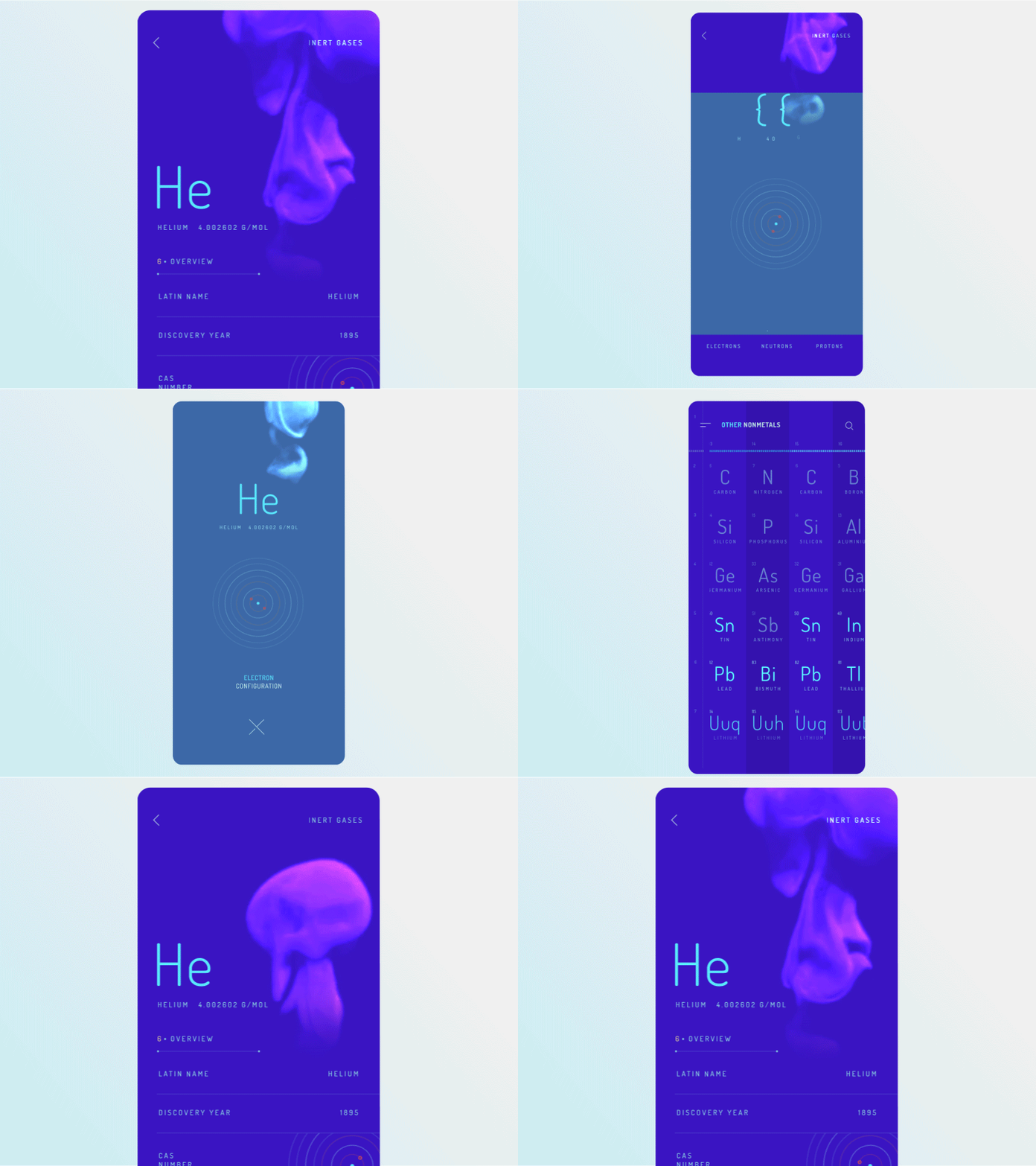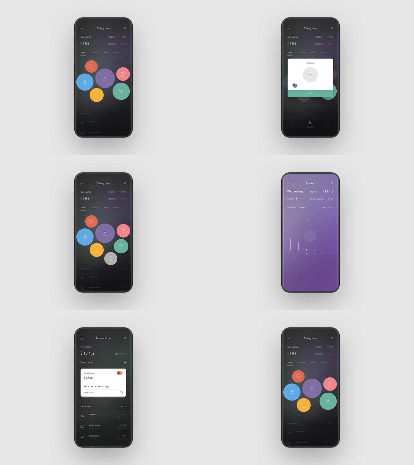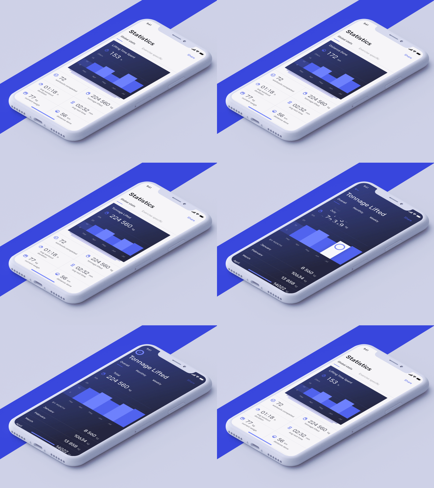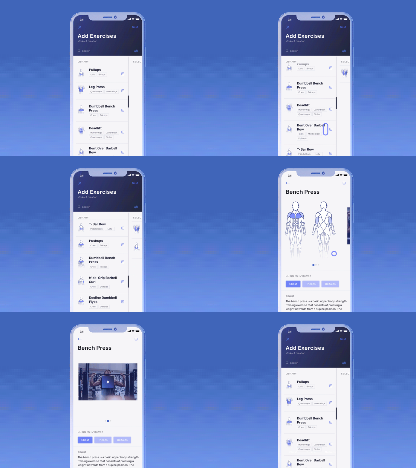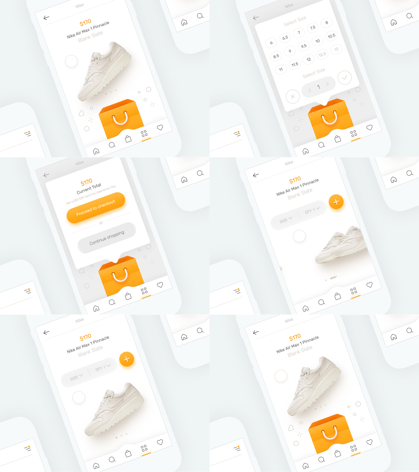
Looking for a way to notify users about what's going on in a mobile app and improve its overall UX? Look no further: animation used in mobile applications can do the trick for you. Introduce it to your app to add visual cues, and you will never regret it.
When it comes to mobile apps, animation is extremely helpful when UI changes are involved (e.g., when new content is loading). This gives your product a polished look and feel.
But be cautious about using animation in mobile apps — you can have too much of a good thing.
When is it appropriate to use animation in a mobile app? Read on this post to find it out.
Displaying a Hierarchy of UI Elements
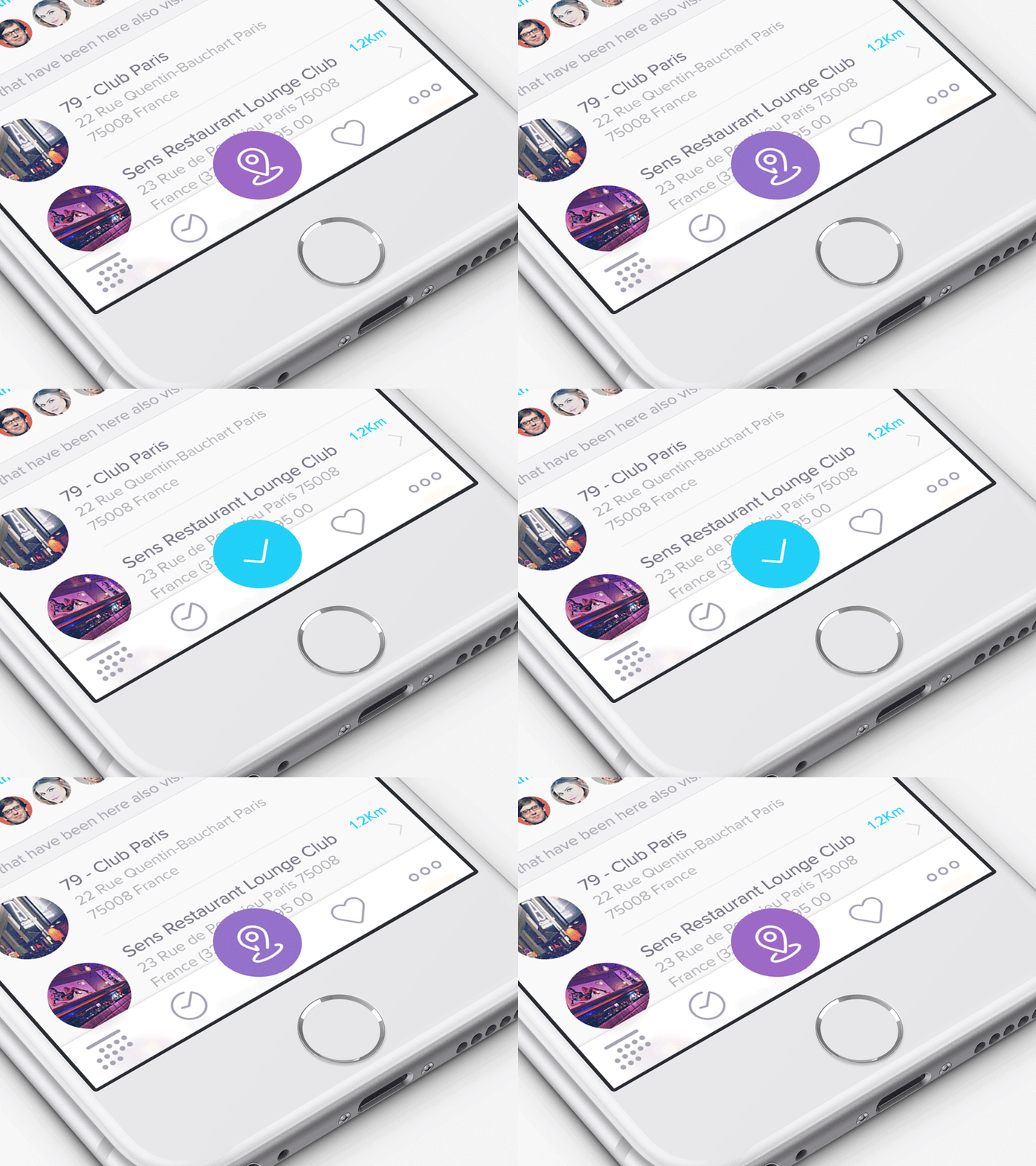
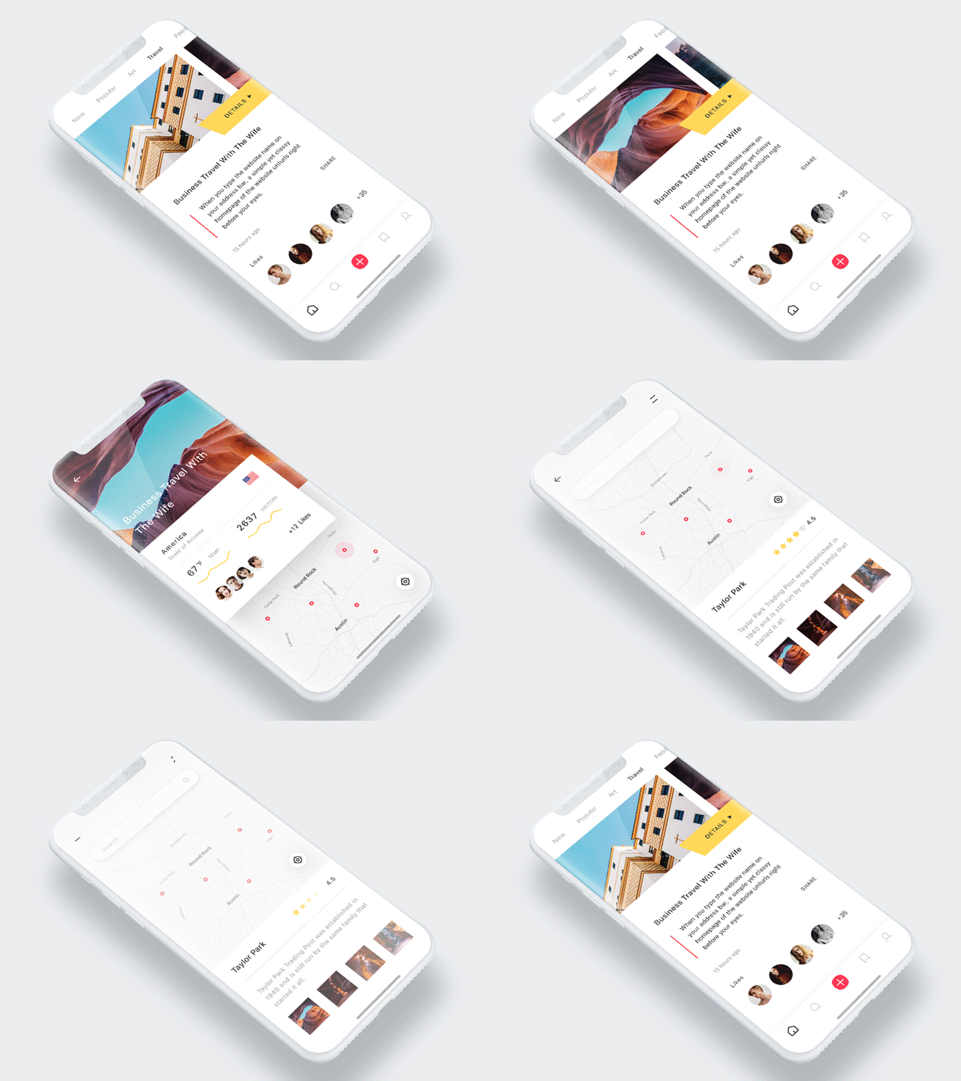
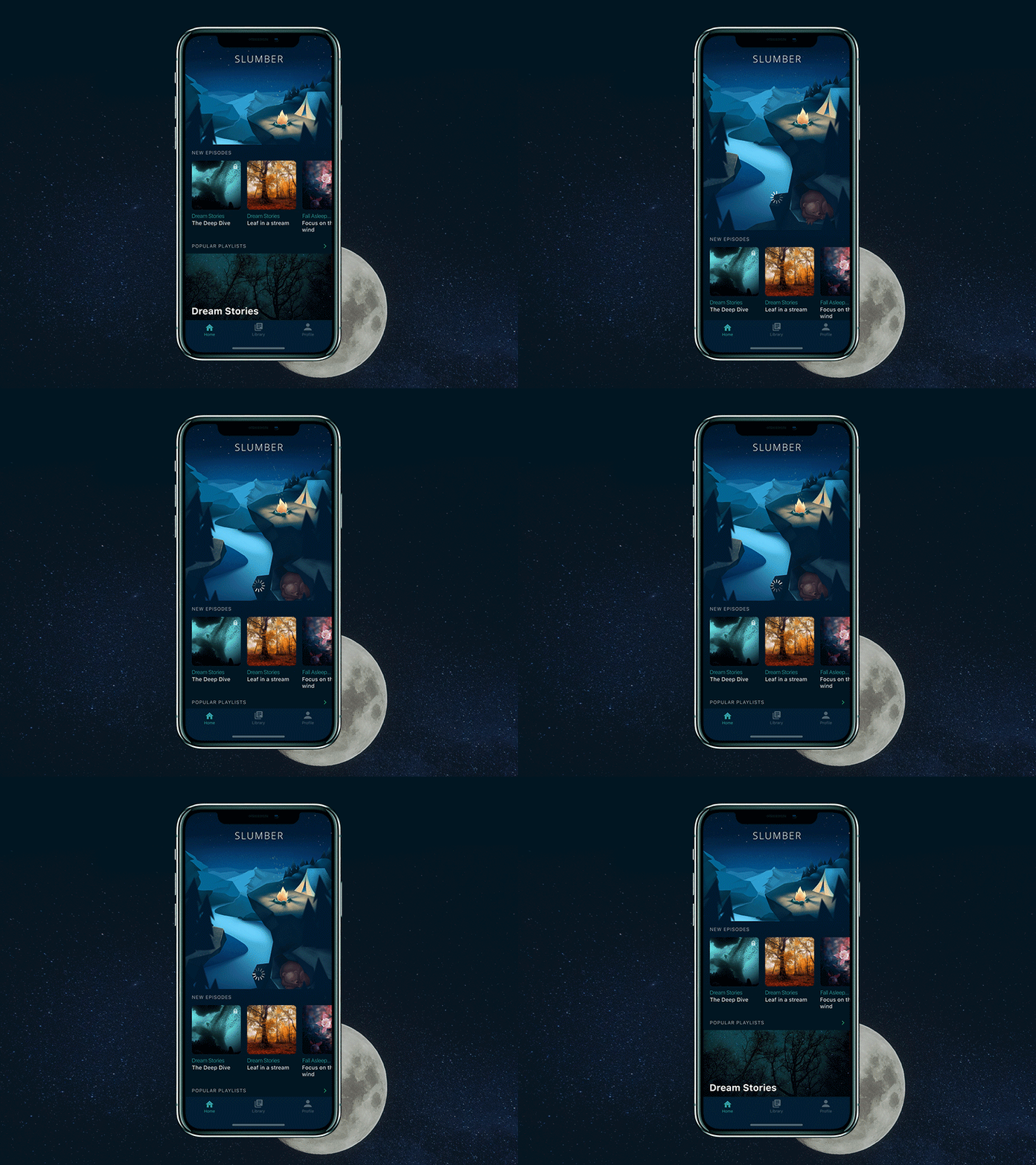
Mobile animation is frequently put to use to show motion that indicates how one UI element relates to another. In a nutshell, it reflects hierarchy — a relationship between parent and child elements on a mobile screen.
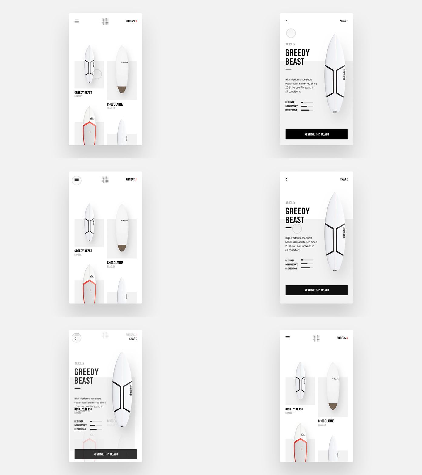
Navigation transitions are such motions. They take place when a user moves from one screen to another in an app.
Source: Dribbble
Providing a User Status Update and Visual Feedback
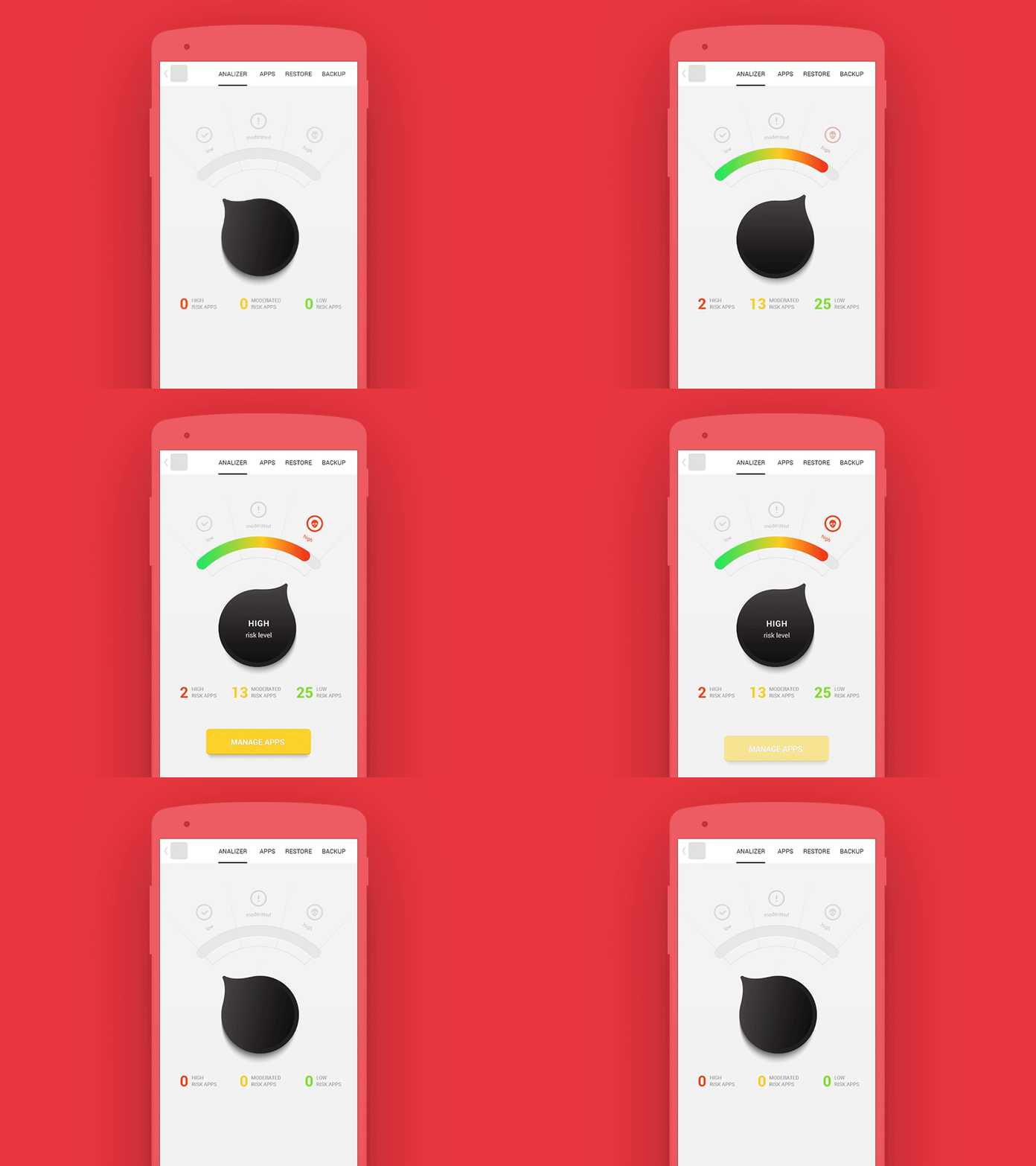
When users are interacting with an app they expect some sort of feedback or update on the status of the action they've just made.
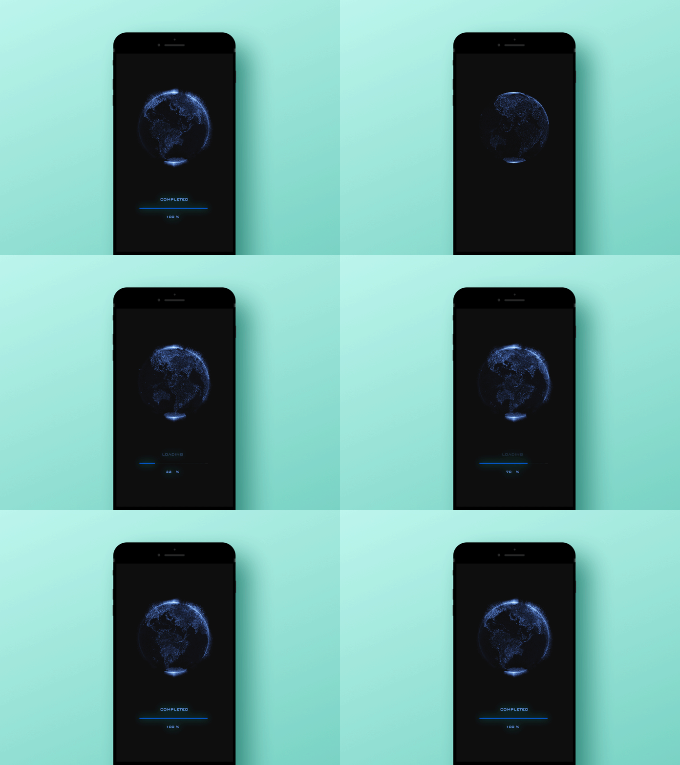
What would you choose while waiting for an app to load — a static image or an animated one? You would certainly opt for the second option.
Such a decision stems from our natural desire to get a visual response from the real world in order to understand what's happening at a specific moment. And the same desire is transferred to the digital world.
So utilize this tactic to provide users with timely feedback, or to update them on progress. For instance, identify an image upload process using an animated progress bar.
Serving Educational Purposes
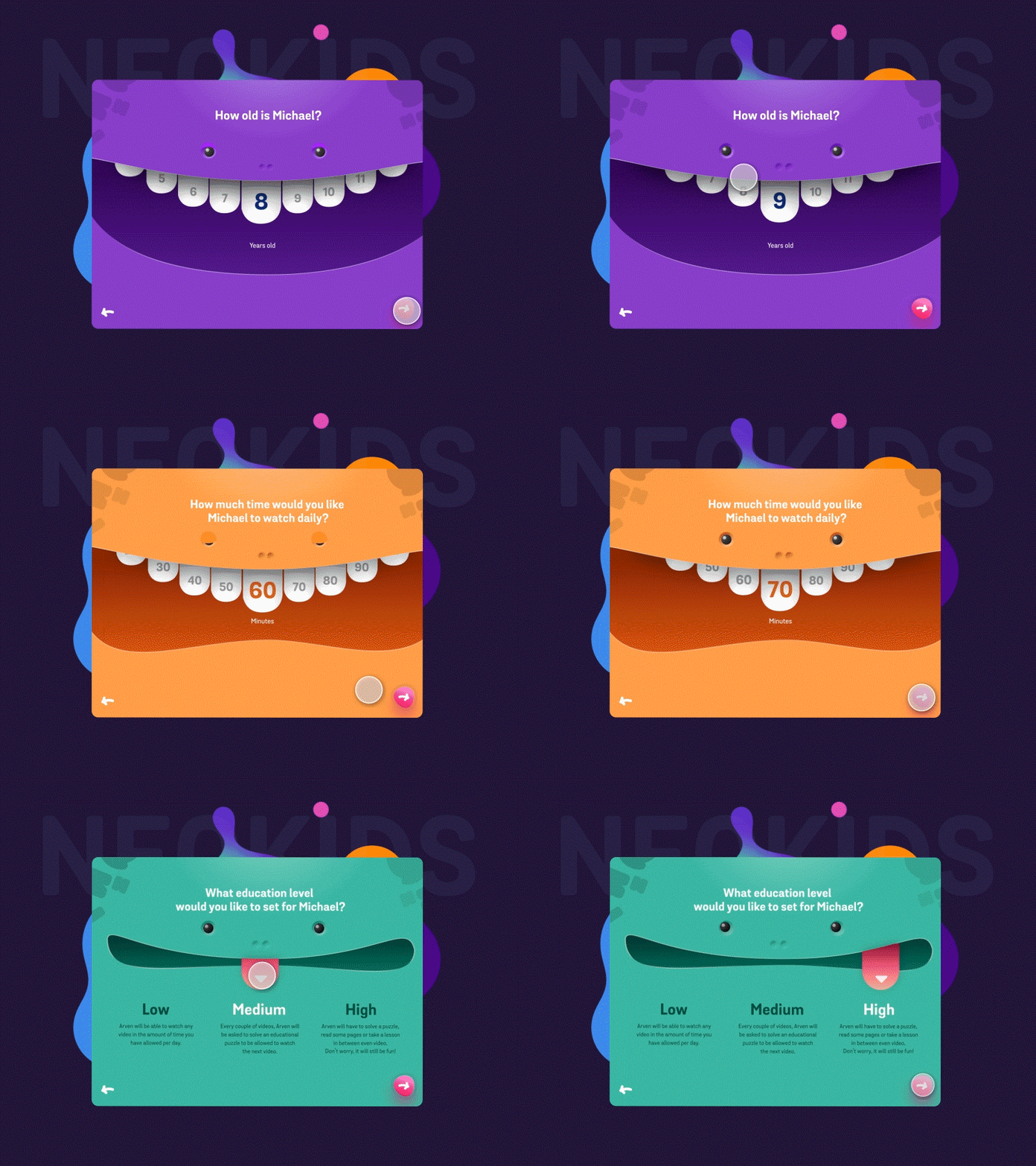
Mobile UI animations can be a helpful guide for first-time or non-tech-savvy users. Employ them to offer suggestions or to indicate how to carry out in-app actions.
You can also make the onboarding process less painful by taking advantage of mobile animation as a training tool.
Long (and let's be frank, boring) user guides often remain unused, aren’t they? But explaining features through mobile app animation will work for sure. Why? Put simply, they are never boring. Animated motions not only educate but entertain viewers.
They also help to make a favorable first impression and potentially increase user involvement.
Source: Dribbble
Adding a Character to a Mobile App
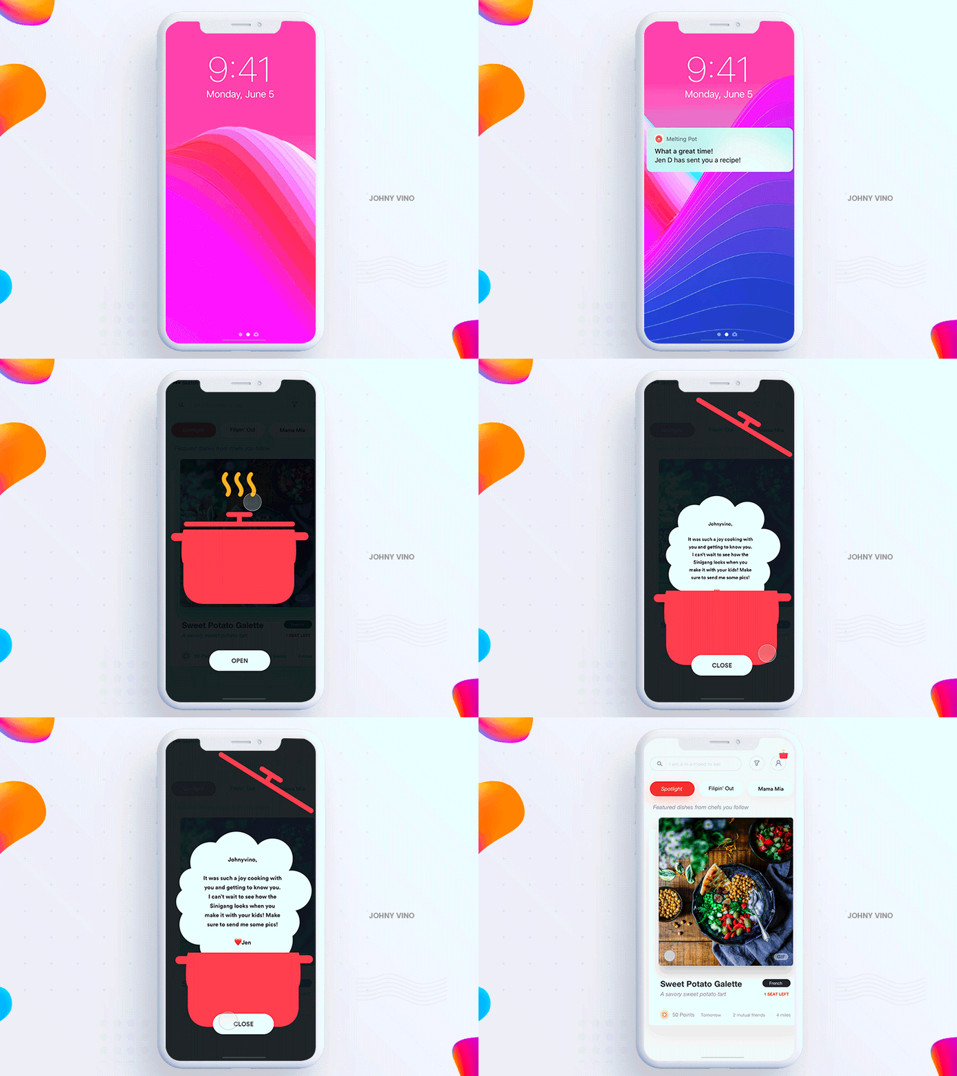
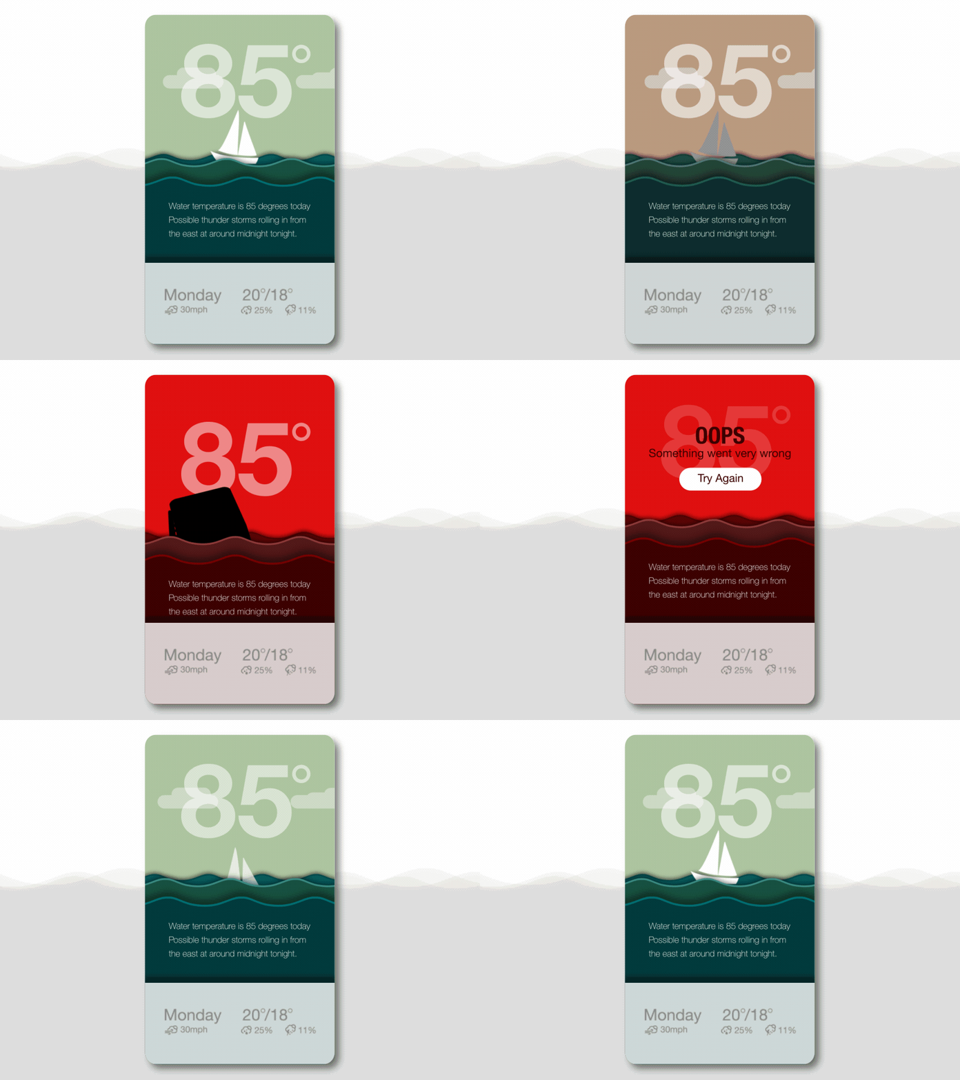
Creating animations for mobile applications is also useful when you wish to add character and/or appeal to mobile interactions.
Taking into consideration the fact that thousands of apps are launched every year, such an approach will definitely grant you a competitive advantage.
Source: Dribbble
Product Demos
Creating animated product demos is what most app development companies do to exhibit product functionality, either to developers who will be working on it or to the customer. The coding for mobile animations that have been used for a demo can be reused later on in an app if a tool where the demo was created supports code export.
Source: Dribbble
Design Principles to Follow
When working on a mobile UI animation, make sure you keep some fundamental principles in mind. They all are covered below.
Informational Value
A good animation serves as a means of providing some information, such as the elements hierarchy, available actions, etc.
Removal of Distractions
Motion is crucial for eliminating distractions. It helps a person to concentrate on what is really important.
Expressiveness
Motion can not only add character to in-app interactions and liven them up but it can also convey a personality of a brand and its style. This is essential when we speak about an app released by a company to offer its products and services to the audience.
Tools for Crafting Animation
There are hundreds, if not thousands, of solutions for creating animated interfaces on the market like Hype, Atomic, and ProtoPie. You can opt for any of them. But first take a look at the proven tools with which you will certainly get what you need.
Adobe After Effects
This software is a perfect choice for mobile animations. It has an extensive toolset that enables the creation of great motion graphics with dynamic and expressive visual effects. Though AE may be difficult to use initially, there are numerous video tutorials on the web help you master it.
Integrating animations into a mobile product is quite easy — export them in a JSON file with Bodymovin and import them into your project with, for example, Lottie.
Principle
Though this solution is available to MacOS users only, it is raved about by the design community. It is also chosen by many world-famous brands such as Netflix, Facebook, and Google. This easy-to-use design tool is particularly suitable for layouts with screens that transition into each other.
This tool gives you the freedom of choice — it has no predefined transitions. Like experiments? Go on and create a custom interaction with Principle!
GsapTools
This tool is not directly linked with creating motion, but we still included it in this list, and here’s why: this solution is indispensable for debugging GSAP animations. Please note that it currently works with React.
Killer Design Examples
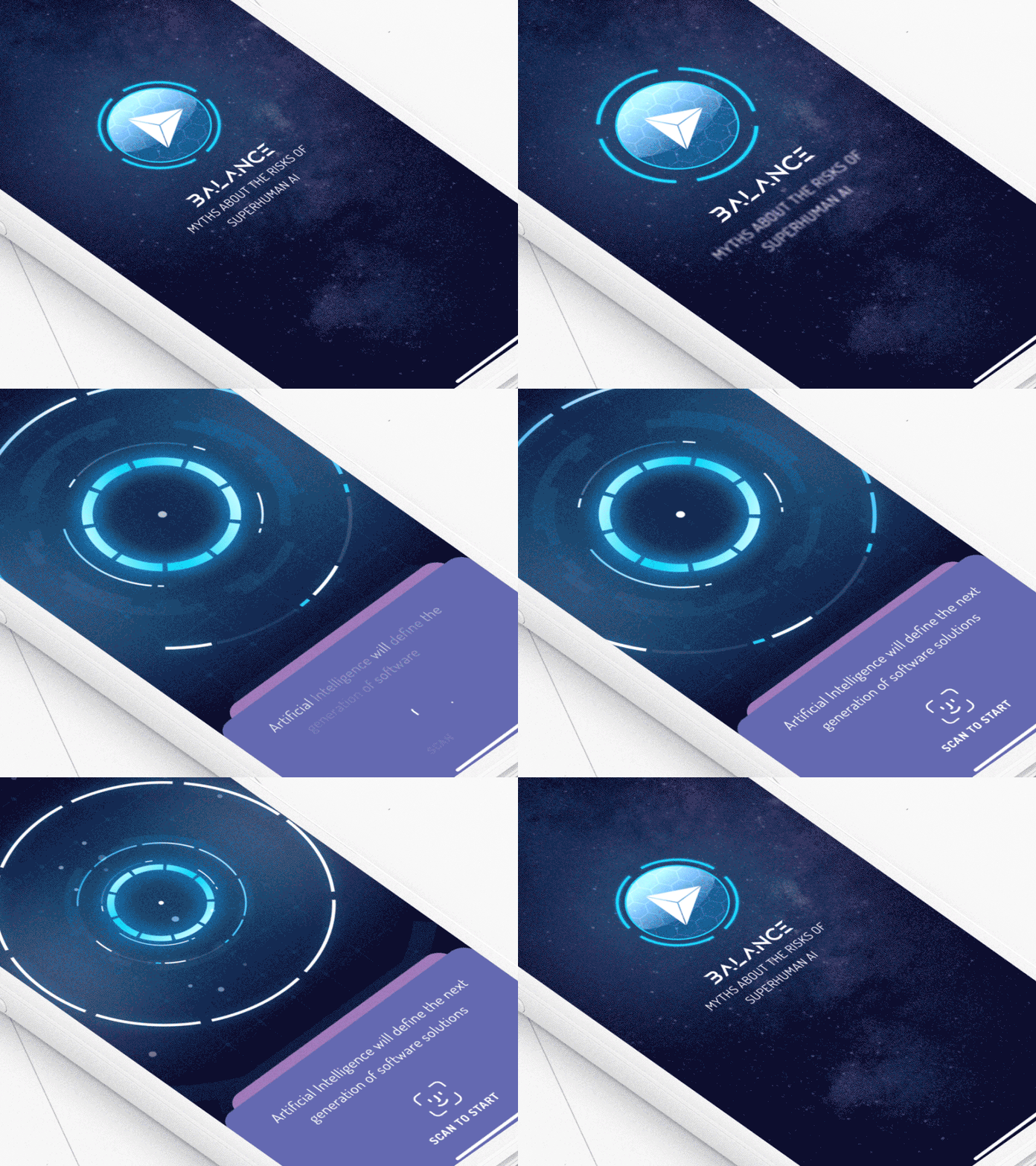
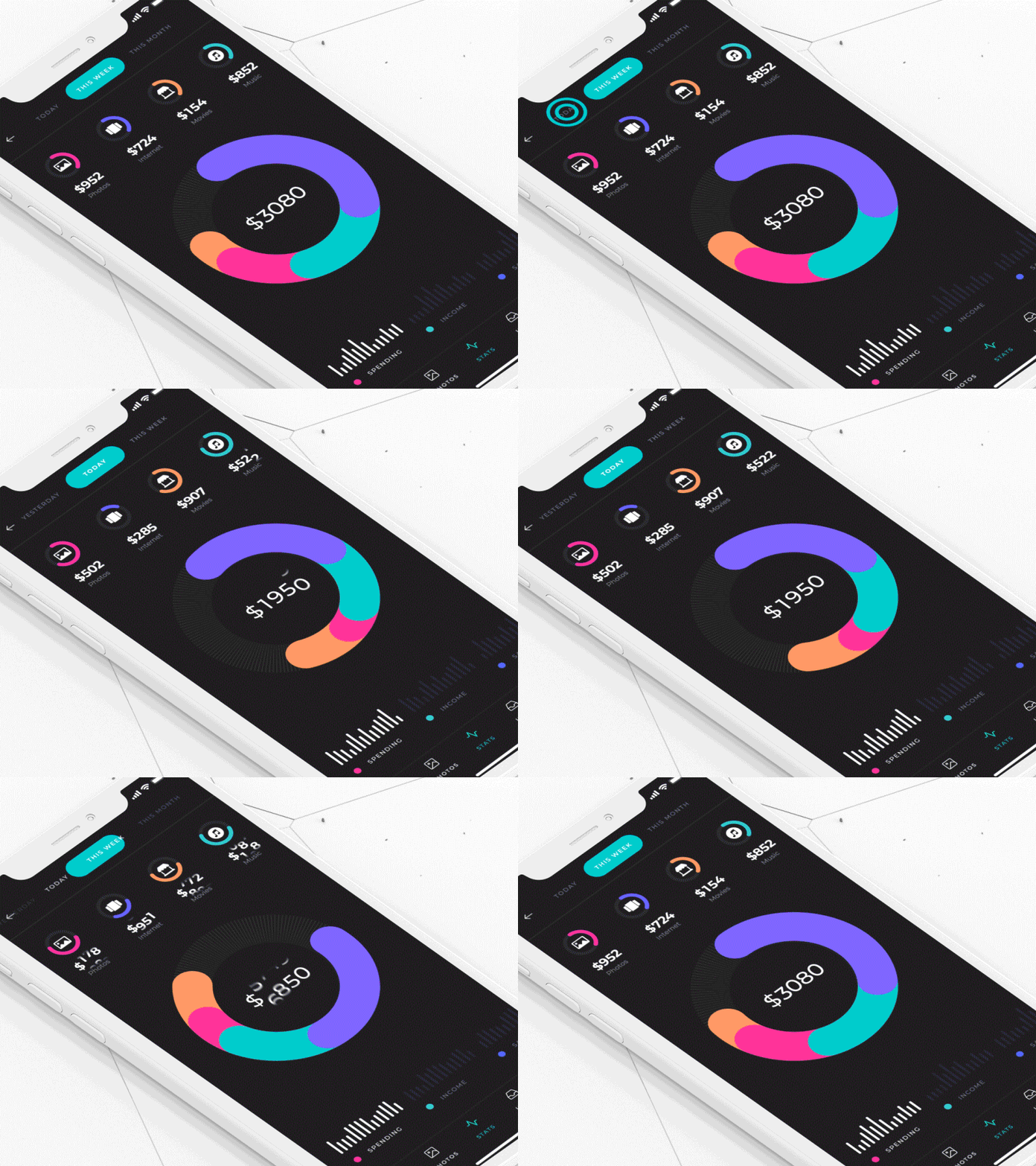
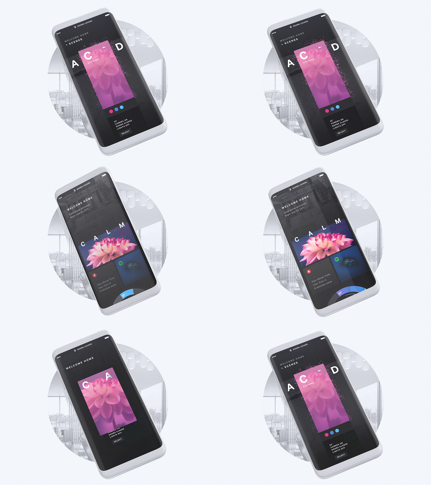
Are you still uncertain whether to add animations to your app? Check out the stunning examples we have prepared for you and all your doubts will disappear.
Source: Dribbble
Source: Dribbble
Source: Dribbble
Source: Dribbble
Source: Dribbble
Source: Dribbble
Source: Dribbble
Source: Dribbble
Source: Behance
Source: Behance
Source: Dribbble
Source: Dribbble
Source: Dribbble
Source: Dribbble
Source: Dribbble
Source: Dribbble
Source: Dribbble
Source: Dribbble
Source: Dribbble
Source: Dribbble
Summing Up
Mobile apps and motion design should go hand in hand. Mobile app animations can improve navigation and interactions. They make UIs more interactive and entertaining.
Be careful when using them. Too many motions in a simple app may distract and even frustrate users. Before you start drawing and animating, think twice about when and where you will use mobile animations. They are like a final flourish for your app. So put functionality first and you’ll succeed.
Want to learn more or have a question? Don’t hesitate even a second, contact the AGENTE team today!
Rate this post!
795 ratings, average ratings is 3.9 out of 5
Related Posts

22 January 2024
Top 15 Software Project Risks and Mitigation Examples in 2024
Explore our guide to the top 15 software project risks and learn mitigation examples to ensure project success.

Travel Agency Website Development in 2024: Features, Tech Stack & Cost
Explore the world of Travel Agency Website Development, discover features, and get insights into the costs of building your online travel platform.
29 April 2022
How to Design a User Profile Page in 2022
User profiles can become a constant flow of customer-related data that is extremely useful for marketing. How to design a user profile page? Read in our new article.

How to Write a Project Brief for Websites & Mobile Apps the Right Way
We are talking about the importance of a project brief in the success of an app and website development There are many reasons for that, but a common one is a discrepancy between what a client had in mind and what was written in the design or app design brief template.
15 November 2018
How to Create Mobile App UX That Converts
Day after day, conversion optimization is becoming more sophisticated. What matters most in mobile apps if you want to make money? Learn about the most common mobile UX mistakes and get some advice on how to manage them.
How to Design a Pricing Page That Converts
A successful pricing page acts as a sales rep, enticing site visitors into making a purchase, launching a free trial or contacting a member of a sales team. In this article, Agente team gets down to the nitty-gritty of creating a high-converting one.
Let's talk
Is there a challenge your organization or company needs help solving? We’d love to discuss it.

Managing Director, Partner
Andrew Terehin

Thank You!
Your message has been successfully sent.
We will contact you very soon.

