Investing in UX is a smart business decision, as people have increased their time spent digitally. This trend also concerns health.
Patients find healthcare providers online and make their decision about the qualities of services based on how the website is designed. Visual and written content, as well as a marketing strategy, are important, but how users feel when they visit the website is of primary significance.
A healthcare website is more than an advertisement for a provider. It should be an educational and reassuring platform for prospective patients.
In this article, we’ll look into the best practices in healthcare website design and the key features the best medical websites should have.
Best practices
Data visualization techniques
Ninety percent of the information transmitted to the brain is visual. People come across gigabytes of data online and grab only the one which is well-interpreted.
Presenting key insights in charts or graphs to visualize significant amounts of complex data is more accessible than relying on spreadsheets or reports.
Here’s a list of essential data visualization tips:
- Use infographics with minimum text. Include charts, maps, pie charts, and gauge charts.
- Choose a color scheme and be consistent in it throughout the website. Use clear contrasts to distinguish important information.
- Create a clear layout and hierarchy to prioritize information.
- Include comparisons. Present two graphs together, each showing contrasting versions of the same information over a particular timeframe. For example, the number of satisfied patients last year and this year.
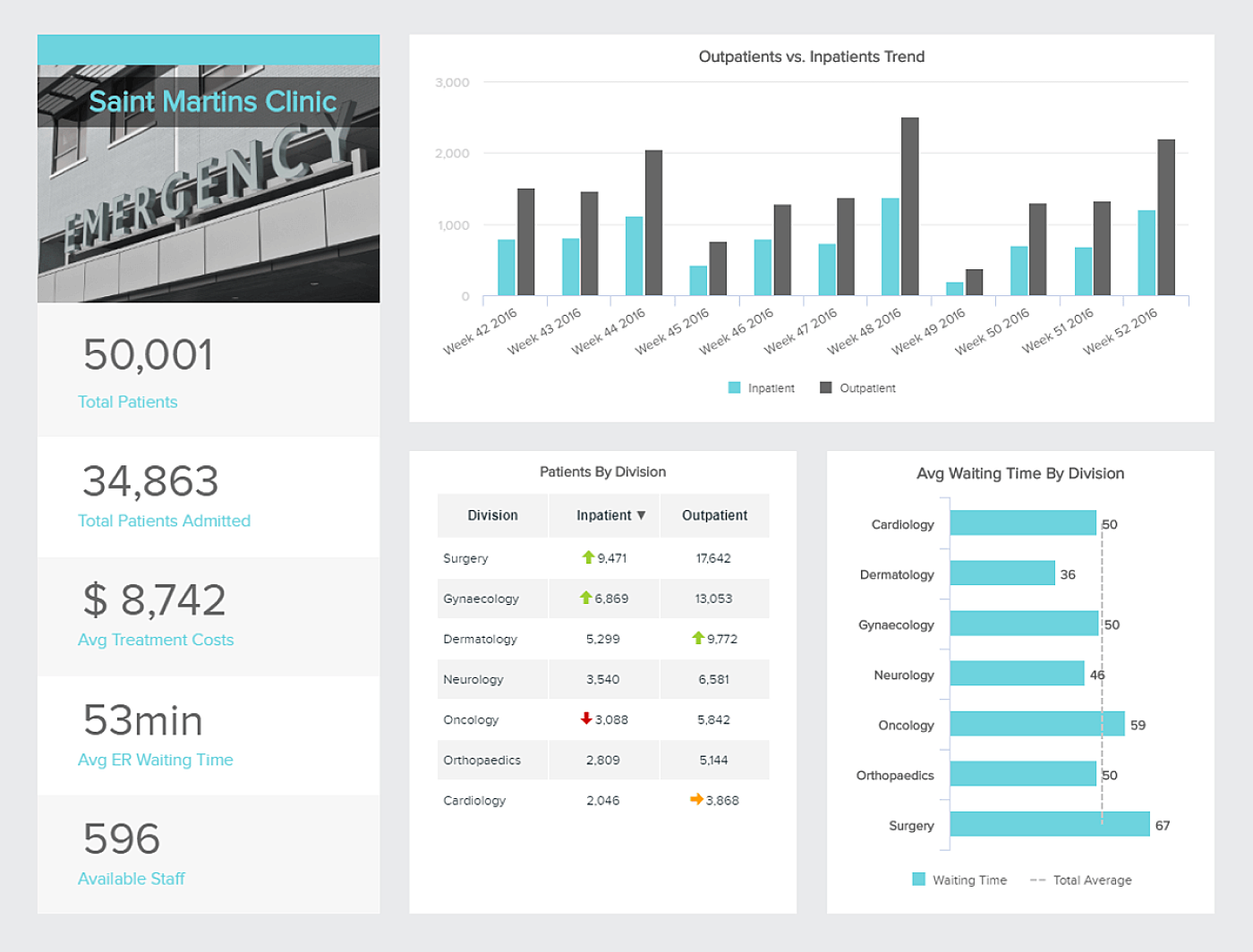
Source: Data Pine
Adequate interface across multiple devices
Mobile accounts for around half of web traffic worldwide. In the first quarter of 2020, mobile devices have already generated 51.92 percent of global website traffic, consistently hovering around the 50 percent mark since the beginning of 2017.
In all probability, most of the patients will visit your website through a mobile device. That’s why make sure the website is equally usable on computers, mobile phones, and tablets.
Take a look at Google recommendations on how to make your website work on mobile devices.
Speed
Remember, high-performance websites increase visitor engagement. Keep page and image weight small. Avoid over-downloading of high-res images. PageSpeed Insights is a great tool to make your pages fast on all devices.
Usability
- Use descriptive buttons to help users understand where they are. For example, “Step 1 of 3” instead of “Next”.
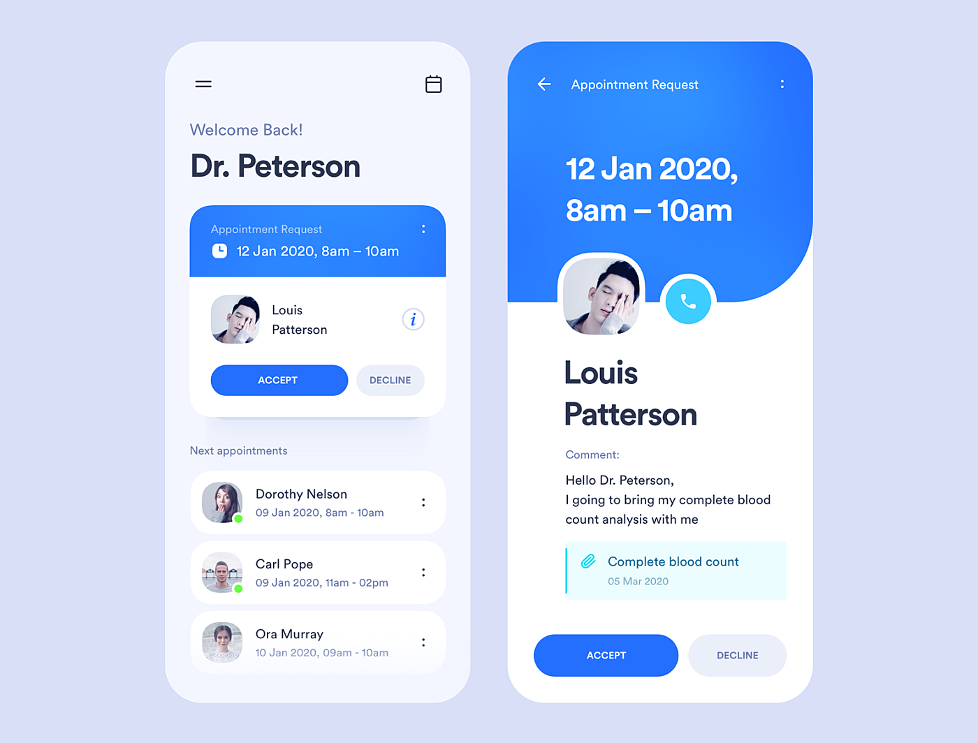
Source: Dribbble
- Touch target size should be at least 7mm, up to 10mm.
- Font size should be at least 10 pixels for better visibility.
- Adapt hover to mobile screens. Choose touch and hold or swipe left/right.
- Be careful with pop-ups. The following techniques make content less accessible to the user.
- Showing a pop-up that either immediately covers the main content when the user navigates to a page from the search results or while they are looking through the page.
- Displaying a standalone pop-up that the user has to dismiss before accessing the content
Pop-ups on mobile devices can be replaced with in-text hyperlinks and call-to-action prompts.
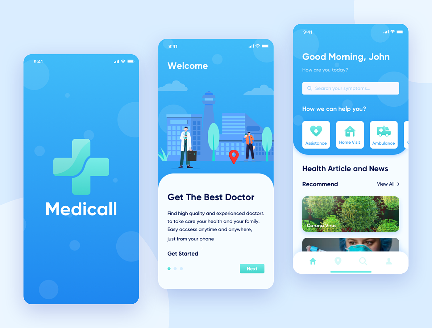
Source: Dribbble
Content
- Use HTML 5 instead of Flash to ensure videos work.
- Don’t try to pack a mobile page with information. The standard recommendation is that there should be no more than between 30 and 40 characters in a line. Anything more or less could affect readability adversely.
Consistency
Create a pattern library (a collection of user interface design elements) or a design system. It's a combination of design standards, tools, deliverables, and style guides that help companies build digital products and then maintain them with a modular approach.
Accessibility for people with disabilities
Follow these simple tips:
- Use alt tags. These are little words that pop up when you hover your mouse over a website. People with visual impairment use a screen reader (a program that reads text on a website out loud). All alt tags are read aloud and are the only way a user knows what the image is.
- Write subtitles and transcripts. All videos on your healthcare website should have transcription.
- Put periods in abbreviations. For example H.I.P.A.A. instead of HIPAA. A screen reader won't recognize the abbreviation without periods.
- Underline links or make sure that there is a color contrast between hyperlinked text and regular text. Thit way, colorblind users will be able to find a link immediately.
- Keep your copy simple. It’s extremely helpful for elderly people and those with learning disabilities. Break the text into smaller paragraphs. Use simple, straightforward language in the active voice.
Content structure with headings
Section headings (e.g., <h1>, <h2>) with large or bold text can help quickly scan and understand web pages without fishing for the main ideas. HTML headings are classified starting with level 1 and ending at level 6. Headings on well-designed web pages will form an outline of the page’s content.
Such content structure also helps users with visual disabilities who use assistive technologies to detect subjects covered in the text and navigate quickly to a specific section.
Space
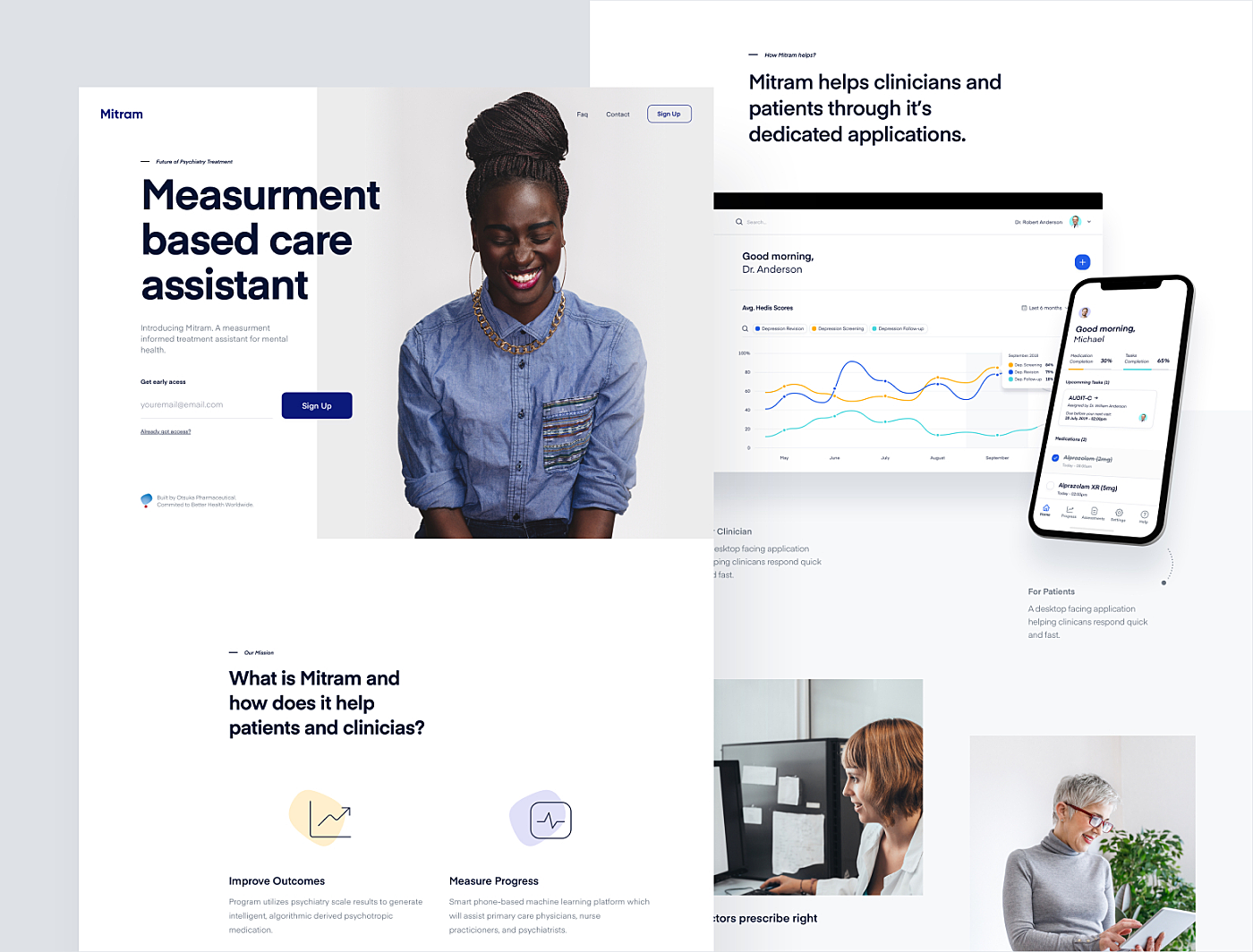
Let the page breathe. To avoid logical parts from blending in, keep them separate inserting a large space (at least 120 px) between them. For easy navigation, split the text into paragraphs or introduce breaks such as an image or a key phrase. A wall of text makes reading difficult to understand.
Source: Mitram
Website search
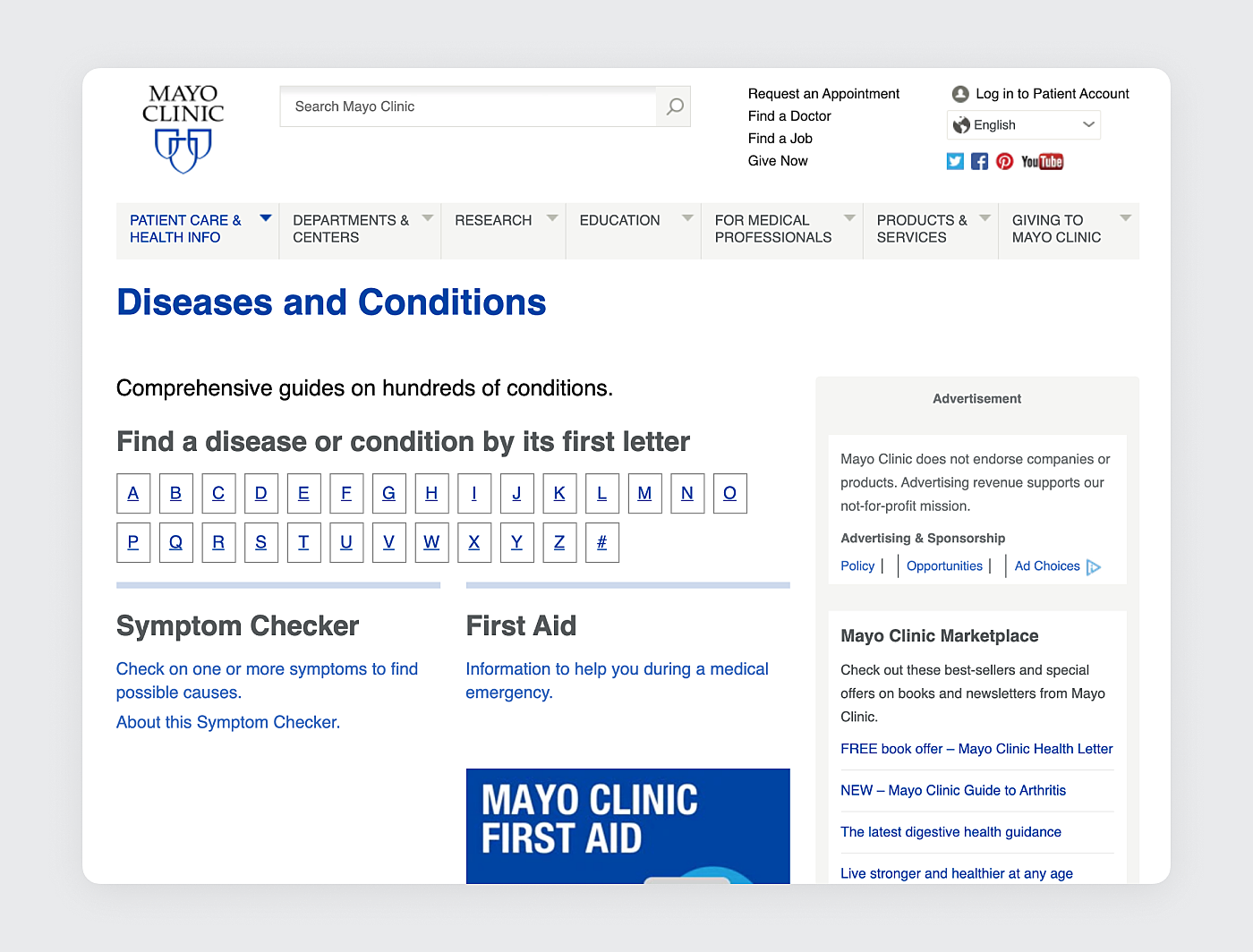
Most of the users don’t have enough time to go over a healthcare website to find particular information. A robust keyword search feature will help them filter searches by criteria, such as news, medical services, and events, providers and locations. It’s a good practice to feature a listing of recent searches in the left/right margin that allows users to track their search history.
Source: Mayo Clinic
Separate navigation for patients and healthcare providers
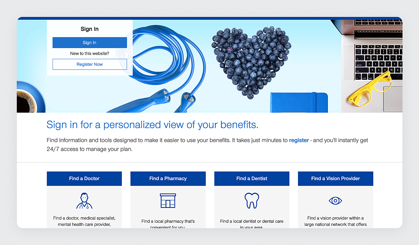
Patients and healthcare providers usually need different information. That’s why it’s worth considering to set up a separate version of a website for each audience.
Priority information for patients: doctors, appointments, disease description, treatment, information about drugs (benefits, side effects, affordability).
Priority information for healthcare providers: appointments, prescribing information, information about drugs, mechanism of action.
Source: United Healthcare
Reliable data
Best health websites minimize marketing and become a source of reliable information for both patients and healthcare providers. Here are some tips on how to do that:
- Links to original research and clinical trials.
- Always up-to-date information.
- Images of real people, true case studies, and testimonies from patients and caregivers.
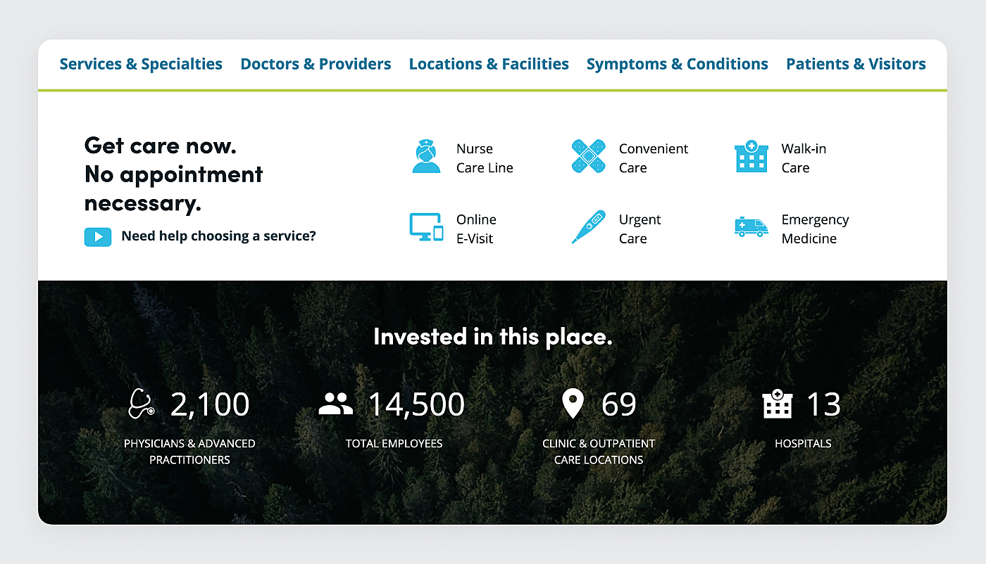
Your website should also include proof of your medical authority and expertise, namely:
- Awards and achievements.
- Rankings in “Best of” publications.
- Affiliations.
- Doctor pedigrees.
- Associations.
Source: Essentia Health
Access to an online patient portal
An online patient portal is a secure online website that gives patients convenient 24-hour access to personal health information and connects them with doctors. It also keeps doctors in the know about their appointments.
Healthcare providers should have the ability to access online patient portals through the website as well.
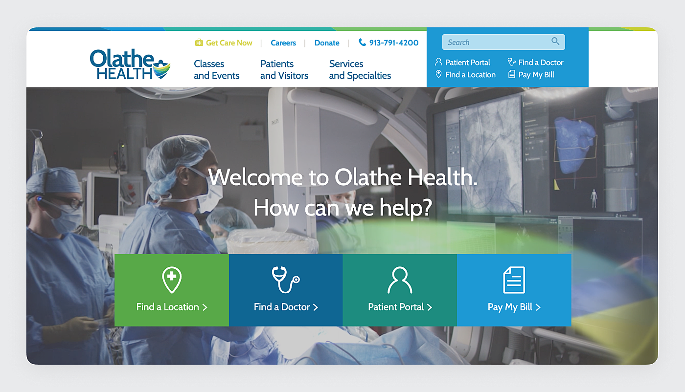
Source: Olathe Health
Secure web presence
Every website related to healthcare should meet the standards of H.I.P.A.A. Security Rule. It provides guidelines for the transmission of electronic patient health information and states who has access to that information.
Our Experience
For years, we’ve been developing custom healthcare apps, mHealth and telehealth solutions that address the most acute challenges of medical providers. Take a look at some of the cases.
Medical website
This is a website for a pharmaceutical company. Our designers meticulously picked up the color palette varying shades of blue throughout the website. It helps to maintain continuity and a sense of cohesion. We see a healthy proportion between images and text, which makes the page look neat and not overloaded with information. All the key functions like checkout, ordering, and product range stand out and catch the user’s attention.
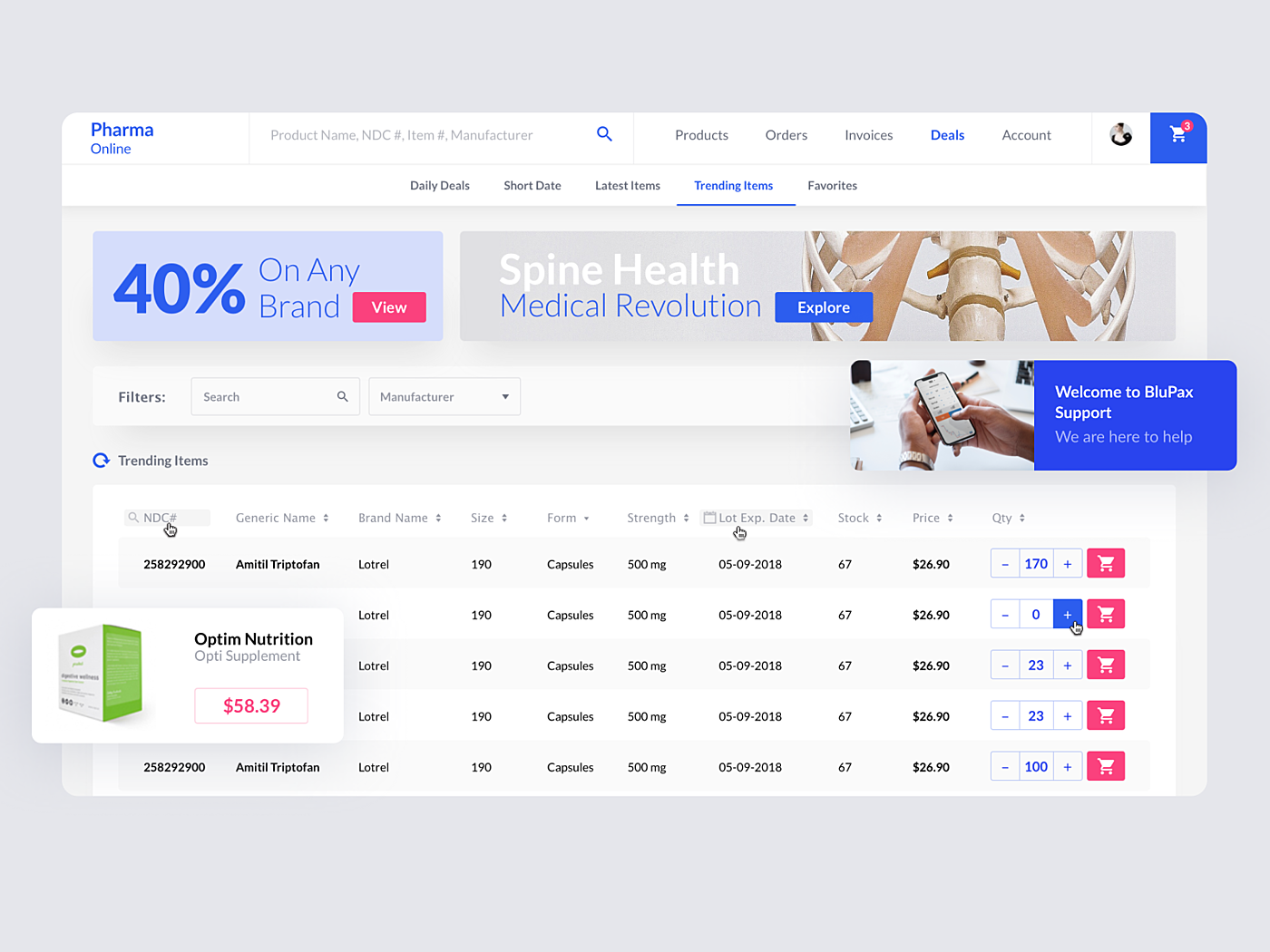
Source: Agente
Mobile patient portal
One of our recent works is a mobile patient portal allowing users to store and edit patient records, share patient check-up history, make notes and communicate with the healthcare provider. As you can see,
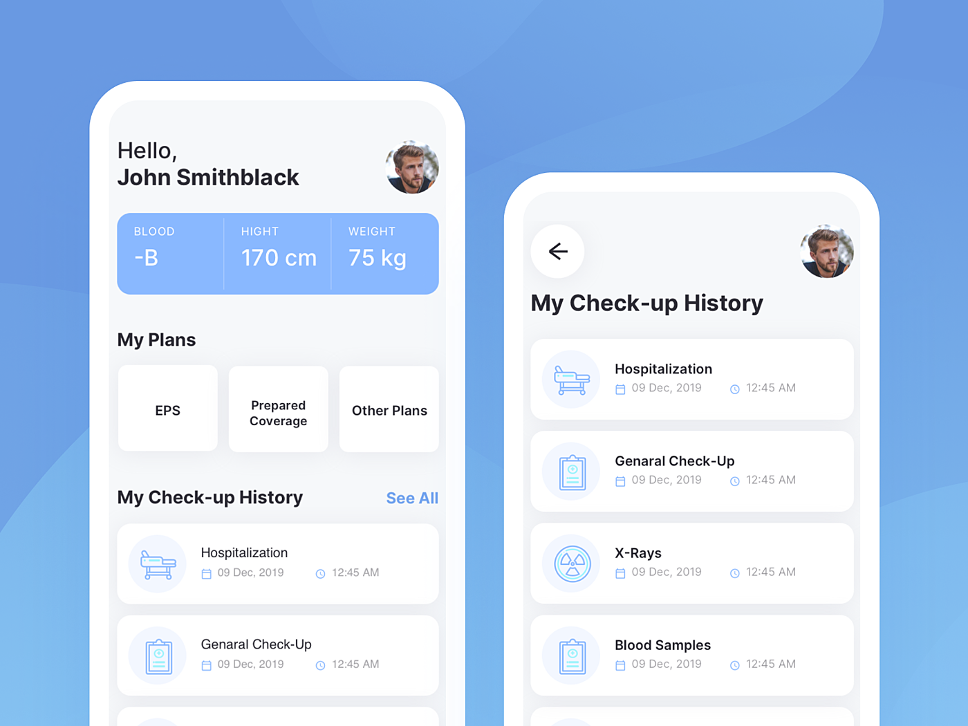
Source: Agente
Clinical management system
This was a long-term project clinical management system for a non-profit medical resource organization.
Summary
For the finale let’s go over healthcare website design tips that make your online resource stand out:
- Data visualization where possible
- Adequate view across devices
- Accessibility for people with disabilities
- Clear content structure
- Simple copy
- Reliable data
- Robust search tool
- Separate versions for healthcare providers and patients
- Access to the online patient portal
- Secure web presence.
Agente has always put these guidelines into practice designing healthcare solutions for companies across business sectors. We’ll be happy to hear from you and assist with a digital presence.
Check out our latest article: How to create an online course website?
Rate this post!
189 ratings, average ratings is 4.9 out of 5
Related Posts
14 May 2020
What is an Online Patient Portal and Why Your Clinic Needs One?
Find out how an online patient portal app can streamline the work and engage patients in health organizations.

23 July 2019
AGENTE Recognized as Top UX Designer in Belarus and the UK
We are so thankful for our customers for taking the time to leave us reviews and for helping us achieve such amazing recognition as Top UX Design company!

24 August 2017
10 Best Medical Website Design Examples
Today the number of Internet users is enormous, and it is still on the rise. According to a study by Pew Research Center, approximately nine out of ten adults use the Internet in the U.S. alone. The Internet has turned into a valuable source of information. For instance, more than 70% of connected adults look online for health information.

16 January 2024
ChatGPT Plugin Development: Features and Benefits for Business
Explore the process of crafting a ChatGPT plugin tailored precisely to meet your unique business requirements.

09 May 2024
Top 7 Open-Source LLMs for 2024
Here, we break down everything you need to know about open source LLM models: top 7 offerings on the market, their pros, cons, and capabilities.

19 January 2024
AI Model Fine-Tuning: How to Use Your Organization's Data?
Organizations are transitioning from generic solutions to hyper-customized intelligence, seeking AI models designed to address their unique challenges and propel them toward strategic objectives.
This demand has propelled fine-tuning to the forefront of AI development.
Let's talk
Is there a challenge your organization or company needs help solving? We’d love to discuss it.

Managing Director, Partner
Andrew Terehin

Thank You!
Your message has been successfully sent.
We will contact you very soon.


