In today’s world of startups, small and medium businesses that become more and more popular every single day it is all about your company’s business strategy that will help you position the company on the overcrowded marketplace and ensure growth and stability.
Basically the strategy is a plan that consists of different components and depending on the sphere of business these components may vary. But in order to be successful a business owner should be able to manage effectively all those components, but focusing on the core. And if the business is built around a mobile app, then mobile app UX design strategy should be the center of attention.
In this article we’ll tell you how to build a mobile app UX design strategy that would help you reach your goal and optimize the process of building an app.
Mobile app UX strategy main components
1) Start with research and analyses.
Basically, any strategy, regardless of whether it is UX strategy for mobile app or any other kind of strategy should start with research and analyses. And here are just some basic questions that need to be answered as a result.
• Who are the target audience?
How old they are? What gadgets they use? What are their hobbies or work? Knowing your target audience is immensely important, and the more your know the better. Ideally this information can be obtained through the set of user interviews.
• Who are your competitors?
This question should actually be a part of general strategy, but from the mobile user experience design strategy perspective you need to look closer at their products, find out their main features, find out what users like and don’t like about their apps. You can take all the findings into account while working on your app.
• What problem the app solves?
What you can offer your precious users? Answering this question will also help prioritize app’s features.
• When and how the app will be used?
If a user opens the app on their way back home somewhere in the subway station or they if it used every morning after they wake up, the apps peculiarities would be different.

All the results obtained from the research phase will help in the next phase, the main purpose of which is to visualize your users and their behaviour.
2) Move on to user story
If your audience is diverse or there are several roles within our app such as buyer and seller, for instance, then it will be good to know how each group will interact with the app. That is why the set of all interactions with your app need to be created. The main question here is what this type of user can do with our app. Here is an example of the user story: a 38 year old traveller John wants to buy a pair of hiking boots.
3) Create a set of user scenarios
User story consists of scenarios that describe general actions that need to be taken to accomplish a task. Following the above mentioned example, traveller John needs to go to the store with the hiking equipment, choose a pair of boots and pay for them.

4) Continue with use cases
Now when you have a set of user stories and user scenarios it is time for even more details. Take a user scenario and for each of the steps create use cases. They should be similar to the following
Use case A - John need to visit the store with the hiking equipment.
- John searches for the shop in the Internet.
- Several shops are compared.
- John finds a perfect store.
- John comes to the store.
Use case B - Choosing a pair of boots
- John comes to the shelves with boots.
- The amount of boots is overwhelming, so John decides to ask for assistance.
- The shop assistant asks John about the boots that he would like to have, compare the advantages of different models.
- John chooses one pair that he would like to buy.

5) Make user flows
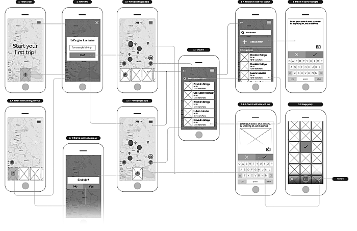
The purpose of user flows is to see how users would go from one screen to another to complete their tasks. Also it will help to find out the number of screens needed for the app. The best way to do that is to schematically visualize all the screens to make sure all the needed information is it its rightful place. This is when the Information Architecture comes into play. Please look at the example below that we created for the one of our clients. This user flow is designed for the TripTracker app, the main purpose of which was to collect traveling memories in easy way. As you can see there are lines showing the user flow from one screen to another.
6) Wireframe
Now when all the key tasks and scenarios are described, the next step is to create wireframes of all the screens. The goal of this step is to have layouts for the app screens. You need to keep in mind that the wireframes are designed to define the set of elements that should be presented on each screen so the graphic should be simple. And the detalization of the prototype depends on the needs, sometimes the block schemes can be enough and sometimes each and every drop-down should be shown. Usually we create wireframes with a medium or high detalization, as it helps to better image the final product. Below is an example of the prototypes were created for TripTracker app.

7) User testing
It is one of the best practices to do user testing. We put this after the wireframing because this is the time when first round of user testing can be made. The main idea is to have a user feedback on whether is was easy to find the needed info or complete tasks. It is an opportunity to test the layout. It is much easier and cost less to make changes in wireframes rather than in the fully developed app.

The key to success is a consistent systematic work. So when all this said and done the app will have very good chances to succeed.
One more thing to keep in mind.
Goals & Metrics
Any strategy requires the clearly defined goals.
• A big dream
This is the time to think big, set your most desireable goal that would become a guiding light of all your endeavours.
• Monthly goals
Divided by a certain periods these goals will let you know if you’re still on track, and you will be able to adjust as you go.
Also you should choose the right metrics that will help you to measure your success and find out whether you should improve some parts of your strategy.
Conclusion
There is no one-size-fits-all solution on how to build a perfect mobile app UX design strategy, so while searching for mobile user experience strategy example, please keep in mind that all businesses are different and even if you find a good example of 5 best mobile UX strategies then it doesn’t mean they will work for you. The methods and actions that need to be taken are already invented, you just need to find those that would suit your app best and develop a mobile UX strategy that would benefit your business. Agente is working with all kinds of businesses to help them build killer apps from scratch, focusing on creating a UX strategy for mobile applications that would guaranteed help to achieve big goals.
Rate this post!
246 ratings, average ratings is 4.7 out of 5
Related Posts

11 January 2024
Mobile-First Design: Full Guide for 2024
What is mobile first design? Well, the mobile first approach is a central principle of progressive enhancement. In a nutshell, it’s all about producing a small screen design and then scaling it up to other devices. In our new blog post, we cover some aspects that need to be taken into account when launching a mobile first web design project. We also share some outstanding design examples for your inspiration.

07 January 2024
The UX Audit: A Beginner's Guide For 2024
A user experience audit (UX audit) is a great way to reveal the non-perfect areas causing severe headaches for users, and to get recommendations on how to improve them to make it easier for visitors to reach their goals on the website, thus boosting conversions, improving user engagement, and generating more leads, among other benefits from a UX audit. Let's dig deeper into details in our new article.

22 April 2022
Pagination Design Examples and Best Practices
Structure and hierarchy help to simplify things and make them easier to read ⚡ In this article we will come across pagination design examples and best practices.

Infinite Scroll Tutorial: Implementation, Best Practices and Examples
Infinite scrolling was designed as a faster and user-friendlier alternative to pagination. But is that the case? In our new article, we delved into this web design technique and shared some best practices and examples of endless scroll implementation.

06 November 2020
How to Run a Product Design Workshop
Our secret of successful collaboration on product design is that each team member understands the product at its core. That’s why we leverage product design workshops at Agente when kick-starting new projects.
05 September 2018
7 Points About Accessibility in Web Design
Web accessibility is the practice of designing and creating websites in such a way that individuals with disabilities can use them. The importance of accessibility in web design is undeniable. To find out whether your site is accessible, you can read our new article.
Let's talk
Is there a challenge your organization or company needs help solving? We’d love to discuss it.

Managing Director, Partner
Andrew Terehin

Thank You!
Your message has been successfully sent.
We will contact you very soon.


