As an owner of an educational platform, you might face several exciting challenges related to the design of your educational website.
One of the major issues could be creating a user-friendly and visually appealing educational website design that captures the attention of your target audience. A well-designed education website should not only showcase the institution's mission and values but also provide easy access to relevant information for students, parents, and educators.
Another challenge could be optimizing your website for different devices and screen sizes, ensuring a seamless experience for users on both desktop and mobile platforms.
It is crucial to address these design issues to create a successful educational platform that attracts and retains users..
Based on the experience of the Agente team which provides LMS website design services, we are happy to share our knowledge on how to design for a revenue-generating educational website and provide you with the best examples.

Things to Consider in Educational Website Design
1. Set Up Your Goals
Education website design development starts like any other design.
You set up your business objective, define the target audience, and customize the website to achieve your goals.
For example, if you plan to create a website design for educational institutions, you should address both pupils and their parents, who will visit the site.
You’ll need to balance bold and colorful elements with informative content and easy navigation in order to appeal to both target groups.
2. Elaborate on Visuals
Remember our insights about color palettes for educational website design
in one of our blog posts?
And the education industry is no exception.
If you have a brand book for your educational institution, make sure your website colors match the existing scheme to create a homogeneous brand image.
For an e-learning platform, use neutral and convincing colors, for example blue, green, brown.
Highlight essential edtech design elements, such as headers, footers, CTA buttons with other hues matching the color palette.
3. Add Content and Media Elements
The well-structured, consistent, and meaningful copy is half the battle.
Here’s why: a website that combines useful content, and user-friendly elements of web design, will foster trusted long-term relationships with more students.
Media elements make the education website more attractive and the learning process more interactive.
4. Get Some Inspiration
Well, it’s not really the next step when thinking about education website development; inspiration is something that should follow you the whole way through.
However, best educational website design for physical institutions and online learning platforms will differ in their form and content.
Let’s overview the best educational website design features for each of the educational website types.
Read also: Awesome Examples of Game Website Designs
Features of Educational Website Design for University & School
Developing a good website design for educational institutions should attract new students and orient existing students.
The following education website ideas and features will ensure your site gets a better conversion rate and more visitors who will stay longer:
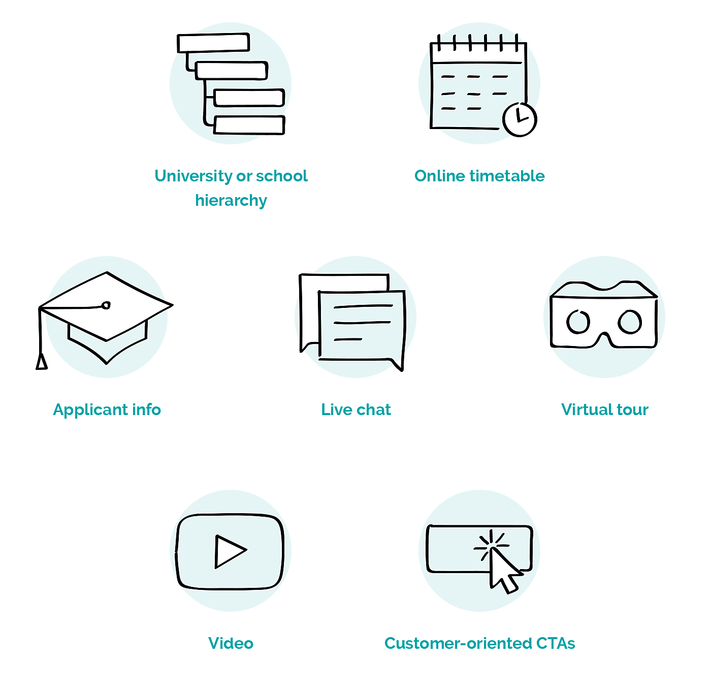
- University or school hierarch
Show how the faculties, courses, or subjects are arranged. Present the heads of departments, deans, and teachers. Make the site searchable across sections and publications.
- Online timetable
Timetable functionality goes without saying. However, some EdTech website designs and features are often overlooked. For example, for security, make the timetable available only after the student/teacher logs in. If the university has several buildings or departments across the city, it’s great to pin the studying locations to the map and provide directions.
- Applicant info
Applicants are a vital part of the target audience. Make sure to add some key dates of application and enrollment, including all relevant information. Let the visitors subscribe to notifications about the enrollment flow.
- Live chat
A live chat option throughout the website improves the user experience and helps you to generate leads. Voice interaction or chatbots are gaining more trust among millennial and generation Z users, so consider this option when defining the target audience.
- Virtual tour
Videos, photos, panoramas, or 3D tours will add to the student engagement and impress potential students, even before they step inside the campus.
- Video
If you want to go further in showing how amazing life inside your university is, shoot some videos around the campus with the help of drones. Then put the videos into the background of some banners, or create a separate section where potential students can watch them. Not only will it show how things are inside your institution, but it will also build trust and add to credibility.
- Customer-oriented CTAs
A direct and clear call to action and application form will show what the institute wants its target visitors to do—apply, take a virtual tour, or subscribe to a newsletter. Many institutions pay no regard to these features, so you have a real chance to stand out.
- Gamification
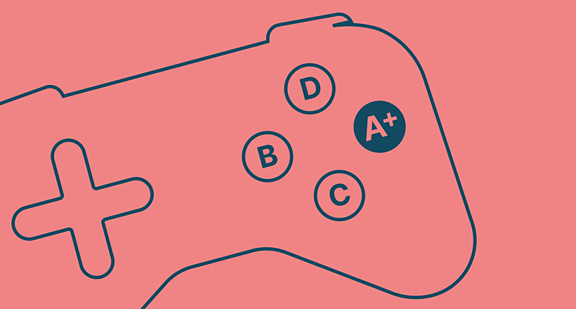
According to the Emerald research, well-designed gamification elements are well-received by about 85% of students. What is more, gamification elements should not be limited to a video game-like experience but should foster the relatedness and anatomy of the learning process, and ensure better learning outcomes.
As a result, gamification, as an element of education web design, should be contextual and relevant to the user. Four types of players should be considered: killers (20%), achievers (40%), socializers (80%), and explorers (50%) (according to Richard Bartle, who studied gamers). Then, they should be combined with the learner types you have.
This will help choose the most appropriate for your project gamification mechanics:
- Scores
- Levels
- Leaderboards
- Unlocks
- Progress bars
- Course currency
- Ranks
- Badges and trophies
- Upgraded avatars
For example, group competition that requires teamwork to complete a task can give the team extra internal currency, reward points, a real-life trophy, etc. Your imagination has no limits.
Best Educational Website Design Exampless
If you now know how to design a continuing education website, we’ve collected the top website design examples to illustrate what a well-designed educational website may look like.
Ready to be inspired?
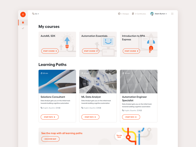
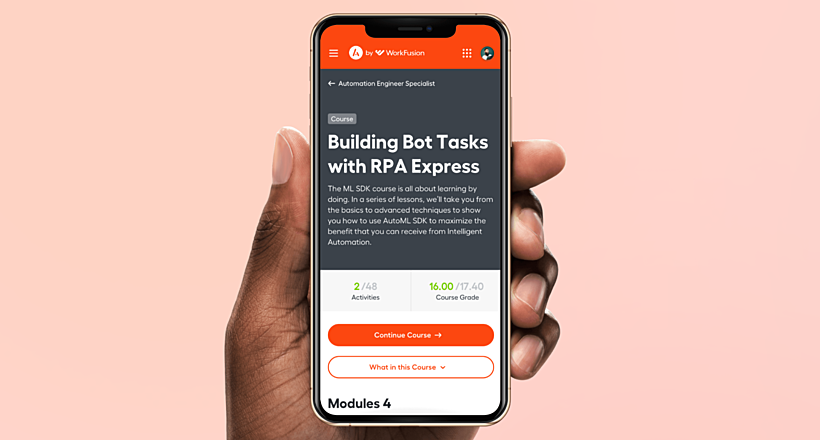
Automation Academy by Workfusion

Source: Agente case
This example is one of the Agente design projects. It lets you focus on the visual component of the website design.
Automation Academy features:
- simple interactive tabs,
- attractive colors and textures,
- quick-access icons.
It all makes this learning platform look welcoming and elegant.
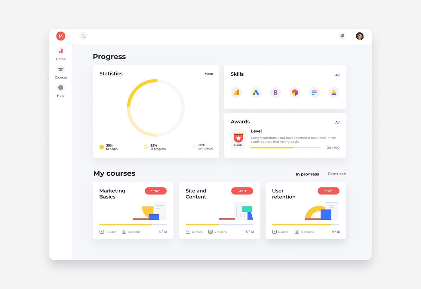
LMS Design for Marketing Courses

Source: Agente case
This project focuses on offering video tutorials for marketing specialists.
The creation of the full-cycle flow of the education process was required, i.e., video lessons, tasks, communication between the teacher and the student, plus assessment.
Read also how to redesign your LMS and redesign an eCommerce website.
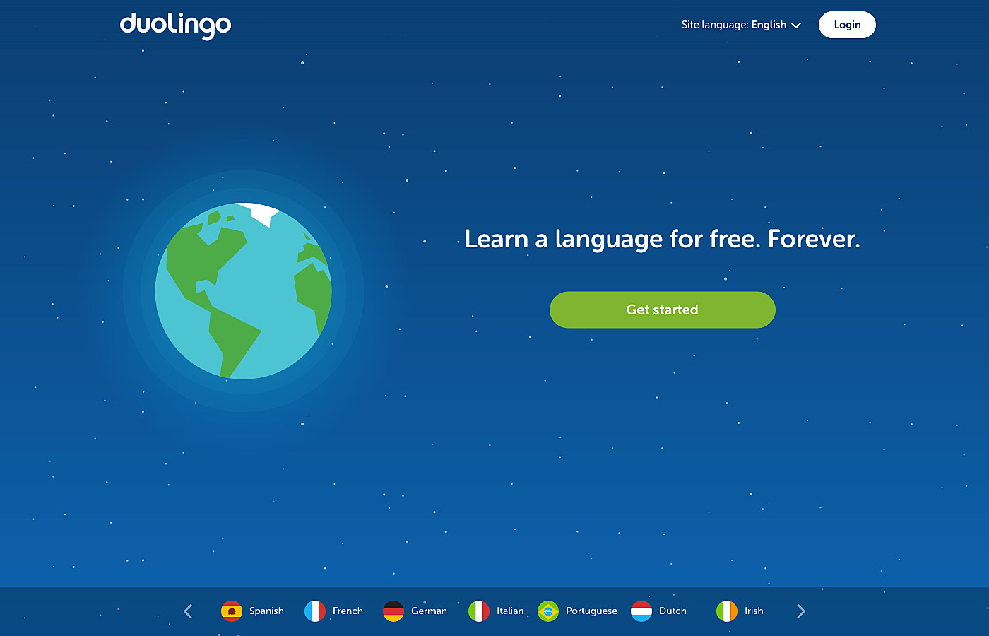
Duolingo

Source: duolingo.com
Duolingo seems more like a game than an educational website, but that’s what attracts users the most.
Interactive lessons and a rating system foster gamification.
A greenish-blue and white color palette with circular icons on the top create a pleasant and minimalist UI.
Read also: How to Make Educational Games That Engage Your Players
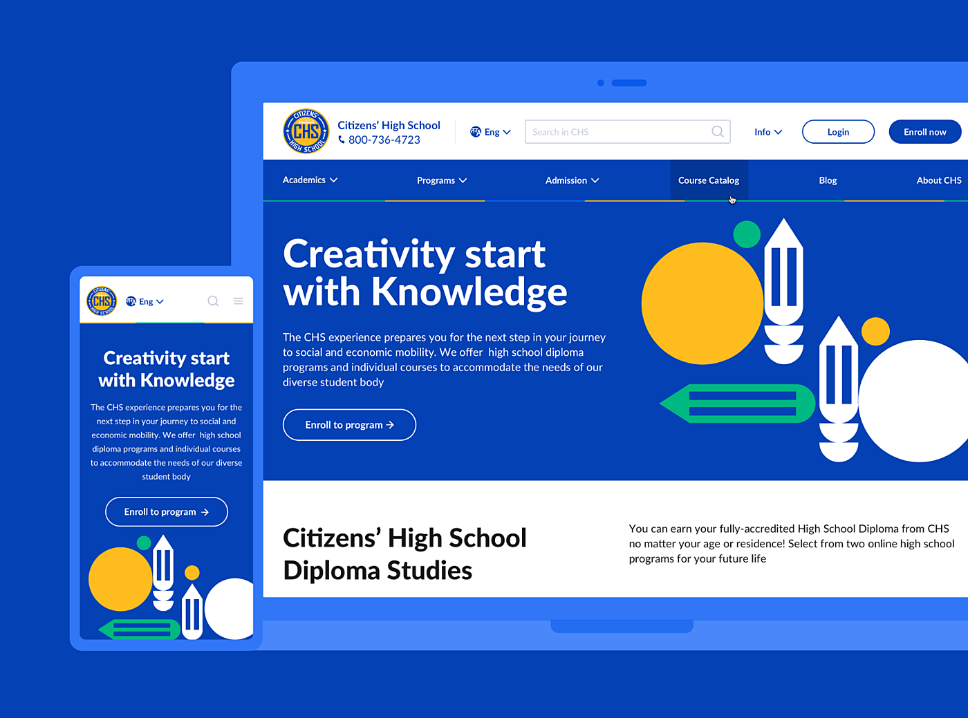
CHS―High School Website

Source: Agente case
This is another school website design example for higher education built by the Agente dedicated team.
Accessibility in no more than two clicks was a requirement when creating this website.
So said, so done!
Thus, if you are looking for some inspirational, clear and concise on-site navigation examples, we welcome you to explore this case study for more details.
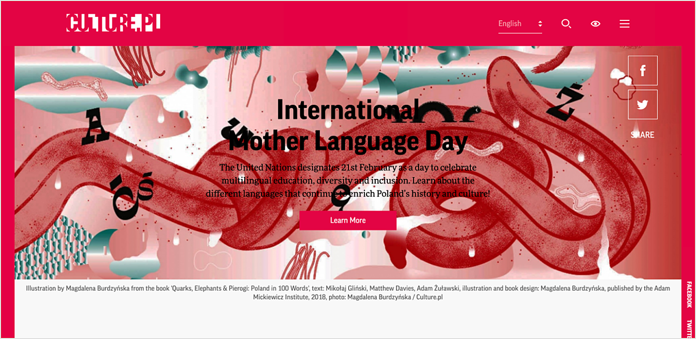
Culture

Source: culture.pl
Red is the color of love and romance. Or is it more like vermillion?
That’s what this website aims to achieve―make the Polish language attractive for potential learners, and make Poland attractive for potential visitors.
Bold fonts and creative graphics on a two-colored background are recommended, with a CTA button on the first screen for further exploration of the website.
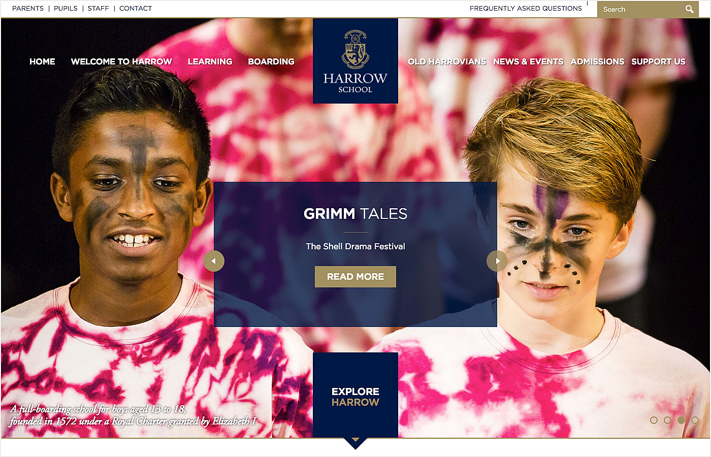
Harrow School

Source: harrowschool.org.uk
The pictures of happy students on the main page, university heraldry, and intuitive sections of the website are standard in the best school website design example.
Announcements with calls to action in the middle welcome visitors inside to explore the content.
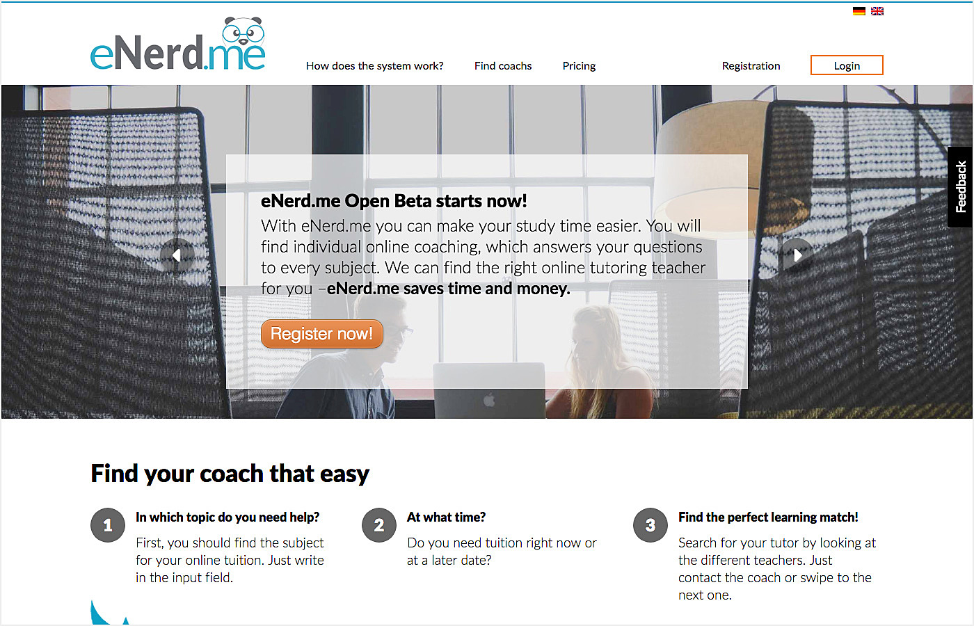
eNerd

Source: enerd.me
Minimum tabs, diluted colors, and simple fonts help visitors to concentrate on the learning content.
The funny panda logo and structured content help to make users stay.
Learning App

Source: dribbble.com
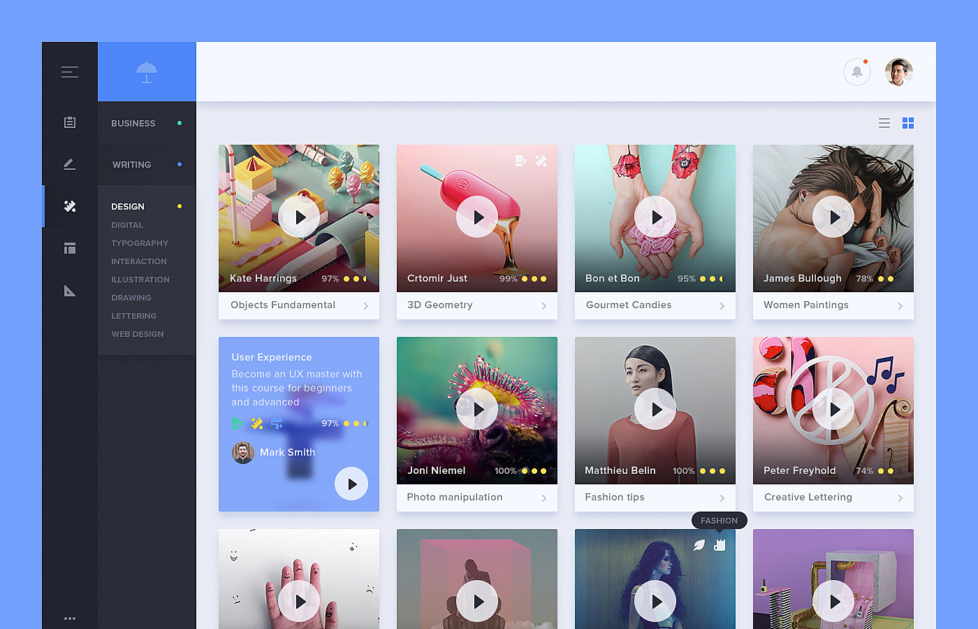
Video content with welcoming previews plus a simple sidebar menu for better navigation is the ideal UX formula for a generation Z learning website—easily digestible and bright.
Academy Dressmakers

Source: Agente case
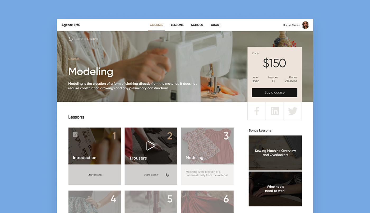
This project is an e-learning resource for dressmakers, where each video lesson can be purchased individually.
While the fonts and colors were defined by the brand book, we focused on color coding for each main section of the platform to ensure the site’s elegant consistency.
BetterLesson

Source: BetterLesson
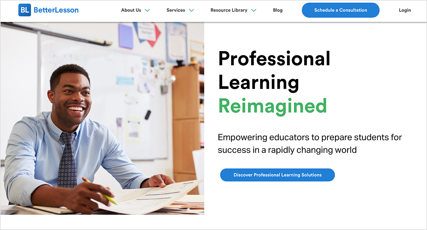
This is one of the educational teacher website examples.
The academic teaching website design of this resource can be characterized by the combination of blue and white colors, cleanness, and smooth on-site navigation.
By the way, you may learn top educational app development companies including Agente team, to choose a reliable software development partner for your educational idea.
Bottom Line
We did our best to get some educational website design ideas for your next project. Website design takes a lot of time and effort, and your contribution may come to a marketable product with a professional partner.
Ready to give it a start?
Contact Agente today, and we’ll help you design and create an educational website that works for your audience.

