Introduction
Often overlooked, the footer is yet a key element for a website. It is an important section for website visitors who want to get more information about your company. When designing the footer for your website, you face the challenge of defining the elements that will be included in it, while keeping in mind that a perfectly optimized footer facilitates the navigation while helping you to reach your commercial objectives. Want to know what visitors expect when they scrolled down to the bottom of your site? Follow the article – we gathered the best practices of website footer design best practices.
Agente Studio knows what to put in the footer of a website check out our case studies.
Why do footers matter for your website?
1. They emphasize your content

Making your footer visible will attract a larger number of visitors to them. You can hardly imagine how long readers can scroll down your page – close to infinity! Remember: you footer is never too far, so it will apparently find its audience.
2. They help you win leads

Let your visitors know that the bottom of a page is not the end of a website. It may be a time to leave your website but not your company. Pick what fits you better: either contact form, email, or address in the footer will help your users take the next step.
3. They provide your users with useful info

Got more information than can be adequately put into a single page? Place it in your footer! It concerns any links to external resources, your partners, sponsors. Putting some legal info into your website may also be reasonable, but terms of service or legal notice are always better off somewhere underneath.
4. They guide your readers

If your website visitors find themselves too far from the header – it is an unmistakable sign that they are still in search of something they came for. Navigate them through your footer to the main sections of your website.
5. They hold visitors’ attention

If basic information on your website supposes meager information, you can catch the attention by final accord making your website footer design creative or even entertaining.
10 amazing footers of our choice
Agente analyzed top trends for footer design that we offer our customers and here are the ideas for making your simple website footer design outstanding:
1. Minimalism
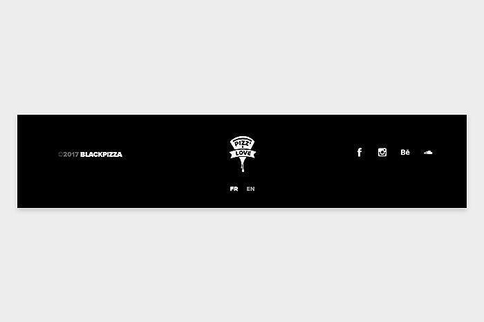
Source: www.awwwards.com
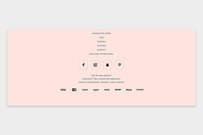
“Simplicity is the ultimate sophistication”, Leonardo da Vinci said. The overstuffed footer doesn’t always mean informative footer. Try to concentrate on one to three elements and keep it minimalistic and fresh. We suggest this combination: copyright plus logo plus social media buttons. Prevent plagiarism, catch attention and lead your readers further. As simple as that.
2. Site map
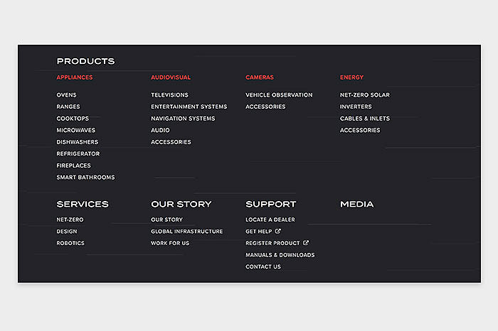
Source: www.furrion.com
Sitemaps are often underestimated, as only a few readers click them. Unlike the minimalistic trend, fat footer with an extensive site directory serves for other purposes. If users don’t find what they need, search engines will! Big footers allow Google better index your pages which will probably be a little step for you to rank higher.
3. Contact form/newsletter
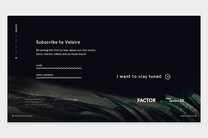
Source: valaire.mu
As far as contact form placement, Agente sticks to the three positions: top right, bottom right, and bottom center. Make sure that the link refers to a contact form, not a pop-up to send mail. Generally, avoid embedding links to an e-mail because they are spam magnets.
The other trick for visitors engagement is a newsletter registration module in your website footer. We especially suggest using this feature as the element of footer design to online shopping companies. Indicate what the user will receive with this newsletter and how often, while specifying the number of people who have signed up for this web service.
4. Navigation
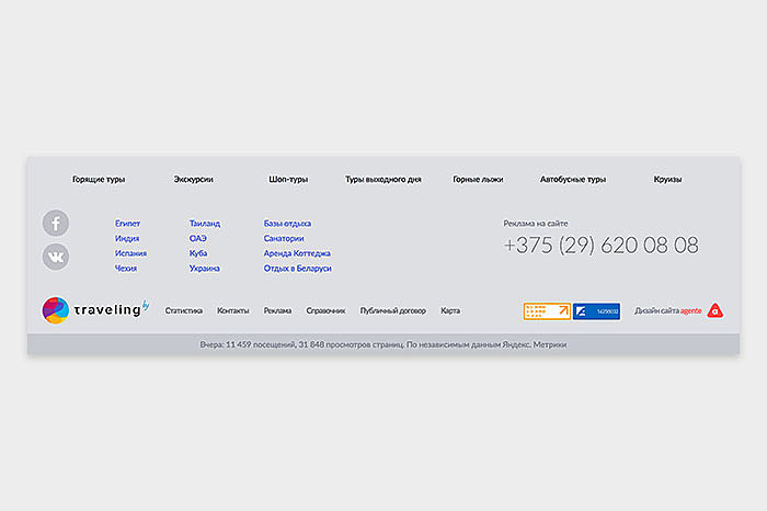
Source: traveling.by
Here is where your footer can save the lost visitors. If they went down so low on your page, probably they did not find what they were looking for. A smartly organized set of referring links will guide your visitors through the core sections of your website.
You can arrange the footer links as tabs, drop-downs, or a simple three-four column menu. Make sure to identify beforehand the most visited pages of your site and optimize their visibility in the footer.
5. Social media
Source: www.awwwards.com
Generally, companies appreciate that visitors coming from social networks consult their websites. Conversely, some are reluctant to integrate icons referring to social networks for fear of losing part of their audience. As social networks occupy a strategic place in your marketing funnel, make sure that the footer on your site contains icons that will guide users to them.
In the example below, they put social media icons in the center. Besides, they added short menu, contact details, terms of use, and copyright in the footer.
6. Call to action
Source: www.behance.net
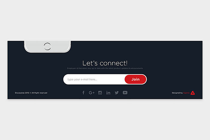
Let’s connect! Hire us! Leave your phone number, and we’ll contact you within an hour! A simple but catchy appeal to your readers in the footer followed by newsletter or contact form may help you increase conversion rate. Make sure your call to action leaves nothing to be guessed. Remember, your audience doesn’t want to think much about how to perform the action.
7. Contact details, telephone, address
Source: www.behance.net
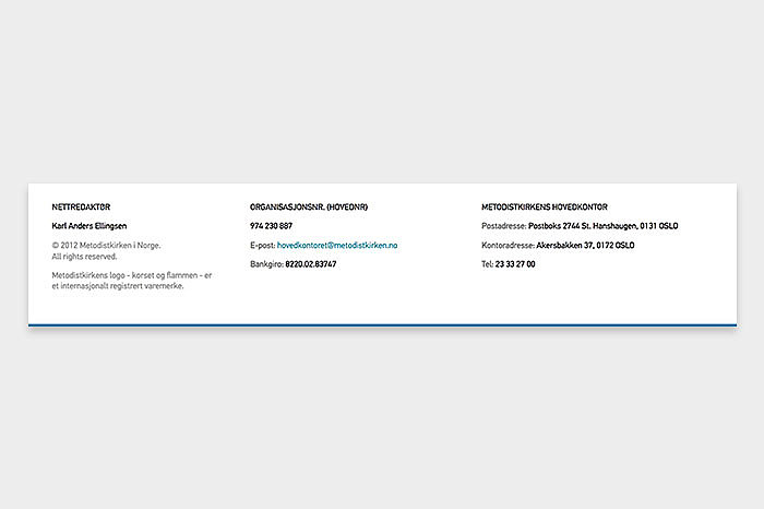
What users obviously expect to discover in the footer is the contact information, especially in data-rich products, e.g. when you work on healthcare website design. A phone number with your country's phone code is a key indicator that allows search engines to understand where you are located. Make every link clickable, to let your users dial a number or send an email right from their smartphones.
This footer designed by Agente contains nothing more than clickable contact information, so their visitors don’t distract their attention to unnecessary stuff.
8. Map
Source: Bootstrap
Connection with a map adds credibility to your business image by indicating where your premises are. Moreover, this is a great way to help Google Maps users find you.
9. Custom footer
Source: www.thespruce.com
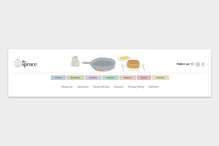
If you want to customize your site then images, animation, photos of your team in the footer will contribute to your personalization. To carry a more powerful and catchy message, do not hesitate to include a video in the footer.
10. No footer at all
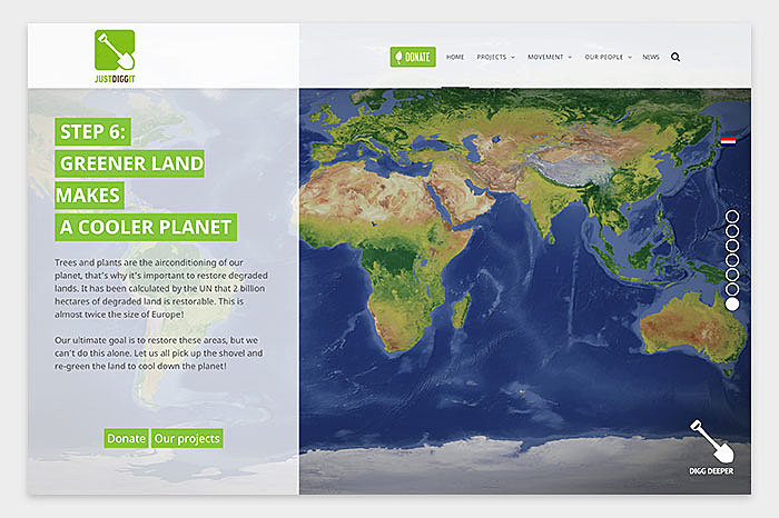
Source: justdiggit.org
Sometimes going aside header-sidebar-footer template can make you stand out of the crowd. Try this for your landing page, while maintaining the standard footers with crucial information on the other pages of your website. The example shows the abandoned footer on the homepage to highlight the key points.
Steps to create a good footer:
Seems that you’ve been hit with a great website footer idea? To avoid the roadblocks that lie in the way of its implementation, you should come up with a plan of what you expect to see down your website page.
1. Decide on the basics
- Review your website structure and decide where you need your footer, select from the footer menu examples.
- Take care to make responsive footer, mind mobile or app version.
- Make custom footers for the separate pages, if necessary: for example, add a map to “Contact us” page.
2. Design your footer layout
- Determine the size and number of sections and columns, order them in terms of priority or standards. Example: contact info is expected in the center or in the right corner of your footer.
- Leave it on the bottom or pin a sticky footer with custom HTML and CSS to “fix” it to the bottom of the display in a desktop browser.
3. Enhance it with custom elements
- Insert social media: Twitter widgets showing a timeline or Facebook “follow” button.
- Add advertising plugin.
- Embed Google Maps or another map of your choice.
- Maintain the style: choose bootstrap/WordPress footer template or create custom one from scratch, matching the colors and styles with the website.
This was our outlook at the best footer design ideas and examples. However, don’t hasten to include them all into your website. Think about your visitors and act respectively, the design of your footer and the process of its creation may vary depending on your business requirements – contact Agente, and we will guide you through the way of designing an amazing footer.
Rate this post!
604 ratings, average ratings is 4.0 out of 5
Related Posts

11 January 2024
Mobile-First Design: Full Guide for 2024
What is mobile first design? Well, the mobile first approach is a central principle of progressive enhancement. In a nutshell, it’s all about producing a small screen design and then scaling it up to other devices. In our new blog post, we cover some aspects that need to be taken into account when launching a mobile first web design project. We also share some outstanding design examples for your inspiration.

03 January 2024
10 Best Game Website Design Examples: How to Design Yours
Game website design: importance in attracting new players, awesome examples and design tips.
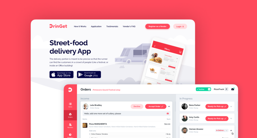
Effective Food Delivery App: Key Tips & Best Practices
In this article, we will share our experience in creating a design for a specialized food delivery management software, as well as best practices in designing such an application.
22 November 2022
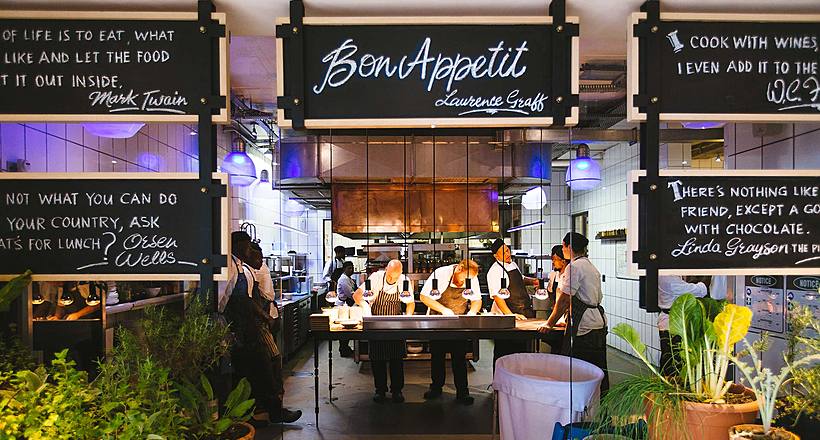
10 Best Restaurant Website Designs & Best Design Practices
Restaurant owners always have a lot on their plate, and they are usually focused on the areas that can bring tangible benefits. Websites, unfortunately, are not one of those areas because even the perfect website does not guarantee that the restaurant will be full every evening.
26 May 2022
10 Best Examples of Beautiful Blog Design | Agente
In this article, you'll find 10 best examples of beautiful blog design, along with the tips that can help you enchant visitors.
09 January 2022
Web Design Trends in Web Interfaces for 2022
Best practices vs. trends on the Web. Is there any difference? Find out more about the principles of good web design in 2022.
Let's talk
Is there a challenge your organization or company needs help solving? We’d love to discuss it.

Managing Director, Partner
Andrew Terehin

Thank You!
Your message has been successfully sent.
We will contact you very soon.
