Some time ago POS interfaces have replaced traditional cash registers in offline stores, and now they do a lot more than just process payments.
That’s why POS system designers must embrace the modern context and offer complex solutions that benefit the customer and simplify things for a business.
So whether you are a UX designer or retail business owner, I hope you get a lot of value from integrating the design principles described in this post to your point of sale.
POS Design Principles
What makes a great POS terminal? In order to build a successful user experience, you should marry a stunning POS design with robust hardware.
There are some handy tips that are essential for a successful POS interface design.
Design For Simplicity
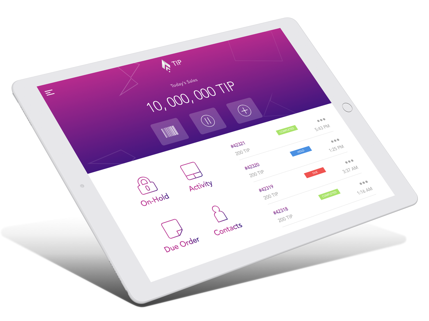
A point of sale user interface should not be too complex. Your task is to eliminate the wasteful cognitive load caused by too many redundant UI elements or steps required to perform an action.
The same relates to unexpected pop-ups that distract users and result in additional stress. In a nutshell, follow the KISS principle (Keep it Simple, Stupid) to make everything right.
Source: Dribbble
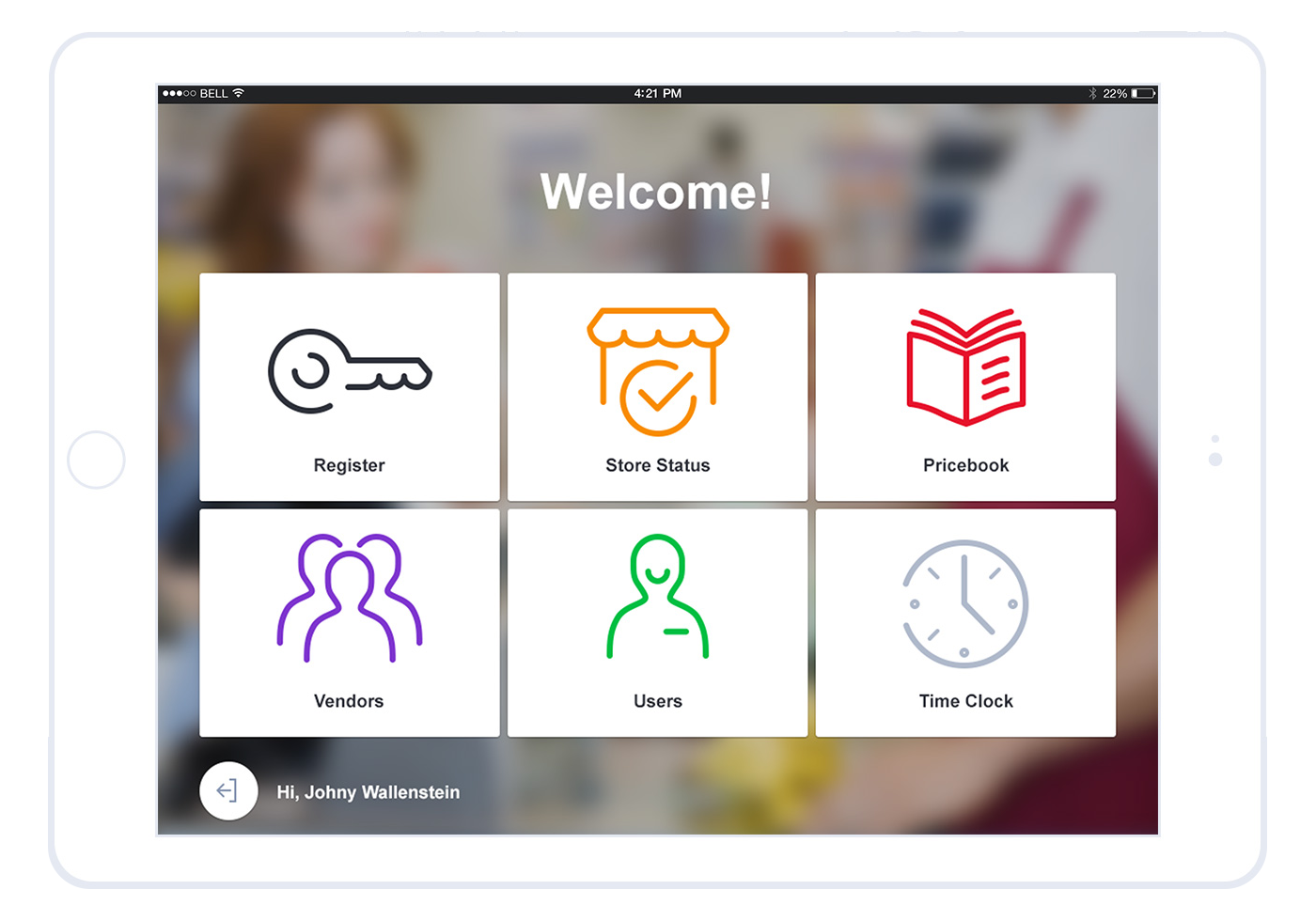
Remember to keep an eye on findability, too, since it is a key to simplicity and POS UI design efficiency. You can ensure it by grouping related controls and/or indicating their relationship by color on a POS display. E.g., all inventory-related interface elements can be colored gray, while the cancel button is always red.
Be careful while choosing colors and contrasts: all controls should be seen clearly from different angles and different distances.
Reduce Learning Time
All new users get some initial training that is either carried out by a solution provider or an in-house specialist who is already trained enough to teach others. Stress often accompanies terminal operators, both when they learn how to use a terminal and when they deal with it without supervision. And this stress affects their learning and memory. So the chances are high that a person forgets an important feature straight after he/she is shown it.
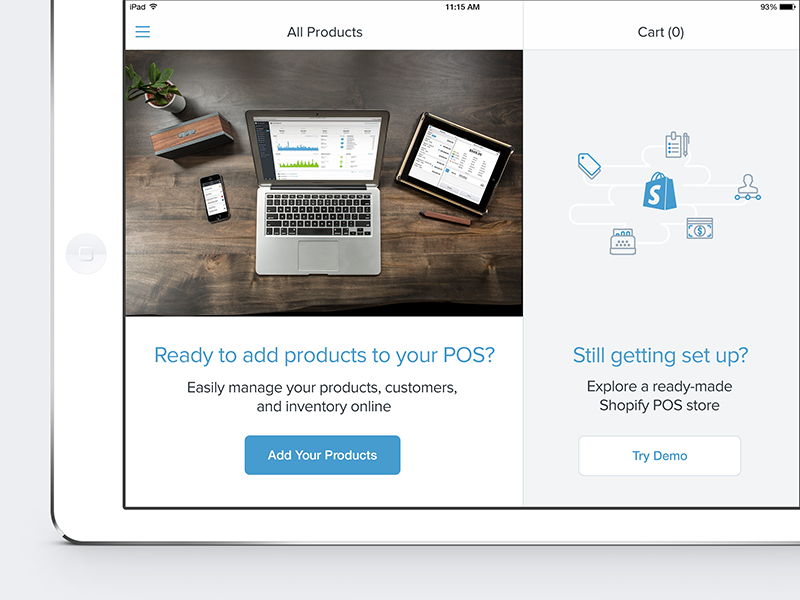
So save their time and make their life easier by stressing usability in a POS interface to let inexperienced users intuitively understand what to do if they don't remember the next step.
Source: Dribbble
Aim At Design Consistency
Design consistency is another vital aspect of POS design guidelines. There's no need to introduce new controls on every single page of the application. Draw a set of interface elements and use them throughout the solution. Place controls wisely: they should be on the same position on all pages where they will be added.
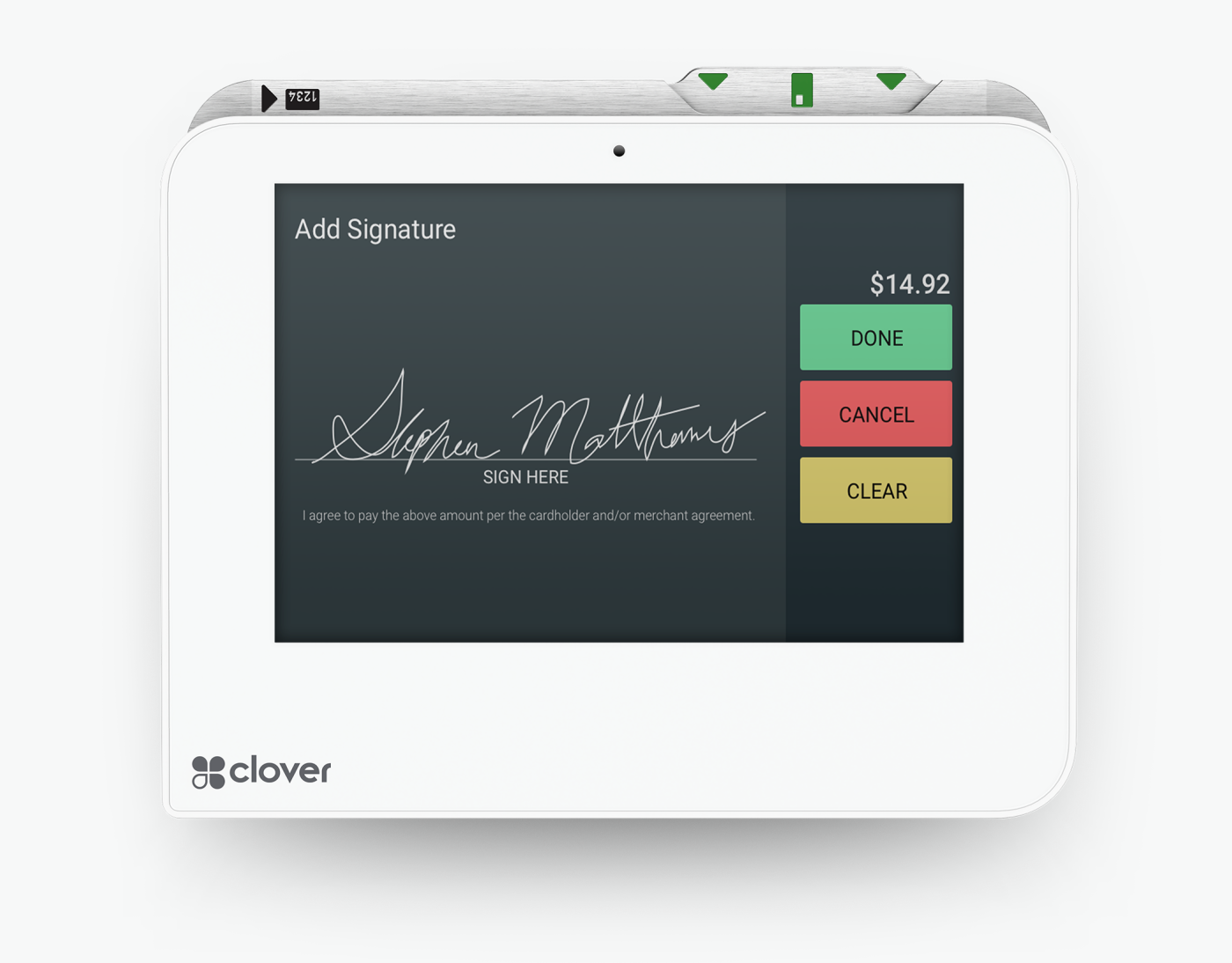
Source: Clover
Simplify navigation
The flow of scanning a product is quite obvious. However, a POS system designer should bear in mind the following cases:
- searching for items by name or by category;
- typing barcode or serial number manually;
- applying discounts or loyal customer cards;
- finding old transactions;
- custom reorders.
Source: AGENTE
Introduce Conversational Ordering
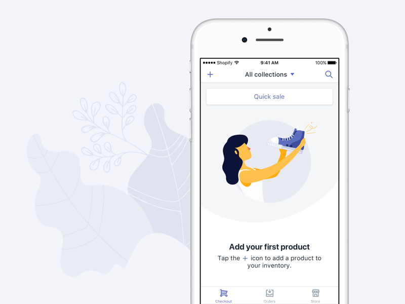
Customers are the order driver, not the system itself. Get rid of a fixed sequence of actions to allow operators to add items in the order stated by a client.
This approach will contribute to customer satisfaction by improving the speed of service and making ordering as easy as 123.
Source: Dribbble
Provide Different Login For Different User Personas
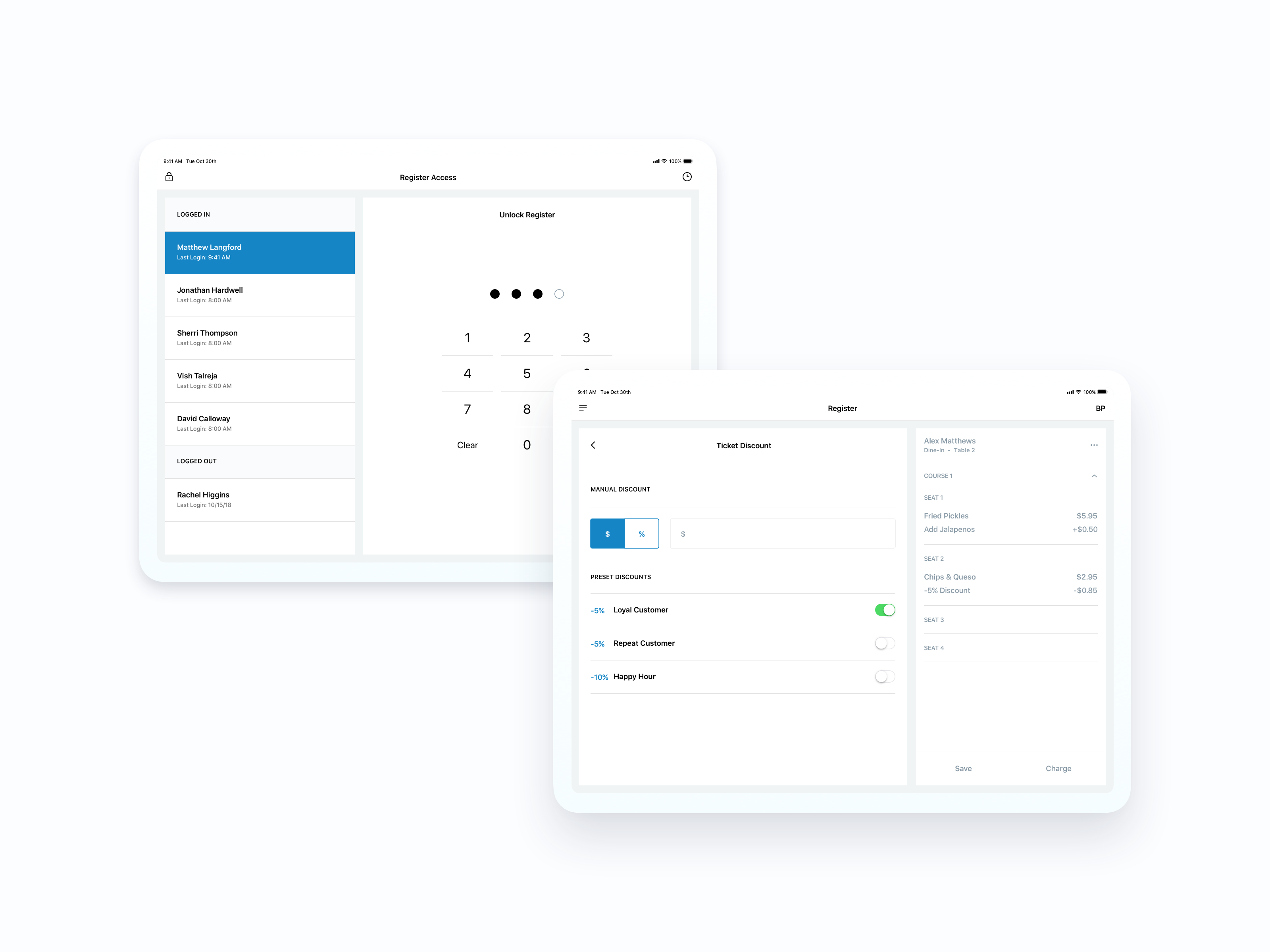
POS terminals with extended functionality can have different categories of users who are responsible for different activities in a company and have different levels of access.
Create different scenarios depending on users and enable separate login for such personas. Doing so, you'll achieve greater usability and reduce the possibility of a mistake made by an inexperienced user.
Source: Dribbble
mPOS app design
Mobile POS makes it possible for any business to set up a shop and accept payments anywhere. This is especially relevant amidst self-isolation and online ordering and taking businesses off into a delivery mode. Mobile applications for POSs are flexible, affordable, and feature-rich. Here are the core features:
You can run an e-commerce store. In this case, you should think of a payment processing system like PayPal, Clover Go, SumUp, or Square.
You can manage your inventory. Most mPOS options allow you to keep a record of items for sale, add photos and descriptions, as well as list item variants at different prices.
You can offer customers with discounts and deals. Most mPOS will support promotions and special offers. You can also set a discount on a collection of items or individual ones.
You can run a virtual terminal. They allow you to take payments from any internet-connected computer. All you need is to log in through your browser and plug in the card information. Even if you don’t use it, a virtual terminal is a good backup option to accept payments.

Source: Freepik
You can even create employee accounts and set permissions. You can’t fully appreciate this feature if you’re the only person running credit cards. If not, this opportunity is a great security boost. Creating sub-user accounts for your employees will allow them to manage basic functions such as completing transactions without access to more sensitive features like sales reports and the ability to issue voids or refunds.
Be careful with updates
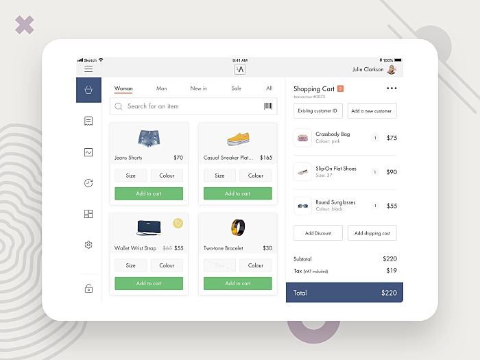
POS is a system used for hours each day. Therefore, people get used to the interface and making any considerable changes will lead to user dissatisfaction. Especially among cashiers who already heavily rely on the system’s automated features and shortcuts.
Source: Pinterest
Add integrations
The functionality of the best POS systems goes far beyond simple sales processing and payments. They are a strong marketing tool, that help you run your business faster, connect with customers and manage your store effectively. Successful mPOS design include or have integrations for:
- email marketing;
- loyalty programs;
- CRM;
- inventory management;
- sales data analytics.
Use validation reasonably
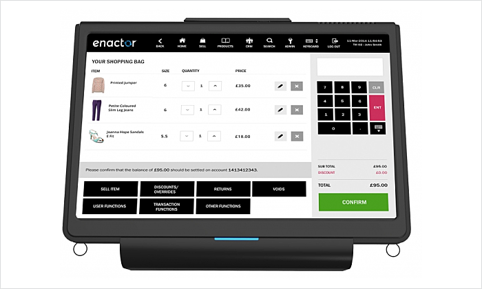
It’s necessary to give users feedback about their actions. However, it is annoying when a POS system asks to validate a dozen of steps in one session. Think where this activity is critical (for example when an error occurs) and where it can present a hindrance to users (e.g. asking if I’m sure I want to pay with a card).
Source: Enactor
User experience barriers
Your task as a designer is to eliminate POS usability barriers to make transactions as quick as possible. It will help to reduce queues. Designers can’t change a shop layout or increase the number of POSs to completely avoid queuing. However, they can make the design more intuitive.
Specific store lighting
Designers should take into consideration lighting issues in stores (both too dark and too bright light) and the fact that five percent of the general population have a mild visual impairment.
Small button size
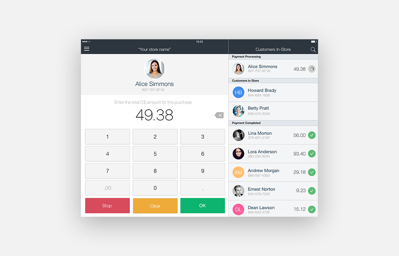
mPOS design should be fat finger-friendly to ensure that it can perform the desired action without a problem. One more tip: highlight buttons when they are pressed.
Source: Dribbble
Information overload
Even for an experienced cashier, working with a POS could be a challenge. They need to sell the products, check the items in the POS system, apply different discounts and loyalty programs, and still, be attentive to their customer and, what is more important, fast. The tension intensifies, as the shift goes closer to its end.
Obsolete interface
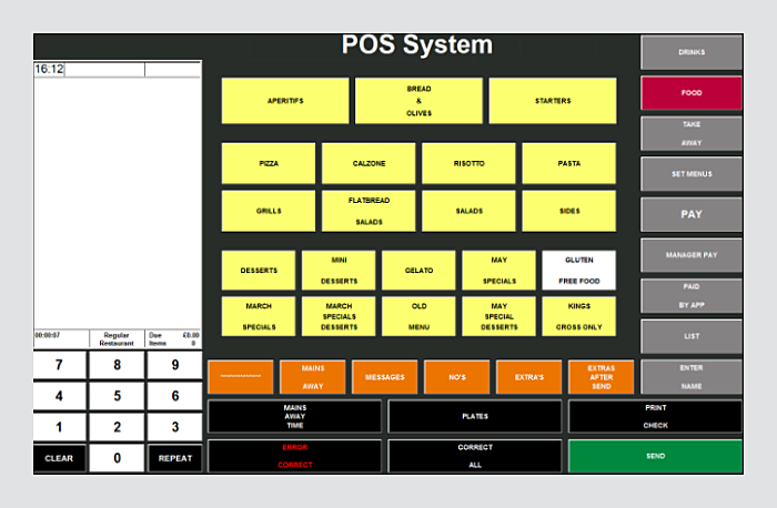
The consequences of a design like this, namely the clashing colors, small typeface, and Windows 95 styling of the buttons are quite sad.
Source: Stack Exchange
Slow response time
Designers should work closely with the developers to ensure that their ideas are implemented effectively. A couple of seconds on processing the queries may cost you customer satisfaction and drop in sales, so the team should reduce the system load as much as possible.
Low-performance hardware
Designers often overlook the hardware issue, focusing more on the layout of the elements and navigation. However, it is critical to bear in mind what hardware a store is using: a smartphone, a tablet, or a self-service terminal.
Even if most stores tend to use mobile devices and mPOS to handle their operations, POS design standards should be in place.
Inspiring examples to follow
We prepared some shining examples of POS terminal interfaces to illustrate how they look like in reality. Scroll down to see all of them one by one.
Our experience
Agente had the opportunity to work on several POS-related projects: POS terminal UI design and self-service POS interface design.
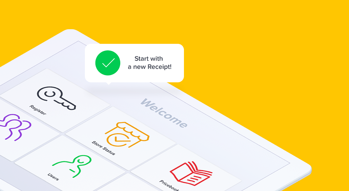
In the first project, we designed a user interface for the retail point of sales terminal. We managed to improve the user experience for several user scenarios based on the prototypes that we received from the customer's development team.
Source: Agente
In the second one, our team designed the self-service POS user interface for several user scenarios and device resolutions.
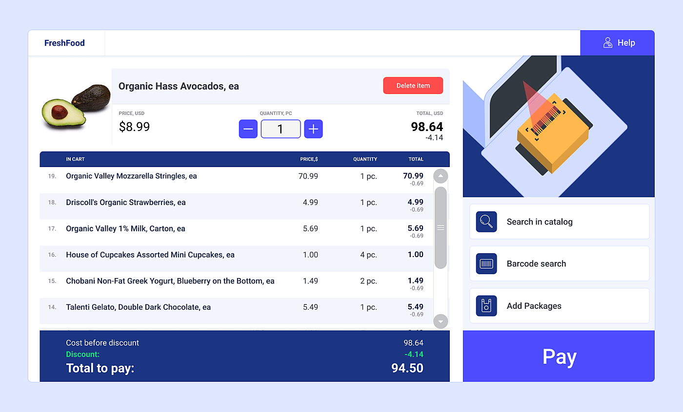
Source: Agente
POS System Design FAQ
What is the cost of developing a POS system?
The services of POS system design and development may include a product discovery stage, POS system screen design, software development, API development, hardware configuration, and a lot of QA and usability testing. Depending on the hardware, system requirements, and the complexity of POS UX design, the price may vary from $10K for an MVP to $50K and more for a fully-featured retail POS software design and development.
What are some components or features that POS should have?
When you design a POS system, always include the basic features like billing management, payment processing, stock management, balance sheet. For a restaurant POS UI design, you may need additional functionality, such as table management, order management, customer loyalty programs, and mobile POS design.
Can POS integrate with my existing software?
POS integrates with your existing e-commerce website, accounting software, CMS platforms, appointment management apps, CRMs, and employee management software. Note that integrating 3rd party apps will cost you extra money on design and development, as well as API development, in some cases.
What are the risks associated with mobile POS systems?
Remember that an mPOS software that runs on a mobile device is just a part of a more complicated system. Often mPOS app is the entry point for a cyberattack on a network of e-commerce businesses in general. That means you must take care of cybersecurity on a server-side.
Summing up
After all, poor POS system design leads to low customer satisfaction and a drop in sales. What we are trying to say is that designers of POS systems should embrace the context of a retail store and focus on main metrics, such as average transaction time for a cash register or a conversion rate for a self-service POS.
Similarly, an ecommerce redesign should prioritize user experience to enhance customer satisfaction and sales online.
Willing to learn more details or discuss your custom POS interface design project? Send AGENTE an inquiry and our rep will contact you shortly.
Rate this post!
712 ratings, average ratings is 4.3 out of 5
Related Posts
How to Launch Your Online Travel Marketplace Platform in 2024?
Learn how to launch your own online travel marketplace platform in 2023 with our comprehensive guide and step-by-step insights.
14 January 2024
Marketplace Website Design and Development in 2024: Features, Tech Stack & Cost
Discover the latest in marketplace website design and development, explore features, technology stacks, and gain insights into cost-effective strategies.

Top eCommerce Website Design Features and Tips in 2024
While creating an online store, it is difficult to orientate quickly and understand how the website should look to create a positive impact on the owner’s income. It determines whether clients remain on store’s page, would they have confidence in the store and would they like to purchase

Ecommerce Website Revamp [The Ultimate Guide]
Learn why you should redesign your e-commerce website and how it can improve your online store's performance, including increasing traffic, engagement, and sales. Get expert tips now.
What Is mCommerce and How Your Business Can Benefit from It
Find out about m-commerce advantages and disadvantages, benefits for consumers and future trends in the sector.
How to Improve Online Shopping App Design for Better UX | Agente
Dissecting shopping app UX design: how to make your design work and provide a superb user experience.
Let's talk
Is there a challenge your organization or company needs help solving? We’d love to discuss it.

Managing Director, Partner
Andrew Terehin

Thank You!
Your message has been successfully sent.
We will contact you very soon.

