While creating an online store, it is difficult to orientate quickly and understand how the website should look to create a positive impact on the owner’s income. It determines whether clients remain on the store's page, would they have confidence in the store and would they like to purchase.
But what exactly is “the right ecommerce web design” supposed to be? In fact, there are no firm rules for page design; it all depends on the individual characteristics of each store and their target audience. However, there are techniques that work equally well for everyone.
In this article, we systematized the knowledge required to create a quality ecommerce site and focus on the most important aspects. We’ve also added several eCommerce website design ideas and tips on how to optimize the eCommerce website in 2023, so that customers would be eager to return.
Best eCommerce website design features to Add
These eCommerce web design best practices can be applied to websites in general.
Keep it simple
Customers are tired of irrelevant information and always prefer a simple and clear website. Your customers shouldn’t get distracted by slow or laggy pages, advertisements, and hundreds of links to click through in order to find what they’re looking for.
Simple design provides fewer choices, thus making the life of its users easier. When you want to direct leads to your products, less choice is better. That’s why it’s important to think through how you are going to streamline your menu options and product pages to keep your site free of clutter and distractions. Take a look at the examples below: no excessive information, pages focus on the products.
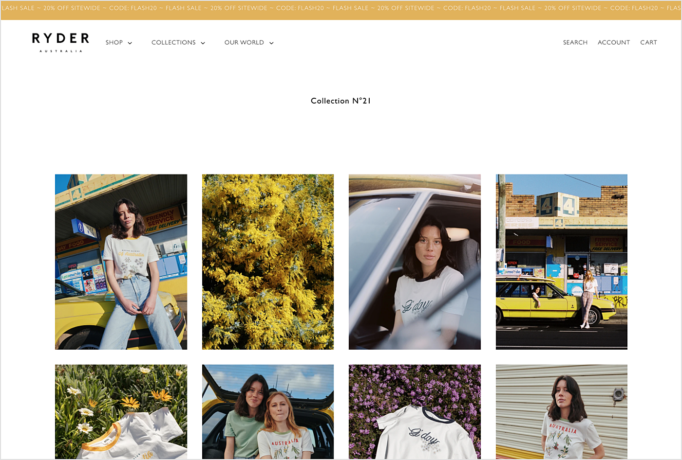
Source: RYDER
Connect with your customers
One needs just a few seconds to understand if he or she will use the services of a company via searching through the website. Of course, the user should be given clarity on what exactly a particular webshop specializes in. Each element must play along with the main idea and emphasize it — this is the website design essentials. Any part of the custom online retail store should be carefully thought through.
Take a cohesive look at your product photos and other photography you use throughout your site, like those on the homepage. The overall design for an eCommerce website must be concise, recognizable and original, to incite only the positive emotions onto the customer. A great example is when you want to create a website like Udemy or Coursera. You can use simple geometric forms and a minimum number of neutral colors — the eCommerce UX design looks best if there is nothing redundant.
Nevertheless, this does not mean that the successful eCommerce site has to be drab and boring, with bad eCommerce usability. If you don’t make your e-commerce website design stand out, customers won’t ever pay attention to it. Using large, beautiful images stimulates the user's imagination and their wish to purchase. Another great feature would be price comparisons, messages about popular items in stock and buttons that call to action, anything, in fact, that will help to create and uphold an emotional connection with the customer.
Encourage user-generated content
User-generated content (UGC) is a great word-of-mouth marketing tool. You need to encourage your customers to create content and share their love for your products or services with friends.
Provide incentives to get your customers to create this content, like Instagram, Facebook or Twitter posts with information about their experience, and share it on your ecommerce site.
Take, for example, Ikea. There are 11.7 million posts with the hashtag #ikea, among them 254k for #ikeahome.
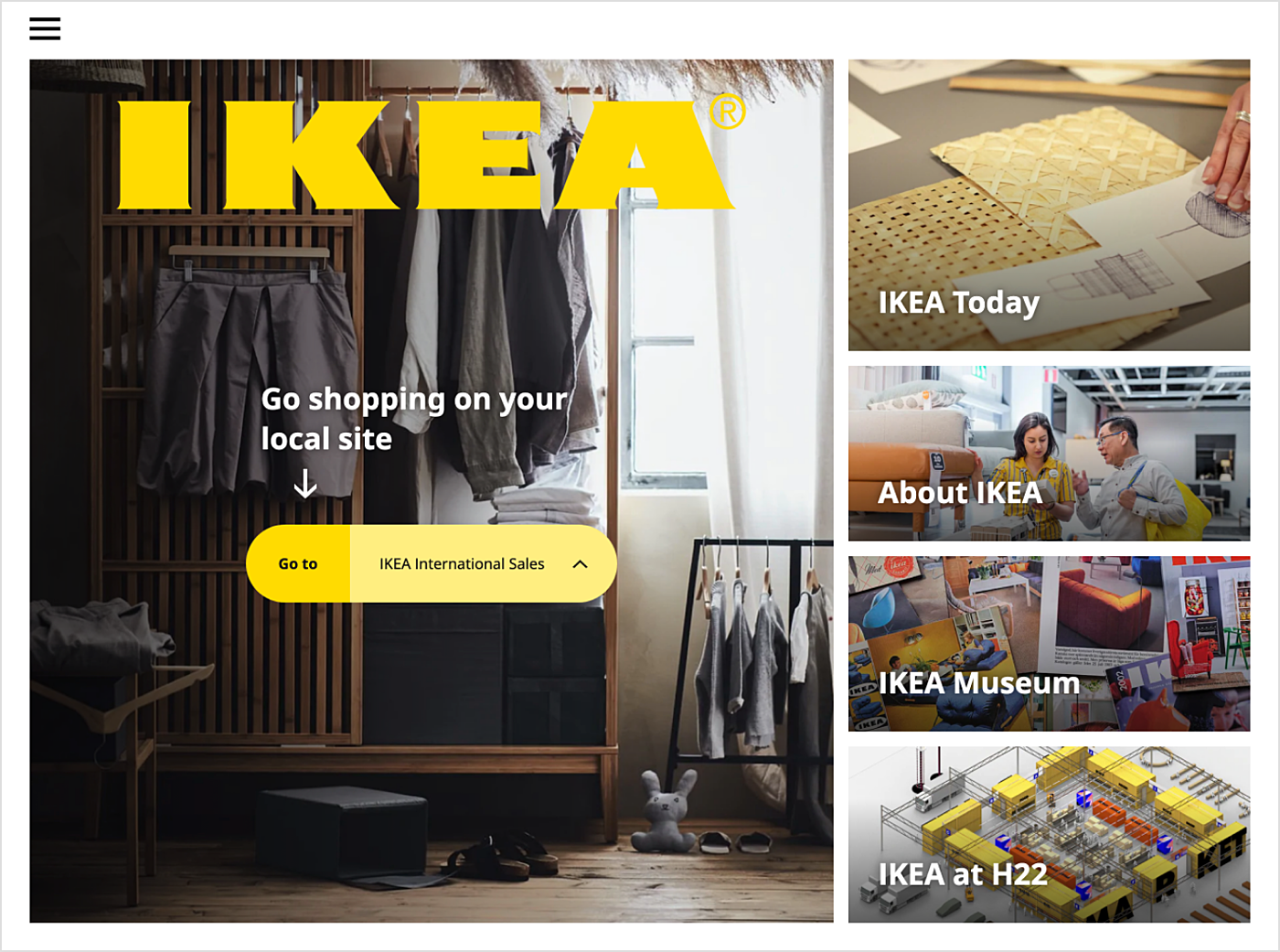
Source: IKEA
Make user experience easy-breezy
Even if every detail of an eCommerce store is carefully considered, unified in style and color scheme, up to the current eCommerce UX trends, users won’t become customers, if they can find just about anything on the landing page of your site, except what they are actually interested in.
It would be a good piece of advice to find a balanced combination of minimalist design and comprehensible user-friendly navigation. It is important that all user interface elements of an online shop are placed customary. Because nobody is going to waste time trying to understand the site's odd logic, if they can find tens, if not hundreds, of alternatives where everything is clear.
Being attentive to the customer’s time always pays back. It is important to make sure that the goods selection and buying process takes place as simply and quickly, as possible.

Source: Zara
Pay attention to these major eCommerce site design tips:
- Site search. Search will help buyers to save a lot of time looking for the necessary items in the catalog. Customers increasingly prefer to use search, rather than the site's menu. Search, in fact, has a huge influence on conversions and sales, so it should be placed in an easily accessible place. An ability to search within a category is also worth adding, especially if you have a large number of titles. Auto-correct for a more accurate result delivery and add the products relevant to the given search into the output for the best effect.
- Delivery info. The delivery information should be easily accessed from any page of the site; the link can be placed in the header, for example. Buyers will be more comfortable if they would clearly understand the delivery terms and timeframes. It should be noted that free shipping plays a decisive role in choosing a store for many users. In addition, it encourages purchasing more at a time, as does combined shipping, if paid.
- Text/pics proportion. Your design should avoid large walls of text and, instead, focus on photos and graphics that lead customers to specific areas of your site. Focus on smaller blurbs for your homepage and “About us” section rather than lots of words. On product pages, you can be more detailed and write compelling descriptions for items, but add features as bullet points rather than lengthy paragraphs of copy.
- Online support chat. Even if anything that could be conceived by potential customers was present at the website, investing into an online support chat won’t hurt. After all, one can never truly predict what the next visitor may be interested in, and prompt replies to their questions will be considered a sign of company’s enthusiasm.
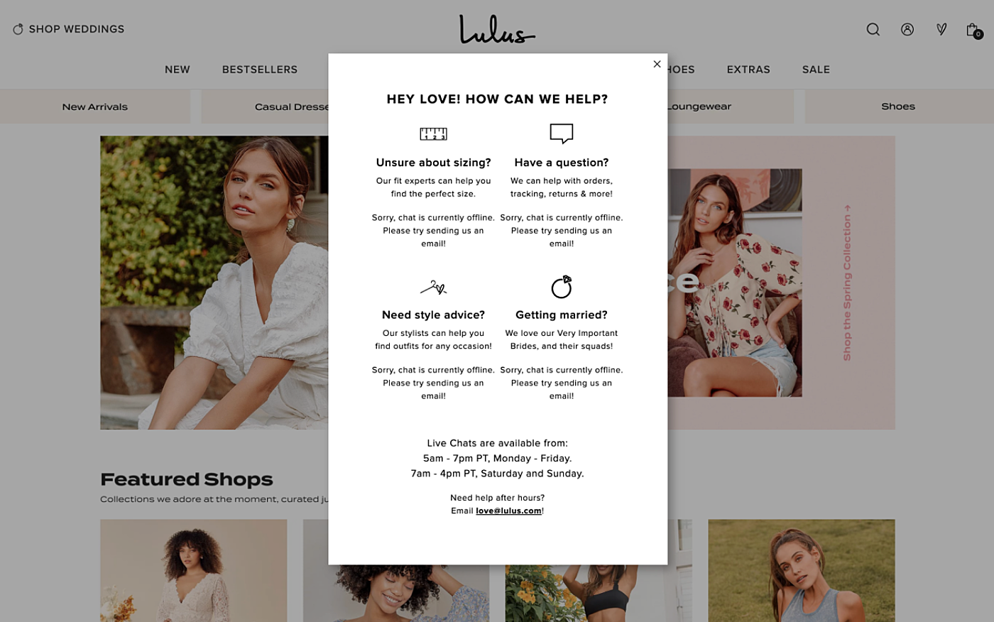
Source: lulus -
Shopping cart or bag. The shopping basket should also be available from any page of the site. It is also important to consider the function of displaying orders in a small pop-up window. That allows users to monitor their carts at any time, correct the quantity, perhaps. But this doesn’t mean that a pop-up window can replace a full-fledged shopping cart page.
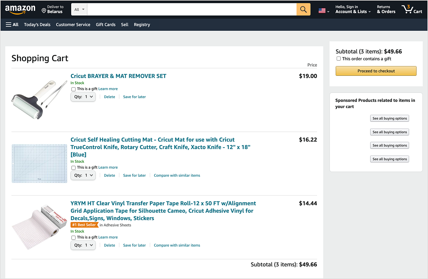
Source: Amazon
-
User testing. This method allows learning preferences of the audience and to govern the site’s key performance indicators, including conversion, users loyalty, the average order price, bounce rate, and other metrics. The A/B-testing is an important and continuous process that is maintained at all the stages of the website’s life cycle. New features are implemented, tested and improved all the time. All the relative hypotheses are tested with the help of live traffic and real users.
-
Testimonials and reviews. Customers don’t get one-on-one interaction with you like they would at a bricks-and-mortar shop in town. They need to be told that you’re worth buying from other customers. You can add testimonials to your homepage and every product you sell.
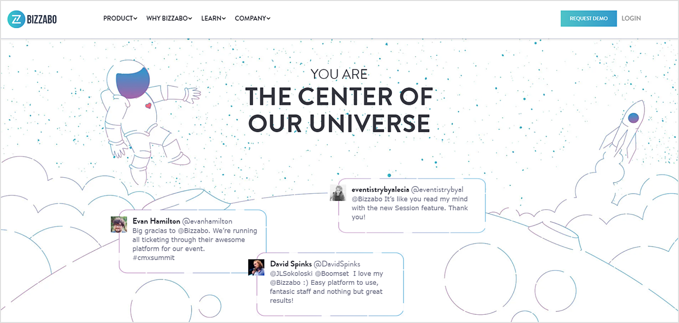
Source: Bizzabo
Provide trouble-free navigation
Due to the way people perceive information, the most important blocks should be located at the top of the page. The most logical visual hierarchy should be:
- logo and name in the header
- search bar
- navigation menu
- contacts
- a slider
- an area with the main content
- footer.
Two main elements of the eCommerce navigation are the product catalog and the search. They should be optimized during the eCommerce website redesign process, and create the most comfortable conditions for customers to find their way in the online store’s assortment.
Important eCommerce navigation design elements are:
- Product catalog or the store’s main menu is an overview of the range of goods. This is a unique part of the shop — the simplest way for the visitor to get acquainted with the features of product assortment and immediately understand what differentiates the shop from the competition. It is better to make it drop-down and divide the catalog into categories and subcategories, but limited to only two levels for easier understanding of the site's structure. In addition to the main menu, it is necessary to place auxiliary buttons for quick access to the page with the company info, shopping cart, delivery services, featured articles, etc. Usually, it is placed at the top of the website over the search box and the contextual menu. Sitemap, however rarely used, should also be present. This section holds a reference to all the shop pages, which improves the search engines indexing.
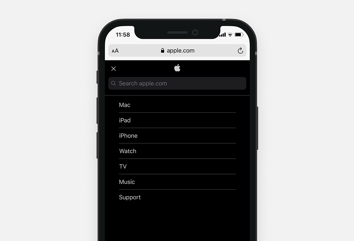
Source: apple.com -
Faceted navigation. Next thing to take care of is the faceted navigation design — giving users the list of the goods, which correspond to a given characteristic. Simply put — filter items. For example, if a user has selected leather goods, all items to be displayed on the page should be made of, contain, care of or be reminiscent of leather. It is important that faceted navigation is very detailed, with the ability to customize the most appropriate filter for each client.
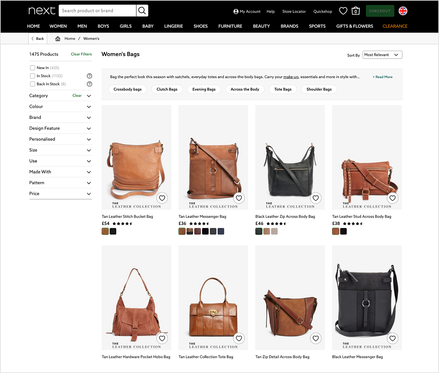
Source: next.co.uk
-
Site search, as we mentioned already, must be maximally adapted to the queries of potential buyers, reachable from any page and easy to use. The two most necessary functions for the search are auto-complete/spell-checking and category search. First is needed to avoid zero results in case of a typo or an incorrect keyboard layout. One of the best practices is to design a drop-down list so it shows some of the most suitable products with reduced images and prices. Search bot can collect user experience statistics, thus helping to find out the trends in consumers’ needs. This way the likelihood of a particular item purchase will increase if a new user, already knowing exactly what he/she needs, visits the site.
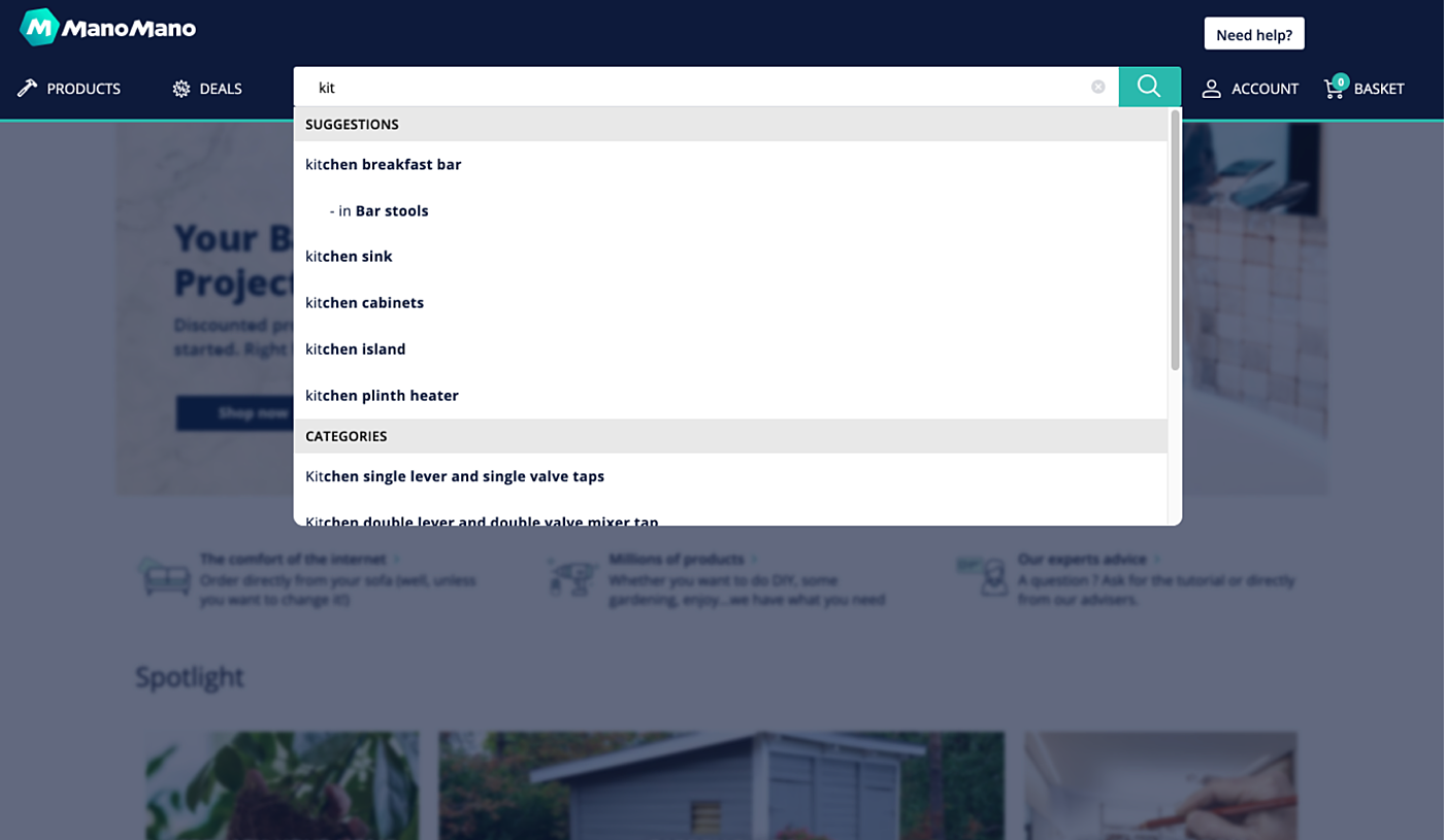
Source: ManoMano
Make it accessible
Allow people to make navigation adjustments with features such as a screen reader, blinks blocking, a text reader, and voice commands. You can also provide color adjustment options for the content, background, and headings.
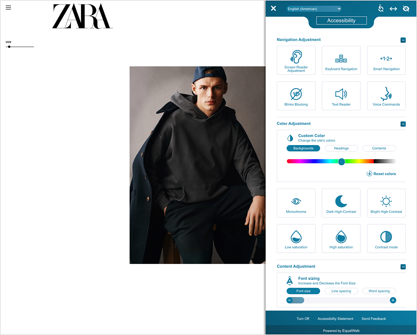
Source: Zara
Recommendations by page types
In this article, we discuss only the basic types of pages. Each online store is unique and should be taken as such, so every individual case and the best eCommerce website features list is discussed separately.
eCommerce homepage design ideas
- Promotional block, informing customers about campaigns, updates, events and popular goods must be present on the main page. This is one of the most important elements of an online store, in fact, it’s what primarily draws clients’ attention. Usually, it is made as a vertical or a horizontal banner with switching slides. Sometimes, it can occupy the whole page, like in Ikea. Such elements should be created by the UX designer to cling to users and motivate them to purchase. Of course, the colors and their combinations should be bolder and brighter here, than in all other parts of the site. Also, it is necessary to use titles, descriptions, and price comparison on the slides.
- Banners with popular products and innovations are a sales mechanism that is based on human psychology. The probability of purchase of goods and services presented on banners is higher among both permanent and new customers. It would be great, if the store’s business logic allowed adapting to regular customers’ preferences, providing promo-blocks with information on the products or brands they are most interested in.
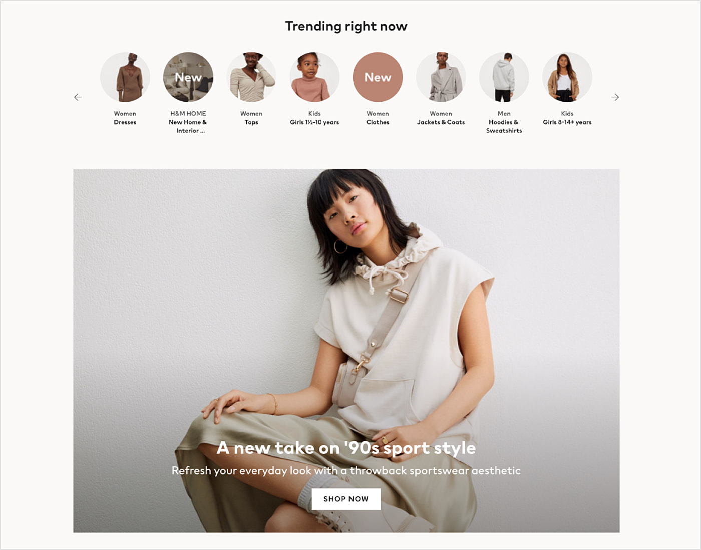
Source: HM.com -
Floating windows or pop-ups are the most convenient way to get any information from the visitors. Country and language choices may be offered to the user via pop-ups in shops focused on international deliveries. One can also use pop-ups to demonstrate the most suitable product range to clients, based on their behavior, age, physical characteristics, and interests.
Pop-ups, in addition, help collect the leads and increase the number of subscribers to social media pages. Pop-ups have a number of undisputed advantages such as high functionality and space for experiments. They effectively guarantee to attract attention and to provide greater opportunities for information personalization. However, one must be careful in their use, as not everyone would like exploring the store's content being continuously interrupted for interaction with something not included in their scope of interest.
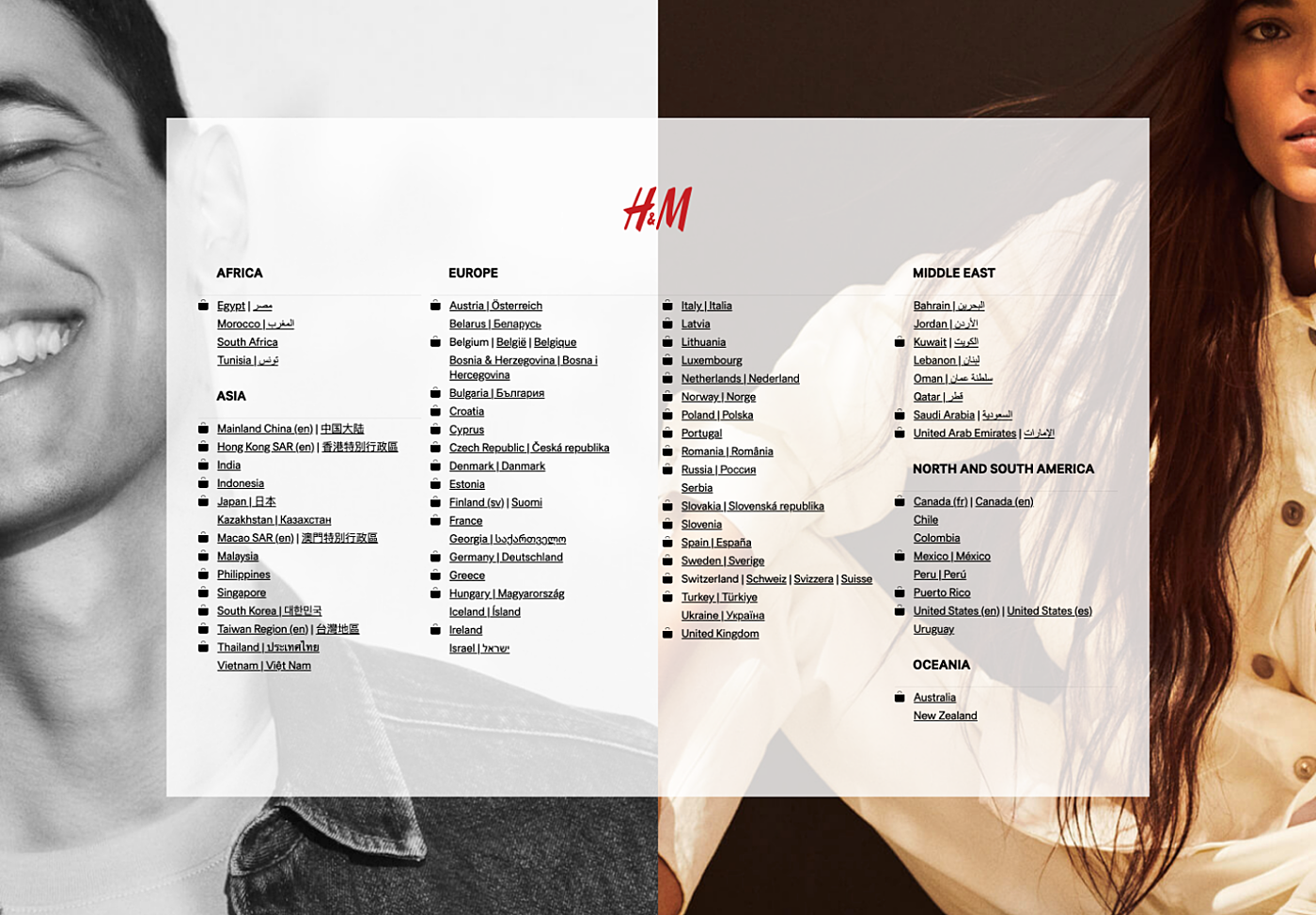
Source: HM.comMake sure you avoid these popular design mistakes when creating a homepage for an ecommerce website.
Product page design
In this section, we want to discuss the product card design. On the product card page, a potential buyer must acquire maximum of possible information about the product they are interested in, though it is important not to overload it.
Important product page elements include:
- Pictures. Online shopping is inferior to the real one in that the customer cannot touch goods directly, and is guided only by pictures and descriptions. It is, therefore, necessary that the images are of good quality, with an option to view them in original resolution, in a sufficient number of views from different sides, and, possibly, in different usage cases. A major role is also played by correct composition — the possibility to watch products in relative contexts might increase the sales. Also, it is important to present photos of the goods in all the available colours. Cutting costs on hiring professional photographers might prove catastrophic. Moreover, clients often don’t want to know what material the product is made of, preferring a photo, which shows it clearly. Images should arouse a desire to purchase the goods.
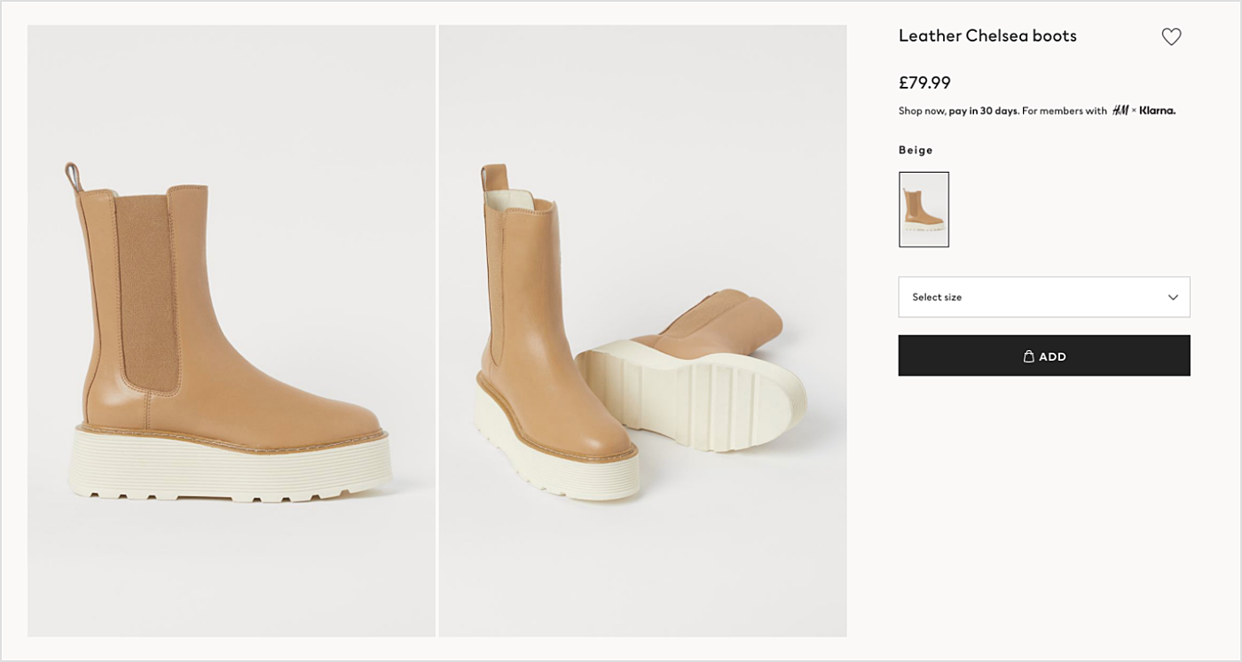
Source: HM.com -
Video reviews or 3D models can illustrate the value of the propositions, their functionality, and performance.
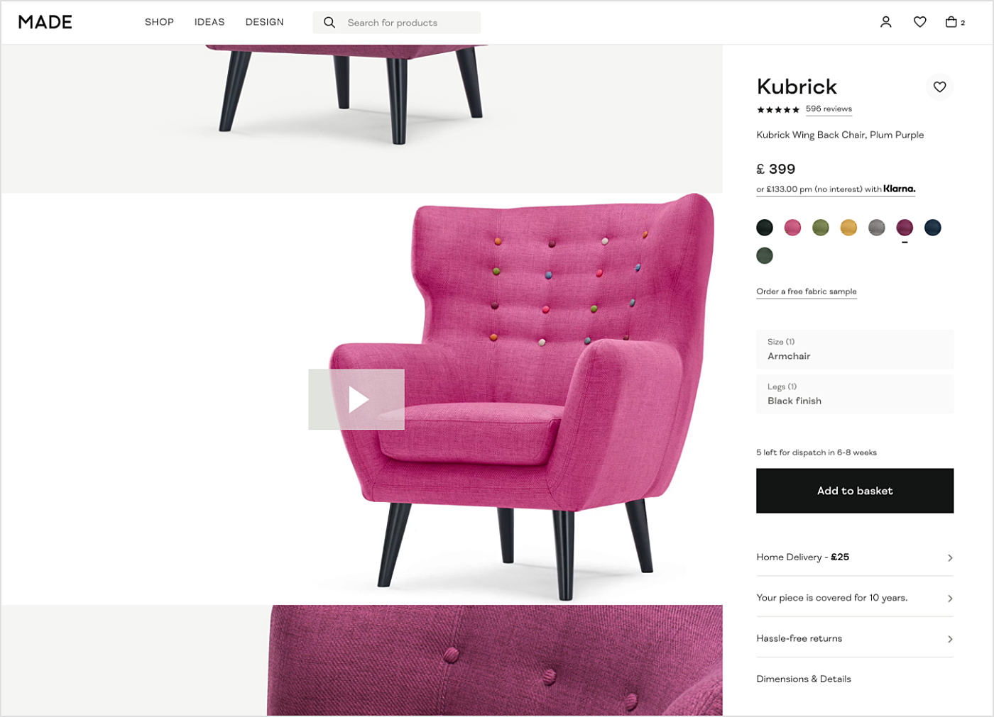
Source: Made
-
Price and stock. The second by importance for the buyer is the information on product price and availability. Naturally, the price should be the same, regardless of color or size. Discount options, notifications of short-term promotions and demonstration of savings as a percentage will help visitors to decide quicker. It will not hurt to have a "follow the price" button — this way the company gets the leads, and the client will be able to learn quickly about promotions and sales. The message about the stock shortage might stimulate immediate purchase. Never should the customer learn that the product has already ended after adding it to their cart. This should be pointed at the product page with an option to subscribe to notifications, telling the product is back in stock.
Shopping cart page design
The client interacts with the shopping basket in the process of goods selection on the website or in the POS interface design. Advertisement and banners are unnecessary here — buyers have already decided what they need, extra information will be annoying. Another crucial moment would be deciding whether registration is one of the requirements for booking an order. Small shops should not create additional obstacles for shopping, but for the large ones, it is easier to work with a pool of loyal customers.
Critical elements of this page are the check-out button, a promo code field, price calculator and the ability to continue shopping.
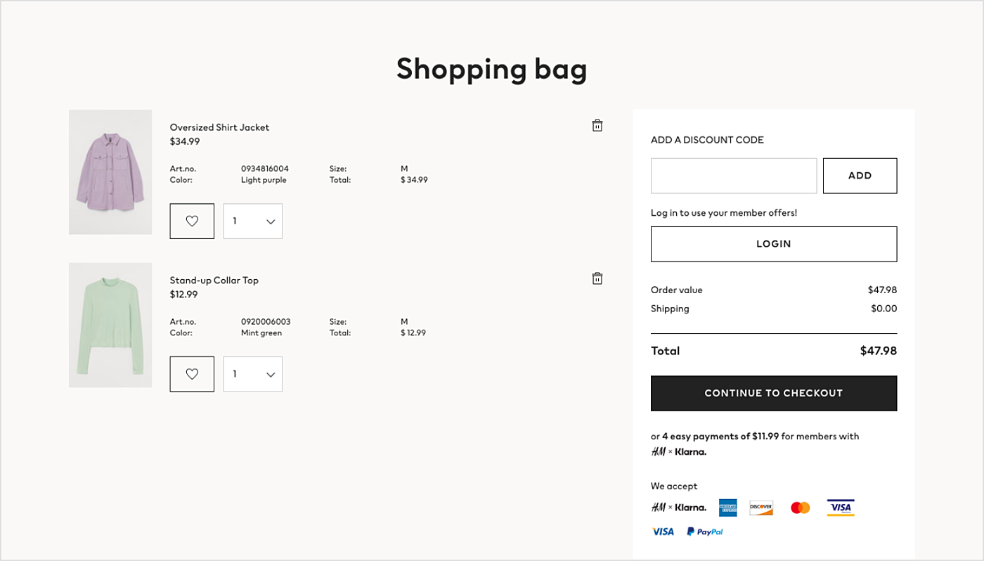
Source: HM.com
- Cost and promo codes. If the delivery price depends on the customer's geographical position, they should see the price in their local currency. The same thing goes for the promo codes: do not forget to create a field to enter it, if such codes are supported by the shop's marketing strategy, so that it will be immediately taken into account by the calculator.
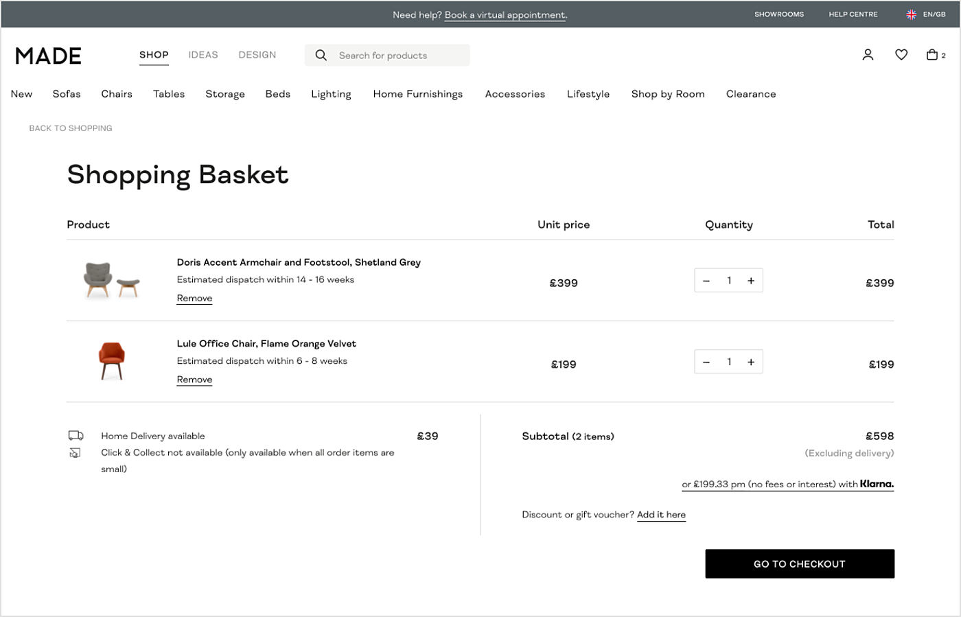
Source: Made -
Privacy policy. Would be nice to remind the customer that their privacy and personal information are respected and will not be used against their explicit will; the return policy. If the cart is still empty, it is better to display the information on how to place an order here, instead of just reminding them that they have not chosen anything yet.
-
Recently viewed or suggestions block. Place the information on the goods that other people tend to buy together with the present in the cart, or suggestions that may still be necessary to the client. Consider several payment options for the processed order to reduce the number of failures due to improper calculations.
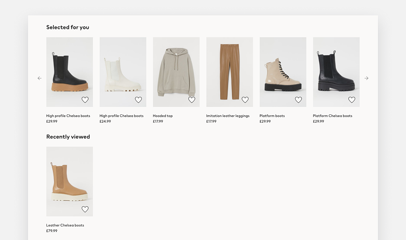
Source: HM.com
-
Show customers the final purchase list before the checkout. It is better to let them check the entered data one more time in the additional tab before finalizing the checkout. This will help to complete the purchase quickly and with the least effort. All the information should be displayed on the same page, starting with the general information about the customer down to the chosen payment method details. On the right, a short-order contents list can be put. It will display summary information so that it can be controlled in the process of filling out the checkout.
Summary on how to design an eCommerce website
Same as for real sales, the main task of creating an eCommerce website is to do everything for the customer’s satisfaction, not just to sell goods and make profits. In general, store designs have similar logic and consistency. Nevertheless, each one of them has its own unique features, according to which the clean eCommerce design is directed at solving some crucial tasks.
In this article, we gave examples of the most important and common interface elements and tried to explain how to improve eCommerce website design. However, it is impossible to use the same functionality for all the different businesses. The best way to choose the most appropriate solution for each specific case is found with the help of the A/B-testing. We plan to feature the A/B-design guidelines in detail in a separate article in near future.
If you’re thinking of going online or giving your website a reboot, reach out! Agente knows how to make your eCommerce website design stand out.
Rate this post!
403 ratings, average ratings is 4.8 out of 5
Related Posts

How to Launch Your Online Travel Marketplace Platform in 2024?
Learn how to launch your own online travel marketplace platform in 2023 with our comprehensive guide and step-by-step insights.

14 January 2024
Marketplace Website Design and Development in 2024: Features, Tech Stack & Cost
Discover the latest in marketplace website design and development, explore features, technology stacks, and gain insights into cost-effective strategies.

Ecommerce Website Revamp [The Ultimate Guide]
Learn why you should redesign your e-commerce website and how it can improve your online store's performance, including increasing traffic, engagement, and sales. Get expert tips now.

POS Interface Design Principles
There's hardly a retailer who doesn't have POS software in place or not planning to start using it in the future. In this article, we're going to discuss the Design Principles of POS Interface.
What Is mCommerce and How Your Business Can Benefit from It
Find out about m-commerce advantages and disadvantages, benefits for consumers and future trends in the sector.
How to Improve Online Shopping App Design for Better UX | Agente
Dissecting shopping app UX design: how to make your design work and provide a superb user experience.
Let's talk
Is there a challenge your organization or company needs help solving? We’d love to discuss it.

Managing Director, Partner
Andrew Terehin

Thank You!
Your message has been successfully sent.
We will contact you very soon.


