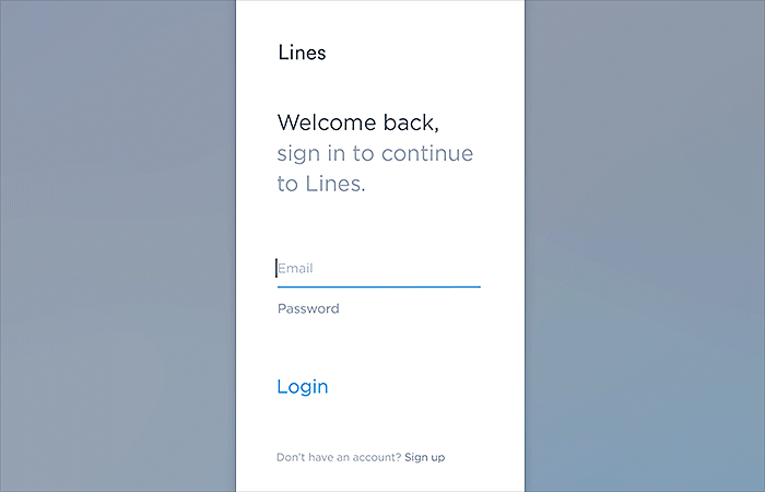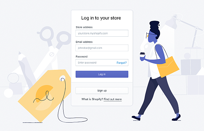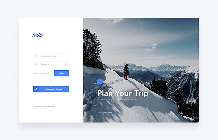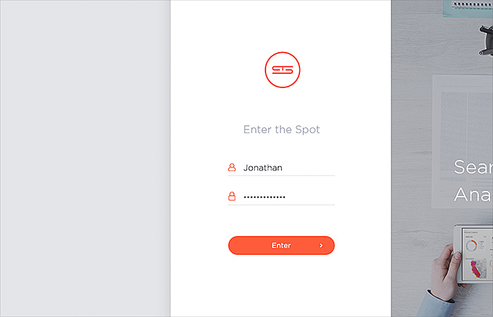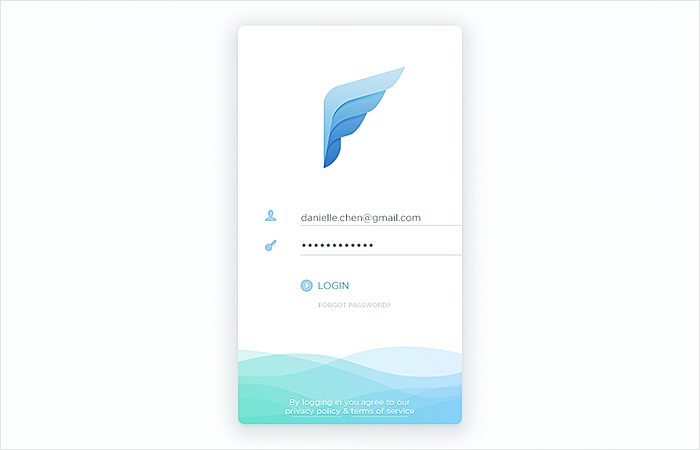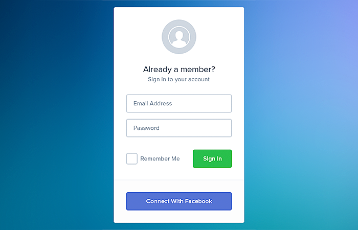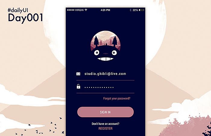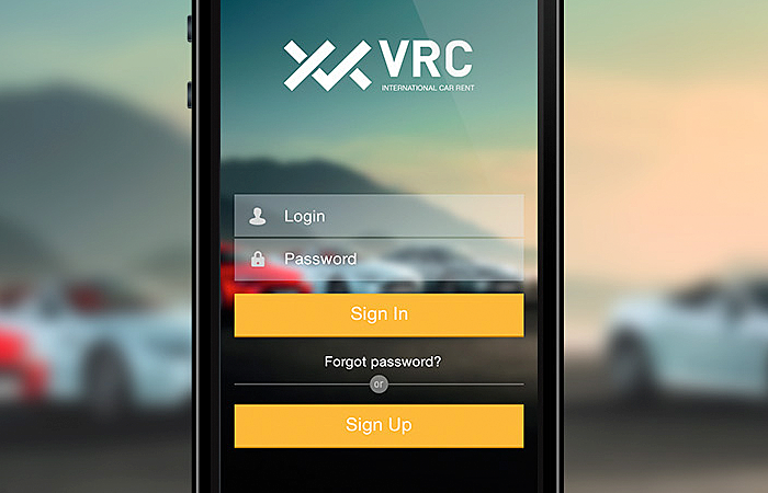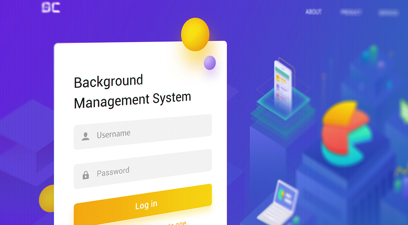
The success of websites and mobile apps depends on a variety of factors, and UX is not the last on that list. Such a small constituent as a login form usually plays a crucial role when it comes to UX. An attractive login page may turn a first-time website visitor into a loyal friend, while a poor login page design may increase the bounce rate.
A complex login form design isn’t something that today’s consumers expect. In this fast-paced world where time is so precious, people are unlikely to take the trouble to lose time filling out long forms, especially if they are accessing the form from a mobile screen.
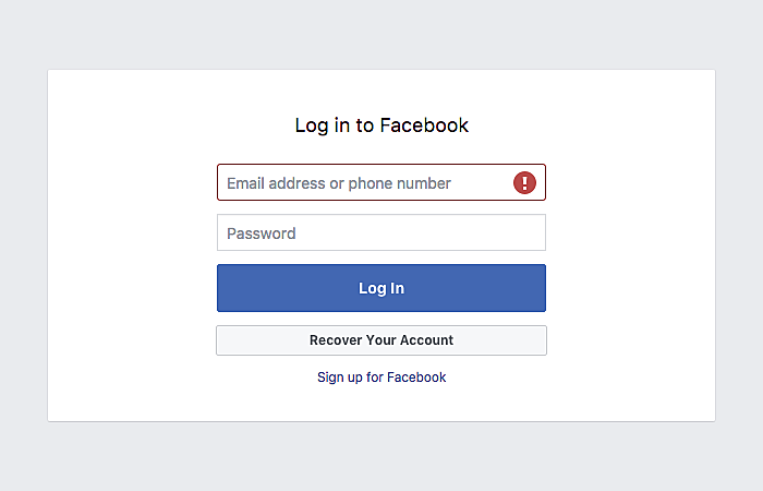
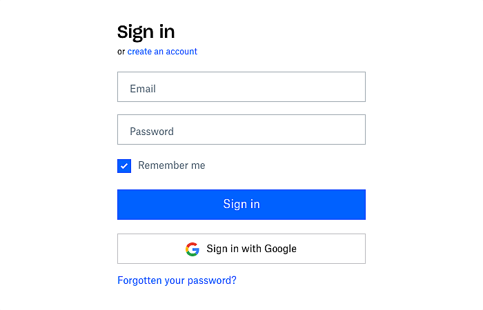
Online stores, social media networks, blogs, and the best bank website designs are all examples of websites and applications where these forms are a necessary evil. Popular and high-traffic websites have started to opt for a simple user login design a long time ago to nudge users into staying with them. Check out these two login page design examples we’ve found on well-known sites:
Source: Facebook
Source: Dropbox
Select the Right Terminology
The terms “sign in”, “sign up”, “sign out”, “log in”, and “register” may cause confusion for non-native speakers. Mistakes are made particularly often when web designers position “sign in” and “sign up” buttons very close to each other.
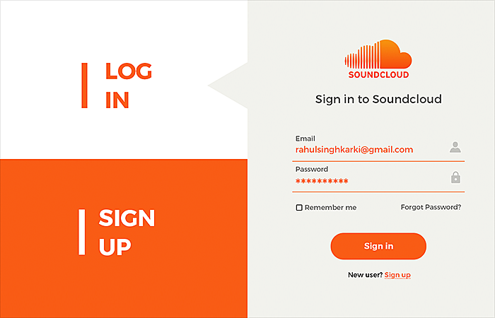
“Sign in” and “log in” can be used interchangeably.“Log in” is believed to be more technical, while “sign in” sounds more natural (just as people speak to each other). “Sign up” simply means “register’. So it’s better to use “log in” together with “sign up” or “register” to eliminate any confusion.
“Sign out” and “log out” also have the same meaning, but try to avoid combining “sign in” with “sign up”, as there is a high risk that disgruntled non-natives will abandon the site.
You may also be interested in Best Examples of Beautiful Blog Design.
UX Considerations
We’ve prepared some handy tips on how to design a login page that will deliver a great user experience. These are the tips that will help you create the best login page design.
-
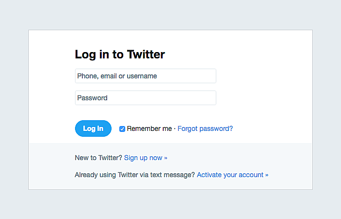
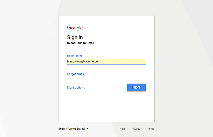
Use an Email Address/Phone Number as a Login
Even though your mobile app/website asks users to create unique usernames when they register, it’s a bright idea not to utilize them as the only login option. Often people simply don’t remember all the usernames they have.
Introduce other login alternatives, such as an email address or a phone number to make the sign-in process as easy as ABC.
Source: Twitter
-
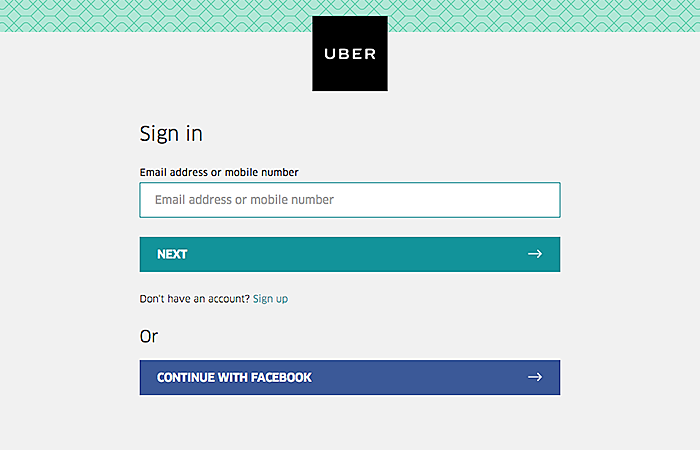
Enable Social Login
There are approximately 2.6 billion social media users today, and you can remove the need to go through a boring process by putting social media login to use. Let people log in via their social media accounts like Twitter, Facebook, and Google and you will win their loyalty.
Source: Uber
-
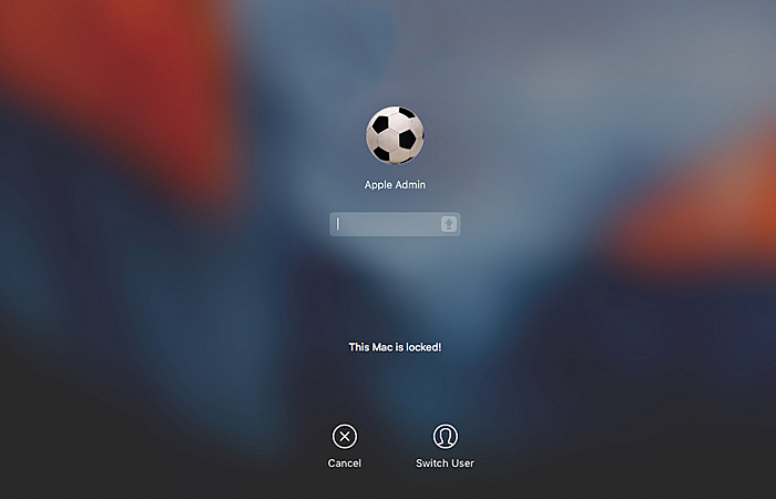
Warn Users When CAPS LOCK is On
Informing users that CAPS LOCK is active may protect them from unintentionally using of upper case characters. You can display the notification near the input field or even inside it.
Source: amsys.co.uk
-
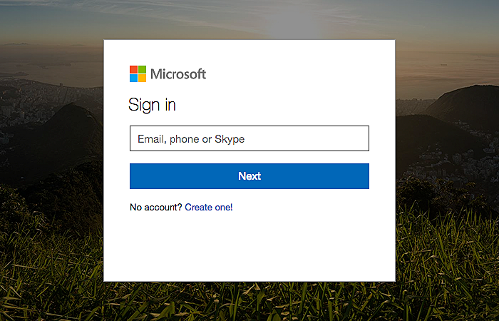
Tell Users When They Enter a Wrong Password/Username
People tend to forget various things, and they often fail to keep in mind all the passwords and usernames they have created. They may even forget a new password they invented a couple of hours ago. It’s good practice to immediately notify users when they have entered a wrong username or password.
Source: Microsoft
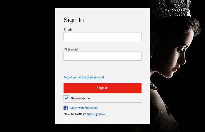
To ensure a positive user experience, add a clear “Forgot your password?” link to the page to help them recover it. You may show this link only if the password is entered incorrectly.
Source: Netflix
Reminding the user of a recently changed password is also a good idea.
-
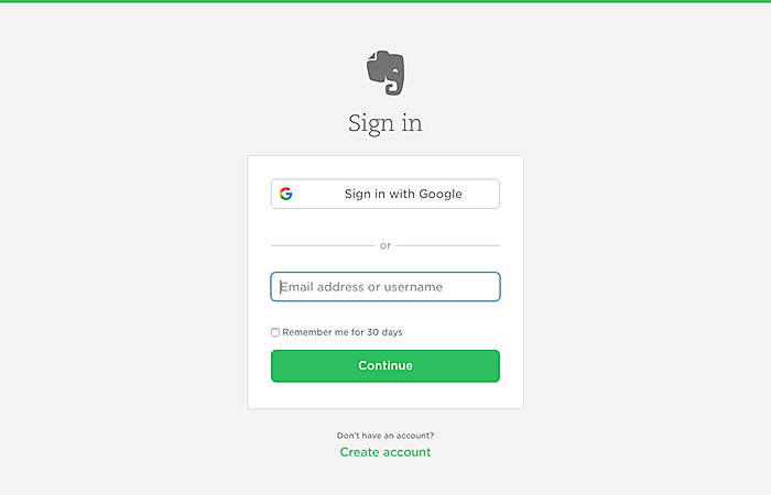
Keep Users Signed In After Registration
Another good tip for login screen design. Spare registered users need to log in each time they visit your website or open your mobile app. Provide them with the opportunity to stay signed in to the account by either adding a checkbox or keeping them signed in automatically.
Source: Evernote
-
Remove the “Confirm Password” Field
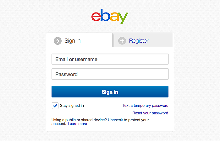
Long forms frustrate people and they reduce conversion rates. That’s why successful sign in forms don’t have them at all. A great example to follow, isn’t it?
Source: eBay
-
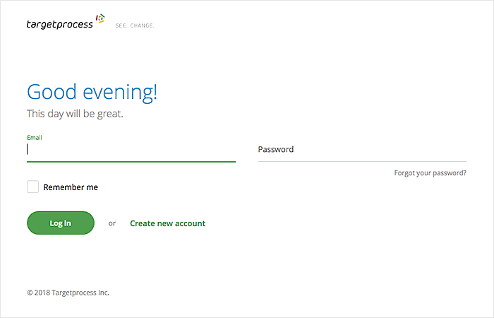
Indicate the First Input Field with Color
You may also give a hint to the user about where to start from by indicating the first input field with the help of color. This tactic works particularly well for mobile visitors by immediately drawing their attention to the necessary field, thus saving their time.
Source: Targetprocess
-
Remember Return Users
Pre-fill as many “sign in” form fields for return as possible, in order to make the login process completely painless for return users. If possible, ask them to enter the password only.
Mobile Login Forms
To delight mobile users, follow these several pieces of advice.
-
Log In Users without a Password
Some practitioners have started to skip the password step by using alternative authentication methods, such as Google Authenticator, one-time SMS security codes, biometric authentication, and so on.
-
Give Visitors an Opportunity to View/Hide a Password
Grant users an opportunity to make the password visible when they are typing it. This option is extremely useful to mobile visitors whose devices have small screens. Taking advantage of this option, they will make fewer mistakes.
-
Optimize Website Login Page for Mobile
A mobile-friendly design is a must for all of the website and for sign-in page design too. Double-check that the login page looks good both on desktop and mobile screens.
Excellent Sign In Form Examples
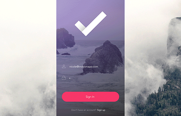
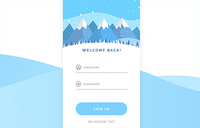
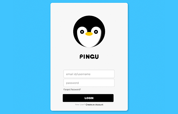
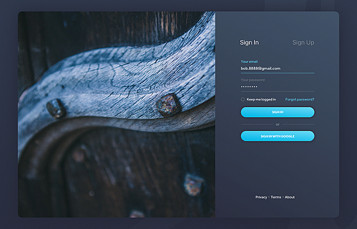
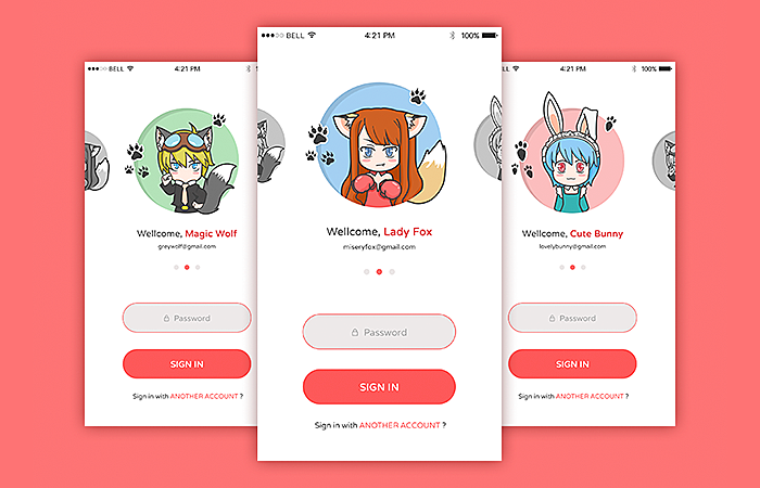
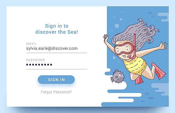
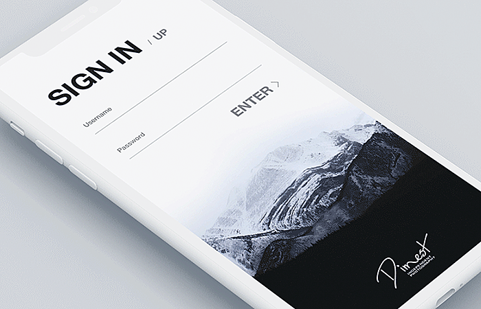
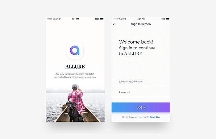
Now you know the nitty-gritty of creating a user-friendly login page. To give you design inspiration, we’ve decided to share with you some great examples of a login page.
It is worth noting that these are not all examples of login pages that can help inspire you to create your own. But this list is quite exhaustive.
Source: Dribbble
Source: Dribbble
Source: Dribbble
Source: Dribbble
Source: Dribbble
Source: Dribbble
Source: Dribbble
Source: Dribbble
Source: Behance
Source: Dribbble
Source: Dribbble
Source: Dribbble
Source: Dribbble
Source: Dribbble
Source: Dribbble
Source: Dribbble
Source: Dribbble
Final Thoughts
The login page design has pivotal importance both for websites and mobile apps. You cannot afford to skimp on it if you want customer recognition and loyalty. In this article, we have cast some light on some vital issues that you should consider when creating a sign in form. Put them into practice and you’ll never regret it. Have something interesting to share with the AGENTE team? Drop us a line or give us a call today.
FAQ
1. What is the importance of a login page?
The login page allows a user to access a website or web application by entering their username and password or by authenticating with a social network login. In addition, the page allows you to enter both authorized users and those who first visited the site and need to register.
2. What makes a good login screen?
For a successful login page, you should use your email address/phone number as your login, enable social login, warn users that CAPS LOCK is enabled, and leave users logged in after login.
3. How long does it take to design a login page?
The time it takes to create a great login page design can vary and depends on various factors. As a rule, this takes approximately 4-5 hours.
4. How do I create a great login page screen?
To do this, you need to have experience in designing and working with tools that allow you to design a login page. Or, you can seek the help of experienced designers to create the best login page in terms of UI design.
Rate this post!
850 ratings, average ratings is 4.9 out of 5
Related Posts

17 January 2024
What Does a UX Designer Do in 2024: Role & Responsibilities
What does a UX designer do? It’s time to define core responsibilities, functions, and perspectives in one place.

11 January 2024
Mobile-First Design: Full Guide for 2024
What is mobile first design? Well, the mobile first approach is a central principle of progressive enhancement. In a nutshell, it’s all about producing a small screen design and then scaling it up to other devices. In our new blog post, we cover some aspects that need to be taken into account when launching a mobile first web design project. We also share some outstanding design examples for your inspiration.

05 January 2024
10 Best 404 Error Page Designs for 2024
In our new blog post, we review the best 404 page design examples of 2019 that will never disappoint you even if you meet the dead end on the website.

03 January 2024
10 Best Game Website Design Examples: How to Design Yours
Game website design: importance in attracting new players, awesome examples and design tips.

22 November 2022
10 Best Restaurant Website Designs & Best Design Practices
Restaurant owners always have a lot on their plate, and they are usually focused on the areas that can bring tangible benefits. Websites, unfortunately, are not one of those areas because even the perfect website does not guarantee that the restaurant will be full every evening.

31 May 2022
10 Best Examples of Website Footer Design
10 website footer design best practices examples for inspiration ⚡ Things that can go in website footers ⚡
Let's talk
Is there a challenge your organization or company needs help solving? We’d love to discuss it.

Managing Director, Partner
Andrew Terehin

Thank You!
Your message has been successfully sent.
We will contact you very soon.
