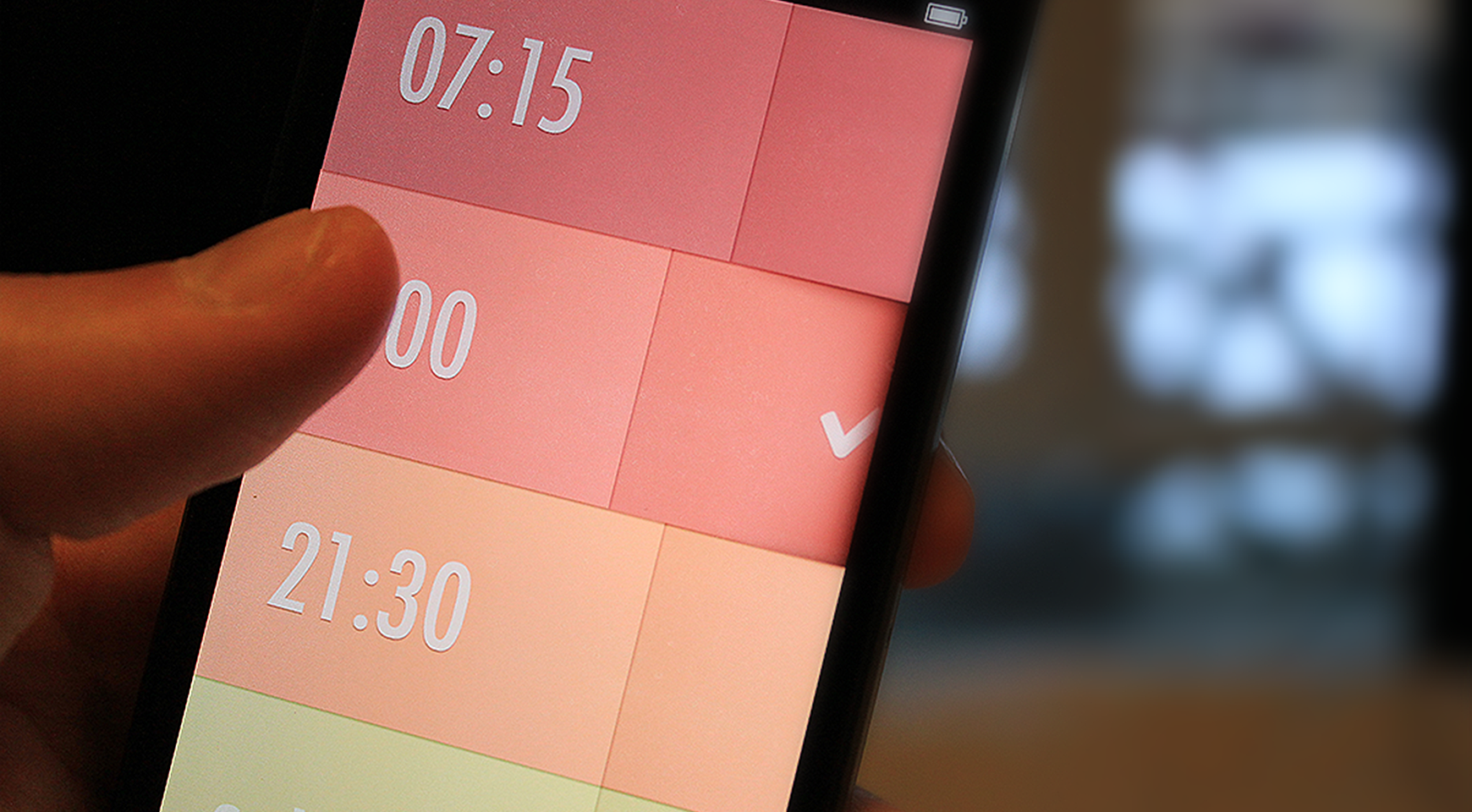
The role of mobile applications is growing, and more of them appear in app stores every day, making it more difficult to distinguish one from the other. When the app is downloaded from the market, it has only a few seconds to impress the users before they will delete the app and look for an alternative. Often just the screenshots in the market are enough for users to decide. So obviously the mobile application interface design should be impressive enough.
That’s why every aspect of your app should be carefully considered to find success in the overcrowded market. You will notice that the proper design of the application will affect the popularity of your product tremendously. In this article, we will cover seven mobile application interface design principles that will help to understand how to design a mobile app with more chances to succeed.
In Agente, we have been always paying proper attention to mobile app design and we have many examples to illustrate each principle we are going to talk about. You can get more familiar with our portfolio to see how we apply each of the principles.
Here are our main principles of designing a mobile app interface.
1. Uniqueness
There is no point in creating something that already exists, that’s why your app should have many advantages. And another point to consider here is presenting them right.
Take Clear, for example. From the first sign, it is a to-do list, but its interface fundamentally differs from other apps of its kind. There are no buttons and there’s no navigation menu, just tasks. Users navigate and interact with the app with the help of gestures, and it is the main feature of the application. Uniqueness is one of the most important mobile design principles and that’s why we put it in first place on our list.
2. Structure
User interfaces in mobile applications should be helpful and meaningful. It means grouping similar items together, so users don’t need to spend tons of time trying to find what they need. You also need to keep in mind that the number of features and sections should not overwhelm the user. Sacrifice some less relevant features without a doubt.
3. Contexts
Some apps can be used only on the go, others — in a relaxed atmosphere, and some apps can be used in both situations. Context seriously affects mobile user interface design, such as a bigger font, highlighted buttons, and only vital content. On the other hand, the interface can be entertaining and full of engaging options. Before moving on, you need to find the context your app will be used in and then build the interface according to this information.
4. Gestures
Gestures allow users to navigate apps intuitively. They can also add gamification and may help you gain particular audiences, like teenagers. Mobile devices are designed for gestures, so try to get the most out of them and become a source of inspiration for other apps. Simultaneously, try to use gestures familiar to your users and keep in mind how your users will be handling their devices and in what context. Let’s say, the user is holding the handrail on public transport with one hand and trying to work an app with the other hand, it might be annoying if to expand there is only a gesture to pinch since it requires two hands.
5. Tolerance
App interface design should be created in a way that if some options come up along the way, the system would suggest by default the most beneficial variants to the user. Make sure your app allows users to undo certain actions and the notifications are showing that some changes will be made and can be undone. Tolerance means allowing users to make mistakes and allowing them to revoke changes.
6. Consistency
If several elements in the app serve the same purpose, they should look and function the same way. No exceptions. Changing one element means changing all other variants. If there are several styles of “submit” buttons on different pages, it will be frustrating and the app would look messy. Consistency means tidiness and it is certainly a must-have in every app. That’s why in the majority of mobile app design companies there’s a rule to create a UI kit for every project. This includes all elements of the app, and it becomes easier to follow the consistency principle with a UI kit.
7. Communication
The core idea is to let users know your app registered the action and processes it, even if an immediate result is not possible. When the user performs a certain action, it can be considered an act of communication with your app, and the app should respond with something. Sometimes even the loader sign can be enough. From a psychological perspective, people need to get acknowledgment for their actions. It is especially important in the banking sphere.
There are many more mobile UI design guidelines and aspects to mobile app interface design. Some of them are general and can be applied to all apps, while others can be more specific to your business sphere. Besides that, each platform has its principles, and if your app is designed for both systems, you should take into account that Android design principles are different from iOS.
Examples of Best Principles of Designing an Interface for a Mobile App
With the knowledge of how to make your application UX design catch and satisfy users' eyes and minds, let’s look at some examples of the project that made the best out of it. Each of the examples has its significant feature and all of them in our opinion are exceptional projects to learn from.
Starbucks
The popular American coffee chain gets so well-known and loved all across the world for its signature offerings that leave a lasting impression. And the company extended the same principle to their application.
First of all, the design is unique and matches the well-known colors of the brand, and it also goes along with all the listed principles. The company has taken care of its customers. Their mobile app user interface is intuitive, consistent, and unique.
Calm
Let’s see… What will the users expect from the meditation and relaxation application? Most probably to have no distractions. And that’s one of the best things about the Calm mobile app. The developers here really thought the context through. Nothing in the UI design works against the goal of the project — the navigation is minimalistic, and the colors and pictures are pleasant and eye-satisfying. Just looking at the interface makes you feel Calm. We’re not surprised it received the award of the best app in 2017.
Houzz
The material design, even though it wasn’t invented just recently and is already used by many app developers, is not so easy to apply in practice. But the Houzz application for the home design and decoration ideas is implemented just perfectly.
Easy and intuitive navigation without details overload allows users to perceive a lot of information without too much effort. The design is so laconic and clear — the users barely need to read to navigate through the structure. No questions, as to why Google Pay awarded it for the mobile app design.
Apple Store
It is widely known how the design principles invented by Apple have changed the industry. Not to be unfounded, let’s take a look at the design of the Apple Store.
Loads of white space and sophisticated minimalism — that’s the best way to describe the unique design concept of the Apple Store. The navigation is easy and clear without much cognitive load. It serves its purpose in a consistent way of staying true to the strategy of the company.
Unix
And another good example of app design is minimalism with a feeling of exclusivity that is achieved with easy details. And don’t let the plain interface confuse you, because as you get deeper in functionality, nothing is missing. And the dark theme of the app looks even more attractive.
The dark interface has been trending in the last years as it saves the battery, reduces the strain on the eyes, and helps the UI elements to stand out.
It is worth mentioning that the trends in mobile app design come and go, while the principles don’t change over time. There is always a point in exploring the market and adopting the best practices (without actually copying anything!) to always be ahead of the competitors.
How Much Does It Cost to Design a Mobile App
The cost of mobile application interface design will depend on certain factors, such as the complexity of the idea, the number of team members involved, and the time spent on the design. Let’s break it down in more detail.
The complexity of the app idea
The complexity of the mobile app user interface will depend directly on your idea. The more simple the idea and the design, the cheaper the design will be.
So before everything to estimate the cost of designing the mobile application you need to figure out how user roles will the app have, how many screens it requires, how many blocks are in the app, and in which way all of them are connected, and what features will the app have.
Have in mind that designing a simple mobile app will take at least 80 h and the amount of time will increase with each new feature.
The type of team involved
This criterion is closely related to the previous one as the complexity of the idea will define what kind of specialists with what kind of expertise will be required to implement the product.
You can choose between hiring an agency, a group of independent freelancers, or an in-house team. Each of the options has its pros and cons, and also the service prices can be very different.
Remember also, that the location of the development team matters as in different regions the average hourly rate will vary.
The design type
There are two ways to make a mobile app interface design: to use a custom design or stick to the native.
In the first case, the User Experience and User Interface are built from scratch. This will add up to the uniqueness and will represent your brand much more precisely, but also it will cost you more because it requires a more experienced designer and more hours of work.
With the Native design, the developers will use the platform-specific guidelines and element placements. iOS, Android, and other mobile device platforms have standards of how everything should look. The good news is that designing the app with those tools will be much faster, easier for the developers, and thus cheaper. Though, it might provide you less freedom to choose the design elements and less space to explore.
So there is no fixed price for designing a mobile app interface because each project and idea are different. Only after getting to know more about the idea, you have in mind and the requirements, we will be able to estimate the project.
Agente experience
AGENTE has been designing mobile interfaces for many years, and it allows us to advise the best suitable strategies to our clients and follow the principles that would ensure the app’s success.
For example, take a look at FQ — Health-minded Fitness App, where we conducted deep research to find the best design solution for the nutrition app. The slick and smooth minimalistic design helps users focus on the main functions and navigate through all the features with ease.
We’re also proud to design a mobile app for San Francisco Stock Market Exchange. As the app was targeting millennials, we decide to use the trending dark mode which also goes perfectly with financial products. It has a lot of eye-catching visual elements, such as bright icons, customized graphics, and contrast elements to simplify the use of the application.
The big part of the user interface is expressing the visual brand identity and in AGENTE we really enjoy working on it, taking into consideration the industry the app is built for. For example, in Hey Wine — a mobile E-commerce platform we used the maroon color a lot in the interface which reminds us of the glass of the drink. The design here is clear and intuitive and importantly without any unnecessary elements.
Conclusion
All of the mentioned principles were tested over time and have shown their effectiveness in building attractive, useful, and user-focused apps that are received well by the target audience. To create a mobile application interface design that users will fall in love with, both designers and developers should be aware of all the principles before starting to work. If you partnered with an agency, then they make sure the app complies with those standards so you don’t have to worry about anything.
Frequently Asked Questions
Why Designing an Interface for a Mobile App is important?
Because the app interface creates an impression and creates user satisfaction. If the User Interface is designed well, the customers will more likely return to the services and have a good impression of the brand or company. In AGENTE we carefully discover your idea to find the best way to express the values of the brand in the app.
How to build a mobile app interface?
The process of designing a user interface for mobile up is a little more complicated than it may seem. First of all, it requires creating a flowchart of users' behavior and then sketching and designing each of the screens. It might be hard for someone who is not familiar with the basics of design. That’s why our team is ready to take this responsibility and develop an app user interface that will satisfy your needs and make your users happy.
Rate this post!
819 ratings, average ratings is 4.0 out of 5
Related Posts

07 January 2024
The UX Audit: A Beginner's Guide For 2024
A user experience audit (UX audit) is a great way to reveal the non-perfect areas causing severe headaches for users, and to get recommendations on how to improve them to make it easier for visitors to reach their goals on the website, thus boosting conversions, improving user engagement, and generating more leads, among other benefits from a UX audit. Let's dig deeper into details in our new article.

05 January 2024
10 Best 404 Error Page Designs for 2024
In our new blog post, we review the best 404 page design examples of 2019 that will never disappoint you even if you meet the dead end on the website.
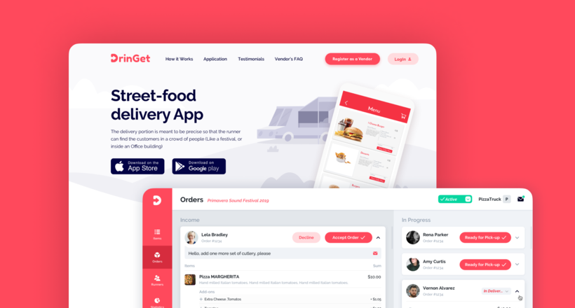
Effective Food Delivery App: Key Tips & Best Practices
In this article, we will share our experience in creating a design for a specialized food delivery management software, as well as best practices in designing such an application.
26 May 2022
10 Best Examples of Beautiful Blog Design | Agente
In this article, you'll find 10 best examples of beautiful blog design, along with the tips that can help you enchant visitors.
16 May 2022
Top Basic Patterns for Mobile Navigation Design
Navigation through your app should be intuitive and predictable. Both new and returning users should be able to figure out how to move through your app with ease.
29 April 2022
How to Design a User Profile Page in 2022
User profiles can become a constant flow of customer-related data that is extremely useful for marketing. How to design a user profile page? Read in our new article.
Let's talk
Is there a challenge your organization or company needs help solving? We’d love to discuss it.

Managing Director, Partner
Andrew Terehin

Thank You!
Your message has been successfully sent.
We will contact you very soon.


