18 September 2018
10 Tips on Typography in Web Design

What’s the main goal of any website? To communicate the message to the end user. Sure, text in the form of web typography is the most obvious means of doing that. Headlines, fonts, size, line distance and paragraph spacing all affect the way information is perceived. The more text a website has, the larger font it requires. If it is not a website but, say, a complex CRM system, then smaller fonts are better, which means that special attention should be drawn to letter kerning in order for letters not to run into one another and complicate reading. In other words, each specific system requires an individual approach to its creation; however, there are always some universal rules to make the font readable, scalable and classy, as well as define elements hierarchy, come up with the right location of the text and hone the solution with microtypographic gimmickry.
This article features 10 tips to refine website typography, a brief overview of current trends and a few ideas to inspire you.
10 Tips on Typography in Web Design
What is a typography in web design? In fact, it is a key to the effective UX/UI design of your website on any device. We start typography web design by creating three files for PC, tablet, and smartphone in sizes that comply with the resolutions of popular devices. So the first tip is:
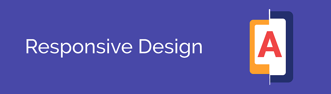
1. Keep in mind responsive design
When creating responsive web typography, pay special attention to at least three factors:
● Font
Too complex and too thin letters are not only hard to read, but also become distorted when scaling for mobile. To avoid this, many designers use sans-serif fonts for mobile websites and apps. As a rule, these simple and straight letters are seamlessly scaled.
● CSS styles
With a few CSS lines, you can fundamentally change the way the text looks on your website in terms of line height, line length, font size, etc. The two critical criteria for a mobile font are size and white space. When the text is smaller than 16 pixels, it’s not mobile-friendly, yet a large text will create uncomfortable intervals and shifts. How should you deal with this? As a rule, mobile wireframes feature fonts in <em> rather than in pixels. Thus, a font size can react to any parameters of the screen accordingly.
● Load time
Mobile users using an unreliable network connection will suffer from slow loads. While you cannot resolve the situation from their side, you can, nevertheless, increase performance by keeping to a limited number of fonts and by selecting web-safe variants (although they might seem not that attractive in some cases).
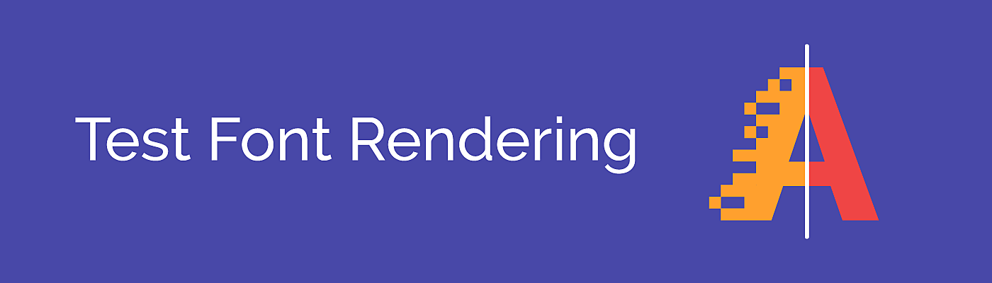
2. Test font rendering across multiple OS
Font rendering differs across browsers and operation systems in terms of kerning, ligatures, underline position and thickness. It can also differ between Windows and Mac OS. Even more crucial differences can be seen in Photoshop.
The most effective way to pick the fonts correctly is to test them on the live server. You need to code the page in HTML and check in a browser.
3. Stick with fonts that look like real letters.
What does that mean? Even though creative designers turn their noses up at Arial and Times New Roman, they remind users of printed letters from books. Easy-to-read fonts with decent kerning and distinct letters are good for any screens with unique characteristics and for special patterns of user interaction.
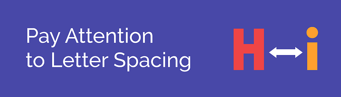
4. Pay attention to letter spacing
Correct spacing is the cornerstone of a comfortable reading experience. Sometimes a line or letter spacing is too large, and often, lines stick to each other, complicating the copy reading process. The optimal interline spacing should be about 120-150% of letter size. As for small text on mobiles, this spacing may be even larger.

5. Align text to the left
In the digital world, justified alignment is no longer popular. Seriously, it is not a book! Left alignment is the appropriate option for a website. Before presenting prototypes to a customer, a good practice for a designer is to remove “hanging” lines and prepositions, and to align ragged edges. Hyphenator is a good tool to do that.
6. Use distinguishable fonts
Give your preference to fonts with open forms and apertures. The wider a letter void is, the better its form can be deciphered.
Also, select the fonts with larger letter height and work with various sizes in the hierarchy. Don’t change multiple parameters at once, work in iterations, altering one of the parameters: form, aperture, height, width, etc.
7. Make sure different fonts match
The most evident way to make sure fonts match is to work with a super font family. It is a kind of family where you’ll find an option for all purposes. Take a look at Tisa, with the serif and sans serif types, 14 font weights in each. You can create almost any font composition.
Finding more sophisticated, contrasting font pairs might be quite a challenge. Fortunately, there are some time-proven harmonic pairs that you can easily find using tools like Fontflame.
8. Fill in your library with new fonts
Even though classic fonts never get old, sometimes designers feel a compelling need of something fresh or creative. That’s why new and unconventional fonts should always be at hand. To stay afloat and understand where typography moves and how it develops, designers and website owners should follow designer studios that set up trends. We suggest you check these:
● https://www.productiontype.com/
Subscribe to Behance- or Dribbble-type designers and studios, and work with free font tools like FontSquirrel or Fontstruct.

9. Create the mood
Be aware of the aesthetics. Sometimes you need to choose fonts “with a mood”. It’s a subjective characteristic, however, there’s a good exercise for checking the mood. Want to “create the mood” and have a killer font for it? Imagine the font with an opposite mood. If you cannot, the font is neutral. Some simple tricks may make this task easier. Add underlining, switch between sans serifs and serifs, feature it with icons and emojis and voila - you get a “delicious” and dynamic text.
10. Check legal issues
Finally, the tip that is rarely mentioned in designer guides. The critical point is to hand in a ready web-product to the customer. However, most customers are not familiar with the specifics of font purchasing or licensing. For the sake of good order, designers should consider website typography legal issues themselves.
Typography trends in 2018
Keeping an eye on new fonts and patterns is one of our tips above, and we want to dig a bit deeper on what’s popular today. Let’s take a look at three trends that affect how designers use typography in web design in 2018.
Disclaimer: remember that we are talking about creative and cutting-edge features that are not necessarily good for every site, only for the trendy type or for classic sites but in a good proportion, to avoid intimidating loyal customers.
1. Expressive typography
Within the creative use of typography, handwriting style gave place to illustrated and 3D fonts, as well as processed font families with animated elements. As for web interfaces, classic grid layouts are slowly going out of fashion in 2018 and being replaced with magazine-like designs.
Source: Awwwards
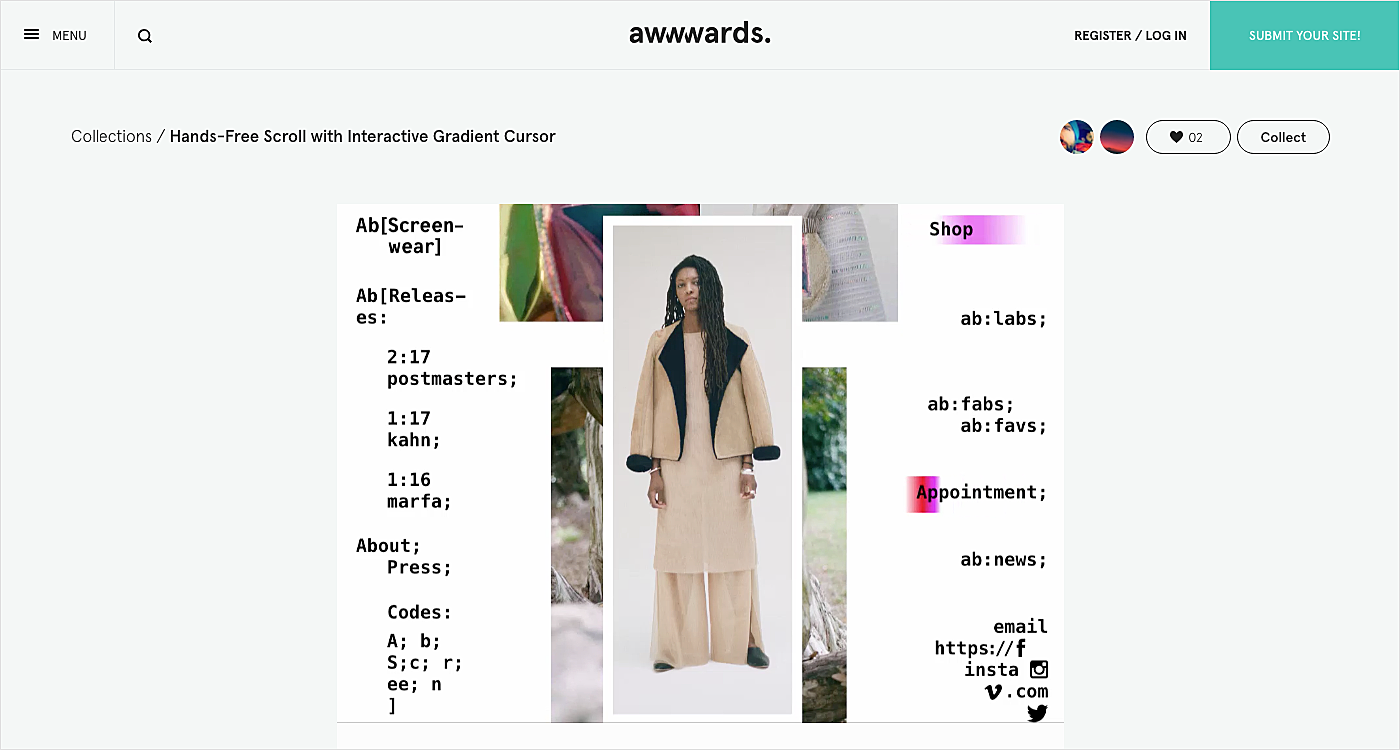
2. Hero typeface and large size
The purpose of typography on the web is to articulate a product’s uniqueness as the “voice and style” of website communication. That’s why fonts are mixed with pictograms, emojis and even with sound or animation, making paragraphs a key element of the page, alongside headlines, and sometimes of their size[x2] which comes under the name of “hero fonts”.
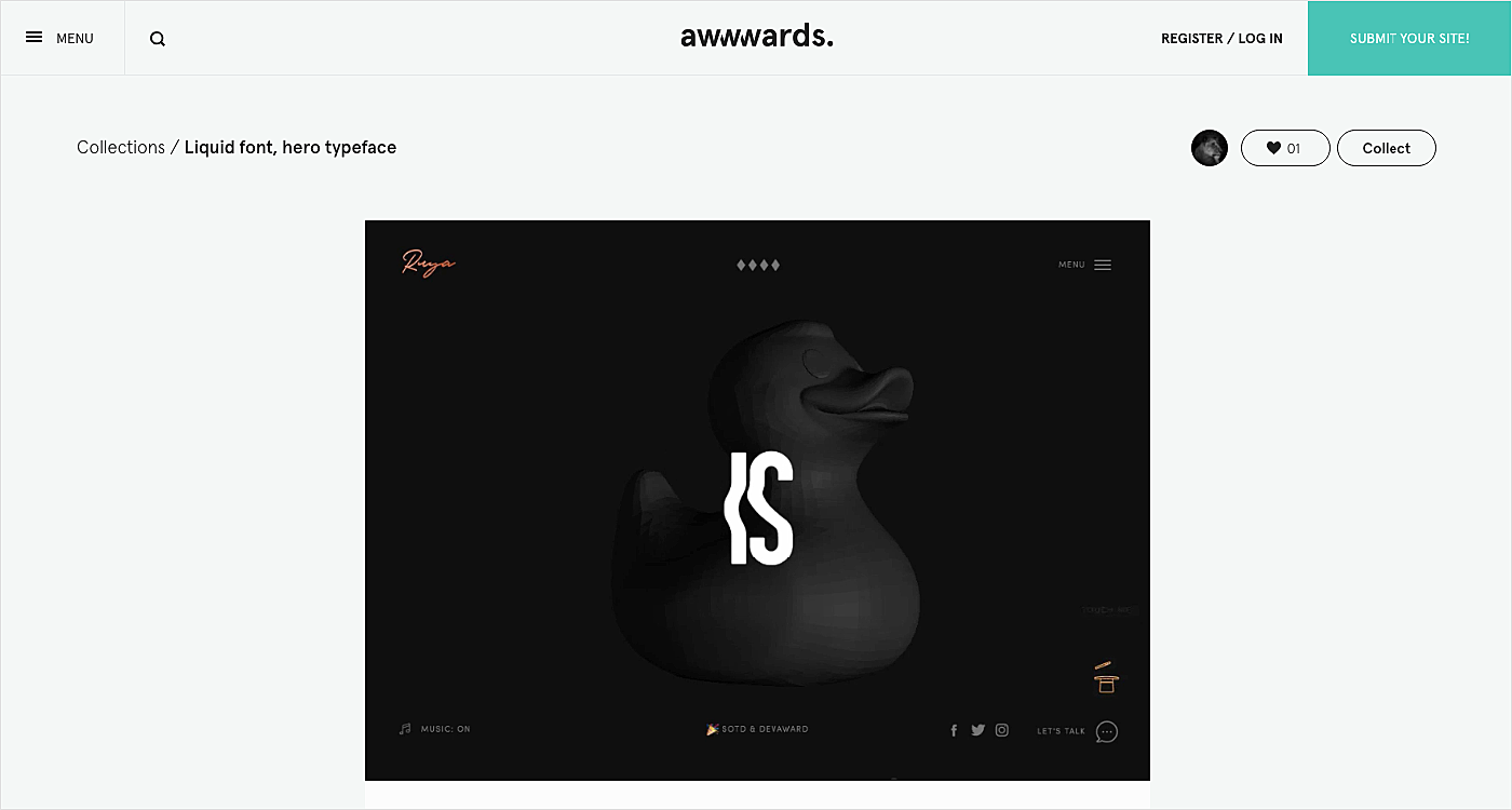
Source: Awwwards
3. “Amplifiers”
The third trend concerns the means of text decorating which can be used in one and the same paragraph: from classical underlining or italics to original hovers, contour fonts, colorful highlights, font switches within a sentence, pictograms and even emojis. The main purpose is to place emphasis on semantically important elements, or just to draw attention to the text.
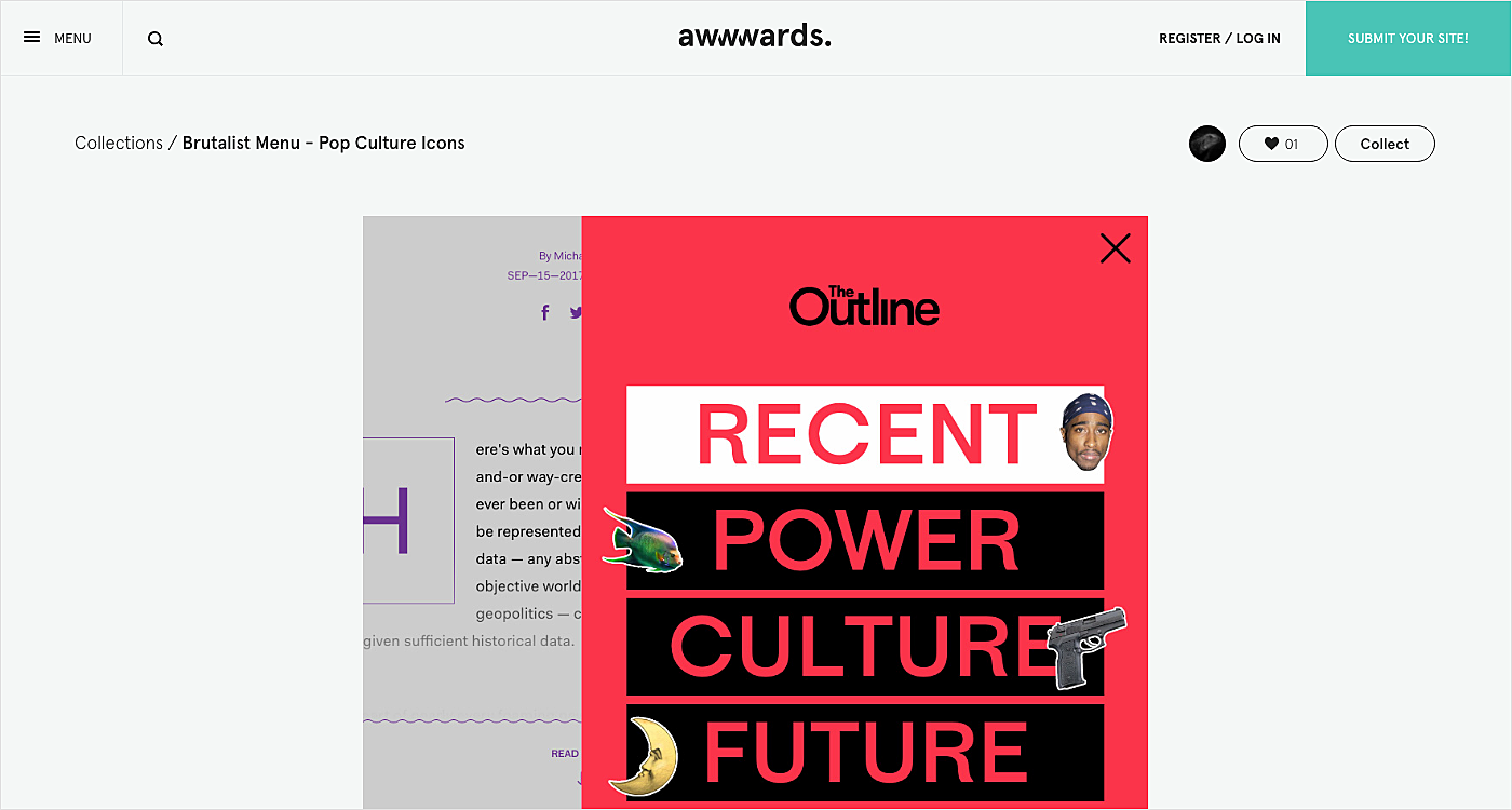
Source: Awwwards
Inspiration
Now it’s time to move from tips to real examples, and to get an eyeful of some amazing web fonts in action:
1.
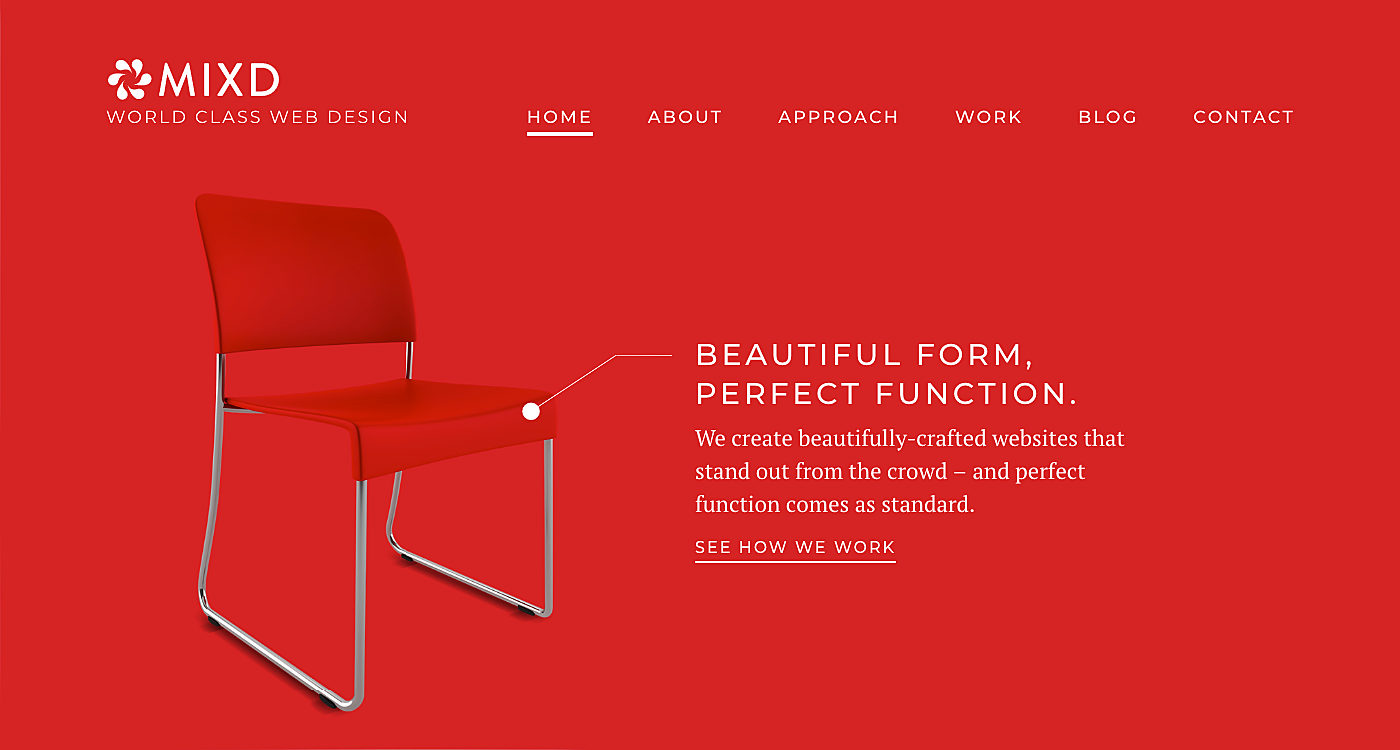
Source: Mixd
2.
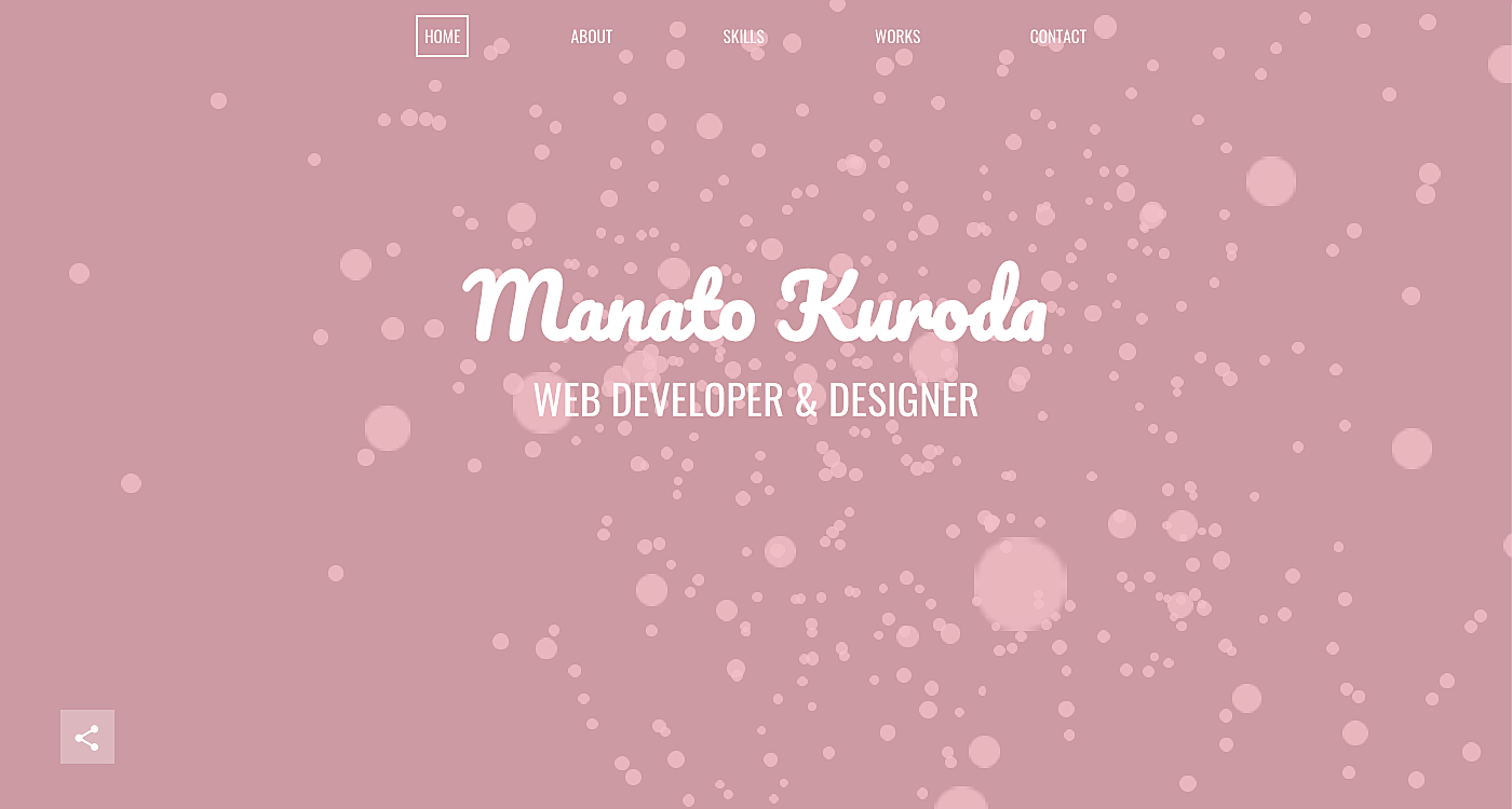
Source: Manato
3.
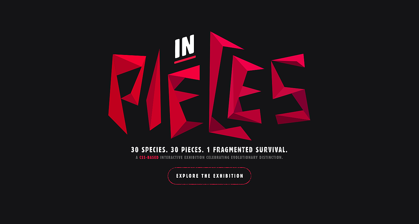
Source: Species-in-pieces
4.
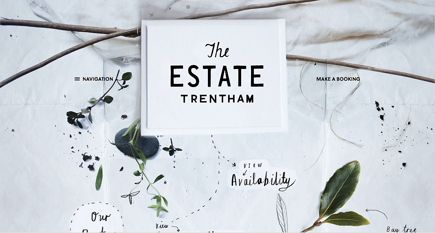
Source: Theestatetrentham
5.
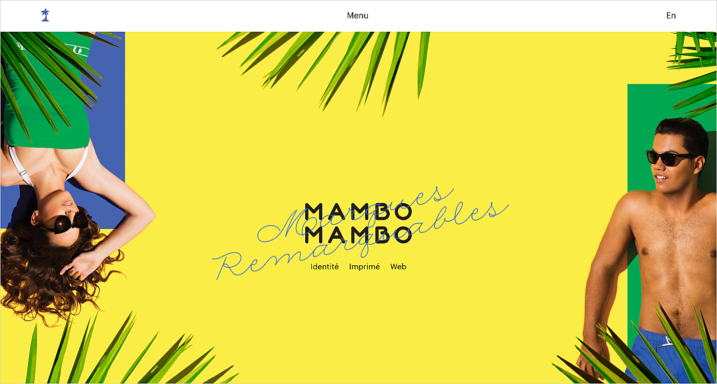
Source: Mambomambo
6.
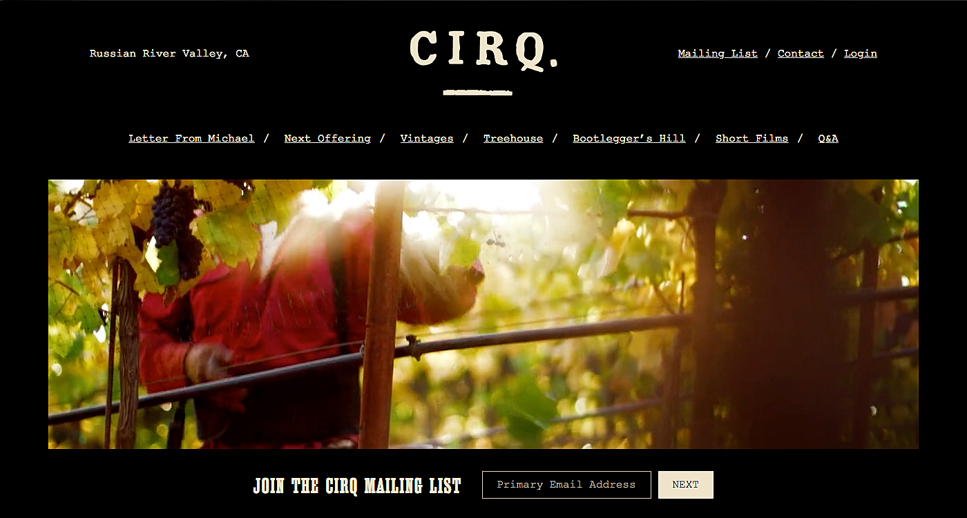
Source: Cirq
7.
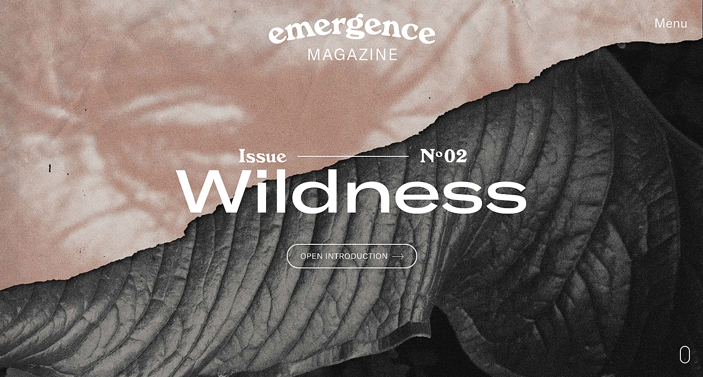
Source: Emergencemagazine
Final Takeaway
Typography is a part of company identity which cannot be neglected. A creative and distinguishable font is the cornerstone of any website, and the identity lies in the basics of its readability and overall brand mood. The right selection of the typography for web design is a complex science which can be mastered only with good taste and vast experience. We hope this article inspired you, and that you learned a few tips to improve the process.
For more info on font creation and usage, drop us a line in live chat and start a dialogue with our experts.


Rate this post!
344 ratings, average ratings is 4.7 out of 5

Related Posts
03 January 2024
10 Best Game Website Design Examples: How to Design Yours
Game website design: importance in attracting new players, awesome examples and design tips.
Effective Food Delivery App: Key Tips & Best Practices
In this article, we will share our experience in creating a design for a specialized food delivery management software, as well as best practices in designing such an application.
22 November 2022
10 Best Restaurant Website Designs & Best Design Practices
Restaurant owners always have a lot on their plate, and they are usually focused on the areas that can bring tangible benefits. Websites, unfortunately, are not one of those areas because even the perfect website does not guarantee that the restaurant will be full every evening.

31 May 2022
10 Best Examples of Website Footer Design
10 website footer design best practices examples for inspiration ⚡ Things that can go in website footers ⚡
26 May 2022
22 Best Serif Fonts for Your Website
Find the best serif font with our roundup of the best serif fonts of 2022! Complete with logo design tips and famous serif logo examples.

09 January 2022
Web Design Trends in Web Interfaces for 2022
Best practices vs. trends on the Web. Is there any difference? Find out more about the principles of good web design in 2022.
Let's talk
Is there a challenge your organization or company needs help solving? We’d love to discuss it.

Managing Director, Partner
Andrew Terehin

Thank You!
Your message has been successfully sent.
We will contact you very soon.