13 April 2017
10 Great Examples of Website Navigation Design
Introduction
Website navigation has become an important element in UX as it could help or disturb your users’ site engagement. It is like the base of your house. If a foundation plan is failed, you put your building at risk of collapse.
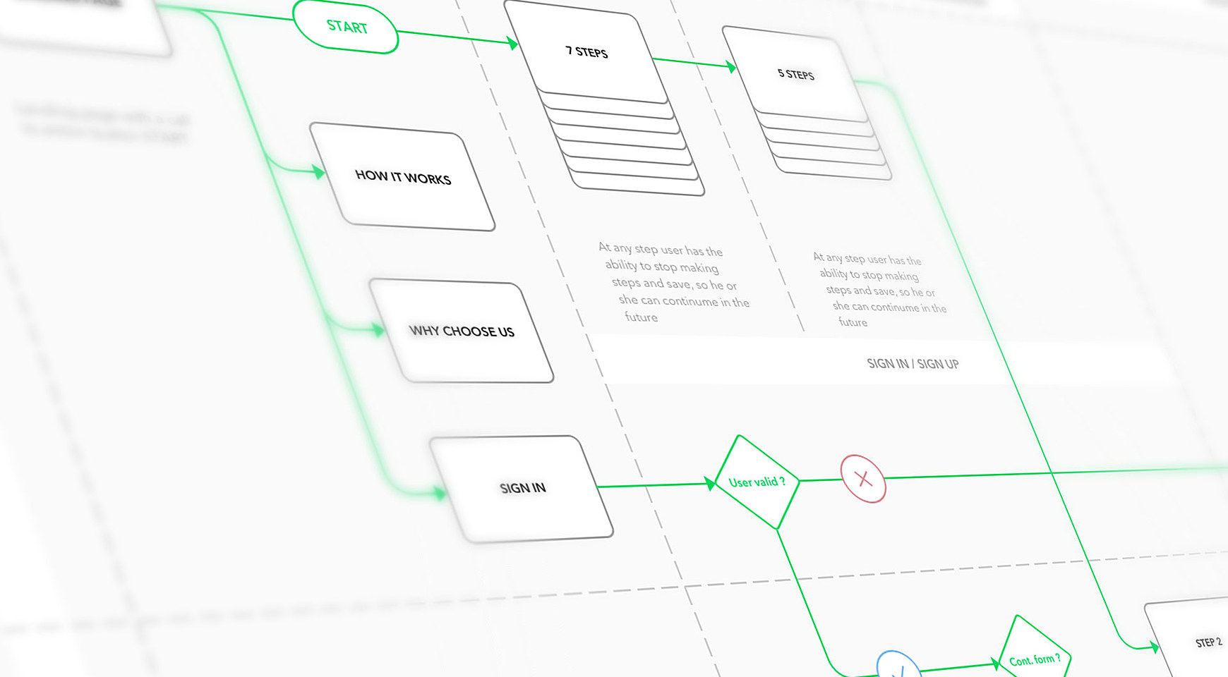
Navigation can vary so much between websites, there are no set directions or how-to’s for organizing it. Learn more about Website Navigation Design in Agente`s Case Studies.
I would like to share my observations about the idea of navigation in web design. I will uncover a few simple tips that you can use to improve your website navigation and usability. There will also be some trends and 10 creative navigation menu design examples for how to plan your design.
What is navigation?
The “navigation” term can be interpreted in a different way. Generally, it is a focal part of the website on your website that lets your users find what they are looking for without needless clicks. It is a way to lead the user to the most important information on your website.
Which questions ask yourself to help prepare a navigation scheme?
-
What is your targeted audience and what is their aim on your website?
-
What kind of information and functional modules will be on the website?
-
How do I group together the information in the order of importance for users?
-
How are you going to organize the functional or information modules in the tree-view structure?
Navigation planning
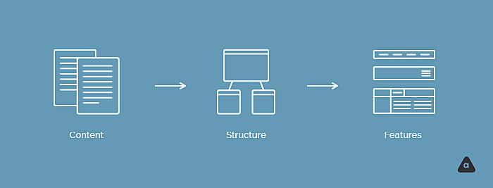
What’s the best way to organize content? How should the elements to be named and positioned?
You have to fundamentally brainstorm the hierarchy in which information should be displayed. From the very beginning
-
Work with the content. It could be card sorting which always helps designers answer all questions even before the design phase begins.
-
Then work with the structure. Create a sitemap or a list with different levels of information. Navigation should be as easy as possible. Overloaded web page with difficult menu titles is a bad idea because it seriously hampers your website’s overall usability. Speak user-friendly language while labeling a navigation menu.
-
Afterward, figure out the features of the navigation menu, type, and design.
You have to remember there is no standard way how to organize your website menu design. It is important to realize what kind of website you create, as well as what the main message and purpose are. For example, when making a website for e-commerce business, you’ll probably use techniques that allow users to find the right product or service in a short amount of time and buy it. For any type of promo website, you’d better put the emphasis on the fast information search and involve your user in gamification, not just a simple menu. If you need an entertaining website, make your elements simple, to help your user find the right information fast and easy. As an e-learning software development company, you'll need to take care of a complex hierarchy of courses, lessons, and side materials.
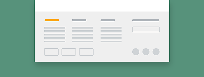
Trends in navigation bar design.
There are some popular web design navigation types you can always use on your website. Which one do you prefer is up to you
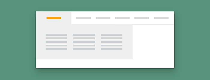
Horizontal vs. Vertical
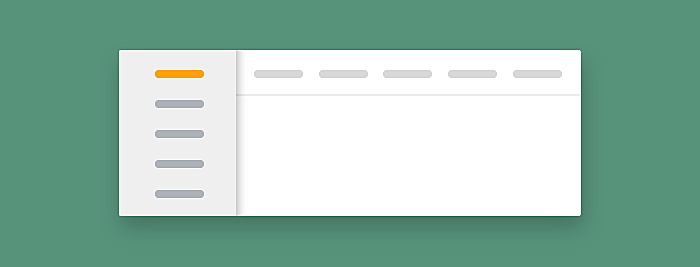
A number of factors influence the decision to choose horizontal or vertical navigation, including design, usability and intention of content. Small websites often prefer horizontal type at the top of the site, while large corporate websites often use both horizontal and vertical type.
Mega Drop-Downs
Mega drop-downs are large menu panels that typically drop down or fly out from a global nav bar. You can’t use a mega drop-down for every site. The main benefit of a mega drop-down is that they facilitate the display of many options at once. So when are they useful? Mega drop-downs work well for e-commerce sites where the category lists are quite large and would not look great in a standard navigation menu. They also work well for sites that have a large list of services
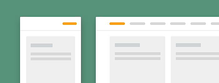
Sticky/ Fixed

Sticky or fixed navigation does not disappear when the user scrolls down the website. Usually, sticky type is used on sites where the main call to action elements are situated on the primary bar.
Fat footers
We used to see in footer space privacy and legal links, email sign up fields, address details and social links. Plenty of websites use fat footers, but it tends to be used for sites that are quite content heavy or e-commerce sites where displaying the security icons and methods of payment is quite crucial.
Responsive design navigation
Responsive navigation makes your website look good on different devices. The bar usually turns to a “hamburger menu” on mobile devices. This icon is made up of three slightly separated horizontal lines, when you deconstruct the main elements, they stay one under another and create a so-called “hamburger menu.” The reason the hamburger menu is used is because there needed to be a way to navigate on mobile without taking up too much space.
Link the logo to the home page
It sounds obvious, but some websites neglect this rule. This is a convention best followed as it is so widely implemented
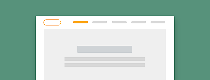
Primary / secondary

The most common primary navigation consists of the main items, which is consistent throughout the site. Typically, in user-focused design examples, the main menu is placed on the top of the page in the center or aligned to the left or right of the page. Secondary navigation consists of additional items and is typically situated in the middle of a webpage without an expressed design.
Let me introduce 10 website navigation design best practices
1. Atterley
Type: sticky, responsive, horizontal.
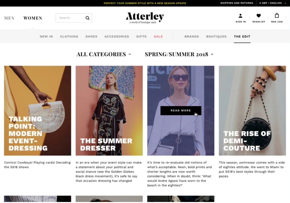
Source: AGENTE
This website attracts user’s attention with its product, which is why the design of the navigation bar is plain.
2. ANGELIA AMI
Type: vertical, responsive.
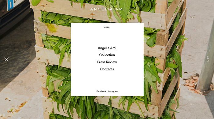
Push the left menu icon and the main menu moves to the center of the page
3. WE3
Type: sticky, top right and vertical.
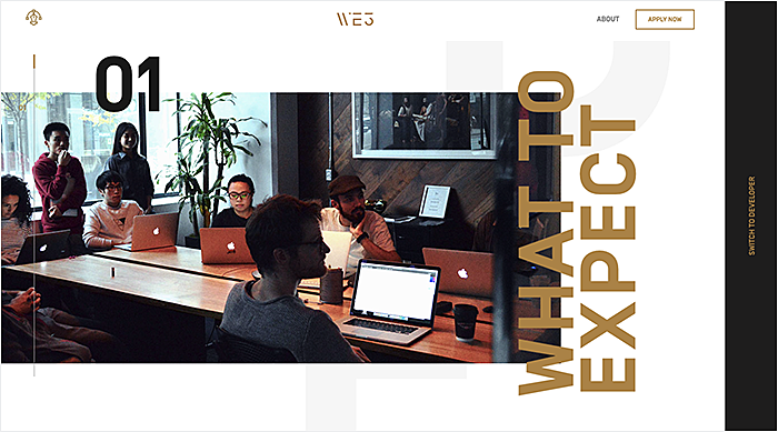
The website designed in actable mode. Every time you scroll down the website, new information appears
4. Fairchild
Type: responsive, left vertical.
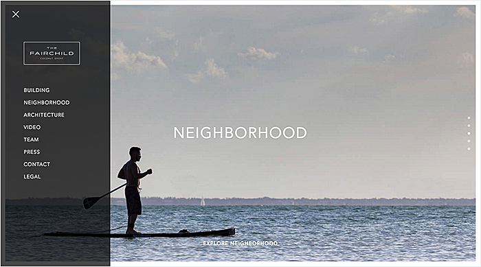
Left sidebar navigation that expands from a menu icon is similar to what you see on mobile sites. The nav is easy to find in the upper left hand corner of the main landing section.
5. Kennedy Center
Type: horizontal, drag and drop.
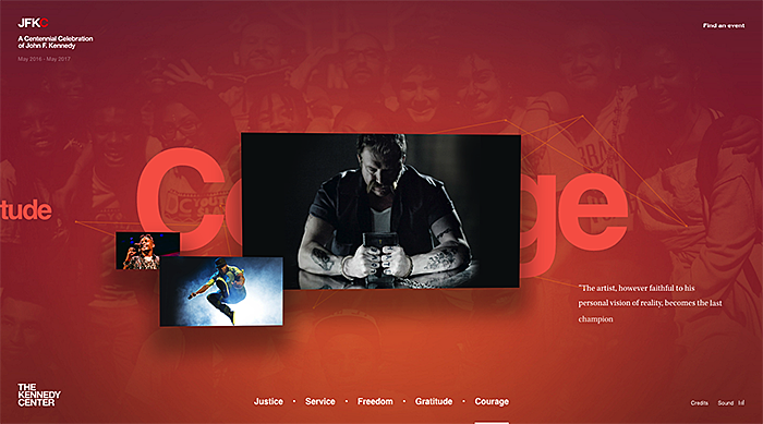
JFK Center you can use in two types of ways: dragging the pictures or just using horizontal menu down the page.
6. Novotel
Type: sticky, horizontal, fat footer, responsive, drag and drop.
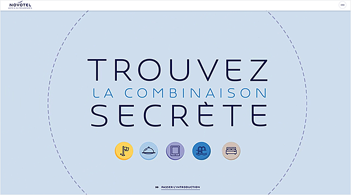
You can play with this website. Use navigation to give some tasks to a person who is waiting for you.
7. Adriatic Luxury Hotels
Type: sticky, horizontal, mega drop-down, fat footer.
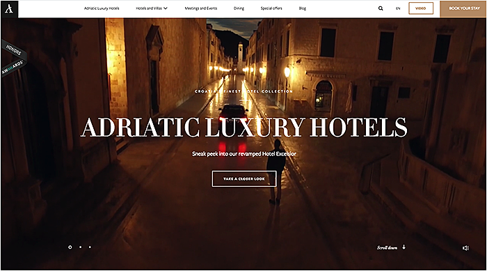
Here you can easily orient scrolling down the site or using a sticky menu to choose what you are looking for.
8. Kalios
Type: sticky, responsive, horizontal, fat footer.
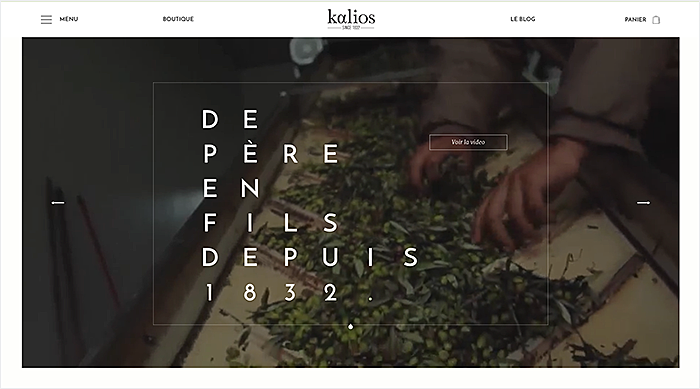
Kalios navigation placed top left. After you press the menu icon, you choose the products you want to buy just by hovering over the icon.
9. Okeanelzy
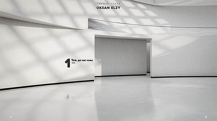
Here you control your moving with arrows. The user can walk around the site like in a house. In every room just scroll down to find the information.
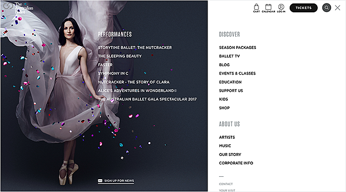
10. Australian Ballet
Type: sticky, responsive, mega drop-down.
Conclusion
There are plenty of navigation types you can implement on your website. There is no single way of creating the perfect site nav. Everything depends on your needs and your customer’s needs. All these examples are just a small drop in the ocean. Hope you’ve found inspiration. AGENTE can help you to realize all your most bravest navigation menu design ideas.


Rate this post!
1002 ratings, average ratings is 4.0 out of 5

Related Posts

31 May 2022
10 Best Examples of Website Footer Design
10 website footer design best practices examples for inspiration ⚡ Things that can go in website footers ⚡
16 May 2022
Top Basic Patterns for Mobile Navigation Design
Navigation through your app should be intuitive and predictable. Both new and returning users should be able to figure out how to move through your app with ease.
11 May 2022
Hamburger Menu Examples and Alternatives
What can be used instead of hamburger menu ⚡ An amazing alternatives to hamburger mobile menu ⚡ Get inspired with these amazing examples.

19 January 2024
AI Model Fine-Tuning: How to Use Your Organization's Data?
Organizations are transitioning from generic solutions to hyper-customized intelligence, seeking AI models designed to address their unique challenges and propel them toward strategic objectives.
This demand has propelled fine-tuning to the forefront of AI development.
09 May 2024
Top 7 Open-Source LLMs for 2024
Here, we break down everything you need to know about open source LLM models: top 7 offerings on the market, their pros, cons, and capabilities.

16 January 2024
ChatGPT Plugin Development: Features and Benefits for Business
Explore the process of crafting a ChatGPT plugin tailored precisely to meet your unique business requirements.
Let's talk
Is there a challenge your organization or company needs help solving? We’d love to discuss it.

Managing Director, Partner
Andrew Terehin

Thank You!
Your message has been successfully sent.
We will contact you very soon.