14 February 2019
18 Examples of Mobile Checkout Form Design

According to Statista, global mobile payment revenue is expected to surpass 1 trillion US dollars in 2019. Today you can barely find an e-commerce company that doesn’t have a responsive website or a mobile app. No wonder that developers and designers are seeking new ways to make mobile checkout forms faster, user-friendlier and more secure. The central question for online businesses is how to simplify checkout for smartphone users and grow the mobile revenues.
Reading this article, you’ll discover the e-commerce website features that improve checkout design and, hopefully, you'll get some inspiration from our checkout page design examples.
General Tips For Designing a Form:
Before we go into detail about mobile checkout design, let's jump back to our latest article about user-friendly form design. Here you’ll see the basic principles of form building and some tips for good form design.
As for mobile checkout, first, you need to understand that, on average, users will access your e-commerce website through a smartphone (even if you have a separate mobile app for it).
That’s why it’s imperative to comprehend the difference between desktop and mobile and create responsive layouts for both.
18 Examples Of Checkout Form Design
Let’s take a look at some examples of e-commerce mobile checkout forms and see the features we can learn from them.
1. Mobile-first approach
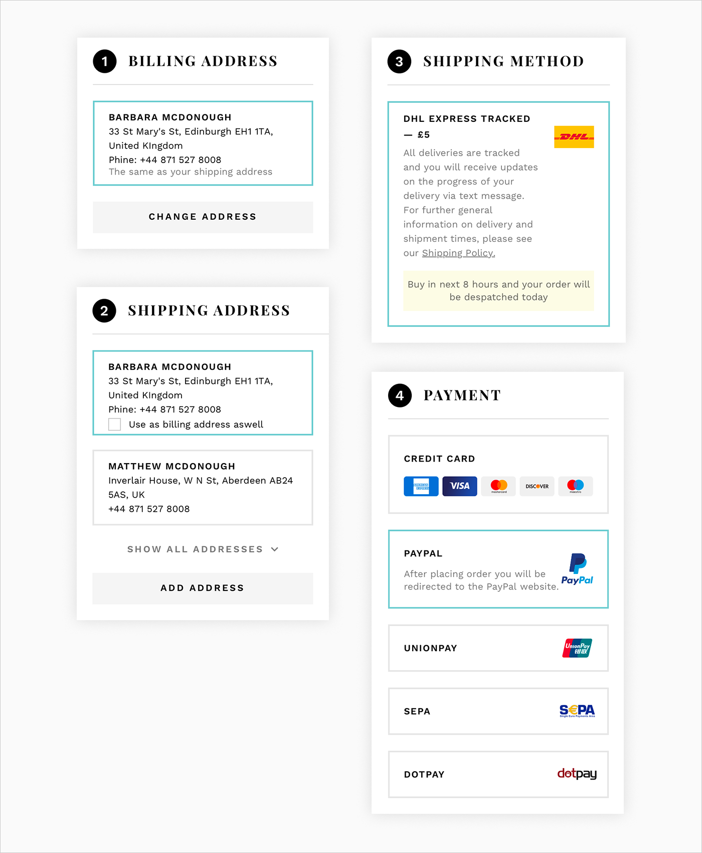
Source: Atterley
The first of the presented mobile checkouts and this is what we have just discussed. The best checkout design for mobile is the one that is already on the web. Create a web checkout form with a mobile-first design approach in mind: merge all the steps of the checkout process into a single one so that it will be scrollable in the mobile version.
By the way, that’s exactly what the Agente team did for the Atterley website re-design to help our client reduce mobile bounce rates.
2. Minimum fields
Source: Dribbble
Let’s admit it: People hate filling out forms. Include only the most significant fields in a mobile form UI. Don’t overwhelm the form with dozens of input options, follow-up questions, and leave product suggestions on the order page. The fewer actions the user needs to complete, the less frustrated he is.
3. Auto-completion
Autocompletion is derived from the previous point. If the user needs to fill out a long shipping and payment form, the least you can do is let them do it just once. Thus, they only need to confirm their payment, which takes no more than one click. Stripe checkout is a great example of pre-populating functionality.
4. Product summary and order review
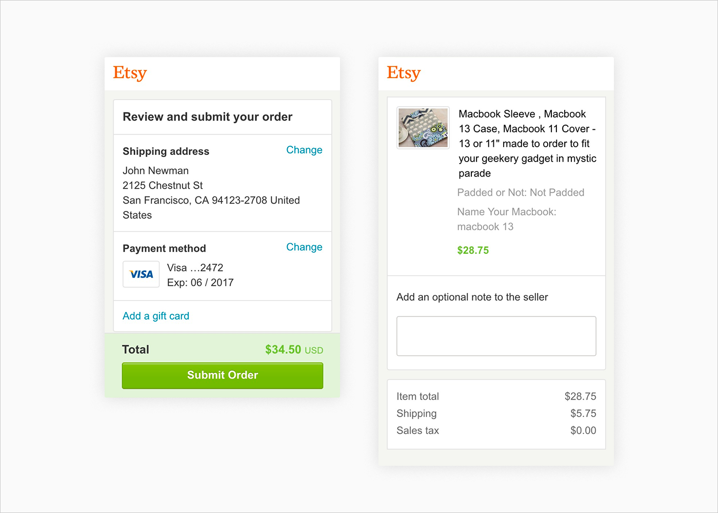
Source: Etsy
Product summary is a popular feature on mobile checkout pages. Nevertheless, it’s a tricky thing for business owners, as users can get stuck on the review process and change their mind about buying things. Small details should be left on the order page, leaving only the info about the product’s prices at the checkout.
5. Microcopy
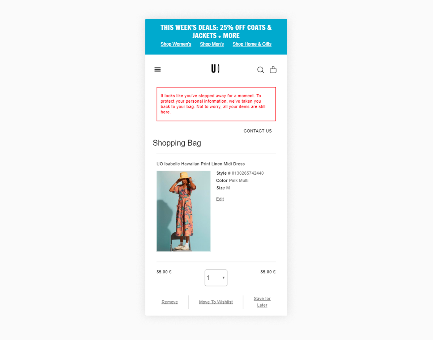
Source: Urban Outfitters
UX writing matters a lot on mobile forms. Fields are getting smaller and becoming more difficult to understand. Proper field labels, inline hints, and error messages will play into the hands of buyers.
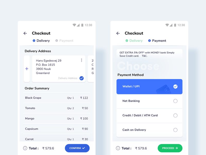
6. Mobile checkout flow
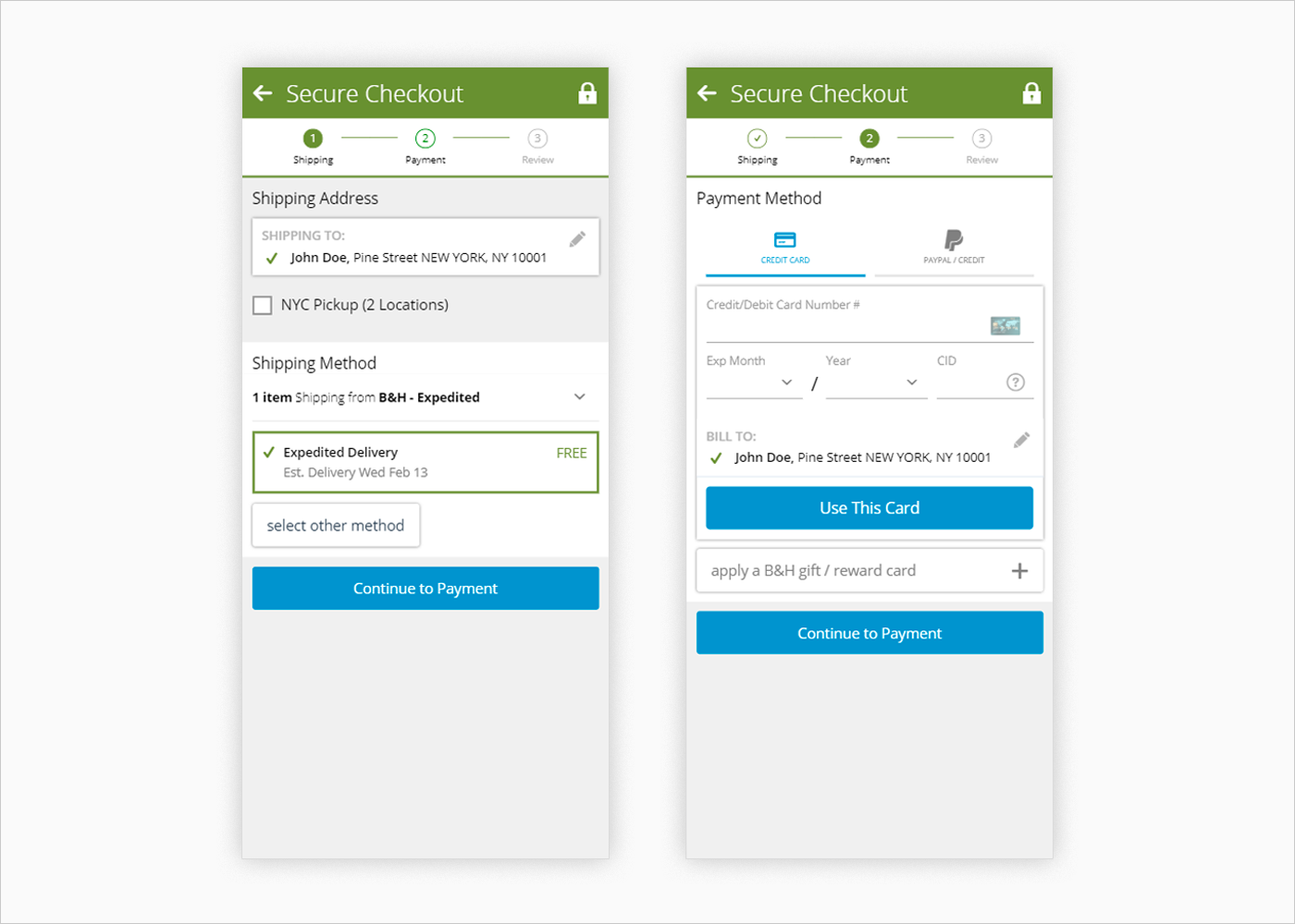
Source: B&H
Another checkout UI example. A user wants to know where they are, and how many steps are left until he gets to the final goal. Just make sure the progress bar steps are shortly and clearly described and highlighted upon completing the step.
7. Multiple shipping methods
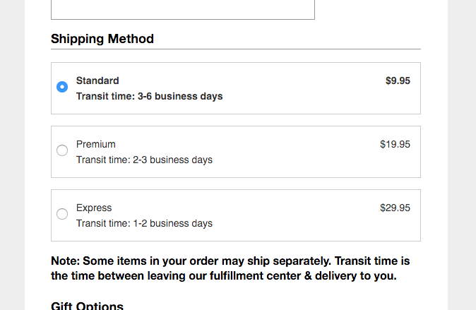
Source: Macy’s
Multiple shipping methods are a vital choice for a buyer. Add delivery prices and transit time options.
8. Multiple payment methods
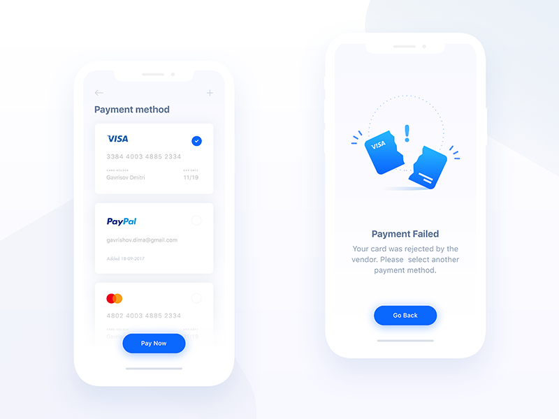
Source: Dribbble
Do not force users to fill out long payment forms and type their addresses. Instead, insert auto-fill credit card forms and popular options for secure payment checkout, such as Stripe and PayPal.
9. QR code
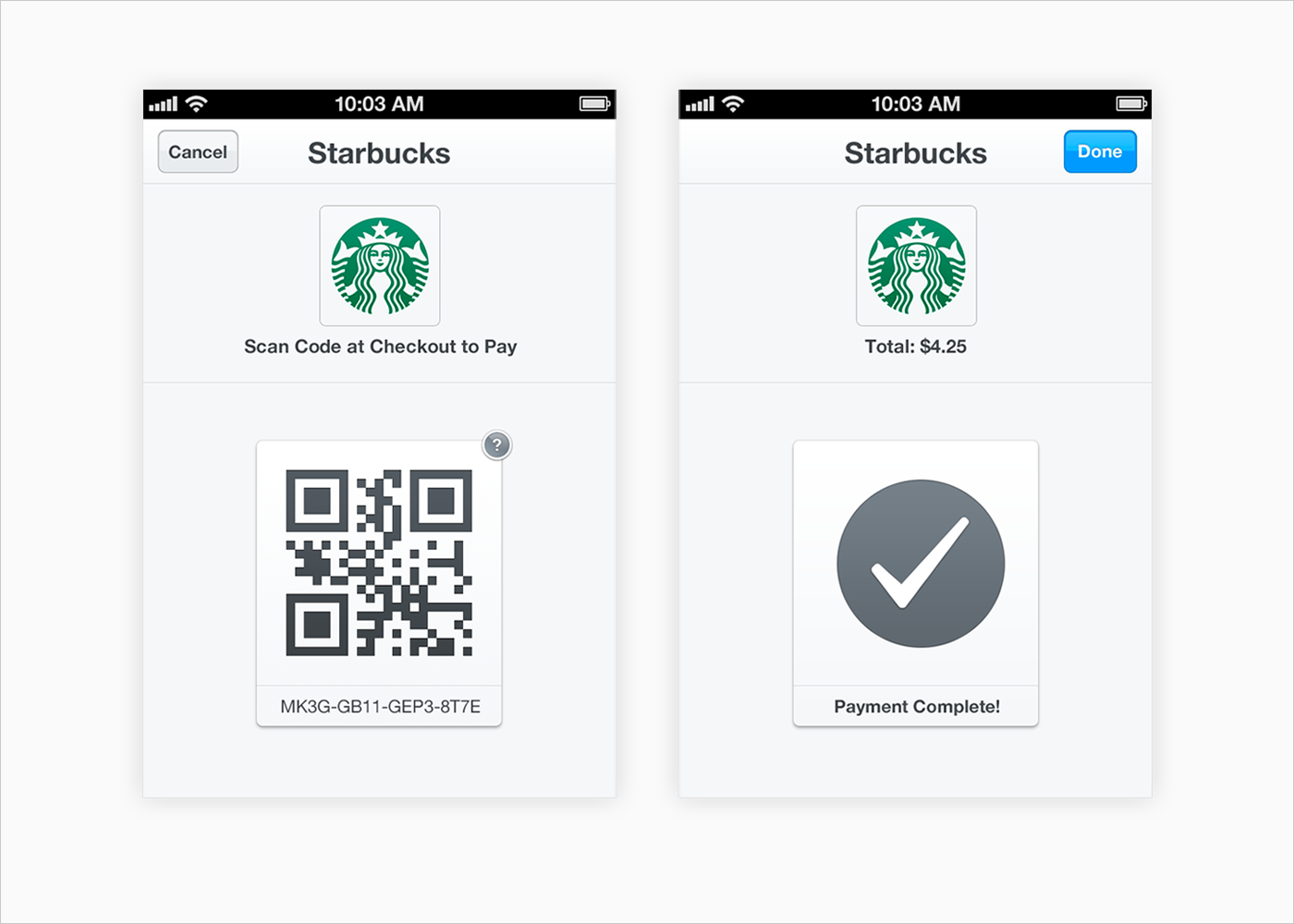
Source: Starbucks
Depending on the type of app, it might be reasonable to add a QR code feature. The user just needs to scan a code on a product and pay with the added payment method of their choice.
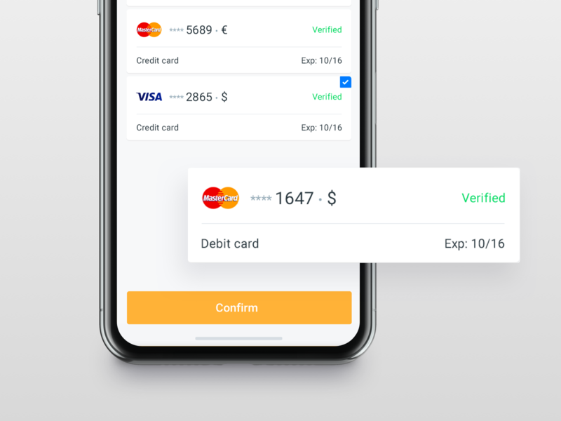
10. Scan card
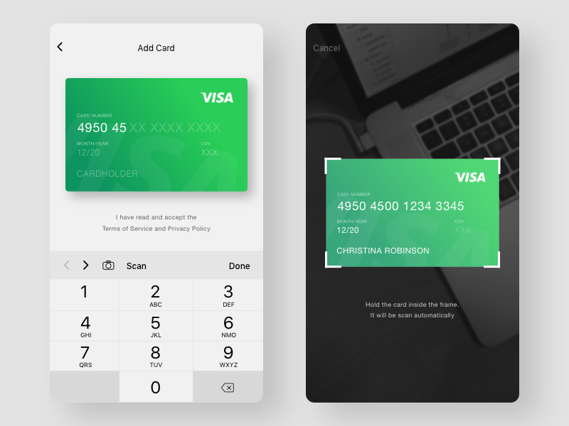
Source: Dribbble
The same goes for a card scanning feature. It saves time on typing 16 digit numbers and checking out names, users just need to make a photo of a card. Just make sure that they don’t need to use this method each time they make a purchase–give them an option to save scanned cards in their accounts.
11. Fingerprint confirmation
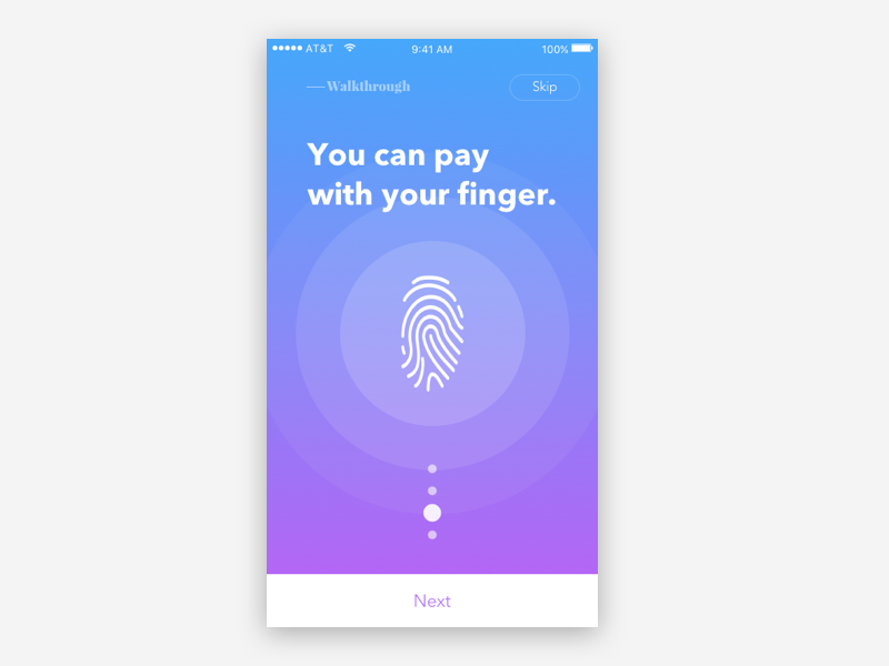
Source: Dribbble
Let user pay for their order with a single tap of a finger. This kind of payment adds to the security, which users will appreciate very much.
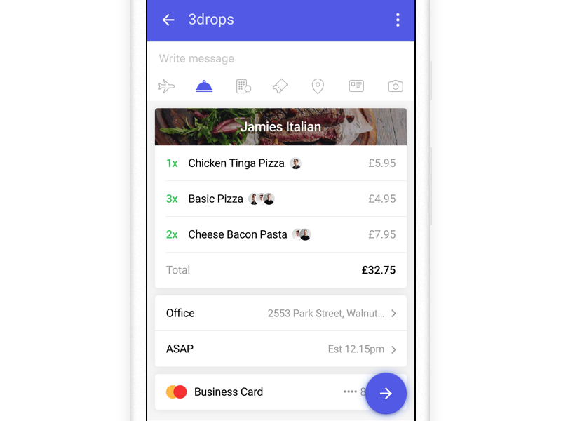
12. Split payment
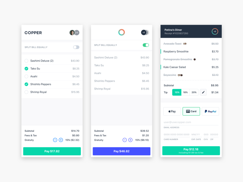
Source: Copper
A lot of apps for splitting the bill have recently appeared on the market. Why let your users somewhere out of your app, if you can install it right inside the app and share the payment with your peers?
13. Promo codes
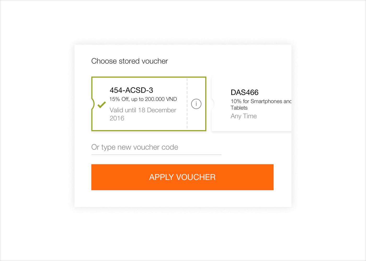
Source: Dribbble
Consider another checkout page UI. To win loyal customers, offer them discounts and promo codes on some goods. A good practice is to add some of them automatically to the order but also feature an input form for typing in third-party voucher details.
14. CTA button
Source: Dribbble
CTAs should be clear and stand out from the whole checkout process. Take a look at the example above: each separated action is highlighted with a unique color, green indicates an ongoing process, while blue means the completion of the action.
15. Order confirmation page
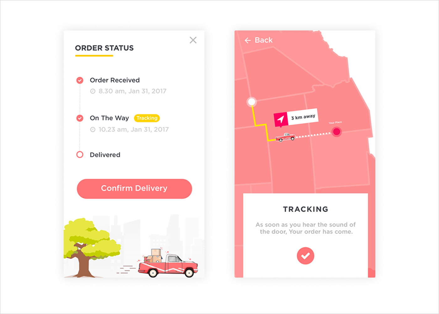
Source: Dribbble
After shipping and payment methods are chosen, give a last chance to confirm that everything is right. On the example above, you can see the extra feature–delivery confirmation–which allows a user to notify that his order has come.
16. Print or save the receipt
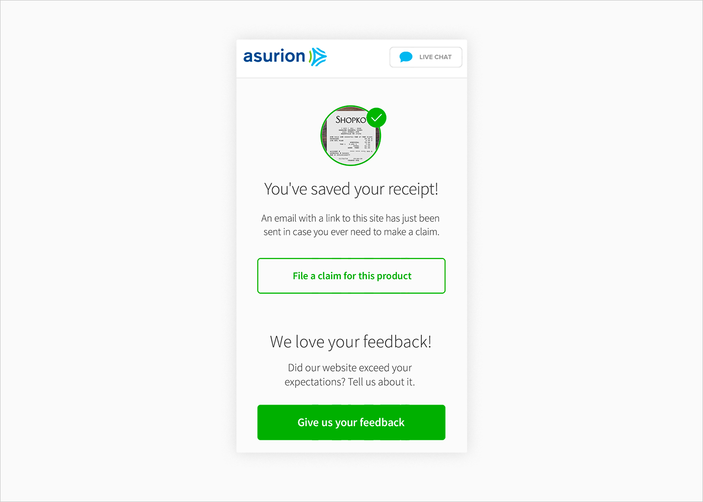
Source: Dribbble
It’s obvious that all receipts should be saved in the app automatically so that a user can have instant access to their completed payments. However, sometimes people need to have their receipts printed or saved in PDF format.
17. Checkout as a guest
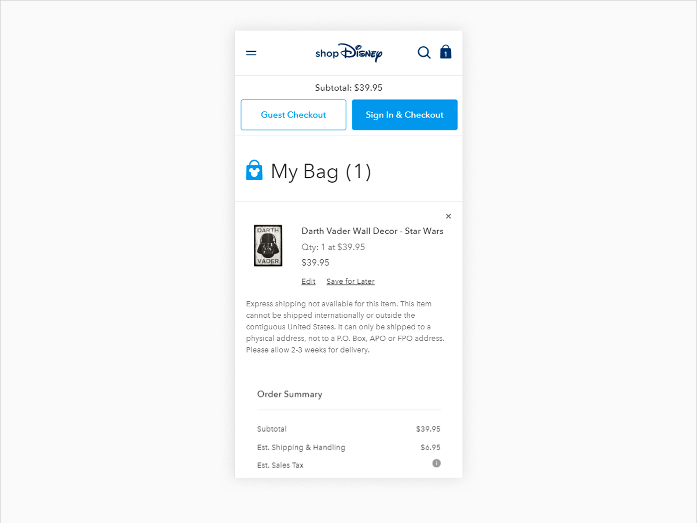
Source: Disney
Entering information on a mobile is a pain, so it makes sense to allow a guest checkout and ask for the minimum information that is required to check out. Another alternative is to allow a Facebook login, so that users don’t need to create their account from scratch.
18. Thank You message
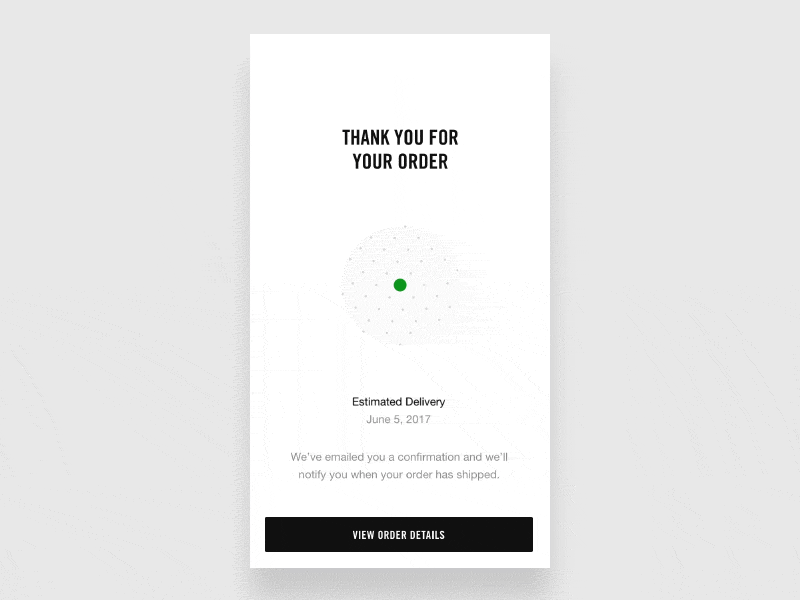
Source: Dribbble
The last checkout screen is the thank you screen. It’s a great user experience practice to show buyers that everything has been done correctly and you’re happy to have them as your customers:)
Outro
As more mobile users come to your website, every step of the order flow matters—including the checkout which needs to be optimized for great user experience and better conversions. We hope you got a dose of checkout page design inspiration! If you know the reasons why to redesign an e-commerce website and want to boost your sales with the help of an effective checkout page design, contact us right away!


Rate this post!
155 ratings, average ratings is 4.1 out of 5

Related Posts
11 January 2024
Mobile-First Design: Full Guide for 2024
What is mobile first design? Well, the mobile first approach is a central principle of progressive enhancement. In a nutshell, it’s all about producing a small screen design and then scaling it up to other devices. In our new blog post, we cover some aspects that need to be taken into account when launching a mobile first web design project. We also share some outstanding design examples for your inspiration.

05 January 2024
10 Best 404 Error Page Designs for 2024
In our new blog post, we review the best 404 page design examples of 2019 that will never disappoint you even if you meet the dead end on the website.

03 January 2024
10 Best Game Website Design Examples: How to Design Yours
Game website design: importance in attracting new players, awesome examples and design tips.
22 November 2022
10 Best Restaurant Website Designs & Best Design Practices
Restaurant owners always have a lot on their plate, and they are usually focused on the areas that can bring tangible benefits. Websites, unfortunately, are not one of those areas because even the perfect website does not guarantee that the restaurant will be full every evening.

31 May 2022
10 Best Examples of Website Footer Design
10 website footer design best practices examples for inspiration ⚡ Things that can go in website footers ⚡
26 May 2022
10 Best Examples of Beautiful Blog Design | Agente
In this article, you'll find 10 best examples of beautiful blog design, along with the tips that can help you enchant visitors.
Let's talk
Is there a challenge your organization or company needs help solving? We’d love to discuss it.

Managing Director, Partner
Andrew Terehin

Thank You!
Your message has been successfully sent.
We will contact you very soon.