06 December 2018
Top 10 Website Layout Ideas & Examples | Agente

Why do people prefer one website to another? Is it the design, content, or something else that entices them into browsing the site? There are many things that together go to make a great website; the layout is one of them.
How many times have you hit the “close” button, failing to find what you were looking for? This will never be the case for a site with a good layout. Such a layout attracts users’ attention by making essential information intuitive and easily accessible. In a nutshell, it turns first-time visitors into engaged users.
To ensure that people like your website, and come back to it again and again, spend at least a couple of hours selecting the best layout for your content.
Many popular sites have a similar layout, and there's one simple reason for that: they really work. So when deciding to introduce a custom layout that no-one else has, think first whether you need it. It can make the website either memorable or a nightmare for users.
Common website layouts have already proven their usability. People are familiar with them. So it takes a few seconds to find the necessary information. Such layouts save money for site owners—they don't have to pay designers for the time they have spent inventing a custom website layout. They also save time by being able to launch quickly.
Basic Elements
In an established system, basic elements determine the layout. What are they?
-
Header. Located at the top of a page, it has a unique and irreplaceable role in the delivery of a consistent user experience. Brand identity elements, navigation elements (e.g., links to major product categories), and a search field are some of the layout elements usually put there.
-
Main content—the biggest area—contains unique page content.
-
Other content. E.g., duplicate blocks used across the site and additional navigation.
-
Footer. Located at the bottom of each page, it contains less important information than a header. E.g., legal notices.
Best Website Layouts
There are many great website layout ideas across the web. In this blog post, we will cover the most common ones.
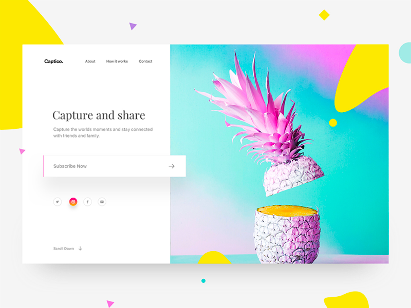
Single-column
Websites with such a layout can be easily recognized since they have only one, vertical column. Navigating them is as easy as ABC: site visitors simply scroll them down.
That's why single-column layouts are frequently chosen when it comes to website layout designing. Blogs, long-form articles, and research magazines frequently utilize them.
And the growing number of people who take advantage of the mobile Internet is one of the major factors contributing to the use of sites with long-scroll pages.
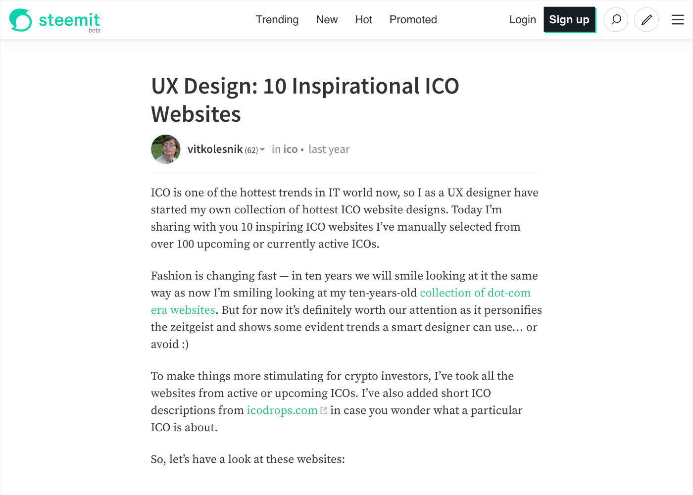
Source: Steemit
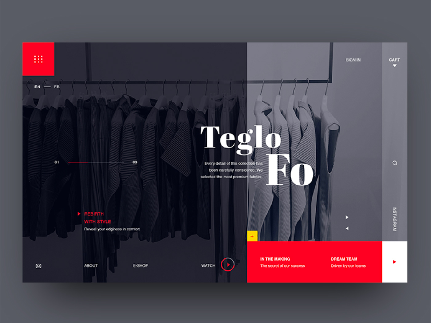
Split-screen
This example of website layout splits the screen into two equally important areas. This usually serves a dual purpose: giving prominence to the elements displayed in the area and giving visitors a choice between them.
This website layout design is also a great way to communicate your company’s strengths, encouraging visitors to click one side of the page for more details.
Source: Dribbble
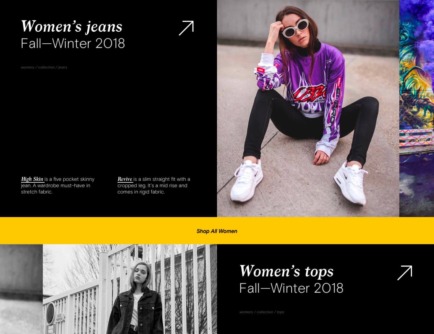
Broken and Asymmetrical Grid
Broken and asymmetrical grids were extremely popular in 2018 as they made it possible for web designers to deliver a unique user experience. Innovative and engaging, they catch the visitor’s eye, keeping them on the website longer through the visual tension they convey.
Some of such website layout examples are designer brands, startups, and web design agencies. But this grid is not a perfect choice for every website. Before putting it to use, make sure that it will work for your content, not against it. Play with colors, they can add the necessary visual weight to a design.
Source: Dribbble
Brutalism websites are all the rage, as well. Seemingly similar to the layouts covered above, they have a different structure. They rebel against “polished”, clean designs found on the web and come in handy for those willing to stand out in the crowd.
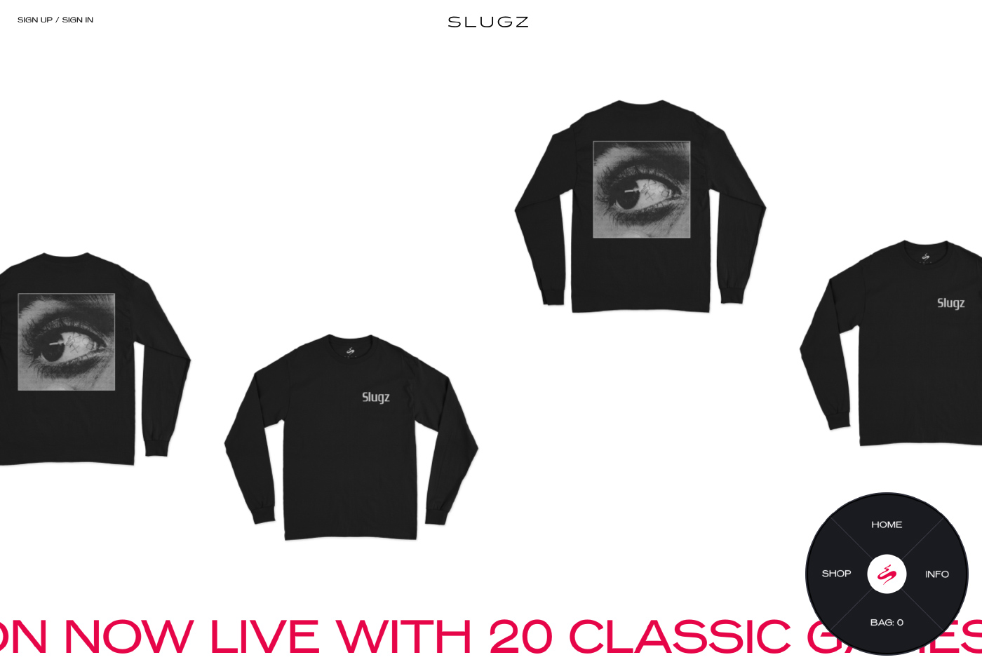
Source: Slugz
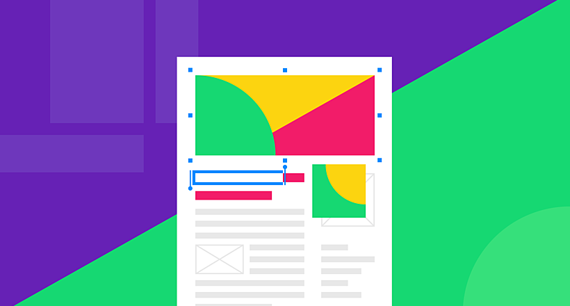
Card-based
Another one example of website layouts. Cards are usually brought into play when there’s lots of content with the same priority. By dividing content into smaller pieces (previews) and placing them in cards, it is made more digestible. To see more, visitors simply click on these previews. This layout comes in handy when you develop a custom website like Coursera or any other educational platform.
The grid, spacing, the number of cards, columns, as well their style may vary according to the design needs. Card-based layouts are found on many sites. Besides better-organized content they have another advantage—they add to the website’s responsiveness.
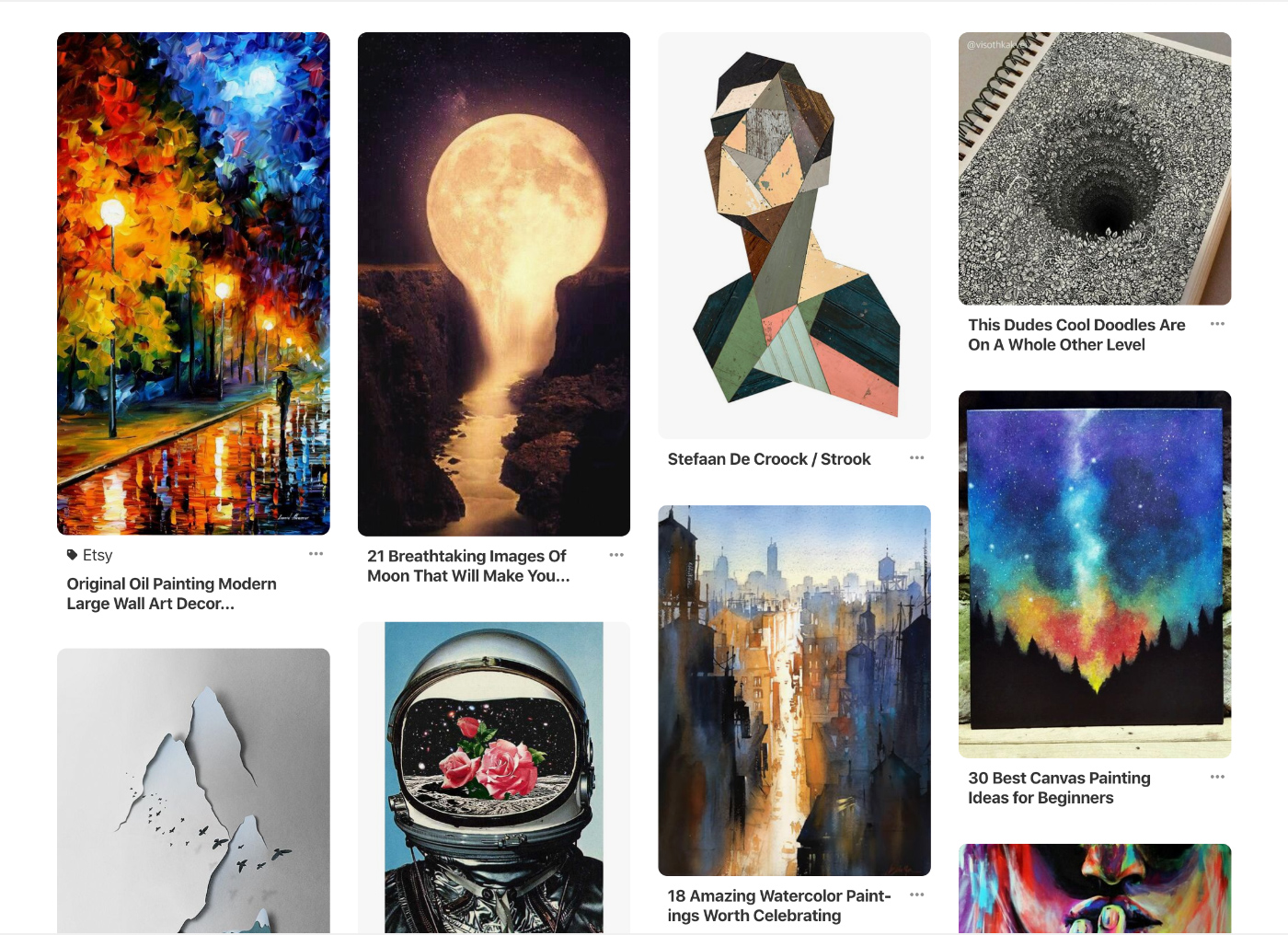
Source: Pinterest
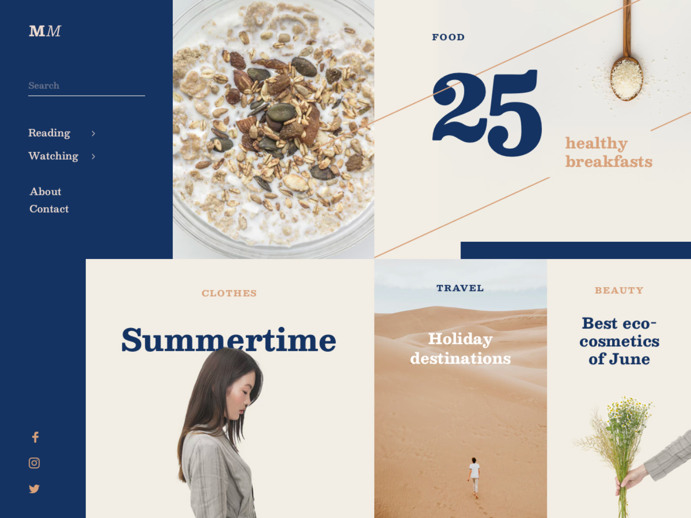
Boxes
The name of this web layout idea is self-explanatory. Pages, where the layout is used, have one large box of grid width, with smaller boxes placed under it. Combined, they tell a story about a company, brand, or product.
A useful tip: if it’s a product site, add its photo and name to a larger box and display previews of its features in smaller boxes.
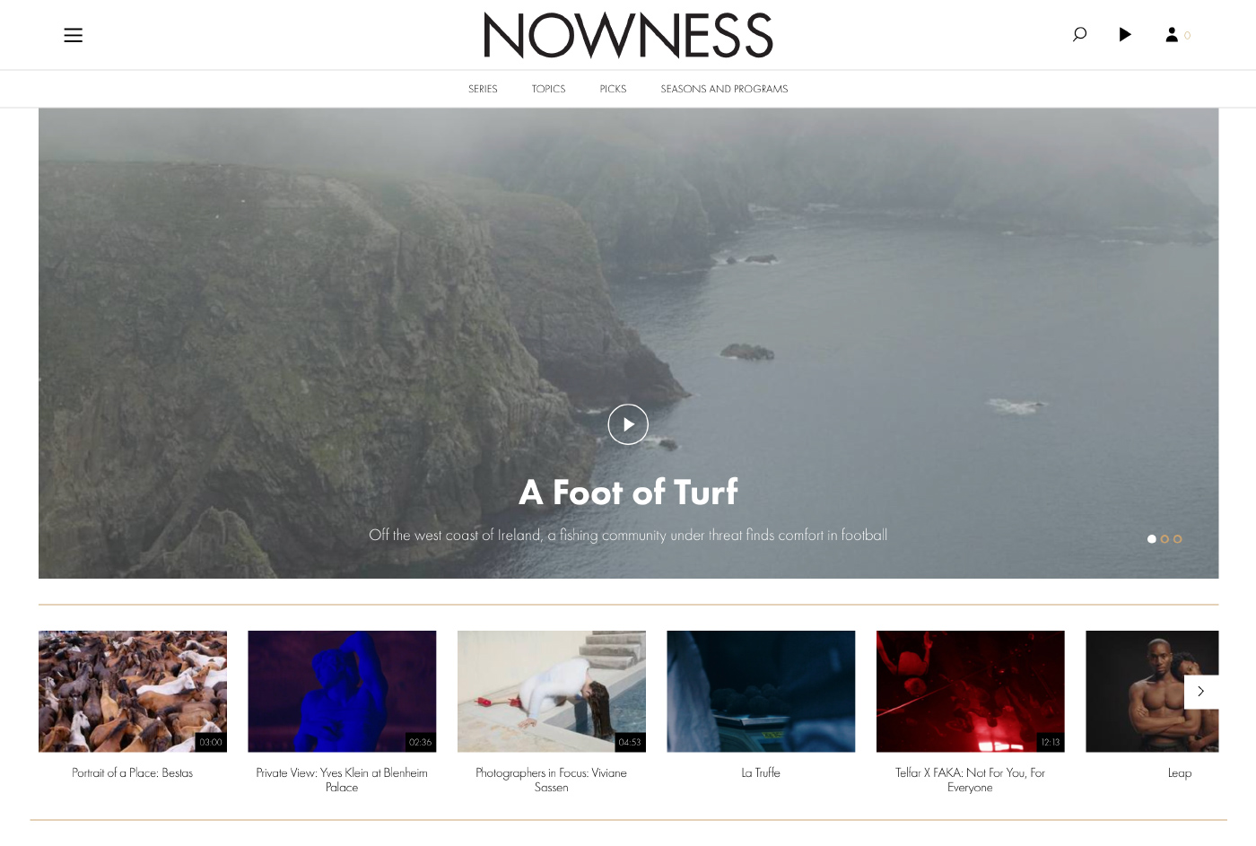
Source: Nowness
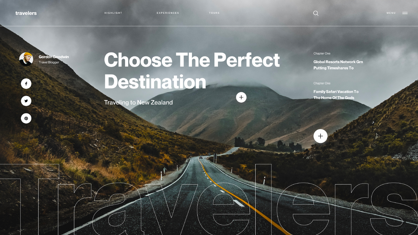
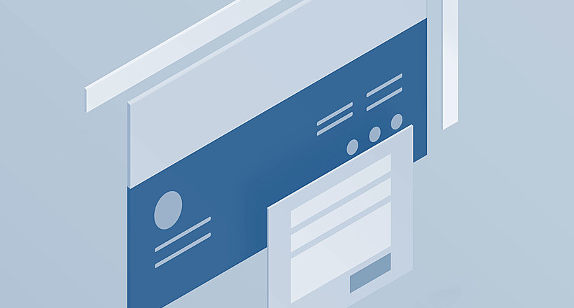
Fixed Sidebar
Easy-to-use, intuitive navigation is crucial to any website. Keeping this in mind, designers introduce a fixed sidebar on the left or right side of the page to permanently showcase the most important menu options and navigation elements.
It’s also a great idea to add links to social media accounts, contact details, and any relevant information to the sidebar.
Sidebars can also contain content other than—or in addition to—a menu, such as social media links, contact information, or anything else you want visitors to find easily.
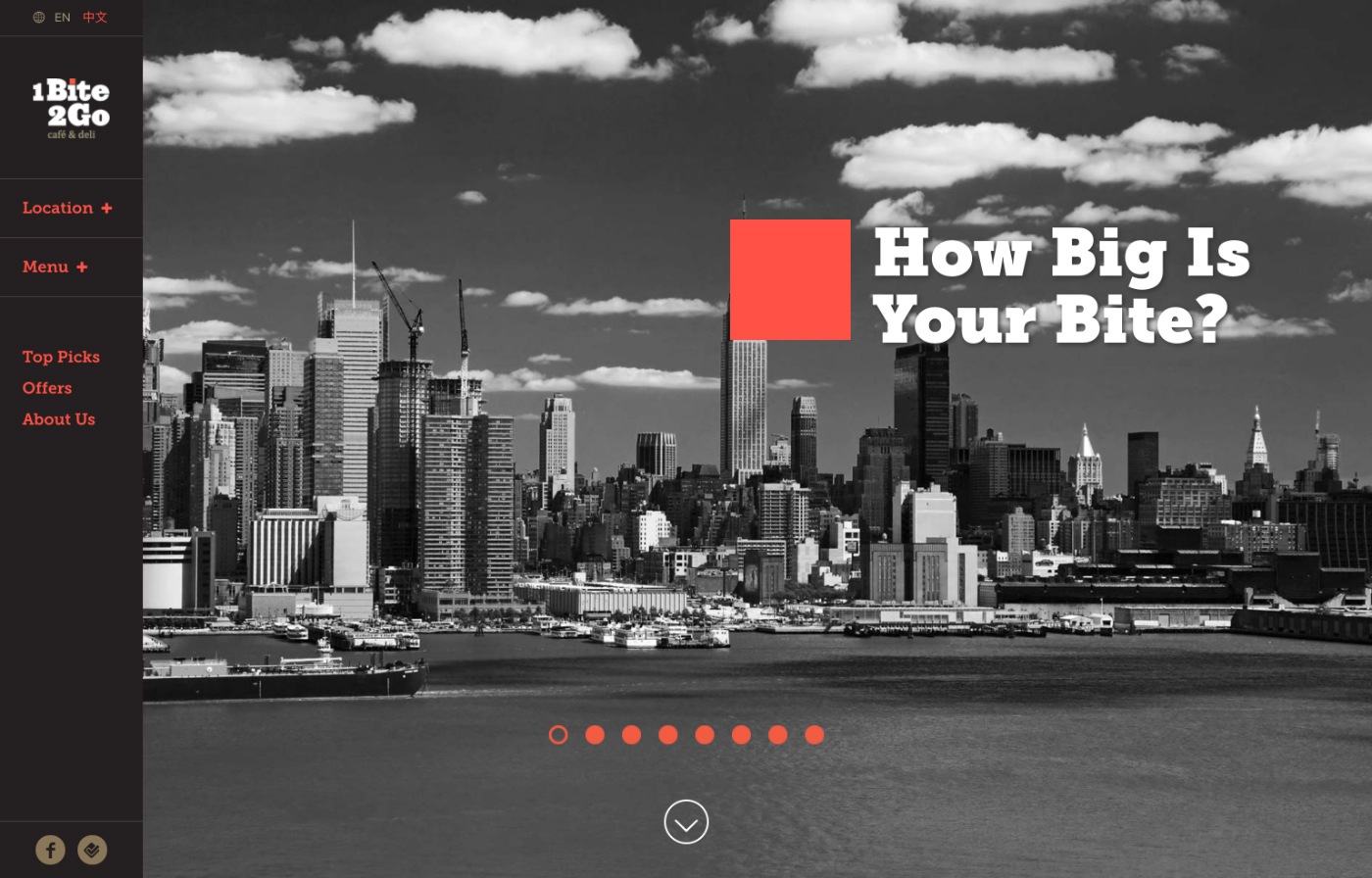
Source: 1Bite2Go
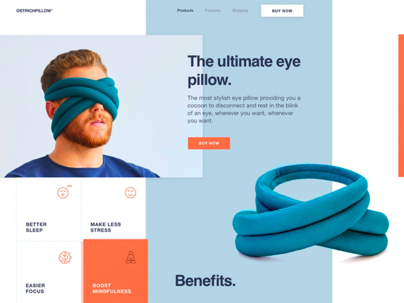
Featured Image
This layout is mostly chosen when site owners are seeking a way to sell a product or service. Building an emotional connection with users, they entice them into buying it and raise product awareness.
To reach the goal, use a high-quality photo, image, or illustration and be selective about typography that accompanies it.
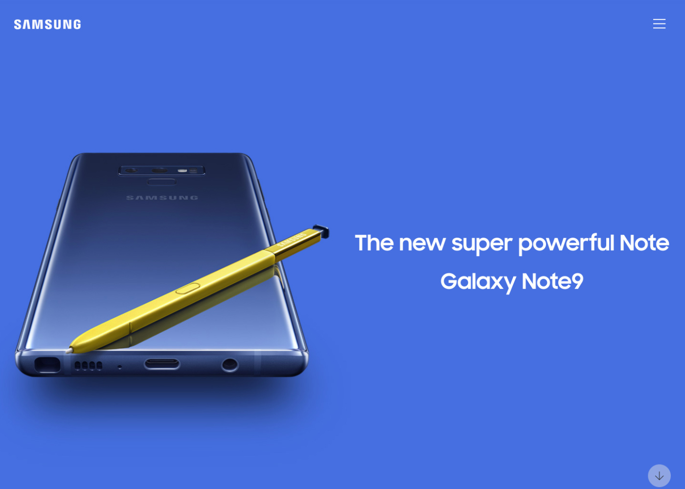
Source: Samsung
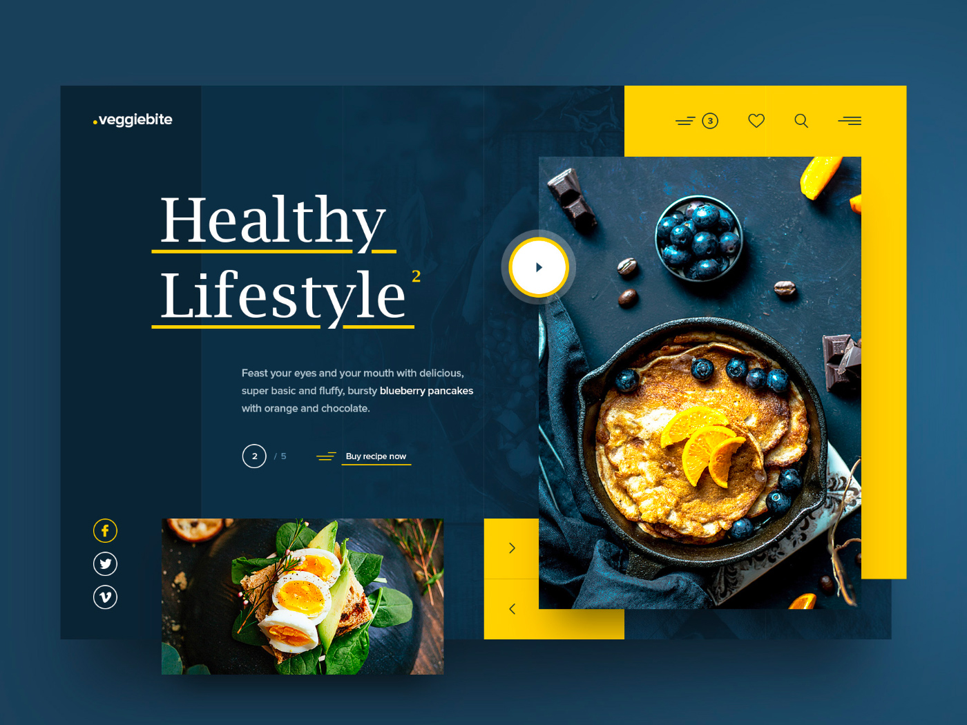
F-shaped
This pattern makes content easy to scan, complementing most users’ reading behavior that resembles the “F” letter. It enables the designer to quickly communicate the purpose of the page to readers.
The F-shaped pattern will help you achieve a good visual hierarchy, contributing to your site’s readability and usability. It’s extremely useful for blogs, online magazines, news portals, and other sites loaded with information.
Source: Dribbble
Z-shaped
Also based on reading behavior patterns, it is about scanning a page rather reading it. That’ why it’s quite common for landing pages in the examples of user-centered design. Mimicking viewers’ eyes move, it represents a great conversion driver.
Note: if there’s much text in your content copy, this layout won’t do you a good turn as it is not suitable in this case. It’s better to choose another one instead.
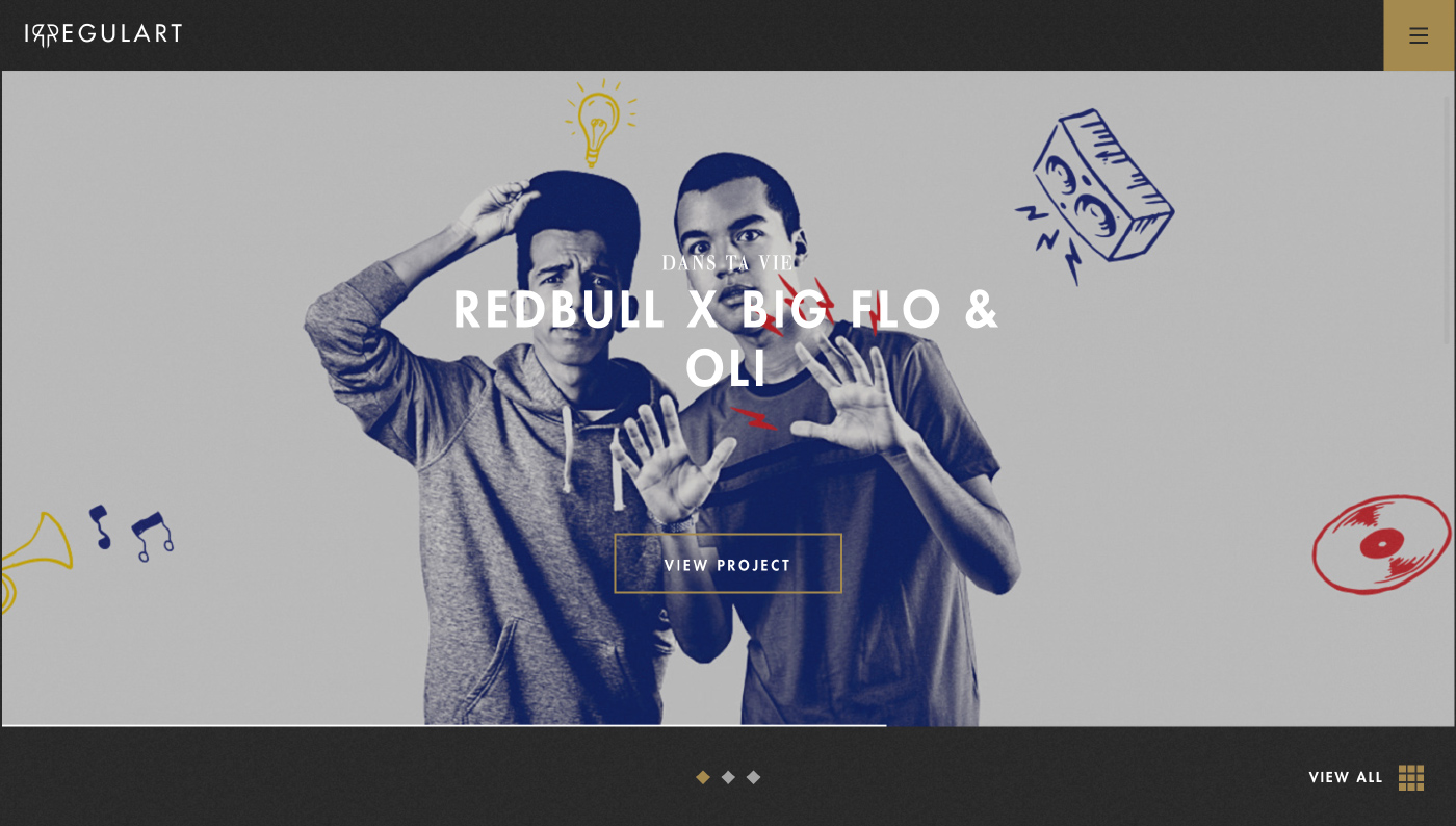
Source: Irregulart
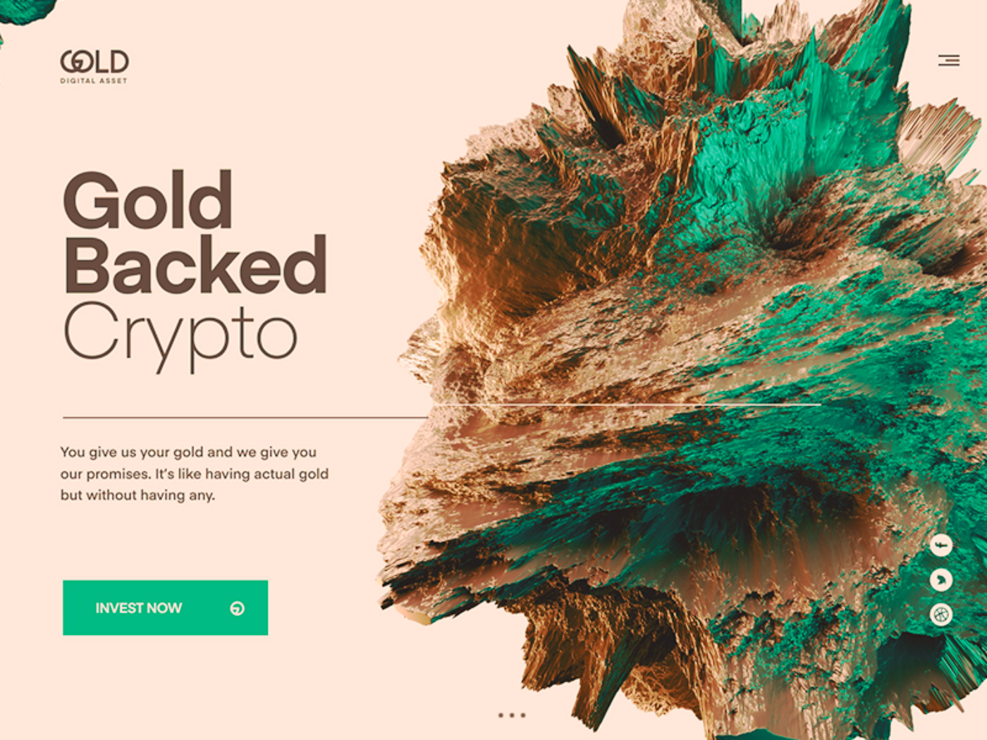
Full-Screen Image/Video
One large background photo forms the core web layout element set to capture website visitors’ attention and create a killer first impression. It can say much more than words. Charity organizations and designer brands are among those who benefit from using the background photo.
Background videos are also increasingly popular since they demonstrate the necessary message in action.
Excellent Website Layout Examples: What Are They?
We have cherry-picked some real-life examples of website layouts to show how they look. Check out them below.
Source: Dribbble
Source: Dribbble
Source: Dribbble
Source: Dribbble
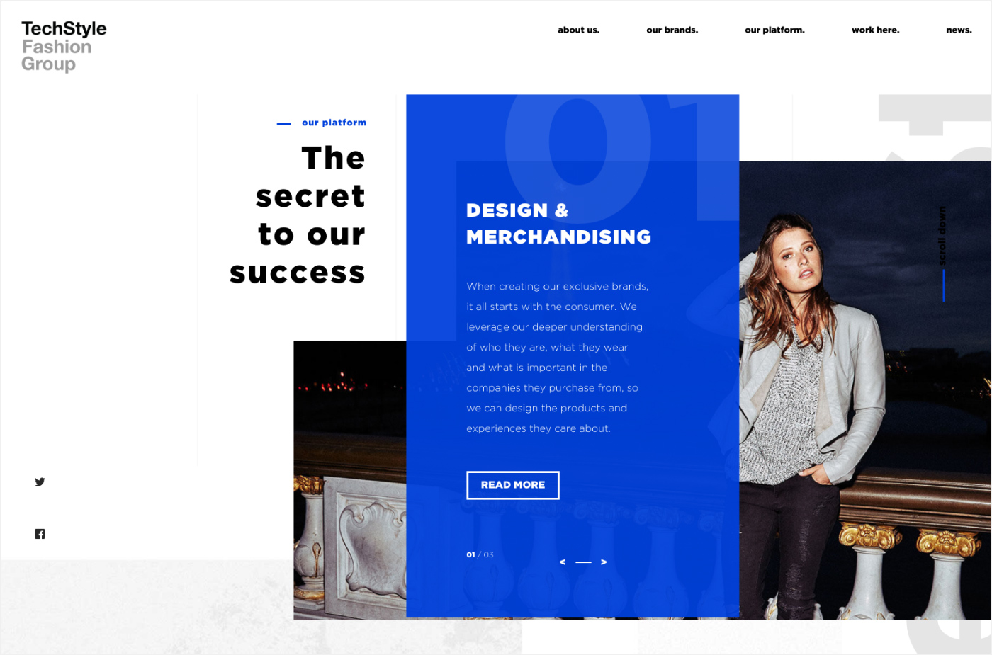
Source: Tech Style Fashion Group
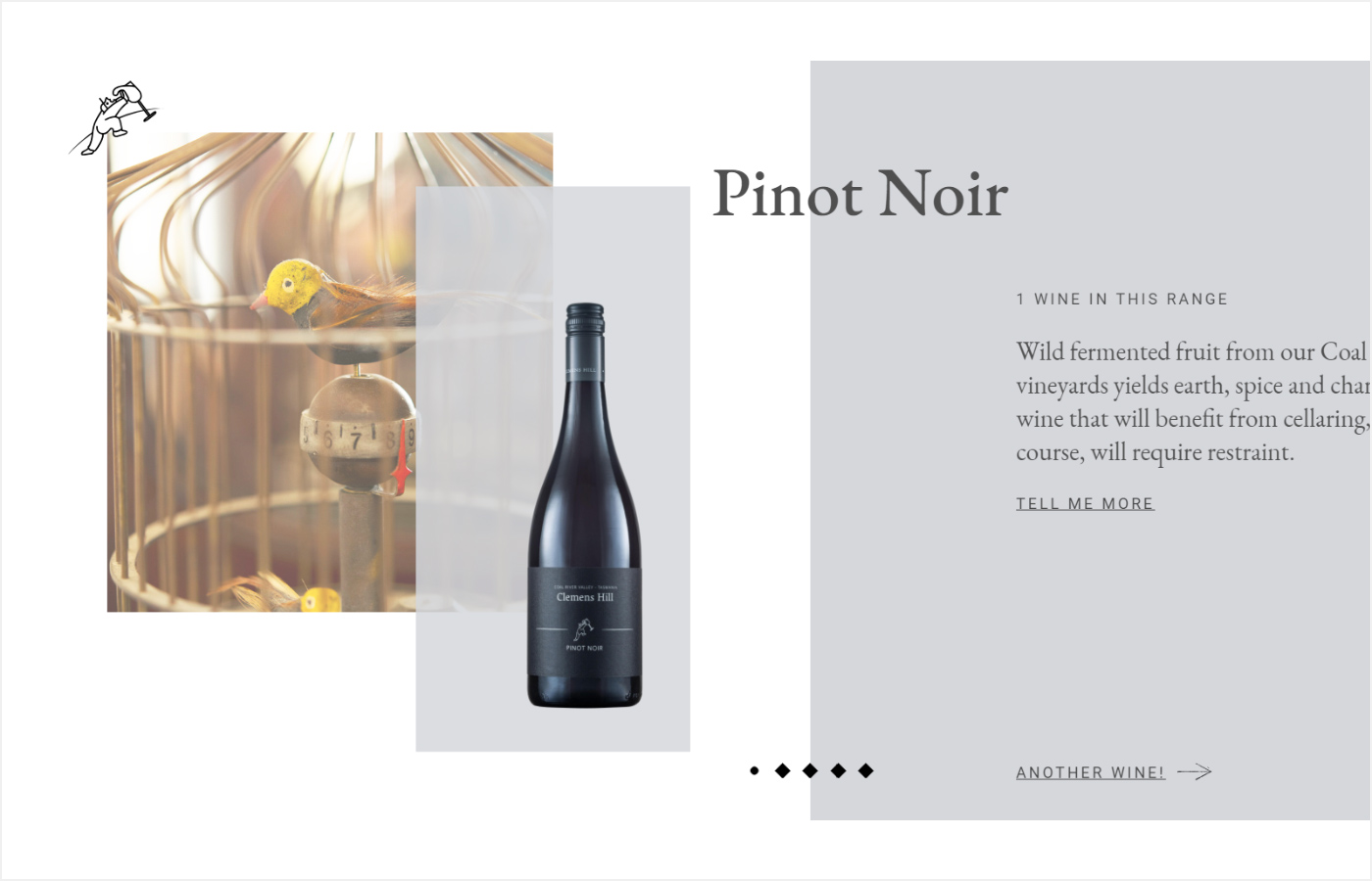
Source: Clemens Hill
Source: Dribbble
Source: Dribbble
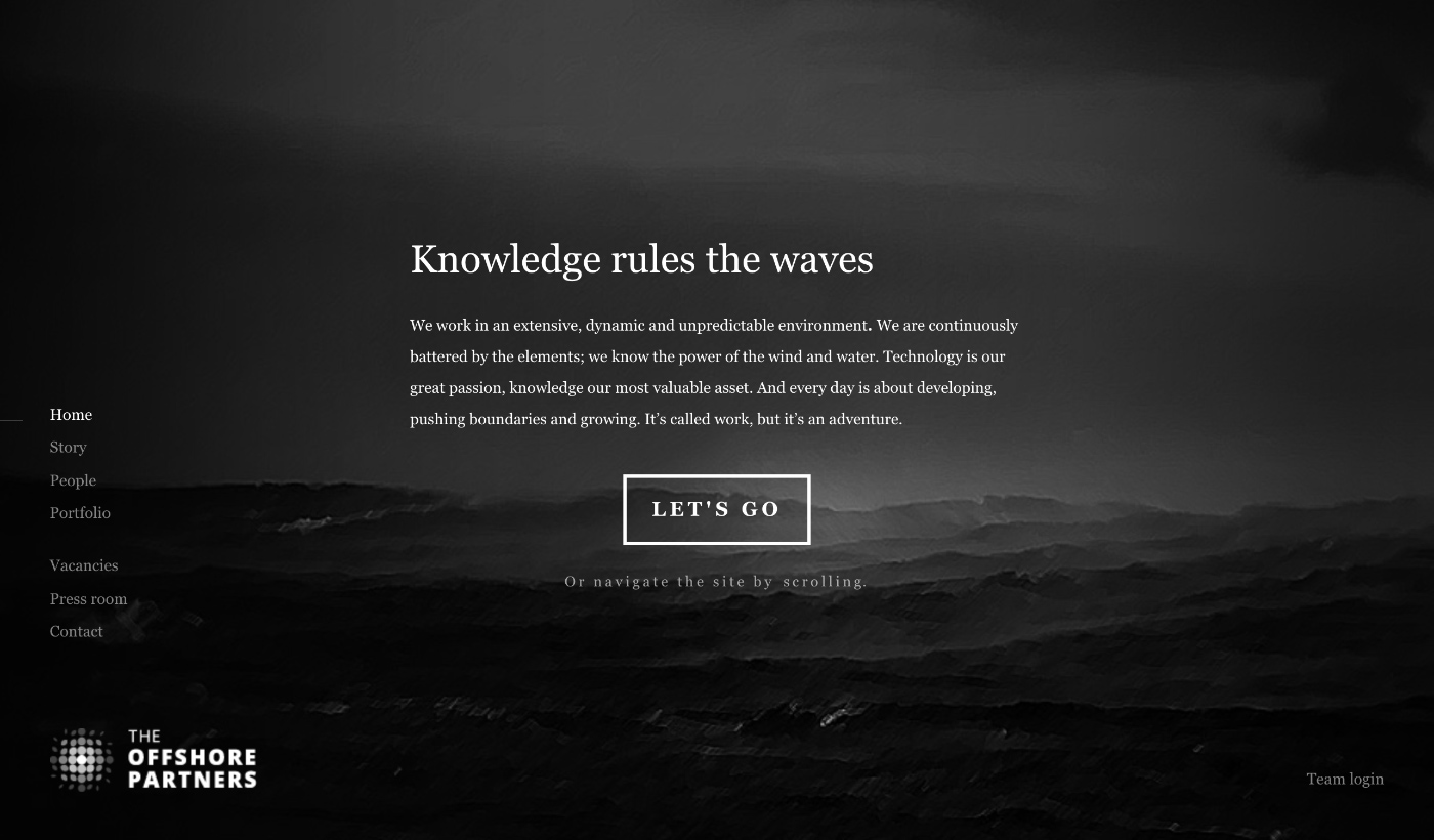
Source: The Offshore Partners
Final Words
Be cautious when selecting a web layout for your site - it can either make it or break it. Take a careful look at your content and try separate ways of organizing it. In this blog post, we have discussed both proven and popular approaches to help you make the best choice. Still have questions or concerns? Ask the AGENTE team for advice.


Rate this post!
857 ratings, average ratings is 4.7 out of 5

Related Posts

11 January 2024
Mobile-First Design: Full Guide for 2024
What is mobile first design? Well, the mobile first approach is a central principle of progressive enhancement. In a nutshell, it’s all about producing a small screen design and then scaling it up to other devices. In our new blog post, we cover some aspects that need to be taken into account when launching a mobile first web design project. We also share some outstanding design examples for your inspiration.
05 January 2024
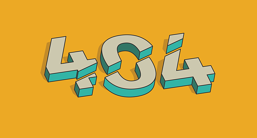
10 Best 404 Error Page Designs for 2024
In our new blog post, we review the best 404 page design examples of 2019 that will never disappoint you even if you meet the dead end on the website.

03 January 2024
10 Best Game Website Design Examples: How to Design Yours
Game website design: importance in attracting new players, awesome examples and design tips.
22 November 2022
10 Best Restaurant Website Designs & Best Design Practices
Restaurant owners always have a lot on their plate, and they are usually focused on the areas that can bring tangible benefits. Websites, unfortunately, are not one of those areas because even the perfect website does not guarantee that the restaurant will be full every evening.
31 May 2022
10 Best Examples of Website Footer Design
10 website footer design best practices examples for inspiration ⚡ Things that can go in website footers ⚡
26 May 2022
10 Best Examples of Beautiful Blog Design | Agente
In this article, you'll find 10 best examples of beautiful blog design, along with the tips that can help you enchant visitors.
Let's talk
Is there a challenge your organization or company needs help solving? We’d love to discuss it.

Managing Director, Partner
Andrew Terehin

Thank You!
Your message has been successfully sent.
We will contact you very soon.