08 March 2018
Buttons in UI Design: Best Practices for Button Design | AGENTE
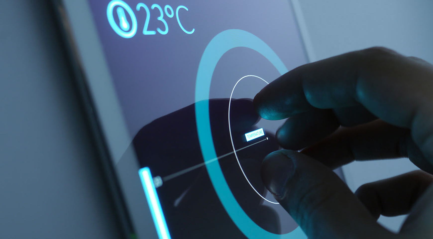
How do you describe a UI button design in three words? We picked these: “action upon touch.” Indeed, the main goal of putting buttons on a website is to enable users to take action and complete one or more tasks: register, buy, subscribe, like, follow, etc. That’s why it’s vital for great button design to make these actions visible and unambiguous, thus empowering user flow and navigation.
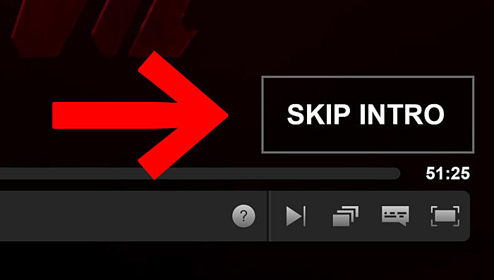
Sounds unimportant? How about this fact: The Guardian called Netflix’s “skip intro” button “the greatest invention of this century”!
Source: thenextweb.com
After Netflix introduced this button for certain TV shows earl in 2017, it was followed by an outburst of praiseful tweets and posts giving thanks for seamless watching, with people craving for this button in other Netflix series. That’s a good example of how one button has transformed a user experience, giving them a long-awaited option for choice.
Further, you’ll see some other ideas for button design, but now let’s focus on the basics and answer the question: what matters when creating buttons for your website?
Placement and size
The first thing you should bear in mind whenever you design a button or perform a user experience audit for the existing ones is where you are going to place them. First, think over the user flow to understand the steps your users are going to make.
Think of the order that buttons follow, define primary vs. secondary actions, and make sure that ‘previous’ is presented earlier than ‘next’.
The size of a button highlights its importance. That’s why making one button larger than another indicates how essential the action is.
Also, keep in mind responsive design, make the mobile version comply with the web design to create intuitive, user-friendly experiences.
Color and contrast
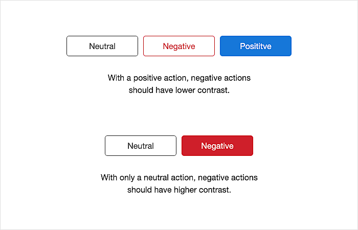
When talking about button colors, first you need to determine the types of action buttons perform:
- Positive – OK, Approve, Confirm
Positive buttons need to have the highest contrast, and the best combination is cold hues(blue or green) + white text.
- Neutral – See more, Cancel, No change
Neutral actions are best used in black-and-white scheme or with a transparent body. The traditional color for the actions like Cancel or Disable is grey.
- Negative – Delete, Block, Reject
For negative buttons, red is the best fit. Use a lower contrast when placing it with neutral and positive actions. However, if you have only neutral vs. negative buttons side by side, put the higher contrast with the red fill color on the more negative one.
Source: uxmovement.com
Note: These rules are commonly applied to the negative vs. positive paradigm, but in other cases, you should highlight the more important of the two, i.e. compare primary to secondary actions.
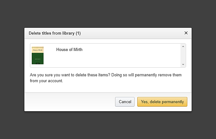
For example, a ‘Delete’ action requires special attention. Users tend to skip dialog and click the highlighted button. Even after reading, they get confused over the ‘Delete’ vs. ‘Cancel’ options, and accidentally destroy their data forever.

Source: winhelponline.com
To avoid this, put the clear labels on each of the buttons and choose wording that doesn’t confuse users:
Source: help.overdrive.com
Style
The next consideration is the appearance of your buttons. In user-centered design examples, styles are often dictated by current trends and their relevance.
-
Skeuomorphic design
The texture, size, shadows and highlights of a skeuomorphic virtual button should take after real ones, and make people feel like they are pushing a real button.
The rise of flat design has rolled back the trend of “real-life” buttons, however, fashion is cyclical, so we suggest bearing this style in mind for the future.
Source: pinterest.com
-
Flat design
The flat button design has become a recent trend as a response to the skeuomorphic design. It represents digital buttons in flat mode, without heavy visual effects. They look minimalistic and don’t remind users of real-life buttons, which simplifies overall UI design.
Source: uxplanet.org
-
Almost flat design
After the cycle of trials and errors and in the light of never-ending debates over skeuomorphic vs. ultra flat design, there appeared a compromise which is called the almost flat design. It is flat in nature but adds more relief to the UI by adding subtle shadows, layers, and highlights. Google’s floating action button is a good example of almost flat design in mobile apps.
Source: stories.uplabs.com
-
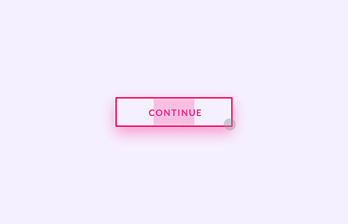
Ghost buttons
The ghost button is the new black in the UX/UI design world. It’s a transparent element activated upon hovering over it. However, they are not so progressive as they may seem: placing the pointer over an image or video with no proper contrast can make it unclear that a button is there. As a result, it may impact the conversions expected by clicking these web buttons. Therefore, we suggest presenting ghost buttons as secondary CTAs, not primary ones.
Source: pinterest.com
Consistency
When arranging all the buttons on the web, and on mobile pages, it’s critical for website designers to ensure that both the graphic elements, their placement, colors and styles are consistent across the platforms. Following the principle of least surprise will do your users a big favor by meeting their expectations, no matter where they access your website or app, helping them to successfully complete of their tasks and, as a result, increase your conversions.
And finally, here come some examples for your inspiration:
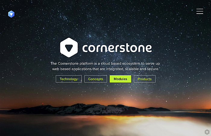
Source: cornerstoneplatform.com
Cornerstone platform from Agente features a nice example of ghost button usage. A well-elaborated contrast and color scheme make such UI buttons visible and reasonable.
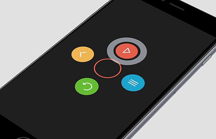
Source: dribbble.com
An interactive menu with round animated buttons is a good fit for a game menu, as well as for any other entertainment mobile app.
Source: dribbble.com
Flat ghost buttons are highlighted when being pointed at; their “ghost” nature is balanced by a bright yellow contour on the black background.
Source: dribbble.com
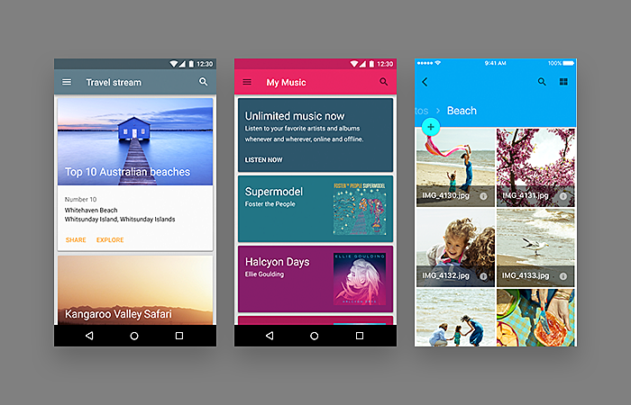
This button interface follows the new design trend: drop-downs are slowly being replaced by toggles, or segmented menus. This is especially relevant for mobile UX, where placement matters much.
Source: dribbble.com
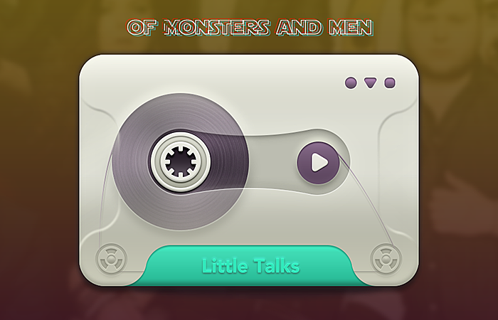
Nothing special from the UX standpoint, but the solution for the ‘Play’ button is sooo cool and nostalgic that we couldn’t but add this to our list.
The bottom line:
As you can see, UI buttons mean more than just pretty little design elements: they direct users into completing the tasks you want them to perform. A fast and meaningful user-interface interaction is ensured by combination of correct colors, shapes, styles and behaviors. Which of them is best for you? Contact Agente for expert UX and UI consultancy, and start creating a better experience for your customers.


Rate this post!
288 ratings, average ratings is 4.9 out of 5

Related Posts
17 January 2024
What Does a UX Designer Do in 2024: Role & Responsibilities
What does a UX designer do? It’s time to define core responsibilities, functions, and perspectives in one place.
11 January 2024
Mobile-First Design: Full Guide for 2024
What is mobile first design? Well, the mobile first approach is a central principle of progressive enhancement. In a nutshell, it’s all about producing a small screen design and then scaling it up to other devices. In our new blog post, we cover some aspects that need to be taken into account when launching a mobile first web design project. We also share some outstanding design examples for your inspiration.
05 January 2024
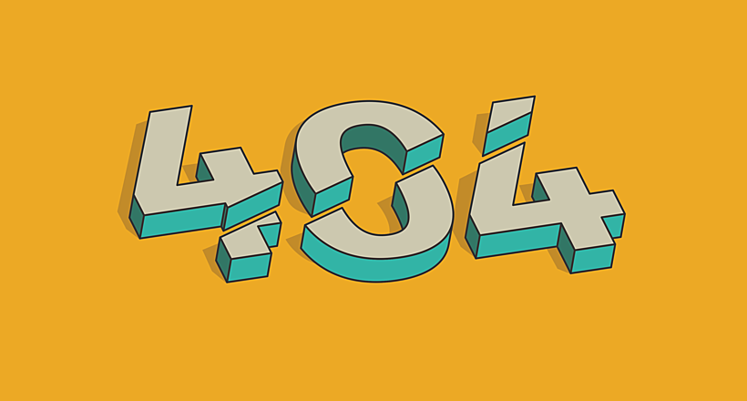
10 Best 404 Error Page Designs for 2024
In our new blog post, we review the best 404 page design examples of 2019 that will never disappoint you even if you meet the dead end on the website.
03 January 2024
10 Best Game Website Design Examples: How to Design Yours
Game website design: importance in attracting new players, awesome examples and design tips.
22 November 2022
10 Best Restaurant Website Designs & Best Design Practices
Restaurant owners always have a lot on their plate, and they are usually focused on the areas that can bring tangible benefits. Websites, unfortunately, are not one of those areas because even the perfect website does not guarantee that the restaurant will be full every evening.
31 May 2022
10 Best Examples of Website Footer Design
10 website footer design best practices examples for inspiration ⚡ Things that can go in website footers ⚡
Let's talk
Is there a challenge your organization or company needs help solving? We’d love to discuss it.

Managing Director, Partner
Andrew Terehin

Thank You!
Your message has been successfully sent.
We will contact you very soon.