14 November 2019
How to Design Dark Themes for iOS Apps?
How to Design Dark Theme for iOS + 5 Black Theme Concepts for Popular Apps
Since Android and iOS launched dark mode in recent times, dark themes have become widely expected. All popular mobile apps are catching up and introducing their vision of dark themes and this is not just because of the hype. Dark themes have many advantages. They are easier on the eye and better to read at night or in low light.
Designing a dark theme for an iOS app is not as easy as it may seem. It goes beyond just inverting colors in an existing interface.
In this article, we’ll touch on the basics of dark themes for iOS mobile apps and share some tips on how to design them. In the end, you’ll find our dark concepts of popular apps that haven’t accepted the trend yet.
Design Dilemma: Black or White?
Which combination is more favorable for the human eyes in terms of reading or working with texts—black letters on a white background or white letters on a black background?
I found several pieces of research:
Taylor&Francis - Black on white is better. This variant is recommended for readers of all ages.
Thomas Phinney, Ex-CEO FontLab - “in daylight and well-lit environments, black text on a white screen will perform best. However, under unusually dim lighting conditions, an alternative may be preferable.”
The Slashdot poll (9430 voters) has shown that 68% of users switch to the dark mode on their computers and phones, whenever available.
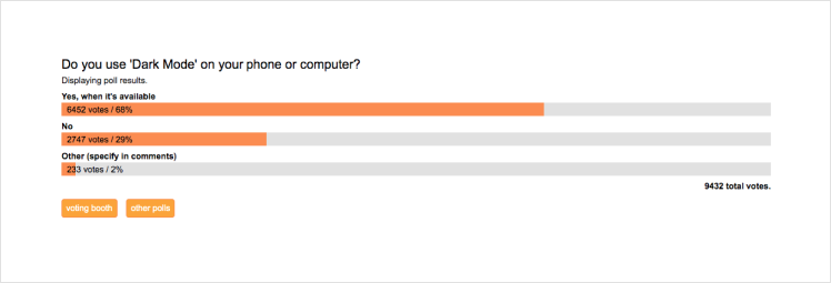
Source: Slashdot
Jason Harrison from the University of British Columbia claims that people with astigmatism (nearly 50% of people in the world) have difficulties reading white on black, this combination provokes blurry vision.
With that research in mind, the conclusion is simple:
- In daylight, the light theme is preferable.
- At night, brightness should be dimmed and the dark mode is a perfect choice.
Tips on Designing Amazing iPhone Dark Themes
So, what about dark mode designs for iPhone mobile apps? In general, your color choice will rest upon three main considerations:
- Accessibility and readability of the content.
- Consistency with the other dark-themed apps.
- Reflecting your app’s brand identity.
After all, your product or website design should maintain its original look after getting the dark theme. How can this be achieved? Here are some tips that I gathered from our design team:
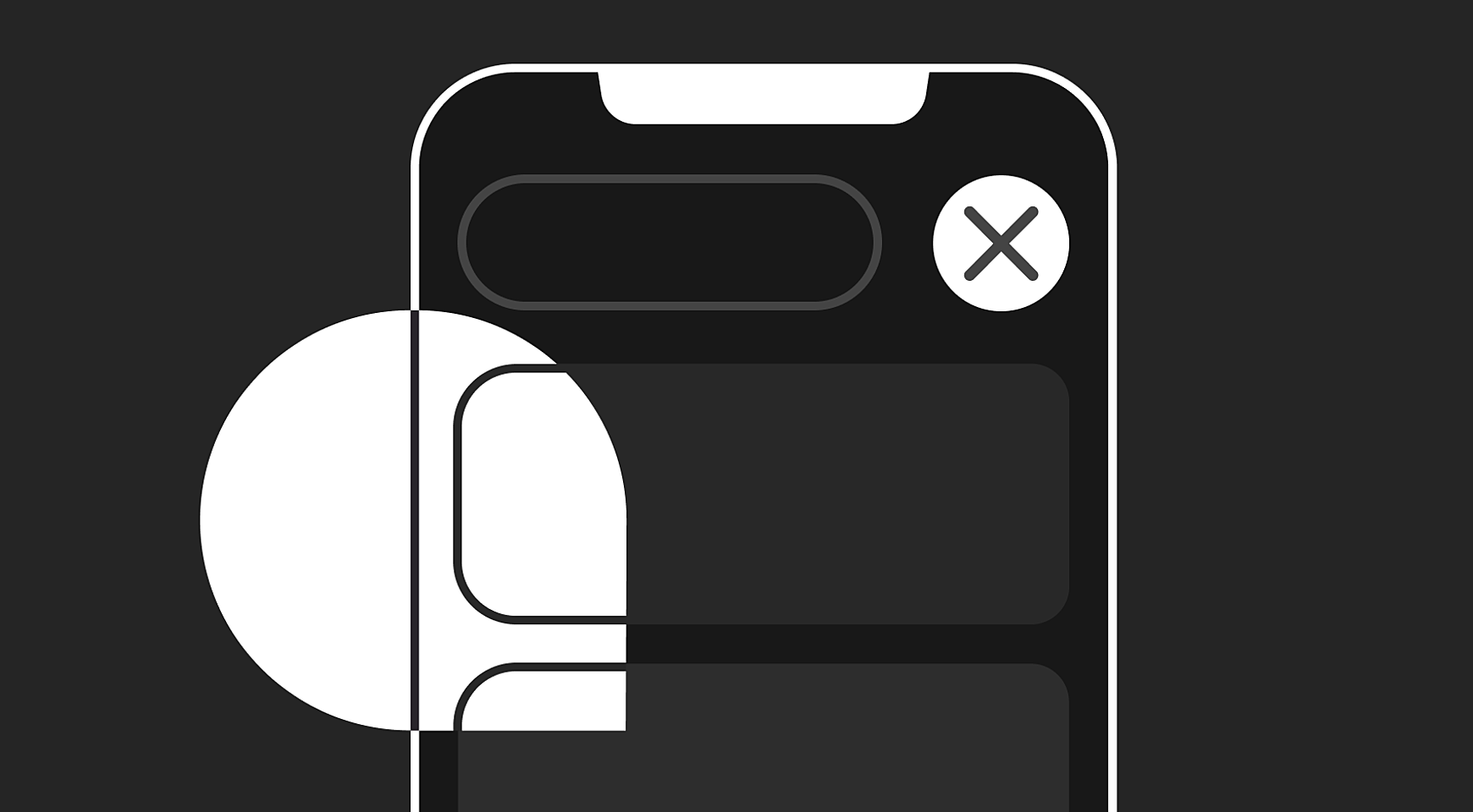
Choose colors properly
Deciding on the colors you use for dark mode on iPhones involves more than simply reversing the colors out, making white backgrounds black, and black text white. Some colors shouldn’t necessarily be inverted. You can follow Apple’s footsteps and separate such views with dark lines or lines of the other color that match your product’s visual identity.

Source: Dribbble
Maintain a comfortable contrast
When it comes to accessibility and readability issues, acute contrasts are a no-go. As WCAG provides it, the color contrast shouldn’t exceed a 4.5:1 ratio for a paragraph text, and 3:1 for headlines.
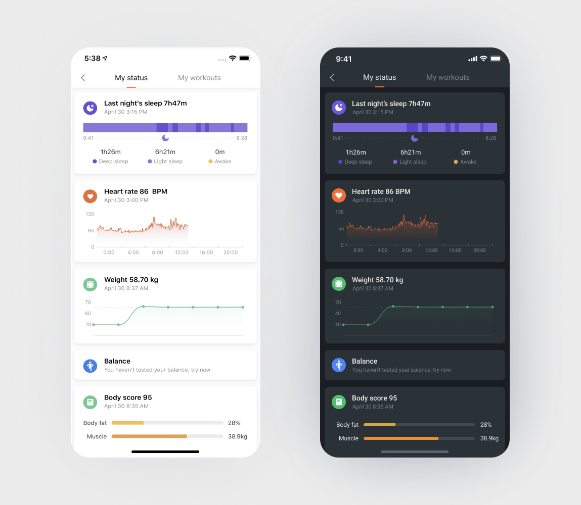
Source: Agente
Optimize bright blocks
In light themes, we often use large blocks with a brighter color. Usually, it is ok to highlight the important elements and make the interface livelier. However, it doesn’t work in dark themes: Large colorful blocks distract attention away from the target actions.
Source: Dribbble
Use bolder fonts
If an inverted font looks thinner on a dark background, it makes sense to thicken it in the dark mode of your iPhone. Consider this from the very beginning, when choosing a font family with multiple typefaces. For example, you’ll need to use medium instead of regular font-weight.
Source: Dribbble
Remember about photos and images
Make sure full-color images and photos look good. You can use the same images in both dark and light modes if it looks good. Otherwise, you should consider modifying the photos or even creating a separate version of them.
Source: Dribbble
Be careful with the blues
Blue is the new black in dark themes. Striving to reduce eyestrain for users, app designers launch dark blue themes instead of, or together with, black versions. However, Flux research discovers that excessive blue lighting makes it harder to fall asleep. Flux paints the screen in a yellowish red color after dawn, which makes working with a dark interface easier.
Source: Dribbble
Don’t rely on CSS filters
If you skip the design stage and color your interface using just CSS filters, you’ll probably face some challenges:
- You won’t be able to manage the final colors.
- Pages that are already dark will invert to light.
- An app’s load time will significantly slow down.
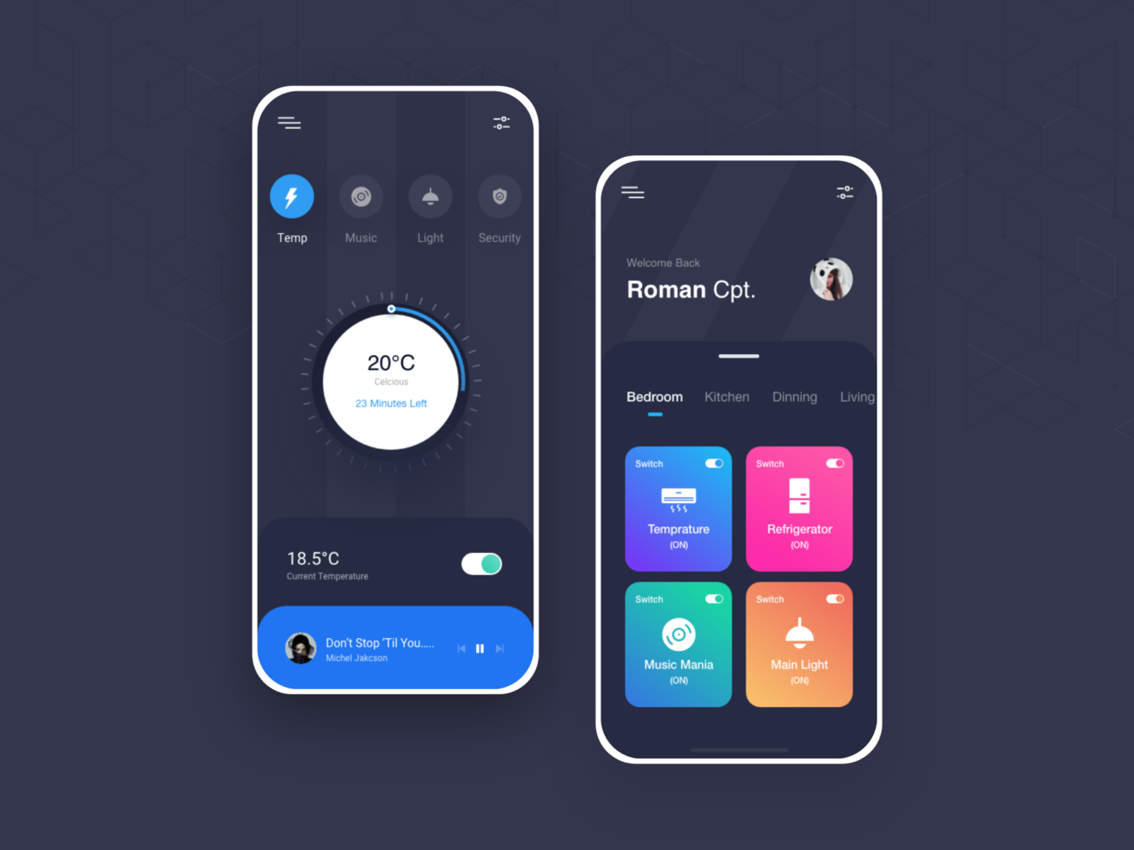
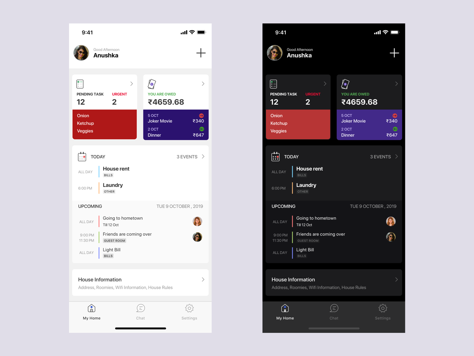
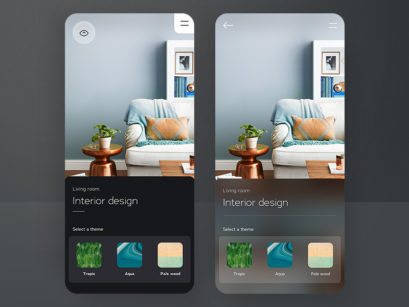
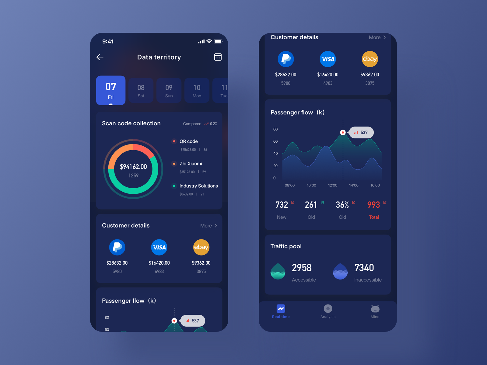
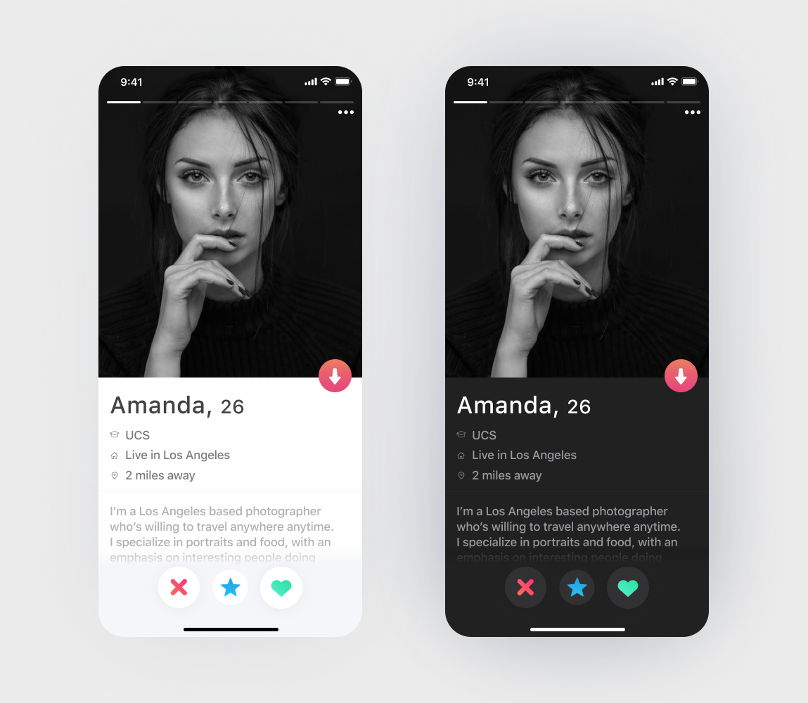
Five Apps That Still Don’t Have Dark Themes
And finally! We’ve gone through the list of the most popular iOS apps and found some that don’t have dark themes yet. I asked the guys from the design and development departments to analyze the elements of these apps and design dark versions of them, maintaining a comfortable level of contrast, brightness, and saturation. Designing for dark mode doesn't stop with choosing darker colors. While working with popular apps, we tried to mimic their brand identity.
Here’s what we’ve got:
Google Drive
In the case of Google Drive dark them, designing was as comfortable as Google Material Design guidelines provide. Luckily, a lot of Google products have already come to the “dark side”, so it was quite easy to follow the lead and apply current dark mode settings to the Google Drive iOS app.
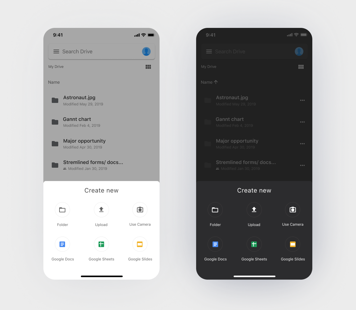
Source: Google Drive
Airbnb
If Airbnb eventually decides to go back to black, we think their dark theme will be as follows: Reduced contrast by softening colors and slightly darkened photos, and a bit off-white for navigation controls.
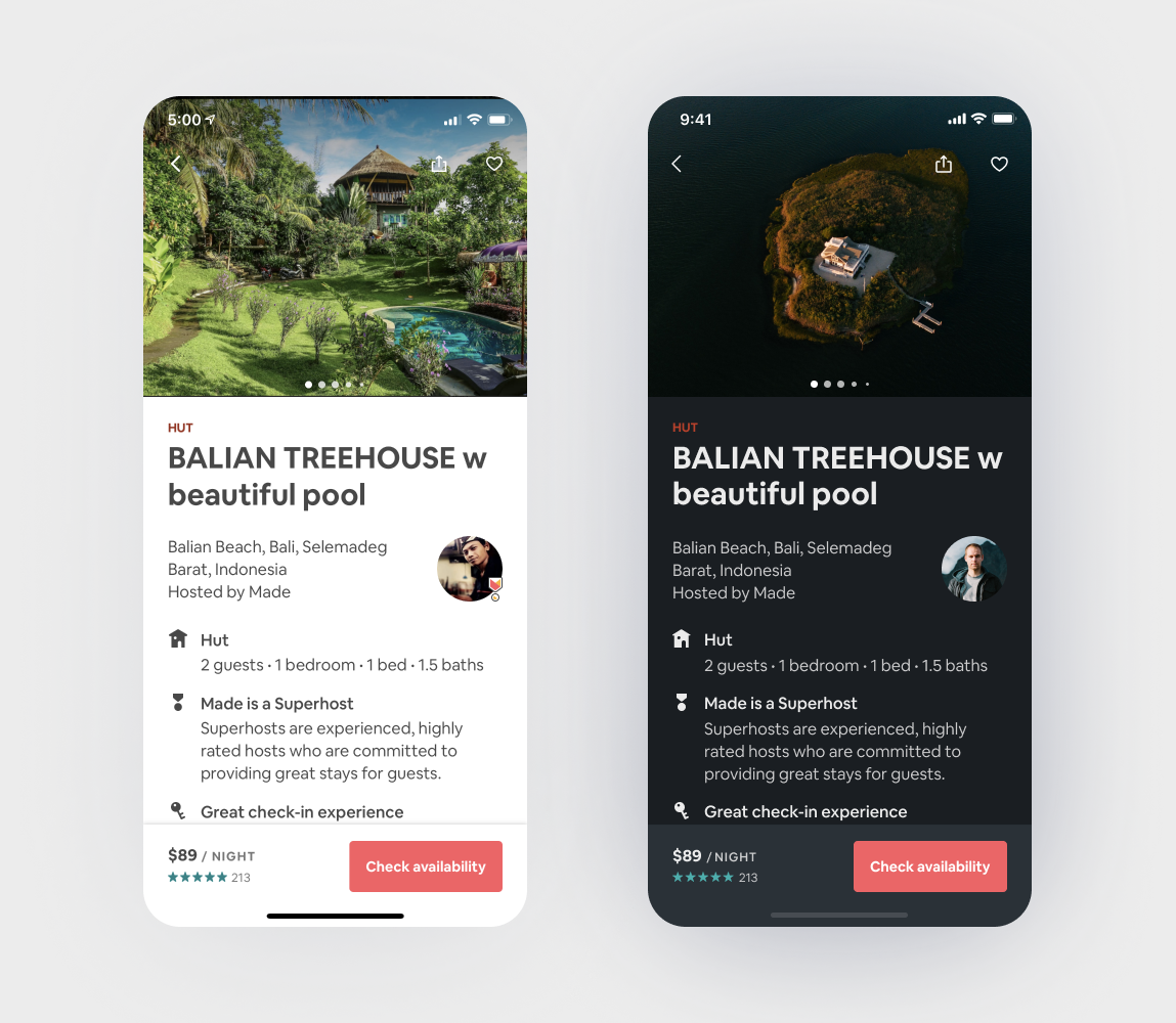
Source: Airbnb
MiFit
We wanted the MiFit brand to be connected across light and dark themes, so we just chose the darker shades of the same palette of colorful elements.
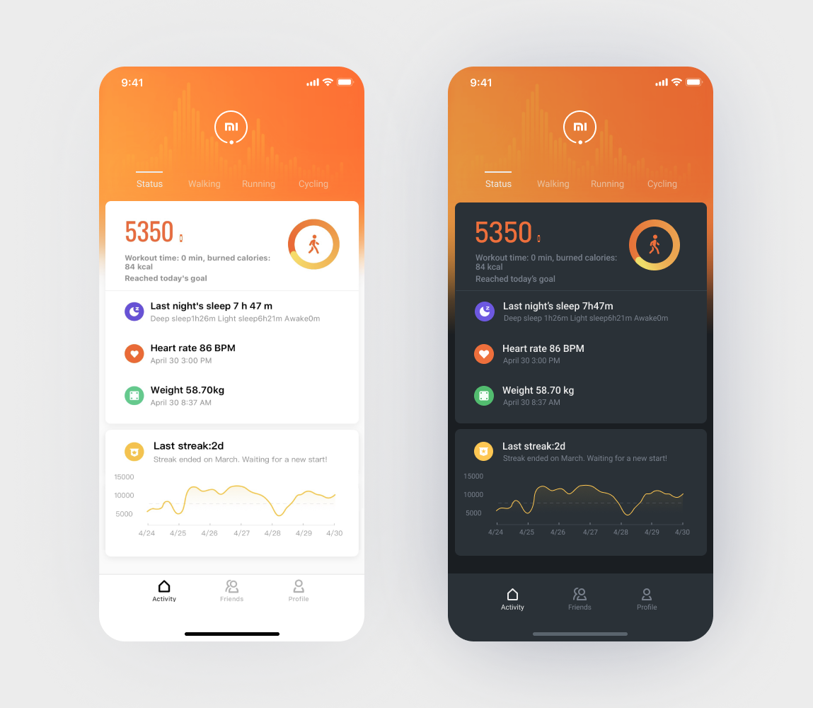
Source: MiFit
Snapchat
As Snapchat is all about photos, we added a subtle tinting effect to them in a Snapchat dark theme. It matched the darkened surroundings and reduced unnecessary contrast.
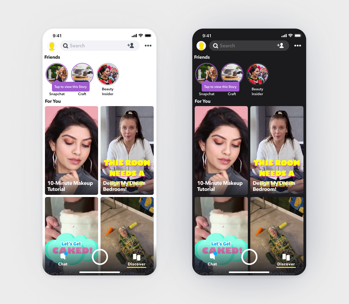
Source: Snapchat
Tinder
For Tinder dark mode, we used several hues of grey color. Near surfaces use lighter shades of grey, while distant ones have darker hues.
Source: Tinder
Final Thoughts
While implementing dark mode for iOS seems easy, designing for it might pose some challenges in terms of accessibility and readability, as well as a consistent look and feel for your brand. We hope this small guide was helpful! Reach out to us via a contact form, Agente is ready to help!


Rate this post!
267 ratings, average ratings is 4.4 out of 5

Related Posts
05 January 2024
10 Best 404 Error Page Designs for 2024
In our new blog post, we review the best 404 page design examples of 2019 that will never disappoint you even if you meet the dead end on the website.
26 May 2022
10 Best Examples of Beautiful Blog Design | Agente
In this article, you'll find 10 best examples of beautiful blog design, along with the tips that can help you enchant visitors.
29 April 2022
How to Design a User Profile Page in 2022
User profiles can become a constant flow of customer-related data that is extremely useful for marketing. How to design a user profile page? Read in our new article.
20 October 2020
How to Design a Website For Black Friday & Cyber Monday?
In this article, we will talk about how to create an attractive and selling website design for Black Friday and Cyber Monday. Let's take a closer look at each step of creating such a website.
05 March 2020
Neumorphism in UI: Free Icon Set
What is neumorphism? Our reply to neumorphic trend + set of free e-commerce icons inside!
14 February 2019
18 Examples of Mobile Checkout Form Design
After reading this article, you’ll find out the features that improve checkout design and, hopefully, get some inspiration from checkout page design examples.
Let's talk
Is there a challenge your organization or company needs help solving? We’d love to discuss it.

Managing Director, Partner
Andrew Terehin

Thank You!
Your message has been successfully sent.
We will contact you very soon.